The notebook can be executed at
A formal paper of the notebook:
@article{wang2023intuitive,
  title={An intuitive tutorial to {Gaussian} process regression},
  author={Wang, Jie},
  journal={Computing in Science \& Engineering},
  volume={25},
  number={4},
  pages={4--11},
  year={2023},
  publisher={IEEE}
}
The audience of this tutorial is the one who wants to use GP but not feels comfortable using it. This happens to me after finishing reading the first two chapters of the textbook Gaussian Process for Machine Learning [1]. There is a gap between the usage of GP and feel comfortable using it due to the difficulties in understanding the theory. When I was reading the textbook and watching tutorial videos online, I can follow the majority without too many difficulties. The content kind of makes sense to me. But even when I am trying to talk to myself what GP is, the big picture is blurry. After keep trying to understand GP from various recourses, including textbooks, blog posts, and open-sourced codes, I get my understandings sorted and summarize them up from my perspective.
One thing I realized the difficulties in understanding GP is due to background varies, everyone has different knowledge. To understand GP, even to the intuitive level, needs to know multivariable Gaussian, kernel, conditional probability. If you familiar with these, start reading from III. Math. Entry or medium-level in deep learning (application level), without a solid understanding in machine learning theory, even cause more confusion in understanding GP.
 [10]
[10]
First of all, why use Gaussian Process to do regression? Or even, what is regression? Regression is a common machine learning task that can be described as Given some observed data points (training dataset), finding a function that represents the dataset as close as possible, then using the function to make predictions at new data points. Regression can be conducted with polynomials, and it's common there is more than one possible function that fits the observed data. Besides getting predictions by the function, we also want to know how certain these predictions are. Moreover, quantifying uncertainty is super valuable to achieve an efficient learning process. The areas with the least certainty should be explored more.
In a word, GP can be used to make predictions at new data points and can tell us how certain these predictions are.
 [2] [2]
|

|
Let's talk about Gaussian.
A random variable  is said to be normally distributed with mean
  and variance
  if its probability density function (PDF) is

Here, represents random variables and  is the real argument. The Gaussian or Normal distribution of is usually represented by
  .
.
A  Gaussian PDF is plotted below. We generate
 n number random sample points from a Gaussian distribution on x axis.
from __future__ import division
import numpy as np
import matplotlib.pyplot as plt
import pandas as pd
import seaborn as sns
# Plot 1-D gaussian
n = 1 # n number of independent 1-D gaussian
m= 1000 # m points in 1-D gaussian
f_random = np.random.normal(size=(n, m))
# more information about 'size': https://www.sharpsightlabs.com/blog/numpy-random-normal/
#print(f_random.shape)
for i in range(n):
#sns.distplot(f_random[i], hist=True, rug=True, vertical=True, color="orange")
sns.distplot(f_random[i], hist=True, rug=True)
plt.title('1 random samples from a 1-D Gaussian distribution')
plt.xlabel('x')
plt.ylabel('P(x)')
plt.show()
We generated data points that follow the normal distribution. On the other hand, we can model data points, assume these points are Gaussian, model as a function, and do regression using it. As shown above, a kernel density and histogram of the generated points were estimated. The kernel density estimation looks a normal distribution due to there are plenty (m=1000) observation points to get this Gaussian looking PDF. In regression, even we don't have that many observation data, we can model the data as a function that follows a normal distribution if we assume a Gaussian prior.
The Gaussian PDF  is completely characterized by the two parameters and
  , they can be obtained from the PDF as [3]

We have a random generated dataset in  . We sampled the generated dataset and got a Gaussian bell curve.
Now, if we project all points  on the x-axis to another space. In this space, We treat all points as a vector
  , and plot on the new axis at
  .
.
n = 1         # n number of independent 1-D gaussian
m= 1000       # m points in 1-D gaussian
f_random = np.random.normal(size=(n, m))

Xshow = np.linspace(0, 1, n).reshape(-1,1)   # n number test points in the range of (0, 1)

plt.clf()
plt.plot(Xshow, f_random, 'o', linewidth=1, markersize=1, markeredgewidth=2)
plt.xlabel('<img src="/tex/cbfb1b2a33b28eab8a3e59464768e810.svg?invert_in_darkmode&sanitize=true" align=middle width=14.908688849999992pt height=22.465723500000017pt/>')
plt.ylabel('<img src="/tex/161805ece9a8142e4ebe9d356fd0f763.svg?invert_in_darkmode&sanitize=true" align=middle width=37.51151249999999pt height=24.65753399999998pt/>')
plt.show()
It's clear that the vector is Gaussian. It looks like we did nothing but vertically plot the vector points .
Next, we can plot multiple independent Gaussian in the  coordinates. For example, put vector at at and another vector
  at at
at at  .
.
n = 2
m = 1000
f_random = np.random.normal(size=(n, m))

Xshow = np.linspace(0, 1, n).reshape(-1,1)   # n number test points in the range of (0, 1)

plt.clf()
plt.plot(Xshow, f_random, 'o', linewidth=1, markersize=1, markeredgewidth=2)
plt.xlabel('<img src="/tex/cbfb1b2a33b28eab8a3e59464768e810.svg?invert_in_darkmode&sanitize=true" align=middle width=14.908688849999992pt height=22.465723500000017pt/>')
plt.ylabel('<img src="/tex/161805ece9a8142e4ebe9d356fd0f763.svg?invert_in_darkmode&sanitize=true" align=middle width=37.51151249999999pt height=24.65753399999998pt/>')
plt.show()
Keep in mind that both vecotr and are Gaussian.

Let's do something interesting. Let's connect points of and by lines. For now, we only generate 10 random points for and , and then join them up as 10 lines. Keep in mind, these random generated 10 points are Gaussian.
n = 2
m = 10
f_random = np.random.normal(size=(n, m))

Xshow = np.linspace(0, 1, n).reshape(-1,1)   # n number test points in the range of (0, 1)

plt.clf()
plt.plot(Xshow, f_random, '-o', linewidth=2, markersize=4, markeredgewidth=2)
plt.xlabel('<img src="/tex/cbfb1b2a33b28eab8a3e59464768e810.svg?invert_in_darkmode&sanitize=true" align=middle width=14.908688849999992pt height=22.465723500000017pt/>')
plt.ylabel('<img src="/tex/161805ece9a8142e4ebe9d356fd0f763.svg?invert_in_darkmode&sanitize=true" align=middle width=37.51151249999999pt height=24.65753399999998pt/>')
plt.show()
Going back to think about regression. These lines look like functions for each pair of points. On the other hand, the plot also looks like we are sampling the region  with 10 linear functions even there are only two points on each line. In the sampling perspective, the domain is our region of interest, i.e. the specific region we do our regression. This sampling looks even more clear if we generate more independent Gaussian and connecting points in order by lines.
n = 20
m = 10
f_random = np.random.normal(size=(n, m))

Xshow = np.linspace(0, 1, n).reshape(-1,1)   # n number test points in the range of (0, 1)

plt.clf()
plt.plot(Xshow, f_random, '-o', linewidth=1, markersize=3, markeredgewidth=2)
plt.xlabel('<img src="/tex/cbfb1b2a33b28eab8a3e59464768e810.svg?invert_in_darkmode&sanitize=true" align=middle width=14.908688849999992pt height=22.465723500000017pt/>')
plt.ylabel('<img src="/tex/161805ece9a8142e4ebe9d356fd0f763.svg?invert_in_darkmode&sanitize=true" align=middle width=37.51151249999999pt height=24.65753399999998pt/>')
plt.show()
Wait for a second, what we are trying to do by connecting random generated independent Gaussian points? Even these lines look like functions, but they are too noisy. If is our input space, these functions are meaningless for the regression task. We can do no prediction by using these functions. The functions should be smoother, meaning input points that are close to each other should have similar values of the function.
Thus, functions by connecting independent Gaussian are not proper for regression, we need Gaussians that correlated to each other. How to describe joint Gaussian? Multivariable Gaussian.
In some situations, a system (set of data) has to be described by more than more feature variables  , and these variables are correlated. If we want to model the data all in one go as Gaussian, we need multivariate Gaussian. Here are examples of the
  Gaussian. A data center is monitored by the CPU load
  and memory use
  . [3]
. [3]

The gaussian can be visualized as a 3D bell curve with the heights representing probability density.

|

|
Goes to Appendix A if you want to generate image on the left.
Formally, multivariate Gaussian is expressed as [4]

The mean vector is a 2d vector  , which are independent mean of each variable and .
The covariance matrix of Gaussian is  . The diagonal terms are independent variances of each variable, and . The offdiagonal terms represents correlations between the two variables. A correlation component represents how much one variable is related to another variable.
A Gaussian can be expressed as

When we have an  Gaussian, the covariance matrix
  is
is  and its
  element is
  . The is a symmetric matrix and stores the pairwise covariances of all the jointly modeled random variables.
Play around with the covariance matrix to see the correlations between the two Gaussians.
import pandas as pd
import seaborn as sns

mean, cov = [0., 0.], [(1., -0.6), (-0.6, 1.)]
data = np.random.multivariate_normal(mean, cov, 1000)
df = pd.DataFrame(data, columns=["x1", "x2"])
g = sns.jointplot("x1", "x2", data=df, kind="kde")

#(sns.jointplot("x1", "x2", data=df).plot_joint(sns.kdeplot))

g.plot_joint(plt.scatter, c="g", s=30, linewidth=1, marker="+")

#g.ax_joint.collections[0].set_alpha(0)
g.set_axis_labels("<img src="/tex/8c76e0c69c5596634f9abb693bbf9438.svg?invert_in_darkmode&sanitize=true" align=middle width=17.614197149999992pt height=21.18721440000001pt/>", "<img src="/tex/1533fefb8348ed2119c7920bf5d7a8a5.svg?invert_in_darkmode&sanitize=true" align=middle width=17.614197149999992pt height=21.18721440000001pt/>");

g.ax_joint.legend_.remove()
plt.show()
Another good MVN visualization is Multivariante Gaussians and Mixtures of Gaussians (MoG).
Besides the joint probalility, we are more interested to the conditional probability. If we cut a slice on the 3D bell curve or draw a line on the elipse contour, we got the conditional probability distribution

|

|
We want to smooth the sampling functions by defining the covariance functions. Considering the fact that when two vectors are similar, their dot product output value is high. It is very clear to see this in the dot product equation  , where
  is the angle between two vectors. If an algorithm is defined solely in terms of inner products in input space then it can be lifted into feature space by replacing occurrences of those inner products by
  ; we call
  a kernel function [1].
A popular covariance function (aka kernel function) is squared exponential kernal, also called the radial basis function (RBF) kernel or Gaussian kernel, defined as

Let's re-plot 20 independent Gaussian and connecting points in order by lines. Instead of generating 20 independent Gaussian before, we do the plot of a  Gaussian with a identity convariance matrix.
n = 20
m = 10

mean = np.zeros(n)
cov = np.eye(n)

f_prior = np.random.multivariate_normal(mean, cov, m).T

plt.clf()

#plt.plot(Xshow, f_prior, '-o')
Xshow = np.linspace(0, 1, n).reshape(-1,1)   # n number test points in the range of (0, 1)

for i in range(m):
    plt.plot(Xshow, f_prior, '-o', linewidth=1)

plt.title('10 samples of the 20-D gaussian prior')
plt.show()
We got exactly the same plot as expected. Now let's kernelizing our funcitons by use the RBF as our convariace.
# Define the kernel
def kernel(a, b):
    sqdist = np.sum(a**2,axis=1).reshape(-1,1) + np.sum(b**2,1) - 2*np.dot(a, b.T)
    # np.sum( ,axis=1) means adding all elements columnly; .reshap(-1, 1) add one dimension to make (n,) become (n,1)
    return np.exp(-.5 * sqdist)
n = 20
m = 10
Xshow = np.linspace(0, 1, n).reshape(-1,1) # n number test points in the range of (0, 1)
K_ = kernel(Xshow, Xshow) # k(x_star, x_star)
mean = np.zeros(n)
cov = np.eye(n)
f_prior = np.random.multivariate_normal(mean, K_, m).T
plt.clf()
Xshow = np.linspace(0, 1, n).reshape(-1,1) # n number test points in the range of (0, 1)
for i in range(m):
plt.plot(Xshow, f_prior, '-o', linewidth=1)
plt.title('10 samples of the 20-D gaussian kernelized prior')
plt.show()
We get much smoother lines and looks even more like functions. When the dimension of Gaussian gets larger, there is no need to connect points. When the dimension become infinity, there is a point represents any possible input. Let's plot m=200 samples of n=200 Gaussian to get a feeling of functions with infinity parameters.
n = 200
m = 200

Xshow = np.linspace(0, 1, n).reshape(-1,1)

K_ = kernel(Xshow, Xshow)                    # k(x_star, x_star)

mean = np.zeros(n)
cov = np.eye(n)

f_prior = np.random.multivariate_normal(mean, K_, m).T

plt.clf()
#plt.plot(Xshow, f_prior, '-o')
Xshow = np.linspace(0, 1, n).reshape(-1,1)   # n number test points in the range of (0, 1)

plt.figure(figsize=(18,9))
for i in range(m):
    plt.plot(Xshow, f_prior, 'o', linewidth=1, markersize=2, markeredgewidth=1)

plt.title('200 samples of the 200-D gaussian kernelized prior')
#plt.axis([0, 1, -3, 3])
plt.show()
#plt.savefig('priorT.png', bbox_inches='tight', dpi=300)
<Figure size 432x288 with 0 Axes>

As we can see above, when we increase the dimension of Gaussian to infinity, we can sample all the possible points in our region of interest.
A great visualization animation of points covariance of the "functions" [10].

|

|
Here we talk a little bit about Parametric and Nonparametric model. You can skip this section without compromising your Gaussian Process understandings.
Parametric models assume that the data distribution can be modeled in terms of a set of finite number parameters. For regression, we have some data points, and we would like to make predictions of the value of  with a specific . If we assume a linear regression model,
  , we need to find the parameters
  and
and  to define the line. In many cases, the linear model assumption isn’t hold, a polynomial model with more parameters, such as
  is needed. We use the training dataset
  of
of  observations,
  to train the model, i.e. mapping to
  through parameters
  . After the training process, we assume all the information of the data are captured by the feature parameters
  , thus the prediction is independent of the training data . It can be expressed as
  , in which
  is the prediction made at a unobserved point
  .
Thus, conducting regression using the parametric model, the complexity or flexibility of model is limited by the parameter numbers. It’s natural to think to use a model that the number of parameters grows with the size of the dataset, and it’s a Bayesian non-parametric model. Bayesian non-parametric model do not imply that there are no parameters, but rather infinitely parameters.
.
Thus, conducting regression using the parametric model, the complexity or flexibility of model is limited by the parameter numbers. It’s natural to think to use a model that the number of parameters grows with the size of the dataset, and it’s a Bayesian non-parametric model. Bayesian non-parametric model do not imply that there are no parameters, but rather infinitely parameters.
To generate correlated normally distributed random samples, one can first generate uncorrelated samples, and then multiply them
by a matrix L such that  , where K is the desired covariance matrix. L can be created, for example, by using
the Cholesky decomposition of K.
, where K is the desired covariance matrix. L can be created, for example, by using
the Cholesky decomposition of K.
n = 20
m = 10

Xshow = np.linspace(0, 1, n).reshape(-1,1)  # n number test points in the range of (0, 1)

K_ = kernel(Xshow, Xshow)

L = np.linalg.cholesky(K_ + 1e-6*np.eye(n))


f_prior = np.dot(L, np.random.normal(size=(n,m)))

plt.clf()
plt.plot(Xshow, f_prior, '-o')
plt.title('10 samples of the 20-D gaussian kernelized prior')
plt.show()
First, again, going back to our task regression. There is a function  we are trying to model given a set of data points
  (trainig data/existing observed data) from the unknow function . The traditional non-linear regression machine learning methods typically give one function that it considers to fit these observations the best. But, as shown at the begining, there can be more than one funcitons fit the observations equally well.
Second, let's review what we got from MVN. We got the feeling that when the dimension of Gaussian is infinite, we can sample all the region of interest with random functions. These infinite random functions are MVN because it's our assumption (prior). More formally, the prior distribution of these infinite random functions are MVN. The prior distribution representing the kind out outputs that we expect to see over some inputs  without even observing any data.
When we have observation points, instead of infinite random functions, we only keep functions that are fit these points. Now we got our posterior, the current belief based on the existing observations. When we have more observation points, we use our previous posterior as our prior, use these new observations to update our posterior.
This is Gaussian process.
A Gaussian process is a probability distribution over possible functions that fit a set of points.
Because we have the probability distribution over all possible functions, we can caculate the means as the function, and caculate the variance to show how confidient when we make predictions using the function.
Keep in mind,
- The functions(posterior) updates with new observations.
- The mean calcualted by the posterior distribution of the possible functions is the function used for regression.
Highly recommend to read Appendix A.1 and A.2 [3] before continue. Basic math.
The function is modeled by a multivarable Gaussian as

where  ,
,  and
and  .
.  is the mean function and it is common to use
  as GPs are flexible enough to model the mean arbitrarily well.
  is a positive definite kernel function or covariance function. Thus, a Gaussian process is a distribution over functions whose shape (smoothness, ...) is defined by
  . If points
  and
and  are considered to be similar by the kernel the function values at these points,
  and
and  , can be expected to be similar too.
So, we have observations, and we have estimated functions with these observations. Now say we have some new points  where we want to predict
  .
.

The joint distribution of and  can be modeled as:

where  ,
,  and
and  . And
. And 
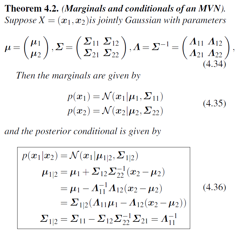
This is modeling a joint distribution  , but we want the conditional distribution over only, which is
  . The derivation process from the joint distribution to the conditional uses the Marginal and conditional distributions of MVN theorem [5].
We got eqn. 2.19 [1]

It is realistic modelling situations that we do not have access to function values themselves, but only noisy versions thereof  . Assuming additive independent identically distributed Gaussian noise with
variance
. Assuming additive independent identically distributed Gaussian noise with
variance  , the prior on the noisy observations becomes
  . The joint distribution of the observed target values and the function values at the test locations under the prior as [1]


where,


We do the regression example between -5 and 5. The observation data points (traing dataset) are generated from a uniform distribution between -5 and 5. This means any point value within the given interval [-5, 5] is equally likely to be drawn by uniform. The functions will be evaluated at n evenly spaced points between -5 and 5. We do this to show a continuous function for regression in our region of interest [-5, 5]. This is a simple example to do GP regression. It assumes a zero mean GP Prior. The code borrows heavily from Dr. Nando de Freitas’ Gaussian processes for nonlinear regression lecture [6].
The algorithm executed follows
The textbook GPML, P19. [1]

Dr. Nando de Freitas, Introduction to Gaussian processes. [6]

from __future__ import division
import numpy as np
import matplotlib.pyplot as plt
import pandas as pd
# This is the true unknown function we are trying to approximate
f = lambda x: np.sin(0.9*x).flatten()
#f = lambda x: (0.25*(x**2)).flatten()
x = np.arange(-5, 5, 0.1)
plt.plot(x, f(x))
plt.axis([-5, 5, -3, 3])
plt.show()
# Define the kernel
def kernel(a, b):
    kernelParameter_l = 0.1
    kernelParameter_sigma = 1.0
    sqdist = np.sum(a**2,axis=1).reshape(-1,1) + np.sum(b**2,1) - 2*np.dot(a, b.T)
    # np.sum( ,axis=1) means adding all elements columnly; .reshap(-1, 1) add one dimension to make (n,) become (n,1)
    return kernelParameter_sigma*np.exp(-.5 * (1/kernelParameter_l) * sqdist)
We use a general Squared Exponential Kernel, also called Radial Basis Function Kernel or Gaussian Kernel:

where  and
and  are hyperparameters. More information about the hyperparameters can be found after the codes.
# Sample some input points and noisy versions of the function evaluated at
# these points.
N = 20         # number of existing observation points (training points).
n = 200        # number of test points.
s = 0.00005    # noise variance.

X = np.random.uniform(-5, 5, size=(N,1))     # N training points
y = f(X) + s*np.random.randn(N)

K = kernel(X, X)
L = np.linalg.cholesky(K + s*np.eye(N))     # line 1

# points we're going to make predictions at.
Xtest = np.linspace(-5, 5, n).reshape(-1,1)

# compute the mean at our test points.
Lk = np.linalg.solve(L, kernel(X, Xtest))   # k_star = kernel(X, Xtest), calculating v := l\k_star
mu = np.dot(Lk.T, np.linalg.solve(L, y))    # \alpha = np.linalg.solve(L, y)

# compute the variance at our test points.
K_ = kernel(Xtest, Xtest)                  # k(x_star, x_star)
s2 = np.diag(K_) - np.sum(Lk**2, axis=0)
s = np.sqrt(s2)

# PLOTS:
plt.figure(1)
plt.clf()
plt.plot(X, y, 'k+', ms=18)
plt.plot(Xtest, f(Xtest), 'b-')
plt.gca().fill_between(Xtest.flat, mu-2*s, mu+2*s, color="#dddddd")
plt.plot(Xtest, mu, 'r--', lw=2)
#plt.savefig('predictive.png', bbox_inches='tight', dpi=300)
plt.title('Mean predictions plus 2 st.deviations')
plt.show()
#plt.axis([-5, 5, -3, 3])
# draw samples from the posterior at our test points.
L = np.linalg.cholesky(K_ + 1e-6*np.eye(n) - np.dot(Lk.T, Lk))
f_post = mu.reshape(-1,1) + np.dot(L, np.random.normal(size=(n,40)))  # size=(n, m), m shown how many posterior
plt.figure(3)
plt.clf()
plt.figure(figsize=(18,9))
plt.plot(X, y, 'k+', markersize=20, markeredgewidth=3)
plt.plot(Xtest, mu, 'r--', linewidth=3)
plt.plot(Xtest, f_post, linewidth=0.8)
plt.title('40 samples from the GP posterior, mean prediction function and observation points')
plt.show()
#plt.axis([-5, 5, -3, 3])
#plt.savefig('post.png', bbox_inches='tight', dpi=600)
<Figure size 432x288 with 0 Axes>

We plotted m=40 samples from the Gaussian Process posterior together with the mean function for prediction and the observation data points (training dataset). It's clear all posterior functions collapse at all observation points.
The general RBF kernel:
where and are hyperparameters. [7]

More complex kernel functions can be selected to depend on the specific tasks. More information about choosing the kernel/covariance function for a Gaussian process can be found in The Kernel Cookbook [8].
There are several packages or frameworks available to conduct Gaussian Process Regression. In this section, I will summarize my initial impression after trying several of them written in Python.
A lightweight one is sklearn.gaussian_process, simple implementation like the example above can be quickly conducted. Just for gaining more implementation understandings of GP after the above simple implementation example. It's too vague for understanding GP theory purpose.
GPR is computationally expensive in high dimensional spaces (features more than a few dozens) due to the fact it uses the whole samples/features to do the predictions. The more observations, the more computations are needed for predictions. A package that includes state-of-the-art algorithm implementations is preferred for efficient implementation of complex GPR tasks.
One of the most well-known GP frameworks is GPy. GPy has been developed pretty maturely with well-documented explanations. GPy uses NumPy to perform all its computations. For tasks that don't require heavy computations and very up-to-date algorithm implementations, GPy is sufficient and the more stable.
For bigger computation required GPR tasks, GPU acceleration are especially preferred. GPflow origins from GPy, and much of the interface is similar. GPflow leverages TensorFlow as its computational backend. More technical difference between GPy and GPflow frameworks is here.
GPyTorch is another framework that provides GPU acceleration through PyTorch. It contains very up-to-date GP algorithms. Similar to GPflow, GPyTorch provides automatic gradients. So complex models such as embedding deep NNs in GP models can be easier developed.
After going through docs quickly and implementing basic GPR tutorials of GPyTorch and GPflow, my impression is using GPyTorch is more automatic and GPflow has more controls. The impression may also come from the usage experience with TensorFlow and PyTorch.
Check and run my modified GPR tutorials of
A Gaussian process (GP) is a probability distribution over possible functions that fit a set of points. [1] GPs are nonparametric models that model the function directly. Thus, GP provides a distribution (with uncertainty) for the prediction value rather than just one value as the prediction. In robot learning, quantifying uncertainty can be extremely valuable to achieve an efficient learning process. The areas with least certain should be explored next. This is the main idea behind Bayesian optimization. [9] Moreover, prior knowledge and specifications about the shape of the model can be added by selecting different kernel functions. [1] Priors can be specified based on criteria including if the model is smooth, if it is sparse, if it is able to change drastically, and if it need to be differentiable.
-
For simplicity and understanding reason, I ignore many math and technical talks. Read the first two chapters of the textbook
Gaussian Process for Machine Learning[1] serveral times to get a solid understanding of GPR. Such as **Gaussian process regression is a linear smoother. ** -
One of most tricky part in understanding GP is the mapping projection among spaces. From input space to latent (feature) space and back to output space. You can get some feeling about space by reading
autoencoder.
[1] C. E. Rasmussen and C. K. I. Williams, Gaussian processes for machine learning. MIT Press, 2006.
[2] R. Turner, “ML Tutorial: Gaussian Processes - YouTube,” 2017. [Online]. Available: https://www.youtube.com/watch?v=92-98SYOdlY&feature=emb_title.
[3] A. Ng, “Multivariate Gaussian Distribution - Stanford University | Coursera,” 2015. [Online]. Available: https://www.coursera.org/learn/machine-learning/lecture/Cf8DF/multivariate-gaussian-distribution.
[4] D. Lee, “Multivariate Gaussian Distribution - University of Pennsylvania | Coursera,” 2017. [Online]. Available: https://www.coursera.org/learn/robotics-learning/lecture/26CFf/1-3-1-multivariate-gaussian-distribution.
[5] F. Dai, Machine Learning Cheat Sheet: Classical equations and diagrams in machine learning. 2017.
[6] N. de Freitas, “Machine learning - Introduction to Gaussian processes - YouTube,” 2013. [Online]. Available: https://www.youtube.com/watch?v=4vGiHC35j9s&t=1424s.
[7] Y. Shi, “Gaussian Process, not quite for dummies,” 2019. [Online]. Available: https://yugeten.github.io/posts/2019/09/GP/.
[8] D. Duvenaud, “Kernel Cookbook,” 2014. [Online]. Available: https://www.cs.toronto.edu/~duvenaud/cookbook/.
[9] Y. Gal, “What my deep model doesn’t know.,” 2015. [Online]. Available: http://mlg.eng.cam.ac.uk/yarin/blog_3d801aa532c1ce.html.
[10] J. Hensman, "Gaussians." 2019. [Online]. Available: https://github.com/mlss-2019/slides/blob/master/gaussian_processes/presentation_links.md.
[11] Z. Dai, "GPSS2019 - Computationally efficient GPs" 2019. [Online]. Available: https://www.youtube.com/watch?list=PLZ_xn3EIbxZHoq8A3-2F4_rLyy61vkEpU&v=7mCfkIuNHYw.
Visualizing 3D plots of a Gaussian by Visualizing the bivariate Gaussian distribution.
import numpy as np
import matplotlib.pyplot as plt
from matplotlib import cm
from mpl_toolkits.mplot3d import Axes3D

# Our 2-dimensional distribution will be over variables X and Y
N = 60
X = np.linspace(-3, 3, N)
Y = np.linspace(-3, 4, N)
X, Y = np.meshgrid(X, Y)

# Mean vector and covariance matrix
mu = np.array([0., 1.])
Sigma = np.array([[ 1. , 0.8], [0.8,  1.]])

# Pack X and Y into a single 3-dimensional array
pos = np.empty(X.shape + (2,))
pos[:, :, 0] = X
pos[:, :, 1] = Y

def multivariate_gaussian(pos, mu, Sigma):
    """Return the multivariate Gaussian distribution on array pos.

    pos is an array constructed by packing the meshed arrays of variables
    x_1, x_2, x_3, ..., x_k into its _last_ dimension.

    """
    n = mu.shape[0]
    Sigma_det = np.linalg.det(Sigma)
    Sigma_inv = np.linalg.inv(Sigma)
    N = np.sqrt((2*np.pi)**n * Sigma_det)
    # This einsum call calculates (x-mu)T.Sigma-1.(x-mu) in a vectorized
    # way across all the input variables.
    fac = np.einsum('...k,kl,...l->...', pos-mu, Sigma_inv, pos-mu)

    return np.exp(-fac / 2) / N

# The distribution on the variables X, Y packed into pos.
Z = multivariate_gaussian(pos, mu, Sigma)

# Create a surface plot and projected filled contour plot under it.
fig = plt.figure()
ax = fig.gca(projection='3d')
ax.plot_surface(X, Y, Z, rstride=3, cstride=3, linewidth=1, antialiased=True,
                cmap=cm.viridis)

cset = ax.contourf(X, Y, Z, zdir='z', offset=-0.2, cmap=cm.viridis)

# Adjust the limits, ticks and view angle
ax.set_zlim(-0.2,0.2)
ax.set_zticks(np.linspace(0,0.2,5))
ax.view_init(30, -100)

ax.set_xlabel(r'<img src="/tex/277fbbae7d4bc65b6aa601ea481bebcc.svg?invert_in_darkmode&sanitize=true" align=middle width=15.94753544999999pt height=14.15524440000002pt/>')
ax.set_ylabel(r'<img src="/tex/95d239357c7dfa2e8d1fd21ff6ed5c7b.svg?invert_in_darkmode&sanitize=true" align=middle width=15.94753544999999pt height=14.15524440000002pt/>')
ax.set_zlabel(r'<img src="/tex/467f6c046e010c04cafe629aaca84961.svg?invert_in_darkmode&sanitize=true" align=middle width=66.46698464999999pt height=24.65753399999998pt/>')

plt.title('mean, cov = [0., 1.], [(1., 0.8), (0.8, 1.)]')
plt.savefig('2d_gaussian3D_0.8.png', dpi=600)
plt.show()