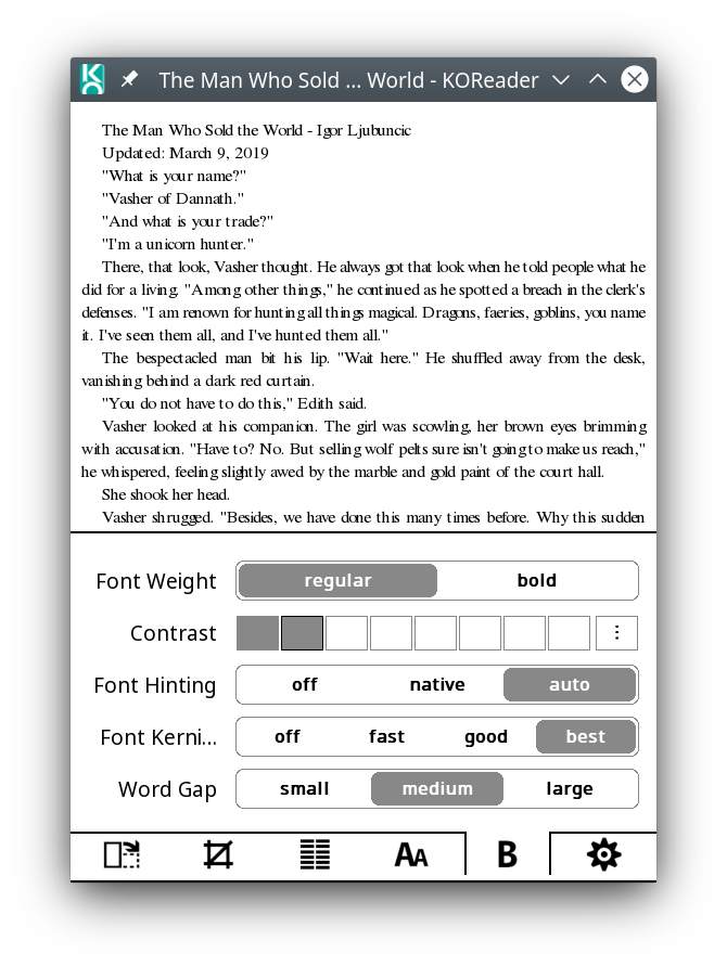
cre: use 'best' (Harfbuzz) as the default kerning method #5553
Conversation
It might be slower, but is needed to properly display
books in arabic, indic...
|
That should be better since the flags fix ;). Switching to "light" render
mode should entirely eradicate discrepancies.
In any case, +1 on best ;).
…On Thu, Oct 31, 2019, 13:16 poire-z ***@***.***> wrote:
It might be slower, but is needed to properly display books in arabic,
indic...
See #5545 (comment)
<#5545 (comment)>
and follow ups.
One thing I'm not sure about, but I often felt when trying "best" that it
looked nicer with font hinting set to "off". Our default for font hinting
is "auto" (Freetype auto hinting).
@NiLuJe <https://github.com/NiLuJe> : any opinion/science about that?
(Lately, I've been using Font hinting "off" with everything, as the other
options were sometimes triggering some font bugs or something.)
Not really needed, but I'll update
https://github.com/koreader/koreader-base/blob/master/cre.cpp#L510 next
time I tweak base/.
------------------------------
You can view, comment on, or merge this pull request online at:
#5553
Commit Summary
- cre: use 'best' (Harfbuzz) as the default kerning method
File Changes
- *M* frontend/apps/reader/modules/readerfont.lua
<https://github.com/koreader/koreader/pull/5553/files#diff-0> (2)
- *M* frontend/ui/data/creoptions.lua
<https://github.com/koreader/koreader/pull/5553/files#diff-1> (4)
Patch Links:
- https://github.com/koreader/koreader/pull/5553.patch
- https://github.com/koreader/koreader/pull/5553.diff
—
You are receiving this because you were mentioned.
Reply to this email directly, view it on GitHub
<#5553?email_source=notifications&email_token=AAA3KZSUHQR5UMKY7RE5L6TQRLEBDA5CNFSM4JHJCLD2YY3PNVWWK3TUL52HS4DFUVEXG43VMWVGG33NNVSW45C7NFSM4HVYEUHQ>,
or unsubscribe
<https://github.com/notifications/unsubscribe-auth/AAA3KZVEFTXNDQ5CZRMT2PTQRLEBDANCNFSM4JHJCLDQ>
.
|
|
Just to be sure, if/when you're using kerning "best", can you check on some of your books what you have for font hinting, if you really have the default "auto" (because I'm not sure best is really best with auto :) |
|
Not sure if you were asking me, but I think hinting off/kerning best gives the best results, mainly in the form of the best baseline alignment,[1] and the best kerning. Combining one of the other hinting settings with kerning best results in slightly worse kerning and sometimes a forced straight baseline. [1] I.e., most true to the font's intended design. It allows them to peek slightly under or over as designed. |
|
(I was indeed asking you and @NiLuJe :) |
|
I'm using unhinted rendering on everything >= 300DPI. On lower density
screens, it depends on the font, and I tend to prefer native hinting then
;).
…On Thu, Oct 31, 2019, 15:54 poire-z ***@***.***> wrote:
(I was indeed asking you and @NiLuJe <https://github.com/NiLuJe> :)
I too find it better with Hinting: off - it avoids some kerning and
baseline bugs (at least with my favorite font Bitter). But it makes things
more condensed (that Harfbuzz already does, hinting off make that even more
noticable), which I like - but people used to fast+auto will be surprised.
—
You are receiving this because you were mentioned.
Reply to this email directly, view it on GitHub
<#5553?email_source=notifications&email_token=AAA3KZV3FRICBRYOKLWPTXLQRLWS5A5CNFSM4JHJCLD2YY3PNVWWK3TUL52HS4DFVREXG43VMVBW63LNMVXHJKTDN5WW2ZLOORPWSZGOECYCKLI#issuecomment-548414765>,
or unsubscribe
<https://github.com/notifications/unsubscribe-auth/AAA3KZT3OSTNQJNTN4GYHIDQRLWS5ANCNFSM4JHJCLDQ>
.
|
|
I might prefer native hinting in theory, at least on smaller font sizes where 300 DPI doesn't make one lick of a difference with 265 and is still fully pixel bound. But in combination with the effect on kerning in crengine/HarfBuzz I don't in practice. |
|
Strangely, for FreeSans and FreeSerif, best + auto is totally ugly on my small emulator (x), while it's ok on my Kobo. It's fine on both for NotoSans and NotoSerif. So, what should we do: let Font hinting to Auto for less drastic changes (and wait for any feedback) - or change it to Off? |
|
I've never cared for the auto default, nor for its name. Some old related comment: #1929 (comment) I think it should be relabeled something like I wouldn't quite call it ugly though? Just not as good. :-)
|


I'm not that an aesthete regarding text, but I find it really ugly, all these glyphs merged into some black mess (that looks like super bad/off kerning), that we don't see on your screenshots with Off or Native:
I guess "auto" made it sound less technical. We could go with "native" for a less drastic condensation than "off". |

|
Fine, it's ugly. ;-) But it's legible anyway. |
|
Light hinting should fix that ;).
…On Thu, Oct 31, 2019, 19:56 Frans de Jonge ***@***.***> wrote:
Fine, it's ugly. ;-) But it's legible anyway.
—
You are receiving this because you were mentioned.
Reply to this email directly, view it on GitHub
<#5553?email_source=notifications&email_token=AAA3KZXBLCF2TGLL5KGHIHDQRMS4XA5CNFSM4JHJCLD2YY3PNVWWK3TUL52HS4DFVREXG43VMVBW63LNMVXHJKTDN5WW2ZLOORPWSZGOECY4GJQ#issuecomment-548520742>,
or unsubscribe
<https://github.com/notifications/unsubscribe-auth/AAA3KZWZ6GRSOK6MNLUVU6TQRMS4XANCNFSM4JHJCLDQ>
.
|
Is that about just replacing the 6 Just tested on the emulator, and it looks indeed cleaner! There's now hardly any difference between native and auto (to the point I wondered if it worked :) but there is some subtle ones: I notice only some small changes vertically (the tip of the |
|
Yep ;). That is essentially the point: no more hinting on the x axis. Bonus points, that simplifies advances computation, as they're no longer modified by hinting ;). The UI could probably also use it in freetype or font (I can't remember which does the load). |
Well, that happens (now?) only with kerning "off" or "fast" - not with "good" or "best". Anyway, looks fine too on my Kobo. So I'll PR and bump crengine with that tomorrow.
For free? No other code change needed on the crengine side? Using your FT cache submsystem , while sounding good, might need a lot of changes in crengine, which does its own caching - dunno how better or not that would be. |
|
Full autohinting can be fairly aggressive on the x axis, yeah ;). Which was
why not letting harfbuzz follow that along led to some fairly egregious
differences.
Don't worry about the auto/native stuff mentioned with the light docs, I
should have made pretty sure no means no, auto means auto, and native means
native ;).
Oh,and yeah, I was very much only thinking about the UI when I mentioned
the FT cache stuff.
…On Fri, Nov 1, 2019, 00:53 poire-z ***@***.***> wrote:
But both, like previously, make the text horizontally streched vs off
(that makes it more condensed)
Well, that happens (now?) only with kerning "off" or "fast" - not with
"good" or "best".
So, dunno, it might be we've had a bug with kerning vs hinting: should
hinting on the x-asis change that much the spacing between letters, for a
same kerning mode?
Anyway, it gets more stable with "best", so that's a plus to go with
"best" as the default. And now that "auto" and "native" are not so much
different, staying with "auto" is ok. (haven't read/understand everything
in the 2nd url above, so I dunno if I understood right that auto may try to
use the native hinting first with that load_target_light flag).
And I might not want to fix that bug, as that airy vs condensed feeling
that this kerning/hinting bug may give is quite a nice bonus feature (now
non-default with this PR).
Anyway, looks fine too on my Kobo. So I'll PR and bump crengine with that
tomorrow.
Bonus points, that simplifies advances computation, as they're no longer
modified by hinting ;).
For free? No other code change needed on the crengine side?
Using your FT cache submsystem
<https://freetype.org/freetype2/docs/reference/ft2-cache_subsystem.html>,
while sounding good, might need a lot of changes in crengine, which does
its own caching - dunno how better or not that would be.
But using it on the UI side might be easier - but may be after my
harfbuzz/fribidi - so we can see how to rework that freetype/font code to
make it play fine in 2 different contexts.
—
You are receiving this because you were mentioned.
Reply to this email directly, view it on GitHub
<#5553?email_source=notifications&email_token=AAA3KZRWV6M44WPAGJZSICDQRNVW3A5CNFSM4JHJCLD2YY3PNVWWK3TUL52HS4DFVREXG43VMVBW63LNMVXHJKTDN5WW2ZLOORPWSZGOECZS65Q#issuecomment-548614006>,
or unsubscribe
<https://github.com/notifications/unsubscribe-auth/AAA3KZSZE27F33FQC2CEA2DQRNVW3ANCNFSM4JHJCLDQ>
.
|
|
But from https://www.freetype.org/freetype2/docs/text-rendering-general.html:
(That doc might be outdated, dunno).
I get that you mean your work on these above flags, right? |
|
Yep, you can just switch the target flag, we do the right thing with the
others to make the situation less murky ;).
…On Fri, Nov 1, 2019, 08:10 poire-z ***@***.***> wrote:
But from
https://www.freetype.org/freetype2/docs/text-rendering-general.html:
Setting ‘slight’ hinting usually leads to FT_LOAD_TARGET_LIGHT. This mode
implied the auto-hinter before and has now been changed to mean “Use native
vertical-grid-only-snapping if driver and font supports it and
vertical-grid-only auto-hinter otherwise”. Right now, only the OpenType/CFF
driver is supported. In the future, this will hopefully include the
TrueType engine once full support for ClearType arrives.
(That doc might be outdated, dunno).
The first sentence is a bit ... unclear :) Should I read it as *Just use
FT_LOAD_TARGET_LIGHT to enable 'slight' hinting*?
The next sentences seem to suggest we could have a 4th hinting mode, a
real "auto", that would use native if there are some instructions, and
freetype hinting only if there are none, by just using some other
combinations of FT_LOAD_NO_AUTOHINT and FT_LOAD_NO_HINTING ?
I should have made pretty sure no means no, auto means auto, and native
means native
I get that you mean your work on these above flags, right?
—
You are receiving this because you were mentioned.
Reply to this email directly, view it on GitHub
<#5553?email_source=notifications&email_token=AAA3KZR4AJMCUTA2F4QNGCTQRPI7XA5CNFSM4JHJCLD2YY3PNVWWK3TUL52HS4DFVREXG43VMVBW63LNMVXHJKTDN5WW2ZLOORPWSZGOEC2FTJY#issuecomment-548690343>,
or unsubscribe
<https://github.com/notifications/unsubscribe-auth/AAA3KZTVKKBSH3XAZTNHFDDQRPI7XANCNFSM4JHJCLDQ>
.
|
It might be slower, but is needed to properly display
books in arabic, indic...
Also bump crengine: use FreeType "light" hinting algorithm,
which hints on the y-axis only (and so avoid messing with
advances and kerning on the x-axis).
It might be slower, but is needed to properly display books in arabic, indic...
See #5545 (comment) and follow ups.
One thing I'm not sure about, but I often felt when trying "best" that it looked nicer with font hinting set to "off". Our default for font hinting is "auto" (Freetype auto hinting).
@NiLuJe : any opinion/science about that?
(Lately, I've been using Font hinting "off" with everything, as the other options were sometimes triggering some font bugs or something.)
Not really needed, but I'll update https://github.com/koreader/koreader-base/blob/master/cre.cpp#L510 next time I tweak base/.