New issue
Have a question about this project? Sign up for a free GitHub account to open an issue and contact its maintainers and the community.
By clicking “Sign up for GitHub”, you agree to our terms of service and privacy statement. We’ll occasionally send you account related emails.
Already on GitHub? Sign in to your account
Enhance landscape categories section wrapping #191
Comments
|
I think the categories might scale better if aligned in a vertical stack. I'll have a mockup soon. |
|
A minimal proof of concept for a vertically-stacked categories section can be generated by adding a few CSS rules: .card .card-content li {
float: right;
width: 200px;
}
.card .card-content {
border: none;
}Alternatively, with some padding removed and the dotted border reoriented: .card .card-content {
border-right: unset;
padding: 0 0 5px 0;
}
.card .card-content:not(:last-child) {
border-bottom-width: 1px;
border-bottom-style: dashed;
border-bottom-color: var(--main-dark-grey);
}Any thoughts, @yogi4? |
|
@Silvyre thanks for jumping in here and providing a couple choices of restyling. This wrapping issue has long plagued the site. The second of your mockups in which a dashed line is used to separate the categories looks like a winner. We would love to receive your PR here. |
|
Thank you so much, Lee! I'm thrilled to contribute my first Hacktoberfest PR to your project! |
|
Ha! That's awesome. :) If you haven't see it already, be sure to checkout the Meshery project --> https://github.com/layer5io/meshery. Contributions are warmly received there as well. See the Meshery Contributor Welcome Guide and join the Slack account to get better connected with the community - http://slack.layer5.io. I'd love to see you in there. |


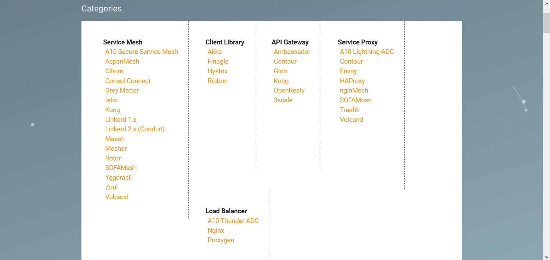
As noted in #65 (comment), the Categories section on the Service Mesh Landscape page currently wraps category cards by floating them down in a way that functions poorly on smaller screens.
Here is how the Categories section currently looks on a 1280px display:

Note that scrolling the page was required to reveal the Load Balancer category.
As more categories will be added in the future (as per #65 (comment)), this section should be restyled to promote scalability.
The text was updated successfully, but these errors were encountered: