Skip to content
New issue

Have a question about this project? Sign up for a free GitHub account to open an issue and contact its maintainers and the community.

By clicking “Sign up for GitHub”, you agree to our terms of service and privacy statement. We’ll occasionally send you account related emails.

Already on GitHub? Sign in to your account

Feature proposal: "Dark mode" divergent colormaps #18608

Open
martinosorb opened this issue Sep 29, 2020 · 6 comments
Open

Feature proposal: "Dark mode" divergent colormaps #18608

martinosorb opened this issue Sep 29, 2020 · 6 comments
Labels
accessibility keep Items to be ignored by the “Stale” Github Action New feature topic: color/color & colormaps

Comments

@martinosorb
Copy link

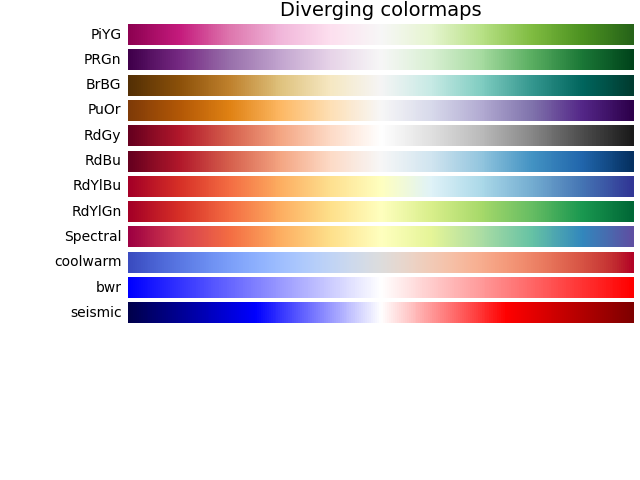
Since version 2.0, matplotlib has done a good job encouraging users to use perceptually uniform colormaps, distinguishing between divergent and sequential colormaps, etc. In my job, I find divergent colormaps very useful; there is a good selection of them, but they all have a very light "zero" colour: typically white or yellow, except one which is light gray. They can be seen here. This is an example of what can be done:
light

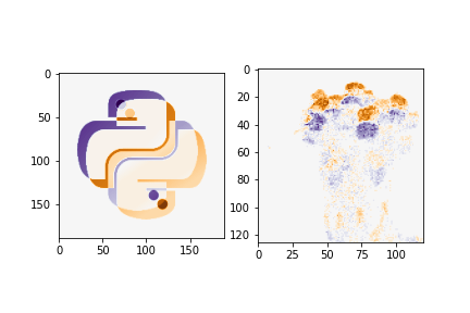
With the explosion of "dark mode" in apps, websites and in the tastes of end-users, it would be very nice to have a divergent colormap that has a dark default colour.

Proposed Solution

To add two or more colormaps which fulfill all the conditions of divergent colormaps, but have a dark colour as a middle colour. At least one of these should use pure black.

Additional context and prior art

Currently, the closest approximation is plt.cmap.twilight, however, it does not look sufficiently symmetric to me. Moreover, it's cyclic, so it ends with the same colour on both sides, which is undesirable. This is how it looks like:
dark

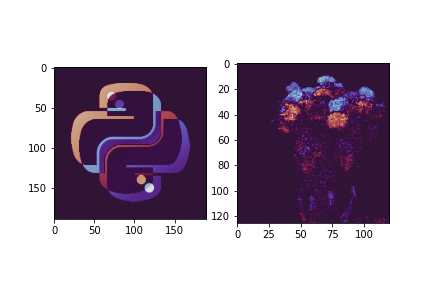
It's quite close to what I'm suggesting, except for the details I mentioned above (and I would add one or two more, including at least one with a black background).

@martinosorb martinosorb changed the title "Dark mode" divergent colormaps Feature proposal: "Dark mode" divergent colormaps Sep 29, 2020
@mwaskom
Copy link

mwaskom commented Sep 29, 2020

I don't think matplotlib has any built-in perceptually uniform divergent maps. The ones you linked to are mostly drawn from ColorBrewer and have pretty good properties, but they are not perceptually uniform in the same color space as viridis et al.

There are several existing implementations, mostly with relatively low contrast (i.e. the extremes are medium-luminance saturated colors) in colorcet.

seaborn also has a high-contrast diverging map with a dark center ("icefire"): http://seaborn.pydata.org/tutorial/color_palettes.html#diverging-color-palettes

@jklymak
Copy link
Member

jklymak commented Sep 29, 2020

I agree that we don't have a dark-centred diverging colormap, and I think that would be a reasonable addition.

I think its fair to say the consensus is that matplotlib should be conservative about adding new colormaps. It stops our colormap palette from becoming unmanageable, and saves PRs where pet colormaps are proposed, folks argue about which shade of chartreuse should be used, or whether the Smithetal02 definition of colormap uniformity is the right model or Jonesetal09.

The best way to get a colormap in is to argue that it is unique from the offered ones. i.e. twilight was properly cyclic, and that was deemed unique enough. These days it helps to argue perceptual uniformity, though I personally don't think that should be a deal-killer. It really helps to show that it has already been used in publications somewhere, or that it is very similar to published data.

@martinosorb
Copy link
Author

The consensus seems reasonable in not wanting to add too many new colormaps. However I do think that this is, as you say, something unique and substantially different from all the existing ones, and not just a variation on shades.

I'm not an expert in colour and I'm not familiar with the literature -- I'm suggesting this in my role as an end user of matplotlib. However, I think a choice similar to Seaborn's icefire, suggested by @mwaskom above, would be great. It's divergent, perceptually uniform, and I think likely colorblind-safe.

@github-actions
Copy link

This issue has been marked "inactive" because it has been 365 days since the last comment. If this issue is still present in recent Matplotlib releases, or the feature request is still wanted, please leave a comment and this label will be removed. If there are no updates in another 30 days, this issue will be automatically closed, but you are free to re-open or create a new issue if needed. We value issue reports, and this procedure is meant to help us resurface and prioritize issues that have not been addressed yet, not make them disappear. Thanks for your help!

@github-actions github-actions bot added the status: inactive Marked by the “Stale” Github Action label Aug 23, 2023
@github-actions github-actions bot added the status: closed as inactive Issues closed by the "Stale" Github Action. Please comment on any you think should still be open. label Sep 22, 2023
@github-actions github-actions bot closed this as not planned Won't fix, can't repro, duplicate, stale Sep 22, 2023
@story645 story645 added accessibility and removed status: inactive Marked by the “Stale” Github Action status: closed as inactive Issues closed by the "Stale" Github Action. Please comment on any you think should still be open. labels Sep 22, 2023
@story645
Copy link
Member

Reading through, looks like there's some consensus around adding one-few diveriging colormaps suitable for a darkmode, provided that they're:

  1. perceptually uniform
  2. well documented, preferably in an academic paper

@story645 story645 reopened this Sep 22, 2023
@jklymak jklymak added the keep Items to be ignored by the “Stale” Github Action label Sep 22, 2023
@ingwag
Copy link

ingwag commented Nov 29, 2023

Hi there are several packages available with perceptually uniform colourmaps. I'm aware of CMasher
https://joss.theoj.org/papers/10.21105/joss.02004
and Fabio Crameri's scientific colormaps
https://www.nature.com/articles/s41467-020-19160-7
https://www.fabiocrameri.ch/colourmaps/

I think adding diverging colormaps with dark central colors would be a great addition to matplotlib, it would certainly be useful for some outreach activities (at least the one that I'm involved in)

Sign up for free to join this conversation on GitHub. Already have an account? Sign in to comment
Labels
accessibility keep Items to be ignored by the “Stale” Github Action New feature topic: color/color & colormaps
Projects
None yet
Development

No branches or pull requests

5 participants