DOC: Tiny fixes, and possible overhaul, of the two scales example in the gallery #10320
Conversation
|
I would get rid of the main helper function as well. It just saves duplicating the four lines of plot code for the second axes, at the cost of a lot of docstring and loop over a parameter set. As such it‘s distracting from the main point twinx. Also, you wouldn‘t likely see such a function in real life. It’s too specific, except if you would do a lot of these plots, which is beyond the scope of this example. |
|
FWIW I had tried to keep some of the previous functional approach as I know that @tacaswell likes to promote it (IIRC). Anyway, a straight to the point example is fine with me too, so here it is. (About the real-life plausibility, well I used such helper functions at my day-job ^^...) BTW: thanks @timhoffm for the remark :). |
examples/api/two_scales.py
Outdated
| data1 = np.exp(t) | ||
| data2 = np.sin(2 * np.pi * t) | ||
|
|
||
| # Create twin axes and plot the mock data onto them |
There was a problem hiding this comment.
This comment is kind of "small" for its contents. That is, it describes the next two or three blocks, but is just a regular comment. I feel like it should be broken up to each block, or made a bit more distinct visually.
|
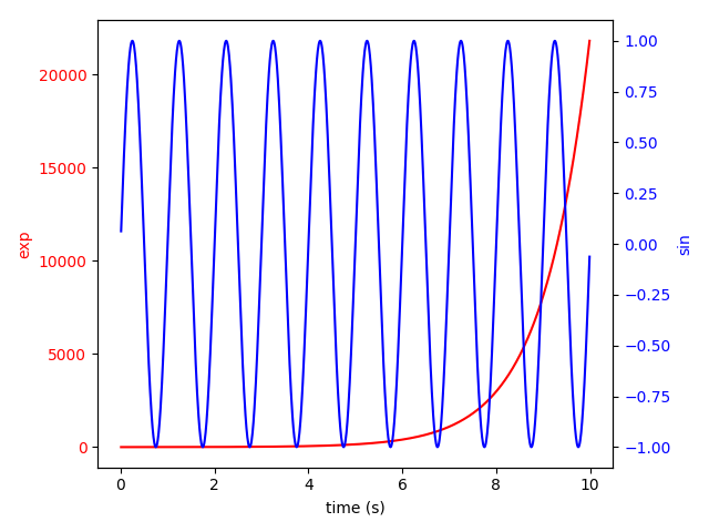
Wouldn't it be more instructive for twinning, to plainly write everything out? E.g. fig, ax1 = plt.subplots()
ax1.set_xlabel('time (s)')
ax1.set_ylabel('exp', color='red')
ax1.plot(t, data1, color='red')
ax1.yaxis.set_tick_params(labelcolor='red')
ax2 = ax1.twinx() # instantiate a second axes that shares the same x-axis
ax2.set_ylabel('sin', color='blue') # NB: we already took care of the x-label with ax1
ax2.plot(t, data2, color='blue')
ax2.yaxis.set_tick_params(labelcolor='blue')
fig.tight_layout() # otherwise the right y-label is slightly clipped
plt.show() |
|
I like @timhoffm 's version better. |
|
I am not sure that I totally agree but I am too biased anyway 😈, so here is the unrolled version adapted from @timhoffm's suggestion. Being there, slight update of the color for something more in phase with Matplotlib 2+ :): |

|
Thanks all :)! |
PR Summary
Two-fold PR about the gallery example that shows how to use
ax.twinxto display two scales on the same plot:fig.tight_layoutto prevent the y-labels from being clippedI agree that the value of the 2nd commit may be subjective (although I personally think that the helper function is now quite more logical, and more suited to reusing outside of the gallery) and I would understand if it were discarded simply because of that. However, if it was the case, the 1st commit fixes minor issues that, I think, are objective enough to still be this commit.
Here is what the example looks like with both commits:
PR Checklist
NB: milestoned for 2.2 as it is only a small piece of documentation. Feel free to re-milestone for 3.0 if needed.