fix: drop down arrow overlapping text #1606
Merged
Conversation
This file contains bidirectional Unicode text that may be interpreted or compiled differently than what appears below. To review, open the file in an editor that reveals hidden Unicode characters.
Learn more about bidirectional Unicode characters
6 tasks
dbjorge
added a commit
that referenced
this pull request
Dec 5, 2019
…1803) #### Description of changes This PR fixes an issue caught during v2.11.0 release validation introduced in #1606 where if you resize the details view down to the minimum window size allowed by Chrome (500px) at default zoom levels, the settings gear icon overflows out of the header bar: 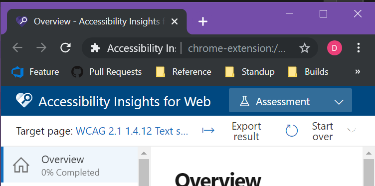 @varshannagarajan 's outstanding PR #1693 fixes a variant of this issue for the switcher dialog at high zoom/text spacing levels. This PR takes the same idea as #1693 but expands it to the entire header bar (it therefore obsoletes #1693) * It runs the *entire* header bar into a flexbox * It enables text-overflow behavior on the extension title, so it will shrink before functional elements do * It adjusts styling slightly such that everything fits at default zoom level + Chrome's default minimum window size (500px) Since this essentially amounted to a rewrite of the relevant styling, I took it as an opportunity to pull it out of the big shared scss files and into modules. This involved a little gymnastics for some of the office fabric style overrides that previously relied on being within a `#details-container` selector to achieve the necessary specificity. To enable re-use of the new modularized styles in guidance pages, this also extracts out the common parts of the header to a new common Header component for the guidance content page to reuse. This happened to be the first point where the guidance content pages required css module styles, so I also added the necessary reference from `insights.html` to `bundle/insights.css`. The most questionable bit of CSS is the use of `margin-left: auto` on the settings icon styling to get it to functionally float right inside the flexbox; I thought using this was a little more pleasant to reason about than the alternative of using nested flexboxes in the same direction, but was a bit on the fence about which technique to use. Screenshots: **details view, 500px 100% zoom** 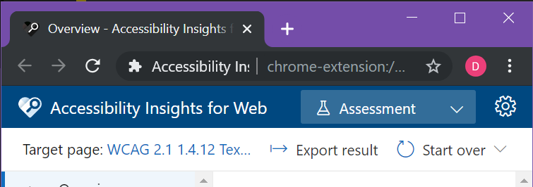 **details view, 500px 100% zoom, text-spacing bookmarklet**  **details view, 1280px, 100% zoom** 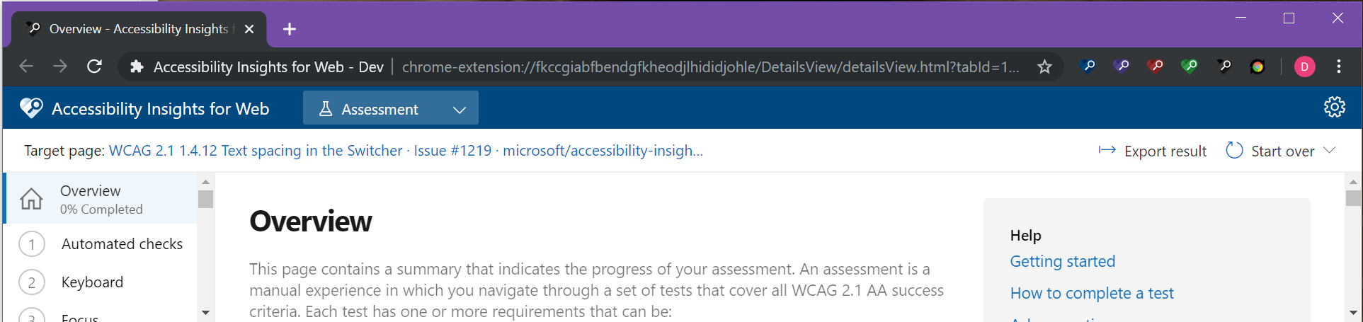 **details view, 1280px 400% zoom** 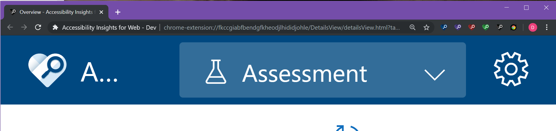 **fastpass report, 500px 100% zoom** 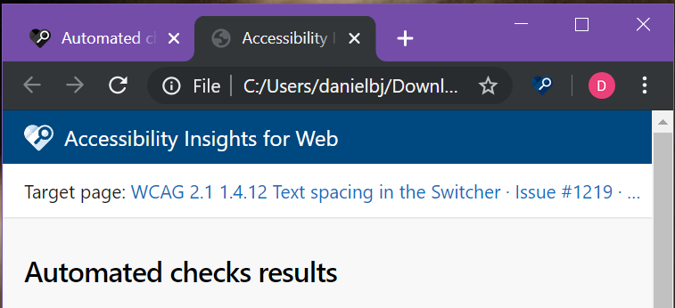 **assessment report, 500px 100% zoom**  #### Pull request checklist <!-- If a checklist item is not applicable to this change, write "n/a" in the checkbox --> - [n/a] Addresses an existing issue: #0000 - [x] Ran `yarn fastpass` - [x] Added/updated relevant unit test(s) (and ran `yarn test`) - [x] Verified code coverage for the changes made. Check coverage report at: `<rootDir>/test-results/unit/coverage` - [x] PR title *AND* final merge commit title both start with a semantic tag (`fix:`, `chore:`, `feat(feature-name):`, `refactor:`). Check workflow guide at: `<rootDir>/docs/workflow.md` - [x] (UI changes only) Added screenshots/GIFs to description above - [x] (UI changes only) Verified usability with NVDA/JAWS
Sign up for free
to join this conversation on GitHub.
Already have an account?
Sign in to comment
Add this suggestion to a batch that can be applied as a single commit.
This suggestion is invalid because no changes were made to the code.
Suggestions cannot be applied while the pull request is closed.
Suggestions cannot be applied while viewing a subset of changes.
Only one suggestion per line can be applied in a batch.
Add this suggestion to a batch that can be applied as a single commit.
Applying suggestions on deleted lines is not supported.
You must change the existing code in this line in order to create a valid suggestion.
Outdated suggestions cannot be applied.
This suggestion has been applied or marked resolved.
Suggestions cannot be applied from pending reviews.
Suggestions cannot be applied on multi-line comments.
Suggestions cannot be applied while the pull request is queued to merge.
Suggestion cannot be applied right now. Please check back later.
Description of changes
Modified width attribute for drop down title. Fixes issue #1219. There is a known issue where after the function is applied the drop down box shifts down outside of the title header. This will be addressed in a later PR.
Before Any Changes:
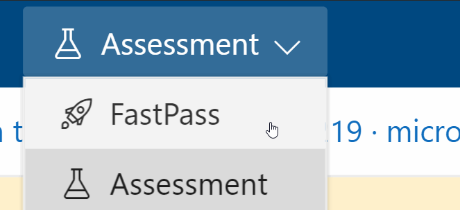
After Changes but Letter Space Function not Applied::
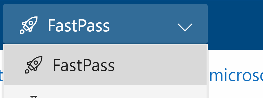
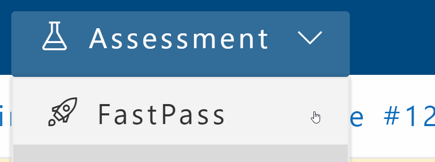
Letter Spacing Function Applied:
Pull request checklist
yarn fastpassyarn test)<rootDir>/test-results/unit/coveragefix:,chore:,feat(feature-name):,refactor:). Check workflow guide at:<rootDir>/docs/workflow.md