Grouped selection support #2310
Comments
 msft-github-bot
added
the
needs-triage
msft-github-bot
added
the
needs-triage
|
|

|
WinUI has the Pivot control that does this |
|
The pivot is more like a tab view. This control would be a multi-toggle button. It wouldn't necessarily be used to switch views. |
Are there any other examples of a segmented control being multi-select? I see macOS supports it, and it is like a list of filters applied to a view. (iOS does not seem to support it)
The Segmented control is not really a concept in Windows UI, either Xaml or Win32. If you can find existing windows apps that would benefit from this kind of control, it would be helpful to judge how necessary this suggestion would be to the community. If it were to be implemented, the Pivot control could be given a multi-select behaviour, and the Pivot could be moved from a view switcher, to allow for a filtering situation (which is part of what it was originally envisaged to be)
|


|
Windows fluent UIs tend to use this method for filtering UX |


|
Its not about filtering. I see this regularly in applications with complex UI, especially if they are visual editing tools. I've even seen it in Microsoft products like the Expression Blend/Design tools, though the edges aren't always rounded. Blender had this kind of visual grouping of controls for a very long time. Its basically about grouping checkboxes and radiobuttons together visually, like you used to do on a classic Windows toolbar with seperators, except that it is a more modern style. Note that they don't have to be restricted to horizontal stack, vertical makes just as much sense (and are also used in practice). I also used it a few times myself in WPF, using existing checkbox/radiobutton controls and adjusting their frames to visualize that they belong together. Obviously its very tedious to achieve manually, especially when UI is dynamic and its not fixed which control is the last in the list and needs its edges rounded. I understand the visual style is something to argue about, but what I think is missing is an easy way to group checkbox / radio buttons together so they can be restyled as one unit. You can do it but its a lot of work. What you want is something as easy as restyling a listbox, except that you can't use a listbox because it changes selection with focus. You could think about it as a restyled listbox-like control with single/multi selection where you have to explicitly confirm that you change selection. |
Well the control is used for filtering as well as applying multiple attributes to a selection, and any number of other uses.
I encounter it a lot too, but it is still useful to gather any uses that Microsoft have had for such a control UX - to convince the WinUI team of the need for this kind of control. My linking it to the Pivot, was attempting to make it easier to sell.
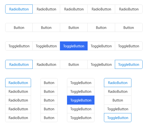
The control would need to work as Icons, Text, and combinations of the two - and would need to visually align to the Fluent design. The RadioButtons control came about out of a need, and this control would be a similar group, with a shared item template, and support both single select and multi-select behaviour.
The list of Musts on the original issue, could be finessed to the point where visually it can be made to fit the Fluent design language. I would imagine this control would use an ItemRepeater, as most of these ListView based controls are moving to use it. I would like to see this control exist, but it would need to visually align to the design language - and be flexible enough to cover most scenarios. |
|
I see where you are going. From a quick check all examples I find in the fluent design language are using separators and not framing to group buttons that belong together. (Context menus like you've shown, Ribbons use grouping but with seperators, etc.) Since there's no common frame they are not running into the problem of not having a control for this kind of grouping. |
|
Some quick ideas |

 StephenLPeters
added
team-Controls
StephenLPeters
added
team-Controls
|
What would the accessibility story look like here? would it report as a collection of items, would it report out selection states? @kikisaints This looks pretty similar to radio buttons, but maybe with multi select. @chigy has some ideas. |
|
Trying to draw parallels to existing controls behavior:
|
|
This control would appear to be an amalgamation of various alternative UX approaches, except contained within a single control. When considering how behaviours should be handled, we can look to these and see how they are handled there. If this control were to be added, it should cover most of these scenarios below.
|


|
btw if anyone is here thinking of pivots (this proposal is not about navigation), please vote for #940 |
|
Pivots are the most lightweight visually for this purpose. Perhaps they need to be separated from their view changing? Pivot becomes just the selection of headings, and a PivotView uses the Pivot with PivotItemViews containing content? |
|
I found a good example of where this is needed. In a color picker it is necessary to switch between RGB/HSV color representation. In the in-box ColorPicker this is done with a ComboBox. However, in the ColorPickerButton that ComboBox would need to be in a flyout. A ComboBox within a flyout is bad UI-design and it also has UWP bugs (#1467). To fix this I thought to switch to RadioButton. However, then I ran accross more UWP bugs that don't allow this to work (#1299 and #2081). So finally, I had to switch to ToggleButton. ToggleButton actually visually look the best -- the only problem is it's not really the intended use case.
I also realize: RadioButtons are good for vertically stacked elements only. Horizontally stacked elements really could use this segmented control. |

|
Could you turn those scrollbar thumbs into circles? They kind of look weird as capsules Segmented control seems like a good choice there, at least until ComboBoxes work within flyouts. I would suggest you figure out the design of it, as it looks weird as two separated buttons. Pivot would work there, but only without the view area |
We should probably discuss that over on the toolkit. I asked for some opinions over there on that but didn't get any feedback. I'm trying not to make it look too much like iOS although circles entirely within the track did cross my mind. This is more of a blend with the Windows style right now.
Design wasn't done at all and I just made it functional. I do plan to make it look more like a segmented control which is why I had the thought to post the example here.
The problem with ComboBoxes is, as you've said in the past, they shouldn't really go inside a flyout. Nested flyouts aren't ideal. Additionally, a ComboBox doesn't show all information -- it only shows what is selected. In this use case that is also not ideal. Edit: Here is what I'm going with for now. The segmented control might be good to add to the community toolkit first as well. I might take a look at that myself.
|

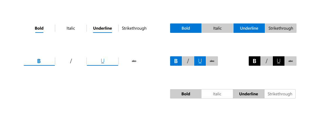
Some ideas for the pivot/segmented control
Thinking about it, ButtonGroup seems like a good solution, in the same way you have the RadioButtons control Creates a list of Buttons or ToggleButtons, connected together, with just strings, icons or strings with icons.
|


|
@mdtauk Good examples. I do think it's important that this 'ButtonGroup' or 'SegmentedControl' is differentiated from a TabView or Pivot. A TabView/Pivot is fundamentally for switching between views. This 'ButtonGroup' is for switching between settings. Conceptually they are two different things and used in different cases. |
|
It also came to my attention that HandyControls already has an example of this control for WPF. https://github.com/HandyOrg/HandyControl#buttongroup
|
|
Is this being worked on? I think the library would great benefit from a control like this but it's been months without any update. |
|
Agreed, I would also appreciate such control |
# Add ColorPickerButton to the Toolkit Closes #3363 ## PR Type What kind of change does this PR introduce? Feature Documentation content changes Sample app changes ## What is the current behavior? The toolkit, and WinUI/UWP, has no flyout ColorPicker. The color picker that currently exists is a large canvas-type control (that is incorrectly named). This existing control has lots of usability concerns discussed in #3363 and the WinUI repository. ## What is the new behavior? A brand-new control is added to allow selecting and editing a color within a flyout. The selected color is always visible in the content area of a drop-down button as a preview. 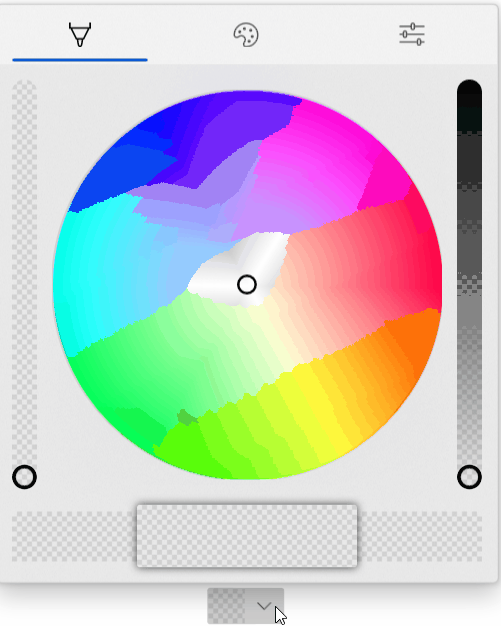 The new properties for this picker are below. Note that these are purposely name 'CustomPalette...' instead of 'Palette...' as multiple palettes may be supported in the future (windows colors, recent colors, custom palette all in different sections visible at the same time). ```csharp /// <summary> /// Gets the list of custom palette colors. /// </summary> public ObservableCollection<Windows.UI.Color> CustomPaletteColors { get; } /// <summary> /// Gets or sets the number of colors in each row (section) of the custom color palette. /// A section is the number of columns within an entire row in the palette. /// Within a standard palette, rows are shades and columns are unique colors. /// </summary> public int CustomPaletteColumns { get; set; } /// <summary> /// Gets or sets a custom IColorPalette . /// This will automatically set <see cref="CustomPaletteColors"/> and <see cref="CustomPaletteSectionCount"/> /// overwriting any existing values. /// </summary> public IColorPalette CustomPalette { get; set; } /// <summary> /// Gets or sets a value indicating whether the color palette is visible. /// </summary> public bool IsColorPaletteVisible { get; set; } ``` Making all of this easier is a new IColorPalette interface. Any class can implement this interface to provide a custom color palette such as windows colors (the default), RYB colors, Flat UI colors, etc. Colors could also be algorithmically generated. ```csharp /// <summary> /// Interface to define a color palette. /// </summary> public interface IColorPalette { /// <summary> /// Gets the total number of colors in this palette. /// A color is not necessarily a single value and may be composed of several shades. /// </summary> int ColorCount { get; } /// <summary> /// Gets the total number of shades for each color in this palette. /// Shades are usually a variation of the color lightening or darkening it. /// </summary> int ShadeCount { get; } /// <summary> /// Gets a color in the palette by index. /// </summary> /// <param name="colorIndex">The index of the color in the palette. /// The index must be between zero and <see cref="ColorCount"/>.</param> /// <param name="shadeIndex">The index of the color shade in the palette. /// The index must be between zero and <see cref="ShadeCount"/>.</param> /// <returns>The color at the specified index or an exception.</returns> Color GetColor(int colorIndex, int shadeIndex); } ``` ## PR Checklist Please check if your PR fulfills the following requirements: - [x] Tested code with current [supported SDKs](../readme.md#supported) - [ ] Pull Request has been submitted to the documentation repository [instructions](..\contributing.md#docs). Link: <!-- docs PR link --> - [x] Sample in sample app has been added / updated (for bug fixes / features) - [x] Icon has been created (if new sample) following the [Thumbnail Style Guide and templates](https://github.com/windows-toolkit/WindowsCommunityToolkit-design-assets) - [ ] Tests for the changes have been added (for bug fixes / features) (if applicable) - [x] Header has been added to all new source files (run *build/UpdateHeaders.bat*) - [x] Contains **NO** breaking changes ## Other information **Control** * [x] Ensure the name ColorPickerButton is accepted * [x] Rename ColorPickerSlider to ColorPickerButtonSlider. ColorPickerSlider is already used by WinUI. * [x] Implement all accessibility functionality. Check tab ordering. * [x] This control originally used NumberBoxes for channel numerical input. Complete porting this functionality over to TextBoxes as the Toolkit does not have a dependency on WinUI. * [x] Support all visual state groups in the original ColorPicker. Connect all functionality * [x] Test changing all ColorPicker properties. Determine which ones make sense to ignore * [x] Trim displayed hex if alpha is not enabled * [x] ~~Switch to radio buttons to switch between RGB/HSV representation. A ComboBox within a Flyout is generally bad practice and is also limited by some bugs in UWP (#1467).~~ * [x] Switch to ToggleButton instead of RadioButton for RGB/HSV representation. Radio buttons don't work in flyouts and controls well due to UWP bugs. ToggleButtons may also visually look better. The design follows a 'segmented control' concept discussed here: microsoft/microsoft-ui-xaml#2310 * [x] Switch the default color palette to be the windows colors (if possible) * [x] Align formatting to the toolkit conventions * [x] Handle CornerRadius in the template. Conditional XAML? Check how other controls do this. * [x] Rename 'CustomPaletteSectionCount' to ~~'CustomPaletteWrapCount'~~ or 'CustomPaletteColumns' like UniformGrid * [x] Update selected palette color data template to provide correct contrast of the border with the selected color ~~to match with windows settings app (check mark overlay)~~ The check mark is not included as the size of swatches in the palette could be smaller than the check mark itself. * [x] Rename 'CustomPaletteColumns' to 'CustomPaletteColumnCount' * [ ] Treat negative/zero numbers in CustomPaletteColumnCount as 'auto' and automatically calculate a good column count to keep rows/columns even. Set the default of this property to 0 'auto'. * [x] Improve spacing above/below channel sliders -- try 24px (2 x 12px) * [ ] Move localizable strings into resources * [x] ~Do not show the color (set the preview border visibility to collapsed) while the control is initializing. This prevents the default color from briefly appearing during initial load. Instead, the background will just show through.~ * [x] Do not change the saturation and value in the hue slider background. Keep SV at maximum. This allows the hue to always be clear to the user and is in line with other implementations (like in Inkscape). * [x] Rename `WindowsColorPalette` to `FluentColorPalette` * [x] Show palette color display name in a tooltip * [x] Use the WinUI algorithm for light/dark color switching * [x] Each tab should have independent visibility using IsColorPaletteVisible (new), IsColorSpectrumVisible (existing) and IsColorChannelTextInputVisible (repurposed to mean the entire tab). The tabs still visible should take up available space remaining. With only one tab visible the tab header should disappear. **Code Review** 1. [x] The mini-palette and color preview will be all one color when the selected color is black or white. The calculated accent colors will not change and pressing them will not change the selected color. * Requires feedback from Microsoft on how the accent colors are calculated in Windows * It is possible to specially handle when the color is as max/min value (black or white) at least the two accent colors to the left/right could be different shades of gray. 1. [x] The mini-palette accent colors are destructive. Pressing back and forward by 1 will not restore the original color. * Again, requires feedback from Microsoft on how the accent colors are calculated in Windows. * Due to perceptual adjustments it's likely this will always be destructive. 1. [x] The third dimension slider in the spectrum tab will vary the other dimensions in the spectrum. This results in the spectrum cursor jumping around as the slider value changes. This might be related to HSV/RGB conversion but needs to be investigated. 1. [x] Adjust the design of the sample app page to move the ColorPickerButton closer to the description. 1. [x] Check if a ColorToDisplayName converter already exists. Consider adding control specific converters to their own sub-namespace. 1. [x] The ColorPickerButton will derive from DropDownButton and have a ColorPicker property. Dependent on #3440 1. [x] The ColorPicker will have the same new style as the ColorPickerButton flyout. While it's a new concept to have tabs in a panel-type control, this is considered acceptable. 1. [x] Merge @michael-hawker branch into this one when given the thumb's up. Both controls will be in the same directory. 1. [x] Remove conditional XAML for corner radius after WinUI 3.0. Conditional XAML doesn't work correctly in resource dictionaries and with setters. See microsoft/microsoft-ui-xaml#2556, fixed with #3440 1. [ ] All slider rendering will be broken out and put into a new ColorPickerSlider. This should simplify code-behind and the default template. 1. [x] The Pivot tab width and show/hide of tabs will be controlled in code-behind. use of the pivot itself is somewhat dependent on issues with touch. The pivot, or switching to a new control, will not hold the release. 1. [ ] Sliders should vary only 1-channel and keep the other channels at maximum. This ensures the gradient always makes sense and never becomes fully black/white/transparent. This could also be made a configuration of the ColorPickerSlider control. Edit: This does need to be configurable as it's only required in HSV mode. 1. [ ] Add color history palette to the sample app **Other** * [x] Complete integration with the sample app. Add XAML to dynamically change the control. * [ ] Complete documentation of the control **Future** These changes should be considered for future versions of the control. They are recorded here for lack of a better location. * [ ] The mini selected color palette may follow the Windows accent color lighter/darker shades algorithm. However, the implementation of this algorithm is currently unknown. This algorithm may be in the XAML fluent theme editor: https://github.com/microsoft/fluent-xaml-theme-editor * [ ] Switch back to NumberBox for all color channel numerical input. This will require WinUI 3.0 and the corresponding release of the toolkit. When microsoft/microsoft-ui-xaml#2757 is implemented, also use NumberBox for hex color input. * [ ] ~Remove the custom 'ColorPickerButtonSlider' after switch to WinUI 3.0. This assumes there is no additional control-specific code at that point. (It currently exists just to work-around UWP bugs).~ This should be turned into it's own full primitive control. * [ ] Update ColorSpectrum_GotFocus event handler (instructions are within code) after/if ColorSpectrum bugs are fixed (likely after WinUI 3.0 * [ ] Use Color.IsEmpty if microsoft/microsoft-ui-xaml#2826 is implemented * [ ] ~Ensure PivotItems are properly removed once/if microsoft/microsoft-ui-xaml#2952 is closed.~
My idea would be using a button group as a TemplatePart for the replacement control, and possibly a FlipView or other kind of carouselling view control, with a two-way binding to display the content. So the new control would have a ContentView property and a ContentHeader property - that content gets placed into the template part controls. |
|
@kat-y can you clarify why you changed the title of this proposal from |
|
A Single-Select ButtonGroup, would have to use a restyled RadioButton to get the correct behaviour. However... A Multi-Select ButtonGroup, would need to use ToggleButtons/AppBarToggleButtons, rather than RadioButtons. |
This would still work with the ItemsRepeater design mentioned above. The ItemsRepeater would host restyled RadioButtons and less-restyled ToggleButtons. |
ItemsRepeater is better than list controls. The control would need its own button/radiobutton style. CommandBar has a subtle button style, and has it's own padding considerations. So in my examples I made, I tried to keep that in mind. It also offers more options for Icons and Labels, and would also help any Ribbon implementations, where resizing could collapse labels or move them below the icons etc. These of course would be styles you can override if you want to customise the look of your button groups.
|

|
As for an API, how about something like: <ButtonGroup Name="fontButtonGroup">
<ButtonGroup.Multi>
<ButtonGroupItem Icon="textBold" Label="Bold" Click="bold_click" />
<ButtonGroupItem Icon="textItalic" Label="Italic" Click="italic_click" />
<ButtonGroupItem Icon="textUnderline" Label="Underline" Click="underline_click" />
</ButtonGroup.Multi>
<ButtonGroup.Single>
<ButtonGroupItem Icon="alignTextLeft" Label="Align Left" Click="a_L_click" />
<ButtonGroupItem Icon="alignTextCenter" Label="Align Centre" Click="a_C_click" />
<ButtonGroupItem Icon="alignTextRight" Label="Align Right" Click="a_R_click" />
<ButtonGroupItem Icon="alignTextJustify" Label="Justify" Click="a_J_click" />
</ButtonGroup.Single>
</ButtonGroup>
This is more verbose and it is more of a Group within a Button Group, so semantically not as clean, but something like this: <ButtonGroup Name="fontButtonGroup" SelectionMode="Multiple">
<ButtonGroupItem Icon="textBold" Label="Bold" Click="bold_click" />
<ButtonGroupItem Icon="textItalic" Label="Italic" Click="italic_click" />
<ButtonGroupItem Icon="textUnderline" Label="Underline" Click="underline_click" />
</ButtonGroup>
<ButtonGroup Name="alignmentButtonGroup" SelectionMode="Single">
<ButtonGroupItem Icon="alignTextLeft" Label="Align Left" Click="a_L_click" />
<ButtonGroupItem Icon="alignTextCenter" Label="Align Centre" Click="a_C_click" />
<ButtonGroupItem Icon="alignTextRight" Label="Align Right" Click="a_R_click" />
<ButtonGroupItem Icon="alignTextJustify" Label="Justify" Click="a_J_click" />
</ButtonGroup>
This is semantically better, but you lose the ability to group sets of buttons within a single control, with separators between items. If this ButtonGroup is used as is, it could display the items as Buttons and ToggleButtons - but maybe when the control is used within a CommandBar it could automatically apply the AppBar styles to the controls - and then you could manually put in Separators? <CommandBar Name="textCmdBar">
<ButtonGroup SelectionMode="Multiple">
<ButtonGroupItem Icon="textBold" Label="Bold" Click="bold_click" />
<ButtonGroupItem Icon="textItalic" Label="Italic" Click="italic_click" />
<ButtonGroupItem Icon="textUnderline" Label="Underline" Click="underline_click" />
</ButtonGroup>
<AppBarSeparator/>
<ButtonGroup SelectionMode="Single">
<ButtonGroupItem Icon="alignTextLeft" Label="Align Left" Click="a_L_click" />
<ButtonGroupItem Icon="alignTextCenter" Label="Align Centre" Click="a_C_click" />
<ButtonGroupItem Icon="alignTextRight" Label="Align Right" Click="a_R_click" />
<ButtonGroupItem Icon="alignTextJustify" Label="Justify" Click="a_J_click" />
</ButtonGroup>
<AppBarSeparator/>
<CommandBar.SecondaryItems>
<AppBarButton Icon="url" Label="View document in the browser" />
</CommandBar.SecondaryItems>
</CommandBar>I know the RadioButtons control can take in strings, but it displays those as RadioButtons which usually do not have Icons and only Text beside the check mark, so maybe we need an Item control? |
 kat-y
changed the title
kat-y
changed the title
|
Thanks everyone for your great comments! Sorry for the delay here - to give some explanation, we heard the community's frustration at Pivot's removal from WinUI 3 and we've been discussing if, where, and how any work done to 'fill the gap' could be delivered in WinUI. I'm hoping to understand your needs and the scope involved for 1) supporting a horizontal selection pattern (this issue) and 2) building a control that takes in inline XAML content like Pivot (see #4555 ) - please take any conversation about that control to that issue! 😄 I've updated the scope for this proposal and added an open question:
Good point! I've updated the title of the proposal to be less specific to radioing behavior.
I don't know if any one control (other than a Pivot rewrite, which could be #4555 ) could be a full replacement for Pivot, since Pivot has been used for a variety of scenarios. If this ButtonsGroup control were to exist, I would see the following Pivot-replacement landscape:
I see that this landscape wouldn't have the convenience factor of Pivot supporting inline content, but please let me know if there is any gap in functionality I haven't captured here. 😃 |
|
@kat-y I noticed that this proposal is for a horizontal selection control, what about expanding it to include a vertical option as well? |
@yaichenbaum That's a good point! I changed the name to Grouped selection support this time 😄. I've also added the orientation functionality to the scope table. I see horizontal as in-scope for a v1 and see vertical as important, but not critical for a v1 ButtonsGroup. Let me know if you think otherwise!
|
|
I suspect someone in the future will recreate an issue asking for a "Segmented control (just like in iOS)" because that's where everyone is used to seeing it and how they're used to call it, not to mention this issue is already more than 1 year old and probably a few people had been following it as it was called and kept checking for updates. |
|
Here is a little something from Flutter for Google's Material You update to their Design system. NavigationBar
|


|
I see two use cases discussed here: one for selecting from a couple of options like in the Office apps, and another one for navigation. While they may look similar in other operating systems, they are pretty different and I think they should stay separate. For navigation specifically I have a proposal in #5223. I think this one should be restricted to selecting items only. |
This proposal is specifically for selecting items within a group, either as Single Selection or Multi Selection. The extended idea is that this control could be used as a primitive for a Pivot replacement, or could group button items for use on a toolbar.
Tab Item and Tab Group seems like it should be worked into the TabView control. Navigation should use the NavigationView control in its Left or Top orientations. Pivot has been used for navigation in the past, but should only be used for switching out views within a single page context. With Pivot being removed eventually, there will need to be a suitable replacement for those non-navigation contexts (or non top-level control contexts). |
|
I might have misunderstood how navigation works in WinUI. Couldn't a single control be used for both switching views in a single page and for switching between pages? TabGroup was intended as a primitive for TabView, and possibly even NavigationView. It could also directly replace Pivot. |
NavigationView has a sidebar you can show and hide with a "Hamburger Button", and has NavigationViewItems for the various entries which when tapped can trigger a frame to navigate and show different pages. This sidebar can be a top bar if you choose, and the items are displayed differently as you switch the orientation mode. TabView is similar except for how it displays it's TabViewItems, and can be used to enable adding new tabs, dragging tabs out, and re-arranging. Both display the navigated content page in a frame. Both controls are designed for filling a whole window or screen, and loading/navigating between Pages in a Frame. So are Top Level controls in that sense. The Pivot has PivotViewItems which are panels which hold XAML content, and transitions between these as you tap or swipe on the control. Pivot is being removed because the WinUI Team wants developers to use the NavigationView with Top orientation instead for navigation. But it also is a bad idea to put a NavigationView inside another NavigationView - so for other uses of the Pivot, there is currently no alternative. TabGroup if it does not manage the Xaml content being brought in and out of view, is not a replacement. And a control named TabControl or TabGroup would be confusing alongside the TabView Control. |


|
I guess I didn't make it clear, but it was intended that TabGroup did hold its content, just like the other controls. So you could have both an entire page and a smaller section in the page using two TabGroups. I don't think the names would necessarily be confusing. There are already similarly named controls like Grid/GridView, RadioButton/RadioButtons. It might be better to move these comments into #5223 |
 ghost
mentioned this issue
ghost
mentioned this issue
# Add ColorPickerButton to the Toolkit Closes #3363 ## PR Type What kind of change does this PR introduce? Feature Documentation content changes Sample app changes ## What is the current behavior? The toolkit, and WinUI/UWP, has no flyout ColorPicker. The color picker that currently exists is a large canvas-type control (that is incorrectly named). This existing control has lots of usability concerns discussed in #3363 and the WinUI repository. ## What is the new behavior? A brand-new control is added to allow selecting and editing a color within a flyout. The selected color is always visible in the content area of a drop-down button as a preview.  The new properties for this picker are below. Note that these are purposely name 'CustomPalette...' instead of 'Palette...' as multiple palettes may be supported in the future (windows colors, recent colors, custom palette all in different sections visible at the same time). ```csharp /// <summary> /// Gets the list of custom palette colors. /// </summary> public ObservableCollection<Windows.UI.Color> CustomPaletteColors { get; } /// <summary> /// Gets or sets the number of colors in each row (section) of the custom color palette. /// A section is the number of columns within an entire row in the palette. /// Within a standard palette, rows are shades and columns are unique colors. /// </summary> public int CustomPaletteColumns { get; set; } /// <summary> /// Gets or sets a custom IColorPalette . /// This will automatically set <see cref="CustomPaletteColors"/> and <see cref="CustomPaletteSectionCount"/> /// overwriting any existing values. /// </summary> public IColorPalette CustomPalette { get; set; } /// <summary> /// Gets or sets a value indicating whether the color palette is visible. /// </summary> public bool IsColorPaletteVisible { get; set; } ``` Making all of this easier is a new IColorPalette interface. Any class can implement this interface to provide a custom color palette such as windows colors (the default), RYB colors, Flat UI colors, etc. Colors could also be algorithmically generated. ```csharp /// <summary> /// Interface to define a color palette. /// </summary> public interface IColorPalette { /// <summary> /// Gets the total number of colors in this palette. /// A color is not necessarily a single value and may be composed of several shades. /// </summary> int ColorCount { get; } /// <summary> /// Gets the total number of shades for each color in this palette. /// Shades are usually a variation of the color lightening or darkening it. /// </summary> int ShadeCount { get; } /// <summary> /// Gets a color in the palette by index. /// </summary> /// <param name="colorIndex">The index of the color in the palette. /// The index must be between zero and <see cref="ColorCount"/>.</param> /// <param name="shadeIndex">The index of the color shade in the palette. /// The index must be between zero and <see cref="ShadeCount"/>.</param> /// <returns>The color at the specified index or an exception.</returns> Color GetColor(int colorIndex, int shadeIndex); } ``` ## PR Checklist Please check if your PR fulfills the following requirements: - [x] Tested code with current [supported SDKs](../readme.md#supported) - [ ] Pull Request has been submitted to the documentation repository [instructions](..\contributing.md#docs). Link: <!-- docs PR link --> - [x] Sample in sample app has been added / updated (for bug fixes / features) - [x] Icon has been created (if new sample) following the [Thumbnail Style Guide and templates](https://github.com/windows-toolkit/WindowsCommunityToolkit-design-assets) - [ ] Tests for the changes have been added (for bug fixes / features) (if applicable) - [x] Header has been added to all new source files (run *build/UpdateHeaders.bat*) - [x] Contains **NO** breaking changes ## Other information **Control** * [x] Ensure the name ColorPickerButton is accepted * [x] Rename ColorPickerSlider to ColorPickerButtonSlider. ColorPickerSlider is already used by WinUI. * [x] Implement all accessibility functionality. Check tab ordering. * [x] This control originally used NumberBoxes for channel numerical input. Complete porting this functionality over to TextBoxes as the Toolkit does not have a dependency on WinUI. * [x] Support all visual state groups in the original ColorPicker. Connect all functionality * [x] Test changing all ColorPicker properties. Determine which ones make sense to ignore * [x] Trim displayed hex if alpha is not enabled * [x] ~~Switch to radio buttons to switch between RGB/HSV representation. A ComboBox within a Flyout is generally bad practice and is also limited by some bugs in UWP (#1467).~~ * [x] Switch to ToggleButton instead of RadioButton for RGB/HSV representation. Radio buttons don't work in flyouts and controls well due to UWP bugs. ToggleButtons may also visually look better. The design follows a 'segmented control' concept discussed here: microsoft/microsoft-ui-xaml#2310 * [x] Switch the default color palette to be the windows colors (if possible) * [x] Align formatting to the toolkit conventions * [x] Handle CornerRadius in the template. Conditional XAML? Check how other controls do this. * [x] Rename 'CustomPaletteSectionCount' to ~~'CustomPaletteWrapCount'~~ or 'CustomPaletteColumns' like UniformGrid * [x] Update selected palette color data template to provide correct contrast of the border with the selected color ~~to match with windows settings app (check mark overlay)~~ The check mark is not included as the size of swatches in the palette could be smaller than the check mark itself. * [x] Rename 'CustomPaletteColumns' to 'CustomPaletteColumnCount' * [ ] Treat negative/zero numbers in CustomPaletteColumnCount as 'auto' and automatically calculate a good column count to keep rows/columns even. Set the default of this property to 0 'auto'. * [x] Improve spacing above/below channel sliders -- try 24px (2 x 12px) * [ ] Move localizable strings into resources * [x] ~Do not show the color (set the preview border visibility to collapsed) while the control is initializing. This prevents the default color from briefly appearing during initial load. Instead, the background will just show through.~ * [x] Do not change the saturation and value in the hue slider background. Keep SV at maximum. This allows the hue to always be clear to the user and is in line with other implementations (like in Inkscape). * [x] Rename `WindowsColorPalette` to `FluentColorPalette` * [x] Show palette color display name in a tooltip * [x] Use the WinUI algorithm for light/dark color switching * [x] Each tab should have independent visibility using IsColorPaletteVisible (new), IsColorSpectrumVisible (existing) and IsColorChannelTextInputVisible (repurposed to mean the entire tab). The tabs still visible should take up available space remaining. With only one tab visible the tab header should disappear. **Code Review** 1. [x] The mini-palette and color preview will be all one color when the selected color is black or white. The calculated accent colors will not change and pressing them will not change the selected color. * Requires feedback from Microsoft on how the accent colors are calculated in Windows * It is possible to specially handle when the color is as max/min value (black or white) at least the two accent colors to the left/right could be different shades of gray. 1. [x] The mini-palette accent colors are destructive. Pressing back and forward by 1 will not restore the original color. * Again, requires feedback from Microsoft on how the accent colors are calculated in Windows. * Due to perceptual adjustments it's likely this will always be destructive. 1. [x] The third dimension slider in the spectrum tab will vary the other dimensions in the spectrum. This results in the spectrum cursor jumping around as the slider value changes. This might be related to HSV/RGB conversion but needs to be investigated. 1. [x] Adjust the design of the sample app page to move the ColorPickerButton closer to the description. 1. [x] Check if a ColorToDisplayName converter already exists. Consider adding control specific converters to their own sub-namespace. 1. [x] The ColorPickerButton will derive from DropDownButton and have a ColorPicker property. Dependent on #3440 1. [x] The ColorPicker will have the same new style as the ColorPickerButton flyout. While it's a new concept to have tabs in a panel-type control, this is considered acceptable. 1. [x] Merge @michael-hawker branch into this one when given the thumb's up. Both controls will be in the same directory. 1. [x] Remove conditional XAML for corner radius after WinUI 3.0. Conditional XAML doesn't work correctly in resource dictionaries and with setters. See microsoft/microsoft-ui-xaml#2556, fixed with #3440 1. [ ] All slider rendering will be broken out and put into a new ColorPickerSlider. This should simplify code-behind and the default template. 1. [x] The Pivot tab width and show/hide of tabs will be controlled in code-behind. use of the pivot itself is somewhat dependent on issues with touch. The pivot, or switching to a new control, will not hold the release. 1. [ ] Sliders should vary only 1-channel and keep the other channels at maximum. This ensures the gradient always makes sense and never becomes fully black/white/transparent. This could also be made a configuration of the ColorPickerSlider control. Edit: This does need to be configurable as it's only required in HSV mode. 1. [ ] Add color history palette to the sample app **Other** * [x] Complete integration with the sample app. Add XAML to dynamically change the control. * [ ] Complete documentation of the control **Future** These changes should be considered for future versions of the control. They are recorded here for lack of a better location. * [ ] The mini selected color palette may follow the Windows accent color lighter/darker shades algorithm. However, the implementation of this algorithm is currently unknown. This algorithm may be in the XAML fluent theme editor: https://github.com/microsoft/fluent-xaml-theme-editor * [ ] Switch back to NumberBox for all color channel numerical input. This will require WinUI 3.0 and the corresponding release of the toolkit. When microsoft/microsoft-ui-xaml#2757 is implemented, also use NumberBox for hex color input. * [ ] ~Remove the custom 'ColorPickerButtonSlider' after switch to WinUI 3.0. This assumes there is no additional control-specific code at that point. (It currently exists just to work-around UWP bugs).~ This should be turned into it's own full primitive control. * [ ] Update ColorSpectrum_GotFocus event handler (instructions are within code) after/if ColorSpectrum bugs are fixed (likely after WinUI 3.0 * [ ] Use Color.IsEmpty if microsoft/microsoft-ui-xaml#2826 is implemented * [ ] ~Ensure PivotItems are properly removed once/if microsoft/microsoft-ui-xaml#2952 is closed.~
ghost
mentioned this issue
|
We have recently published the new Segmented control
More info here: CommunityToolkit/Labs-Windows#392
TokenView
More info here: CommunityToolkit/Labs-Windows#427
|


|
Is there any worth in creating a SegmentedView control or updating the Pivot Control to combine a Segmented control with a view/frame control? |
Proposal: Grouped selection support
Summary
Support for Fluent styling for grouped selection between choices. This type of control could be used in combination with others to display different views of the same or similar data, such as in map interfaces to switch between driving/walking/biking options. This lets a user pick from multiple choices, similar to Segmented Control in iOS.
Rationale
Scope
|
| Support styling for a group of buttons | Could |
| Multiple choice | Could |
| Every segment shall adapt to content width | Could |
| Limit the width of an item | Could |
| Respond to swipe on the control surface | Could |
| Overflow items into a dropdown menu | Could |
| Carousel items when resized | Could |
| Provide an area for content in the control itself | Won't |
| Take in data and display it differently based on selection | Won't |
Important Notes
@mdtauk created this mockup:
Mockups
Open Questions
The text was updated successfully, but these errors were encountered: