Proposal: Support Hex Display and Input in NumberBox #2757
Comments
 msft-github-bot
added
the
needs-triage
msft-github-bot
added
the
needs-triage
 StephenLPeters
added
area-NumberBox
StephenLPeters
added
area-NumberBox
|
@SavoySchuler FYI, this seems cool to me. |
|
@StephenLPeters @teaP @SavoySchuler Is this something the community can contribute to the NumberBox as the team is busy with WinUI 3? I have started to think about how we could approach this and created an API proposal including an API demo below. Let me know if this is something I/the community can further pursue here with the goal of adding this to the NumberBox as a community contribution before WinUI 3 is done and will free up some team resources to work on this proposal. @robloo If you can, please play around with the proposed API, read through the API proposal and let me know if you think anything else is missing here which we should cover for hexadecimal support for the NumberBox. API OverviewMy current thinking is to create a new Now, before I start a detailed post about the API and the current open design questions I am seeing, I want to let you know that you can check out the proposed API here "live" as I've uploaded my current work on the With that out of the way, let's start. API ExamplesAssign a
|


| Name | Description |
|---|---|
| InputPrefixes | Gets the set of string prefixes an input can pick a valid string prefix to use from. |
| OutputPrefix | Gets or sets the string prefix used for the display output. The default is the empty string (""). Note: If you have specified a custom output prefix, please make sure to also include it in the InputPrefixes collection. Otherwise, if you want to use the NumberBox with arithmetic expressions, the entered expressions will not be processed successfully if they contain the output prefix. |
| MinDigits | Gets or sets the minimum number of digits to be displayed. The default is 1. |
| IsGrouped | Gets or sets whether the hexadecimal number should be grouped in digits of four. The default is false. |
API Details
namespace MU_XC_NAMESPACE
{

[WUXC_VERSION_PREVIEW]
[webhosthidden]
[default_interface]
runtimeclass HexadecimalFormatter : Windows.UI.Xaml.DependencyObject, Windows.Globalization.NumberFormatting.INumberFormatter2, Windows.Globalization.NumberFormatting.INumberParser
{
    HexadecimalFormatter();

    String OutputPrefix{ get; set; };
    Windows.Foundation.Collections.IVector<String> InputPrefixes{ get; };

    [MUX_DEFAULT_VALUE("1")]
    Int32 MinDigits{ get; set; };

    [MUX_DEFAULT_VALUE("false")]
    Boolean IsGrouped{ get; set; };

    static Windows.UI.Xaml.DependencyProperty OutputPrefixProperty{ get; };
    static Windows.UI.Xaml.DependencyProperty InputPrefixesProperty{ get; };

    static Windows.UI.Xaml.DependencyProperty MinDigitsProperty{ get; };

    static Windows.UI.Xaml.DependencyProperty IsGroupedProperty{ get; };
};

}
Remarks
The API proposal outlined above specified a HexadecimalFormatter.IsGrouped API. Support for this API requires changes to the NumberBoxParser and how it handles expressions. Currently, the NumberBox expression parser does not treat digits separated by spaces as a single number. An example: In a given expression input like "1234 5678 + 9ABC DEF0" the grouped value "1234 5678" is currently treated as two distinct values - and since there is no operator defined in the input string to take these two values as operands - the parsing fails.
To enable support for the IsGrouped API (which could create an expression input with numbers containing spaces) the idea here is to change the used regular expression to also include whitespace between digits of the value passed to numberParser.ParseDouble(). This will delegate the task of handling an input number with spaces inside to the specified NumberBox.NumberFormatter. This would also match the code flow when the NumberBox does not allow expressions to be entered:
microsoft-ui-xaml/dev/NumberBox/NumberBox.cpp
Line 422 in 5f101c7
Even if the NumberBox does not support expressions, a user might paste a grouped hex value into the NumberBox (like 0123 4567) and it would then be up to the specified hex parser to determine if an input with spaces put between digits is valid. (That determination would happen in the different
INumberParser.Parse*() methods.)
Such a change to the NumberBoxParser will still keep the current default behavior for decimal numbers intact (no spaces between digits of a number allow) as the DecimalFormatter used does not treat such input as valid.
This change has been implemented with commit Felix-Dev@f2db82e in my local fork.
Additional Notes
The HexadecimalFormatter API shown above does not yet implement the INumberFormatter API, as done by the DecimalFormatter, for example. The reason is that my goal for now was to create an API which works primarily in the NumberBox use case in order to gather feedback on the general direction of this API design. If this API is something the team and the community like @robloo think is the right approach here, we can always implement the INumberFormatter interface as well if deemed useful.
The HexadecimalFormatter API also does not implement the INumberFormatterOptions compared to the DecimalFormatter. In this case, I think most of the APIs defined by that interface are not useful for the HexadecimalFormatter, such as FractionDigits, GeographicRegion, IsDecimalPointAlwaysDisplayed, NumeralSystem, etc.... As such, I believe implementing this interface would not add anything useful to the HexadecimalFormatter API.
Open Questions
- The most important question first: Is this an API approach which makes sense to the community and the team? Should further time be invested into it?
- Which additional interfaces - like
INumberFormatter- shouldHexadecimalFormatterimplement which are currently implemented by the DecimalFormatter + related formatters and why? - Which additional APIs should the
HexadecimalFormatterprovide to satisfy common hex input/output configurations? - Currently, passing
nullto theNumberBox.NumberFormatterAPI will result in an exception: https://github.com/microsoft/microsoft-ui-xaml/blob/master/dev/NumberBox/NumberBox.cpp#L294 Would it make sense to change this behavior so that specifyingnullhere would cause the NumberBox to fall-back to its default decimal number formatter? This would allow developers to specify a differentNumberFormatterwithout having to re-create the default number formatter if they want to switch back to it (for example by providing a UI toggle to change from hex to dec input/output mode of the NumberBox back-and-forth). What do you think about this? This sounds like this would be a welcomed improvement to me by removing work developers might have to additionally commit to as a side-effect of them assigning a non-defaultNumberFormatter. - In the future, we might build formatters for different numeral system like the binary system or the octal system to be used by NumberBox. Their public APIs will presumably be quite similar to the proposed
HexadecimalFormatterAPI here. For example, anIsGroupedAPI will also make sense for theOctalFormatter. The APIsOutputPrefixandInputPrefixeswill probably make sense for both a futureOctalFormatterand aBinaryFormatter.
As such, we could create a new interface called INumberFormatterOptions2 which exposes these APIs and will be implemented by future binary, hex and octal number formatters:
public interface INumberFormatterOptions2
{
    string OutputPrefix { get; set; }

    IList<string> InputPrefixes { get; }

    int MinDigits { get; set; }

    bool IsGrouped { get; set; }
}
The NumberBoxParser can then simply query these above APis by checking if the specified number formatter implements the INumberFormatterOptions2 interface.
Your thoughts on that?
API Demo
As mentioned in the beginning of this post, I've uploaded my current work on the HexadecimalFormatter in a branch in my WinUI fork here. If you compile the MUXControlsTestApp, you can open the NumberBox test page and start playing around:

Notice the ComboBox on the left titled "Numeral System Mode". Use it to switch between hex and decimal mode for the NumberBox with the value "256". In code-behind, you can checkout the NumeralSystemComboBox_SelectionChanged method to set more configuration options on the HexadecimalFormatter object (or you can use XAML markup).
If you are interested in the current implementation of the HexadecimalFormatter, you will find it here.
If you have trouple getting a successful full build of WinUI, you can also try out the building the InnerLoop solution. Simply open "MUXControlsInnerLoop.sln" and add <FeatureNumberBoxEnabled>true</FeatureNumberBoxEnabled> to its InnerLoopArea.props file, so that it will look like this:
<?xml version="1.0" encoding="utf-8"?>
<!-- Copyright (c) Microsoft Corporation. All rights reserved. Licensed under the MIT License. See LICENSE in the project root for license information. -->
<Project ToolsVersion="14.0" xmlns="http://schemas.microsoft.com/developer/msbuild/2003">
  <!-- Feature to include for inner loop build -->
  <PropertyGroup Condition="$(SolutionName) == 'MUXControlsInnerLoop'">
    <FeatureNumberBoxEnabled>true</FeatureNumberBoxEnabled>
  </PropertyGroup>
</Project>
Now build MUXControlsTestApp project and you should notice a considerably improved build process experience. Once the app laoded, you should be greeted with a single "NumberBox" entry in the app. (If you are seeing a blank window, you will have to close and reopen the solution. This should solve that issue.). Once you see the single "NumberBox" entry you can start testing the new NumberBox features :)
Specific Implementation Remarks
|
@Felix-Dev Lots of good stuff here to dig through! Give me a bit to provide feedback -- if any is really required. You have lots of good ideas already. I do remember in the original NumberBox spec discussion I was excited about using custom implementations (in C#) of the INumberFormatter2 interface to customize formatting. However, this was quickly shot down by @SavoySchuler for some reason it wasn't supported -- I don't know if there are issues in interop layers or the problem was with parsing, etc. Maybe it was just a miscommunication. If there are no technical limitations though its a great idea to add a new HexadecimalFormatter -- but it's going to have to go into WinRT I'm afraid (which means the impossibly slow and unresponsive Windows team). Also, this whole discussion is related to the generalized topic of supporting custom formatting and parsing: #2684. |
|
@robloo Thanks already for taking an early look.
Hmm, prior to working on this API proposal I did read the NumberBox initial discussion thread and spec again. I also checked the ppec PR discussion just now. I'm afraid to say I didn't find the message you are remembering here. I did find one comment by @SavoySchuler here (under "Localization") where he said that the "the intention of the current implementation" of the NumberBox is the support of " any INumberFormatter/INumberFormatter2". Then again, these threads are massive so perhaps I just missed the comment you are remembering here. That said, I'm not aware of any "technical limitations" regarding the approach I chose above. The proposed What I like about the current API proposal is that we are providing customers with a fully implemented hexadecimal formatter, yet still aim to give them the relevant customization options they expect here to easily customize the supported inputs (like input prefixes) and the final display output (output prefix, min digits to show (useful for displaying colors, for example) and whether the output should be grouped for better visibility). Ideally, we would implement this
Yes, this requires some thought here. Currently, formatters like the Perhaps the fastest way of shipping an API like the proposed |
|
@Felix-Dev I checked the original thread again. My memory wasn't entirely clear and there isn't a technical limitation in supporting INumberFormatter2; however, the reason I'm remembering it isn't supported is because the number formatter can't handle parsing. Therefore, as soon as you use it to add something like a degree symbol, extra spaces or '0x' it breaks #483 (comment). So INumberFormatter2 becomes almost useless. Parsing/Formatting need to be coupled together as discussed in #2684 |
|
@robloo It's true that currently, spaces between digits of a number is not supported when parsing expressions. However, this is a limitation of the current NumberBoxParser (which consumes the specified An inportant point to make clear here is that the proposed The case of custom prefixes like "0x" or "#": The NumberBox will currently send an input like "0x12345678" directly to the specified NumberFormatter to parse - thus again leaving it up to the developer if those are valid inputs. For an example, see the current implementation of the In the code above, the And just as how the And just as how I am adding support for custom prefixes here, so can a developer create another NumberFormatter (implementing both Reading through the post you've linked, I have a feeling we are looking at a missunderstanding here because developers can provide input with custom prefix/suffix support just fine right now - when implementing their own |
|
@Felix-Dev this looks really promising to me, truely excellent work. @ranjeshj and @MikeHillberg should be aware as well. |
|
I anticipate a desire to have an numberbox which can take as input either a hex or a decimal input and then maintain that format for the output, so if it write 10+10 i get 20 and if I write 0x10 + 0x10 i get 0x20. I think this behavior would not be supported by this proposal? |
@StephenLPeters You are correct, the proposed API only focuses on interpreting input as hexadecimal values: Input like However, the proposed So, to conclude, this proposed API could be used as a building block to create such a NumberBox behavior. Just as how the NumberBox makes use of the |
|
@Felix-Dev has a good idea to keep a separate HexadecimalFormatter and DecimalFormatter with clearly defined scope and then on top of that a NumberFormatter that handles mixing/matching between them. That is the cleanest architecture I think and allows for future expansion (binary, octal, etc.). On top of @StephenLPeters's comments, we should probably figure out how to handle 'units' at least conceptually. Other numerical input boxes like this can support cm, mm, m units and automatically do conversions. That concept is related to 0x, 0b, etc prefixes and automatically converting to the base numerical system -- whether hex or decimal. The ideas here are going to end up solving most of the issues mentioned in #2684. I still advocate for a more clear internal processing pipeline that can be hooked into from derived controls though. |
|
@robloo @StephenLPeters With the latest commit to my branch I have now added As part of this gif, you will probably also notice that I now can add spaces between digits and the entered numbers will still be parsed correctly. This is an independent, but required, functionality for the IsGrouped API. Here is a GIF to show it's not dependent on the status of IsGrouped (IsGrouped is set to false): As you can see, the amount of spaces between digits and even where I put spaces between digits doesn't matter. However, if I were to set a custom input prefix like "0x" and then enter a value like "0 x1234 5678" parsing would fail as "0 x" has not been specified as a valid input. This support has been added in a way that the existing behavior for the default NumberBox's NumberFormatter has been kept: As written earlier, the added change now sends input values, potentially with spaces between its digits, to the specified NumberFormatter. (Previously, spaces between digits were used by the NumberBoxParser to treat digits to the left and the right of the space as separate numbers.) It will be up to the I would also like to note that there is currently no "live UI update" support when changing properties of the
An event for the property |


|
Awesome work, this is already functionally more than what I was thinking when opening the issue!
This is going to add too-many specialized 'property changed' events in my opinion. If this technique must be used, it would be better to support INotifyPropertyChanged. However, I think it would be better still to treat a HexadecimalFormatter as immutable. If an app changes settings they need to pass a new formatter to the NumberFormatter property which will trigger the updates. You are working at light-speed on this :) I still haven't had a chance to go through it all! |
@robloo Indeed, thinking further about it...let's not add these events here :). The
I think I am done here for now as my proposal is now fully implemented in my local branch😁 |
|
I agree with rob, your events solutions would require that the numberbox know, or somehow check which events to redrawn the content in response to, which doesn't seem right. If you made the properties immutable then you could redraw when you get a new formatter. |
|
And I agree with your response as well, since the other formatters are mutable this one should be as well. |
|
I have added a separate test page to play around with the
The test page can be found on the new landing page for NumberBox test pages:
@StephenLPeters Do we have a plan how to proceed here and if yes, how would that look? Is there anything else I should do for now or have we reached a point where the team has to find some time to weigh in here for further progress? |


|
@Felix-Dev This is all really good stuff! Since we don't have access to WinRT it makes sense to put this where you have it in the WinUI Repo I think. |
# Add ColorPickerButton to the Toolkit Closes #3363 ## PR Type What kind of change does this PR introduce? Feature Documentation content changes Sample app changes ## What is the current behavior? The toolkit, and WinUI/UWP, has no flyout ColorPicker. The color picker that currently exists is a large canvas-type control (that is incorrectly named). This existing control has lots of usability concerns discussed in #3363 and the WinUI repository. ## What is the new behavior? A brand-new control is added to allow selecting and editing a color within a flyout. The selected color is always visible in the content area of a drop-down button as a preview. 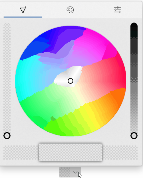 The new properties for this picker are below. Note that these are purposely name 'CustomPalette...' instead of 'Palette...' as multiple palettes may be supported in the future (windows colors, recent colors, custom palette all in different sections visible at the same time). ```csharp /// <summary> /// Gets the list of custom palette colors. /// </summary> public ObservableCollection<Windows.UI.Color> CustomPaletteColors { get; } /// <summary> /// Gets or sets the number of colors in each row (section) of the custom color palette. /// A section is the number of columns within an entire row in the palette. /// Within a standard palette, rows are shades and columns are unique colors. /// </summary> public int CustomPaletteColumns { get; set; } /// <summary> /// Gets or sets a custom IColorPalette . /// This will automatically set <see cref="CustomPaletteColors"/> and <see cref="CustomPaletteSectionCount"/> /// overwriting any existing values. /// </summary> public IColorPalette CustomPalette { get; set; } /// <summary> /// Gets or sets a value indicating whether the color palette is visible. /// </summary> public bool IsColorPaletteVisible { get; set; } ``` Making all of this easier is a new IColorPalette interface. Any class can implement this interface to provide a custom color palette such as windows colors (the default), RYB colors, Flat UI colors, etc. Colors could also be algorithmically generated. ```csharp /// <summary> /// Interface to define a color palette. /// </summary> public interface IColorPalette { /// <summary> /// Gets the total number of colors in this palette. /// A color is not necessarily a single value and may be composed of several shades. /// </summary> int ColorCount { get; } /// <summary> /// Gets the total number of shades for each color in this palette. /// Shades are usually a variation of the color lightening or darkening it. /// </summary> int ShadeCount { get; } /// <summary> /// Gets a color in the palette by index. /// </summary> /// <param name="colorIndex">The index of the color in the palette. /// The index must be between zero and <see cref="ColorCount"/>.</param> /// <param name="shadeIndex">The index of the color shade in the palette. /// The index must be between zero and <see cref="ShadeCount"/>.</param> /// <returns>The color at the specified index or an exception.</returns> Color GetColor(int colorIndex, int shadeIndex); } ``` ## PR Checklist Please check if your PR fulfills the following requirements: - [x] Tested code with current [supported SDKs](../readme.md#supported) - [ ] Pull Request has been submitted to the documentation repository [instructions](..\contributing.md#docs). Link: <!-- docs PR link --> - [x] Sample in sample app has been added / updated (for bug fixes / features) - [x] Icon has been created (if new sample) following the [Thumbnail Style Guide and templates](https://github.com/windows-toolkit/WindowsCommunityToolkit-design-assets) - [ ] Tests for the changes have been added (for bug fixes / features) (if applicable) - [x] Header has been added to all new source files (run *build/UpdateHeaders.bat*) - [x] Contains **NO** breaking changes ## Other information **Control** * [x] Ensure the name ColorPickerButton is accepted * [x] Rename ColorPickerSlider to ColorPickerButtonSlider. ColorPickerSlider is already used by WinUI. * [x] Implement all accessibility functionality. Check tab ordering. * [x] This control originally used NumberBoxes for channel numerical input. Complete porting this functionality over to TextBoxes as the Toolkit does not have a dependency on WinUI. * [x] Support all visual state groups in the original ColorPicker. Connect all functionality * [x] Test changing all ColorPicker properties. Determine which ones make sense to ignore * [x] Trim displayed hex if alpha is not enabled * [x] ~~Switch to radio buttons to switch between RGB/HSV representation. A ComboBox within a Flyout is generally bad practice and is also limited by some bugs in UWP (#1467).~~ * [x] Switch to ToggleButton instead of RadioButton for RGB/HSV representation. Radio buttons don't work in flyouts and controls well due to UWP bugs. ToggleButtons may also visually look better. The design follows a 'segmented control' concept discussed here: microsoft/microsoft-ui-xaml#2310 * [x] Switch the default color palette to be the windows colors (if possible) * [x] Align formatting to the toolkit conventions * [x] Handle CornerRadius in the template. Conditional XAML? Check how other controls do this. * [x] Rename 'CustomPaletteSectionCount' to ~~'CustomPaletteWrapCount'~~ or 'CustomPaletteColumns' like UniformGrid * [x] Update selected palette color data template to provide correct contrast of the border with the selected color ~~to match with windows settings app (check mark overlay)~~ The check mark is not included as the size of swatches in the palette could be smaller than the check mark itself. * [x] Rename 'CustomPaletteColumns' to 'CustomPaletteColumnCount' * [ ] Treat negative/zero numbers in CustomPaletteColumnCount as 'auto' and automatically calculate a good column count to keep rows/columns even. Set the default of this property to 0 'auto'. * [x] Improve spacing above/below channel sliders -- try 24px (2 x 12px) * [ ] Move localizable strings into resources * [x] ~Do not show the color (set the preview border visibility to collapsed) while the control is initializing. This prevents the default color from briefly appearing during initial load. Instead, the background will just show through.~ * [x] Do not change the saturation and value in the hue slider background. Keep SV at maximum. This allows the hue to always be clear to the user and is in line with other implementations (like in Inkscape). * [x] Rename `WindowsColorPalette` to `FluentColorPalette` * [x] Show palette color display name in a tooltip * [x] Use the WinUI algorithm for light/dark color switching * [x] Each tab should have independent visibility using IsColorPaletteVisible (new), IsColorSpectrumVisible (existing) and IsColorChannelTextInputVisible (repurposed to mean the entire tab). The tabs still visible should take up available space remaining. With only one tab visible the tab header should disappear. **Code Review** 1. [x] The mini-palette and color preview will be all one color when the selected color is black or white. The calculated accent colors will not change and pressing them will not change the selected color. * Requires feedback from Microsoft on how the accent colors are calculated in Windows * It is possible to specially handle when the color is as max/min value (black or white) at least the two accent colors to the left/right could be different shades of gray. 1. [x] The mini-palette accent colors are destructive. Pressing back and forward by 1 will not restore the original color. * Again, requires feedback from Microsoft on how the accent colors are calculated in Windows. * Due to perceptual adjustments it's likely this will always be destructive. 1. [x] The third dimension slider in the spectrum tab will vary the other dimensions in the spectrum. This results in the spectrum cursor jumping around as the slider value changes. This might be related to HSV/RGB conversion but needs to be investigated. 1. [x] Adjust the design of the sample app page to move the ColorPickerButton closer to the description. 1. [x] Check if a ColorToDisplayName converter already exists. Consider adding control specific converters to their own sub-namespace. 1. [x] The ColorPickerButton will derive from DropDownButton and have a ColorPicker property. Dependent on #3440 1. [x] The ColorPicker will have the same new style as the ColorPickerButton flyout. While it's a new concept to have tabs in a panel-type control, this is considered acceptable. 1. [x] Merge @michael-hawker branch into this one when given the thumb's up. Both controls will be in the same directory. 1. [x] Remove conditional XAML for corner radius after WinUI 3.0. Conditional XAML doesn't work correctly in resource dictionaries and with setters. See microsoft/microsoft-ui-xaml#2556, fixed with #3440 1. [ ] All slider rendering will be broken out and put into a new ColorPickerSlider. This should simplify code-behind and the default template. 1. [x] The Pivot tab width and show/hide of tabs will be controlled in code-behind. use of the pivot itself is somewhat dependent on issues with touch. The pivot, or switching to a new control, will not hold the release. 1. [ ] Sliders should vary only 1-channel and keep the other channels at maximum. This ensures the gradient always makes sense and never becomes fully black/white/transparent. This could also be made a configuration of the ColorPickerSlider control. Edit: This does need to be configurable as it's only required in HSV mode. 1. [ ] Add color history palette to the sample app **Other** * [x] Complete integration with the sample app. Add XAML to dynamically change the control. * [ ] Complete documentation of the control **Future** These changes should be considered for future versions of the control. They are recorded here for lack of a better location. * [ ] The mini selected color palette may follow the Windows accent color lighter/darker shades algorithm. However, the implementation of this algorithm is currently unknown. This algorithm may be in the XAML fluent theme editor: https://github.com/microsoft/fluent-xaml-theme-editor * [ ] Switch back to NumberBox for all color channel numerical input. This will require WinUI 3.0 and the corresponding release of the toolkit. When microsoft/microsoft-ui-xaml#2757 is implemented, also use NumberBox for hex color input. * [ ] ~Remove the custom 'ColorPickerButtonSlider' after switch to WinUI 3.0. This assumes there is no additional control-specific code at that point. (It currently exists just to work-around UWP bugs).~ This should be turned into it's own full primitive control. * [ ] Update ColorSpectrum_GotFocus event handler (instructions are within code) after/if ColorSpectrum bugs are fixed (likely after WinUI 3.0 * [ ] Use Color.IsEmpty if microsoft/microsoft-ui-xaml#2826 is implemented * [ ] ~Ensure PivotItems are properly removed once/if microsoft/microsoft-ui-xaml#2952 is closed.~
# Add ColorPickerButton to the Toolkit Closes #3363 ## PR Type What kind of change does this PR introduce? Feature Documentation content changes Sample app changes ## What is the current behavior? The toolkit, and WinUI/UWP, has no flyout ColorPicker. The color picker that currently exists is a large canvas-type control (that is incorrectly named). This existing control has lots of usability concerns discussed in #3363 and the WinUI repository. ## What is the new behavior? A brand-new control is added to allow selecting and editing a color within a flyout. The selected color is always visible in the content area of a drop-down button as a preview.  The new properties for this picker are below. Note that these are purposely name 'CustomPalette...' instead of 'Palette...' as multiple palettes may be supported in the future (windows colors, recent colors, custom palette all in different sections visible at the same time). ```csharp /// <summary> /// Gets the list of custom palette colors. /// </summary> public ObservableCollection<Windows.UI.Color> CustomPaletteColors { get; } /// <summary> /// Gets or sets the number of colors in each row (section) of the custom color palette. /// A section is the number of columns within an entire row in the palette. /// Within a standard palette, rows are shades and columns are unique colors. /// </summary> public int CustomPaletteColumns { get; set; } /// <summary> /// Gets or sets a custom IColorPalette . /// This will automatically set <see cref="CustomPaletteColors"/> and <see cref="CustomPaletteSectionCount"/> /// overwriting any existing values. /// </summary> public IColorPalette CustomPalette { get; set; } /// <summary> /// Gets or sets a value indicating whether the color palette is visible. /// </summary> public bool IsColorPaletteVisible { get; set; } ``` Making all of this easier is a new IColorPalette interface. Any class can implement this interface to provide a custom color palette such as windows colors (the default), RYB colors, Flat UI colors, etc. Colors could also be algorithmically generated. ```csharp /// <summary> /// Interface to define a color palette. /// </summary> public interface IColorPalette { /// <summary> /// Gets the total number of colors in this palette. /// A color is not necessarily a single value and may be composed of several shades. /// </summary> int ColorCount { get; } /// <summary> /// Gets the total number of shades for each color in this palette. /// Shades are usually a variation of the color lightening or darkening it. /// </summary> int ShadeCount { get; } /// <summary> /// Gets a color in the palette by index. /// </summary> /// <param name="colorIndex">The index of the color in the palette. /// The index must be between zero and <see cref="ColorCount"/>.</param> /// <param name="shadeIndex">The index of the color shade in the palette. /// The index must be between zero and <see cref="ShadeCount"/>.</param> /// <returns>The color at the specified index or an exception.</returns> Color GetColor(int colorIndex, int shadeIndex); } ``` ## PR Checklist Please check if your PR fulfills the following requirements: - [x] Tested code with current [supported SDKs](../readme.md#supported) - [ ] Pull Request has been submitted to the documentation repository [instructions](..\contributing.md#docs). Link: <!-- docs PR link --> - [x] Sample in sample app has been added / updated (for bug fixes / features) - [x] Icon has been created (if new sample) following the [Thumbnail Style Guide and templates](https://github.com/windows-toolkit/WindowsCommunityToolkit-design-assets) - [ ] Tests for the changes have been added (for bug fixes / features) (if applicable) - [x] Header has been added to all new source files (run *build/UpdateHeaders.bat*) - [x] Contains **NO** breaking changes ## Other information **Control** * [x] Ensure the name ColorPickerButton is accepted * [x] Rename ColorPickerSlider to ColorPickerButtonSlider. ColorPickerSlider is already used by WinUI. * [x] Implement all accessibility functionality. Check tab ordering. * [x] This control originally used NumberBoxes for channel numerical input. Complete porting this functionality over to TextBoxes as the Toolkit does not have a dependency on WinUI. * [x] Support all visual state groups in the original ColorPicker. Connect all functionality * [x] Test changing all ColorPicker properties. Determine which ones make sense to ignore * [x] Trim displayed hex if alpha is not enabled * [x] ~~Switch to radio buttons to switch between RGB/HSV representation. A ComboBox within a Flyout is generally bad practice and is also limited by some bugs in UWP (#1467).~~ * [x] Switch to ToggleButton instead of RadioButton for RGB/HSV representation. Radio buttons don't work in flyouts and controls well due to UWP bugs. ToggleButtons may also visually look better. The design follows a 'segmented control' concept discussed here: microsoft/microsoft-ui-xaml#2310 * [x] Switch the default color palette to be the windows colors (if possible) * [x] Align formatting to the toolkit conventions * [x] Handle CornerRadius in the template. Conditional XAML? Check how other controls do this. * [x] Rename 'CustomPaletteSectionCount' to ~~'CustomPaletteWrapCount'~~ or 'CustomPaletteColumns' like UniformGrid * [x] Update selected palette color data template to provide correct contrast of the border with the selected color ~~to match with windows settings app (check mark overlay)~~ The check mark is not included as the size of swatches in the palette could be smaller than the check mark itself. * [x] Rename 'CustomPaletteColumns' to 'CustomPaletteColumnCount' * [ ] Treat negative/zero numbers in CustomPaletteColumnCount as 'auto' and automatically calculate a good column count to keep rows/columns even. Set the default of this property to 0 'auto'. * [x] Improve spacing above/below channel sliders -- try 24px (2 x 12px) * [ ] Move localizable strings into resources * [x] ~Do not show the color (set the preview border visibility to collapsed) while the control is initializing. This prevents the default color from briefly appearing during initial load. Instead, the background will just show through.~ * [x] Do not change the saturation and value in the hue slider background. Keep SV at maximum. This allows the hue to always be clear to the user and is in line with other implementations (like in Inkscape). * [x] Rename `WindowsColorPalette` to `FluentColorPalette` * [x] Show palette color display name in a tooltip * [x] Use the WinUI algorithm for light/dark color switching * [x] Each tab should have independent visibility using IsColorPaletteVisible (new), IsColorSpectrumVisible (existing) and IsColorChannelTextInputVisible (repurposed to mean the entire tab). The tabs still visible should take up available space remaining. With only one tab visible the tab header should disappear. **Code Review** 1. [x] The mini-palette and color preview will be all one color when the selected color is black or white. The calculated accent colors will not change and pressing them will not change the selected color. * Requires feedback from Microsoft on how the accent colors are calculated in Windows * It is possible to specially handle when the color is as max/min value (black or white) at least the two accent colors to the left/right could be different shades of gray. 1. [x] The mini-palette accent colors are destructive. Pressing back and forward by 1 will not restore the original color. * Again, requires feedback from Microsoft on how the accent colors are calculated in Windows. * Due to perceptual adjustments it's likely this will always be destructive. 1. [x] The third dimension slider in the spectrum tab will vary the other dimensions in the spectrum. This results in the spectrum cursor jumping around as the slider value changes. This might be related to HSV/RGB conversion but needs to be investigated. 1. [x] Adjust the design of the sample app page to move the ColorPickerButton closer to the description. 1. [x] Check if a ColorToDisplayName converter already exists. Consider adding control specific converters to their own sub-namespace. 1. [x] The ColorPickerButton will derive from DropDownButton and have a ColorPicker property. Dependent on #3440 1. [x] The ColorPicker will have the same new style as the ColorPickerButton flyout. While it's a new concept to have tabs in a panel-type control, this is considered acceptable. 1. [x] Merge @michael-hawker branch into this one when given the thumb's up. Both controls will be in the same directory. 1. [x] Remove conditional XAML for corner radius after WinUI 3.0. Conditional XAML doesn't work correctly in resource dictionaries and with setters. See microsoft/microsoft-ui-xaml#2556, fixed with #3440 1. [ ] All slider rendering will be broken out and put into a new ColorPickerSlider. This should simplify code-behind and the default template. 1. [x] The Pivot tab width and show/hide of tabs will be controlled in code-behind. use of the pivot itself is somewhat dependent on issues with touch. The pivot, or switching to a new control, will not hold the release. 1. [ ] Sliders should vary only 1-channel and keep the other channels at maximum. This ensures the gradient always makes sense and never becomes fully black/white/transparent. This could also be made a configuration of the ColorPickerSlider control. Edit: This does need to be configurable as it's only required in HSV mode. 1. [ ] Add color history palette to the sample app **Other** * [x] Complete integration with the sample app. Add XAML to dynamically change the control. * [ ] Complete documentation of the control **Future** These changes should be considered for future versions of the control. They are recorded here for lack of a better location. * [ ] The mini selected color palette may follow the Windows accent color lighter/darker shades algorithm. However, the implementation of this algorithm is currently unknown. This algorithm may be in the XAML fluent theme editor: https://github.com/microsoft/fluent-xaml-theme-editor * [ ] Switch back to NumberBox for all color channel numerical input. This will require WinUI 3.0 and the corresponding release of the toolkit. When microsoft/microsoft-ui-xaml#2757 is implemented, also use NumberBox for hex color input. * [ ] ~Remove the custom 'ColorPickerButtonSlider' after switch to WinUI 3.0. This assumes there is no additional control-specific code at that point. (It currently exists just to work-around UWP bugs).~ This should be turned into it's own full primitive control. * [ ] Update ColorSpectrum_GotFocus event handler (instructions are within code) after/if ColorSpectrum bugs are fixed (likely after WinUI 3.0 * [ ] Use Color.IsEmpty if microsoft/microsoft-ui-xaml#2826 is implemented * [ ] ~Ensure PivotItems are properly removed once/if microsoft/microsoft-ui-xaml#2952 is closed.~
|
Hey, any updates on this since this is 2 years old? |
|
this is necessary Please M$ |
|
This should have been pulled into the NumberBox v2 rework that never was done 3+ years ago. Still seems useful if that is ever done. |
Proposal: Support Hex Display and Input in NumberBox
Summary
Support inputting "FF", "FF2813" or "0xFF" in the NumberBox and preserve the hex values when evaluated and re-displayed.
Rationale
There are lots of use cases for this -- it's needed for the Hex input box of the ColorPicker for one.
Scope
The text was updated successfully, but these errors were encountered: