Skip to content
New issue

Have a question about this project? Sign up for a free GitHub account to open an issue and contact its maintainers and the community.

By clicking “Sign up for GitHub”, you agree to our terms of service and privacy statement. We’ll occasionally send you account related emails.

Already on GitHub? Sign in to your account

Material Design Menus implementation #65

Closed
7 tasks
miguelcobain opened this issue Mar 9, 2015 · 36 comments
Closed
7 tasks

Material Design Menus implementation #65

miguelcobain opened this issue Mar 9, 2015 · 36 comments

Comments

@miguelcobain
Copy link
Owner

After looking at the specs, I came to this conclusion:
Material Design doesn't define any select component. Instead it has the concept of menus. Menus are pretty much the same everywhere. Some common features are:

  • they're all triggered by an element, a button for example
  • their styling is pretty much the same everywhere, including the ripple effect, animation, icons, etc
  • they all have a list of items/options
  • they can have separators between the options
  • clicking an item triggers an action

Use cases that menus should cover:

  • Textfield drop down/select (video)
  • App bar drop down (video)
  • Cascading drop down (video)
  • List views (image)
  • enabled/disabled items and separators (image)

I'm willing to make a full-featured material menu component, or at least the base abstractions for having a decent way to compose future menus.

I separated this on a number of tasks I could identify, so we don't step on each others toes:

  • create component paper-menu.
    • Animation styling should be here, probably
    • Will contain all menu items
    • should center itself on a certain menu item (tricky, javascript must be used :/)
  • create component paper-menu-item (that's what the spec calls them)
    • are meant to be used inside paper-menu
    • Styling, including ripple effect
    • trigger action/event/something on click/tap
    • should have a disabled state
    • styling should support a paper-icon on the right or left side (image)
  • create component paper-menu-item-divider or reuse existing paper-divider
  • create component paper-menu-container
    • holds a paper-menu and a triggering element element that shows the menu. This is generic, any element could trigger it, probably meant to be subclassed by ember-paper or to customize menu elements users.
    • Is responsible for receiving the actions open and close

Proposal for the generic menu usage:

{{#paper-menu-container}}
  {{#paper-button action="open"}}
    Open
  {{/paper-button}}

  {{#paper-menu open=isOpen}}
    {{#paper-menu-item action="open"}} {{!-- this action will go to the user's controller --}}
      Open
    {{/paper-menu-item}}
    {{#paper-menu-item action="close"}} {{!-- this action will go to the user's controller --}}
      Close
    {{/paper-menu-item}}
    {{#paper-menu-item action="refresh"}} {{!-- this action will go to the user's controller --}}
      Refresh
    {{/paper-menu-item}}
  {{/paper-menu}}
{{/paper-menu-container}}

Notice that this follows ember's new motto "actions up, data down", i.e paper-menu has open from parent component and paper-menu-item sends actions to parent. Correct me if I'm wrong.

After this, it may be the time where we need to create specific components for each use case:

  • paper-button-menu extends paper-menu-container
    • displays a ready to use button with menu upon clicking
    • should also cover the case for Cascading drop down menus. Perhaps with a boolean attribute to distinguish. Or we can just create a new component for them.
  • paper-select extends paper-menu-container
    • displays the selected option and a menu upon triggering
  • paper-list-item-menu extends paper-menu-container

Not so sure about how one would use these concrete components, though. We'll give it some more thoughts later.

Any suggestions/comments?

@hhff
Copy link
Contributor

hhff commented Mar 9, 2015

Thanks for your work here @miguelcobain ! 👍

I agree that conceptually we should be thinking differently to selects. I was originally planning on calling my component {{paper-menu}} until I saw the Angular version named select.

Please checkout my new work at #63 - it's a departure from the classic Select.

That said - In most cases, this proposed component will be used as a select - and think given that we're developing in Ember - we should keep a familiar API to what an ember select looks like.

Building off your thoughts, here's my proposal:

Simplest Case (Select Menu)

{{paper-menu prompt="Select a Price Band" 
             content=priceBandOptions 
             optionLabelPath="content.name" 
             selection=priceBand}}
{{/paper-menu}}

In this case, it will render like this.

It would expect a single array for its content.


Different Activator

{{paper-menu prompt="Select a Price Band" 
             content=priceBandOptions 
             optionLabelPath="content.name" 
             selection=priceBand}}

  {{#paper-button action="togglePaperMenu" target=this}}Show Menu{{/paper-button}}
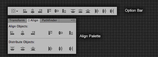
{{/paper-menu}}

If the yield block is present, we just exchange the default activator for the block that was passed in - meaning developers can craft their own activators! 💯


Dividers:

To show dividers, we would pass an object of arrays into content, rather than a single array. The object would look like:

{
  0: [{id: 1, name: "cheddar"}, {id: 5, name: "pepperjack}],
  1: [{id: 2, name: "sauce"}],
  vegetables: [{id:1 "zuchini"}, {id:4 "carrot"}]
} 

This would result in a menu that looks like:

------------------
Cheddar
Pepperjack
------------------
Sauce
----Vegetables----
Zuchini
Carrot

This means the selection property would still be bound to an object and behave as normal.


Positioning

I think the menu should always be positioned based on the activator. In my original POC here, the menu is positioned over the activator, 50% 50%.

We could setup a generic SCSS scheme where absolutely positioned elements can be positioned depending on a relatively positioned element, much like Adobe's Illustrator's Align Palette. I feel like this would come in handy in other places in the library, too?


Triggering Custom Actions

{{paper-menu prompt="Select a Price Band" 
             content=priceBandOptions 
             optionLabelPath="content.name" 
             optionActionPath="content.actionName" 
             selection=priceBand}}
{{/paper-menu}}

In the case that an optionActionPath is passed in, the {{#paper-menu}} will also bubble actions to its parent, based on the name at the optionActionPath.


Triggering Generic Actions

We can also have a generic action name that can be bubbled (with the new selection as the argument):

{{paper-menu prompt="Select a Price Band" 
             content=priceBandOptions 
             optionLabelPath="content.name" 
             action="priceBandSelectionDidChange"
             selection=priceBand}}
{{/paper-menu}}

Phew. Thoughts? It wouldn't be hard to implement all of the above based on my existing PR

@hhff
Copy link
Contributor

hhff commented Mar 9, 2015

After further thought - I feel like the Triggering Custom Actions part of this proposal is overkill. By bubbling a generic action with the item that was clicked, you can handle the action differently in the parent controller. Makes for a simpler API.

@miguelcobain
Copy link
Owner Author

I think people should also be able to explicitly declare a menu without an array.
Example: The app bar dropdown (video)
I think it's ok to explicitly define those 5 actions on my template and not in an array, right?

I think your suggestion is too specific for selects. That's why I suggested having another component for selects or whatever specific implementation we have for menus. Basically what I'm trying to say is that a paper-select would be defined as a custom paper-menu-container.

Our paper-select template would become something like:

  <span>{{selectedOptionLabel}}</span> {{!--defaults to prompt --}}
  {{!--
      insert whatever the specific activator for selects are here
      the activator sends the open action (or custom event, for example) to paper-menu-container
      and set isOpen to true
  --}}

  {{#paper-menu open=isOpen}}
    {{#each item in items}}
      {{#paper-menu-item action="select" param=item target=this}} {{!-- I hope that "this" is set to paper-menu-container here. Not sure. --}}
        {{item.name}}
      {{/paper-menu-item}}
    {{/each}}
  {{/paper-menu}}

Notice that the select component extends paper-menu-container, so we would automatically handle the action open, which is common to all menus.
However, when extending it we have the chance to define the select action and proceed with the normal selection behaviour when a paper-menu-item triggers it.
We're basically defining a selection abstraction on top of regular menus.

The thing is that menus don't always imply a selection. They can be just actions, for example.
That's why I think of generic menus first (which should be our first goal), and only then using them as a base to create selection/button/list menus. And I don't think the default should be a select behaviour.
If what I proposed is possible, we don't need a default! People just use what they need.

Want a select? Just write paper-select. Want a button menu? Just write paper-button-menu. Want a custom menu? You'll have to go a bit deeper and understand how a paper-menu-container works (basically requires your custom activator to send it the open action).


I really like your idea for separators! Makes a lot of sense. Users can group their items with computed properties if desired!


Regarding positioning, the specs say the the menu should be positioned based on the selected item, if there is one.

Menus are positioned over their emitting elements such that the currently selected menu item appears on top of the emitting element.

That's why we can't just center 50% 50% based on the activator every time.
Example to make it clear: not 50-50, also not 50-50.


We can have that generic action name as well, but we may deal with that later.

@miguelcobain
Copy link
Owner Author

I'm setting up a new branch to illustrate what I'm saying.

miguelcobain added a commit that referenced this issue Mar 9, 2015
@miguelcobain
Copy link
Owner Author

Please check 5de425c

It is basically a styleless implementation of selects.
What I like here is that paper-menu-container, paper-menu and paper-menu-item are reused. This way we can change all menu implementations easily!
Styles and logic are reused and clearly separated as well.

You can clone this branch, run ember server and see it in action.

@hhff
Copy link
Contributor

hhff commented Mar 9, 2015

I feel you! I like the idea that paper-select extends paper-menu-container. That makes a ton of sense. Let's do it!

This also means that nested menus will be possible (they aren't in my proposal).

If you setup Paper Menu & associated - I can port over the paper-select logic to it 😄


{{#paper-menu-item action="open"}} {{!-- this action will go to the user's controller --}}

{{!-- I hope that "this" is set to paper-menu-container here. Not sure. --}}

this is set to paper-menu in this case, not paper-menu-container. Actions will need to be bubbled through the paper-menu.

For that reason - I think {{paper-menu-item}} should have a generic action name.


The thing is that menus don't always imply a selection.

Agree'd. paper-select will, but paper-menu-container won't.


RE: Seperators

Rad! I'll set this logic up in paper-select. I'll also build them out generically so they can be used in a regular paper-menu-container.


RE: Positioning

Sure - that's why I'm proposing a flexible case (like Adobe Illustrator) that will be aligned to baselinse, as per the spec. Through generic css classes Developer can choose:

  • opens downward from top of activator
  • opens downward from bottom of activator
  • opens upward from top of activator
  • opens upward from bottom of activator

It will also allow horizontal absolute offsets so that:

  • The menu can be left aligned to the left or right of the activator.

@hhff
Copy link
Contributor

hhff commented Mar 9, 2015

Just saw your branch. I'm about to start work - but I'll have a play with it tonight!

@miguelcobain
Copy link
Owner Author

Just a quick note on positioning.
The problem here isn't aligning top, bottom, downward or upward. Menus need to be opened with the currently selected item on center. So, a menu is positioned differently depending on which option is currently selected. Check angular material demo.
This is a behavior you can't achieve with css only, I'm afraid.

@hhff
Copy link
Contributor

hhff commented Mar 9, 2015

Ah word. Not always though - as in the google docs menu or the top right actions menu.

I think it's really just selects that need to be opened with the current item on center - right?
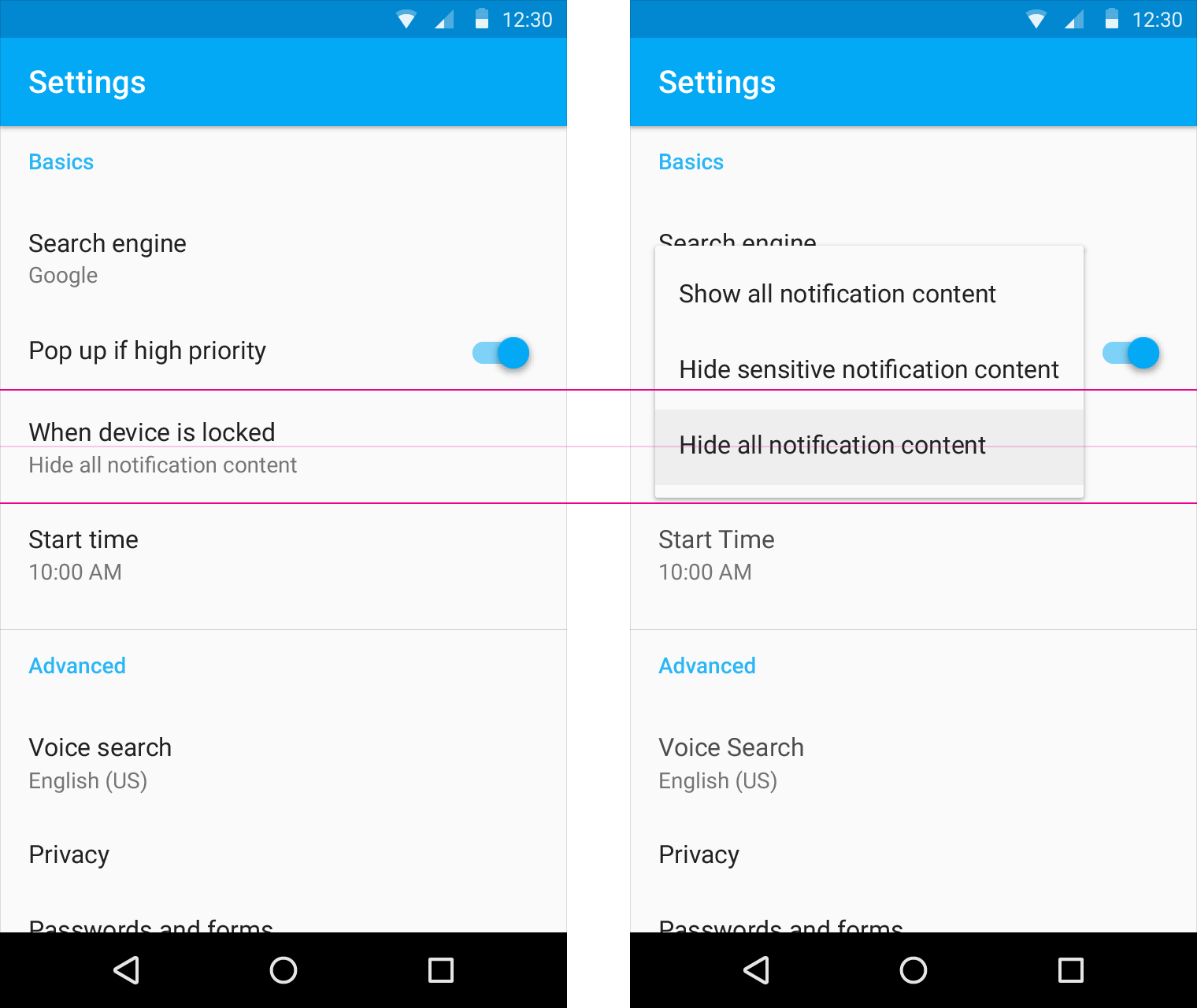
@miguelcobain
Copy link
Owner Author

This is a select: image
This is what I'm calling a list item select: image

So, at least these two cases have this behavior. Others originate from the activator, and that should be the default.
Another situation is what happens here, for example. In this case we didn't have enough space for centering on the currently selected option. In this case we place the menu inside the screen, regardless of the currently selected option.

I think that paper-menu or paper-menu-container component would need to be parameterizable somehow to influence the logic paper-menu opening/positioning.
We need to decide if the opening/closing logic will be on paper-menu or paper-menu-container. But maybe when we code that we find the better place for it.

@miguelcobain
Copy link
Owner Author

I imagine the following class hierarchy
menu components

We basically can differentiate even further:

  • paper-selectable - every kind of menus that have the notion of a selection (or probably a better name would be paper-menu-selectable)

The logic for paper-select and paper-list-item-select is the same. That also applies for any future menu that the purpose is to select something.

Not sure how the usage for paper-button-menu would be, though...

miguelcobain added a commit that referenced this issue Mar 9, 2015
@miguelcobain
Copy link
Owner Author

Adding paper-menu-selectable ended up making paper-select really slim.
Also, I can imagine devs creating their own implementations of a custom selectable without worrying too much about the selection logic.
@hhff, maybe you can start adding styles here, since you've already gone through that in the other PR?
I really like where this is going!

@hhff
Copy link
Contributor

hhff commented Mar 9, 2015

💯 I'm psyched

will jump back into this in a few hours :)

@miguelcobain
Copy link
Owner Author

Just noticed that App bar drop down and Cascading drop down are pretty much the same use case.

The only difference is the positioning of the menu.
With this in mind, we should have different positioning approaches:

  • center on selected option for paper-menu-selectables
  • relative to activator (bottom left/bottom right/top left/top right + )

@hhff
Copy link
Contributor

hhff commented Mar 9, 2015

das what im thinking!

@hhff
Copy link
Contributor

hhff commented Mar 10, 2015

did some work on this last night - still needs some more ❤️

@miguelcobain
Copy link
Owner Author

You can set up a PR or a public branch on your own fork.
This way we could all see the changes and comment on them.

@miguelcobain
Copy link
Owner Author

Ember Component's nearestOfType will be very helpful to make all these components communicate with each other.

@bj-mcduck
Copy link
Contributor

subscribing

@miguelcobain
Copy link
Owner Author

There is now a reasonable implementation of selects in https://github.com/miguelcobain/ember-paper/tree/material-menus

Animation and positioning is missing, but the structure and styling is there.

@SirZach
Copy link
Contributor

SirZach commented May 11, 2015

any foreseeable merge date for this PR?

@miguelcobain
Copy link
Owner Author

Well, this isn't a PR, but yes development is ongoing.

I don't have any estimate for now, but it is more that 50% done!

@SirZach
Copy link
Contributor

SirZach commented May 11, 2015

If you need help testing it let me know.

@msounthar
Copy link

As of now, this seems to be the only major component still left.Any update on when we can expect this will be great,Thanks!

@peec
Copy link
Contributor

peec commented Jul 27, 2015

@msounthar
I am working on this, menues are working 100%, select are also working - just need cleanups:
#140

@SirZach
Copy link
Contributor

SirZach commented Jul 27, 2015

@peec very exciting!

@msounthar
Copy link

Thanks @peec. Your autocomplete implementation is also great. Hoping to see it all as part of the release soon.

@jerel
Copy link
Contributor

jerel commented Jul 28, 2015

@peec your implementation (#140) looks amazing. It seems to handle dismissal and key events well (better than the Angular reference material)

@xomaczar
Copy link
Contributor

@miguelcobain is something missing from @peec implementation of menu component, which delaying your merge into the master?

@miguelcobain
Copy link
Owner Author

@xomaczar Currently the limitation is my time to review. That PR has a dependency on #138.
I hope to get this merged this week! Sorry for the delay.

@xomaczar
Copy link
Contributor

@miguelcobain No problem, I am used to seeing comments from you on a given issue/PR -- this one was stale for 2 weeks. 👍 You are doing a wonderful job.

@DanChadwick
Copy link
Contributor

Two questions:

  1. Any update on merging this?
  2. How does this relate to the Angular Menu Bar: https://material.angularjs.org/latest/demo/menuBar

I am rather keen on having an actual menu bar for application commands. Thank you for your efforts. I'm just starting with ember-paper, but am excited so far.

@elbeezi
Copy link
Contributor

elbeezi commented May 6, 2016

@miguelcobain @DanChadwick status for this particular issue? I know that menu hasn't been upgraded for 1.0 yet, wondering where to refer to for latest intentions, if i were to contribute :)

@knownasilya
Copy link
Contributor

Ping! Can I do nested menus in 1.0?

@knownasilya
Copy link
Contributor

Nested do seem to work, although I can't get onClick working in ember-twiddle https://github.com/knownasilya/ember-twiddle/blob/left-panel/app/templates/components/versions-menu.hbs#L10

@miguelcobain
Copy link
Owner Author

Menus are already implemented (not nested menus, though).

Sign up for free to join this conversation on GitHub. Already have an account? Sign in to comment
Projects
None yet
Development

No branches or pull requests