Skip to content
New issue

Have a question about this project? Sign up for a free GitHub account to open an issue and contact its maintainers and the community.

By clicking “Sign up for GitHub”, you agree to our terms of service and privacy statement. We’ll occasionally send you account related emails.

Already on GitHub? Sign in to your account

Mainmenu: Add customisable pager, add new change game dialog #8758

Closed
wants to merge 11 commits into from

Conversation

rubenwardy
Copy link
Member

@rubenwardy rubenwardy commented Aug 6, 2019

This is the first PR in a series to improve the main menu.

This should be merged as two commits.

The first commit splits up the tabview in such a way as to allow layouters. A layouter is an object with methods which are called to generate the formspec and handle events. The aim of this is to allow easy customisation of the navigation of the main menu. In future, games will be able to provide a Lua script at menu/init.lua to customise their main menu.

The second commit adds a new Change Game dialog, akin to celeron55's plans. This dialog will be the first thing that a new user sees when they start minetest, and will promote the use of ContentDB for installing games and such. Once a user has selected a game, future boots will load directly into that game. To get back to the change game dialog, they can select the layout's change game option.

image

image

To do

  • Add tab view layouters
  • Add change game dialog
  • Fix game selection only working on local tab
  • Change selected game setting name so that users with existing installs will see the dialog
  • Show change game dialog when menu_current_game is nil
  • Implement "play online", "content", and "settings"

How to test

WIP PR, testing later

@rubenwardy rubenwardy added WIP The PR is still being worked on by its author and not ready yet. Feature ✨ PRs that add or enhance a feature @ Mainmenu labels Aug 6, 2019
@rubenwardy rubenwardy mentioned this pull request Aug 6, 2019
9 tasks
@rubenwardy
Copy link
Member Author

rubenwardy commented Aug 6, 2019

Current Builtin Layouters

Please note: these currently look a little ugly because they're not themed very well. This is mostly to demonstrate layout and such rather than my graphic abilities

tabs

The current system

vertical

tabs are on the side, the original form of this PR. With formspec scaling, this would become the fullscreen version

image

image

mainmenu

image

image

@Wuzzy2
Copy link
Contributor

Wuzzy2 commented Aug 23, 2019

How do you select singleplayer games, though?

@ClobberXD
Copy link
Contributor

How do you select singleplayer games, though?

As far as I can tell, "New Game" to create the world, and "Load Game" to load an existing world.

@Wuzzy2
Copy link
Contributor

Wuzzy2 commented Aug 23, 2019

That's not what I meant … I mean, how do you select a different game? How do you go from Minetest Game to MineClone 2?

@LoneWolfHT
Copy link
Contributor

LoneWolfHT commented Aug 23, 2019

That's not what I meant … I mean, how do you select a different game? How do you go from Minetest Game to MineClone 2?

I think what they said can still be your answer, just with slightly different wording

@rubenwardy
Copy link
Member Author

rubenwardy commented Aug 23, 2019

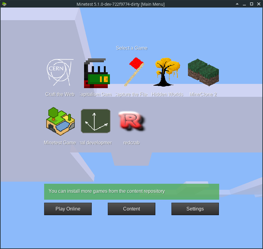
You click "Change Game" which then shows this screen:

This will also be the first screen you see when you launch Minetest

This is WIP, the layout and the contrast isn't as good as it could be.

@Wuzzy2
Copy link
Contributor

Wuzzy2 commented Jan 5, 2020

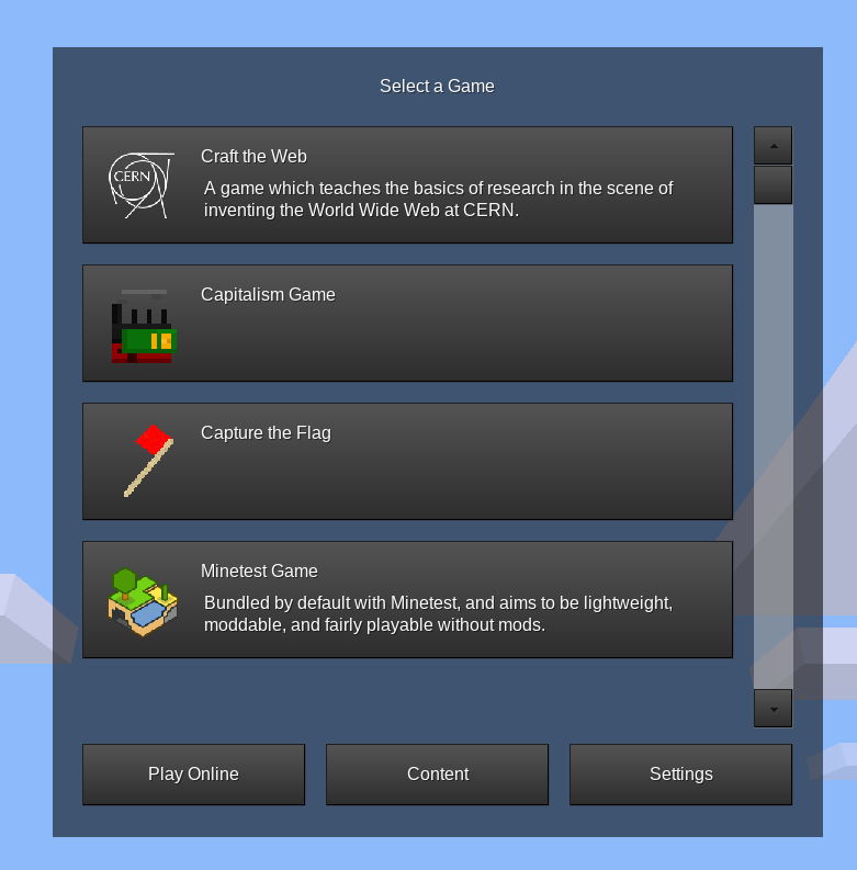
This is a much better layouting than our current one.

Random thoughts:

  • The “You can download new games …” message: I'm not sure if it's neccessary. Sure, for new users it might be useful but after that it becomes a distraction. Maybe it could be a message that only appears once?
  • Overall, all the menus need to become much more visually appalling, but I understand this is out of scope here. But I think it's important to keep in mind
  • Change game dialog: Names need to be readable in full. Also, I'm kind of missing a game description here, but it would be very appropriate for such a menu to show the game description. I'm not sure about the layout. Maybe it's better to show games in a scrollable list (w/ icon, title and description).
  • Main menu: Yes, 99% approval! This is the kind of main menu you know from most other games, so meets player's expectations. The only thing I'm missing is the “Quit” button. :-)
  • A huge problem in UI design we have IMO is that we only have one font size for everything. A title has the same font size as everything else. This makes it difficult to implement e.g. captions and menu titles. E.g. the caption for the game selection dialog is very small

I have actually cloned your repo just to test this stuff myself, but it does not look at all like in the screenshots. :-(

@rubenwardy
Copy link
Member Author

rubenwardy commented Jan 5, 2020

The “You can download new games …” message: I'm not sure if it's neccessary. Sure, for new users it might be useful but after that it becomes a distraction. Maybe it could be a message that only appears once?

This is only for the first load, yeah

Change game dialog: Names need to be readable in full. Also, I'm kind of missing a game description here, but it would be very appropriate for such a menu to show the game description. I'm not sure about the layout. Maybe it's better to show games in a scrollable list (w/ icon, title and description).

I'm planning to make it a vertical scrollable list with icon, title, and description - but I'm blocked by the scroll_container PR.

I have actually cloned your repo just to test this stuff myself, but it does not look at all like in the screenshots. :-(

You need to fiddle with the code in mainmenu/init.lua to see the different styles, and the actual redesign part of it (ie: the content) is not part of this PR, it will be in a later PR

@v-rob
Copy link
Member

v-rob commented Jan 5, 2020

  • Overall, all the menus need to become much more visually appalling

More appalling, or appealing? :)

  • A huge problem in UI design we have IMO is that we only have one font size for everything. A title has the same font size as everything else. This makes it difficult to implement e.g. captions and menu titles. E.g. the caption for the game selection dialog is very small

Setting font sizes is quite possible, as seen through the hypertext element, it's just a matter of adding that functionality to label. Maybe through style.

@LoneWolfHT
Copy link
Contributor

Maybe something like this, where all games are listed with their icons in that red bar, including the ones that haven't been downloaded (the icons for those will be greyscale'd to indicate that maybe)
image
Then down below in the blue area will be the game info, larger icon, name, short description, ect

@Wuzzy2
Copy link
Contributor

Wuzzy2 commented Jan 5, 2020

No, definitely do NOT replicate the old “game button bar” like in our current main menu. It takes 1,000,000 clicks everytime to click through the game I want, it's very annoying.

@LoneWolfHT
Copy link
Contributor

No, definitely do NOT replicate the old “game button bar” like in our current main menu. It takes 1,000,000 clicks everytime to click through the game I want, it's very annoying.

It should just take one click for the scrollbar I didn't show at the top of the red bar and another click to click on the game icon?

@v-rob
Copy link
Member

v-rob commented Jan 7, 2020

Yes, the button bar isn't that annoying. I think using scroll_container would make it perfectly fine. I personally don't like the idea of having to click on a button and then click on a game to get which one I want. Not everyone has a ton of games; I never have more than three at a time, so a scrollable button bar is only one click for people like me and two (or a scroll and a click) for everyone else. Clicking to get a new screen disrupts the mind, so it that will take even longer.

@rubenwardy
Copy link
Member Author

rubenwardy commented Feb 3, 2020

image

Need to fix the alignment, and I'm not happy with the game buttons

@LoneWolfHT
Copy link
Contributor

What would it look like if there were more games than space on the screen for them?

@rubenwardy
Copy link
Member Author

It will scroll vertically using a scroll bar. This pr depends on scroll containers

@LoneWolfHT
Copy link
Contributor

LoneWolfHT commented Feb 3, 2020

Might look better if there was a bit of a background in that case
Maybe something like the half-transparent grey one in this screenshot:
image

@Wuzzy2
Copy link
Contributor

Wuzzy2 commented Feb 3, 2020

It will scroll vertically using a scroll bar. This pr depends on scroll containers

In the meantime, you could use pages instead.

@Wuzzy2
Copy link
Contributor

Wuzzy2 commented Feb 3, 2020

One question:
What's the point of the left bar (“New Game”, “Load Game”, etc.) if you also did the good old main menu? Why have both and not one?

I would strongly prefer to use the classic main menu only. The tabs, or side buttons are pretty unique to Minetest, which is BAD because it will be a surprise to users.

You might argue that the point is to give games full freedom of designing their main menu but that could be actually a bad thing. Because then all games will just implement their own UI with their own, inconsistent conventions and the player must re-learn the UI from scratch every time.

@Wuzzy2
Copy link
Contributor

Wuzzy2 commented Feb 3, 2020

@rubenwardy: About the game selection: Maybe only put 1 game per line? That way, there's much more room for the description. I would also make it more obvious that the game buttons are clickable, by making them look like a real clickable button and not just an icon.

@rubenwardy
Copy link
Member Author

Im leaning towards making the main menu mode the default, as with some attention it would look the best.

I'll be looking into using a 9slice background for the buttons. Not sure how to combine that with the background

@rubenwardy
Copy link
Member Author

rubenwardy commented Feb 3, 2020

image

image

@rubenwardy
Copy link
Member Author

image

@rubenwardy
Copy link
Member Author

image

@Wuzzy2
Copy link
Contributor

Wuzzy2 commented Feb 3, 2020

I can't wait until this is in a testable state.

@Wuzzy2
Copy link
Contributor

Wuzzy2 commented Feb 3, 2020

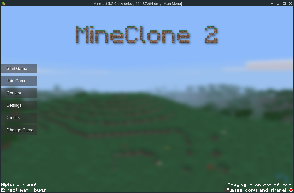
Oh, I noticed you removed the game name from the top left corner. Please bring it back.

The button “Play Online” is inconsitent with “Join Game”. In general, I'm not very happy with some of the menu names …

  • Start Game: Obvious
  • Join Game: Doesn't say it's online
  • Content: Content of what? Way too vague.
  • Settings: Obvious
  • Change Game: Obvious
  • Credits: Obvious

Also: Still no exit button. :P

@MoNTE48
Copy link
Contributor

MoNTE48 commented Feb 12, 2020

IMHO the interface in the first screenshot was simpler. I hate the back button. Back to the empty menu.
Switching between tabs now has 2 actions instead of one.

@cHyper-0815OL
Copy link

Are there any alpha versions of the new menu design out there for testing the new layout?

@v-rob v-rob mentioned this pull request Apr 25, 2020
@@ -31,6 +32,8 @@ void GUIBox::draw()
if (!IsVisible)
return;

// errorstream << "color: " << std::hex << m_color.color << std::endl;
Copy link
Contributor

Choose a reason for hiding this comment

The reason will be displayed to describe this comment to others. Learn more.

Throw this and the #include "log.h" out?

@Pevernow
Copy link
Contributor

It seems all right.
But I don't know why it was close?

@sfan5
Copy link
Member

sfan5 commented Oct 13, 2020

I believe rubenwardy currently has no time to work on this.

@rubenwardy
Copy link
Member Author

Correct. This was only ever a Work-In-Progress / Prototype PR, I don't have much time to spend on it currently so I closed it. It may resurface when I have time for it

@Tim79000
Copy link

I hope this gets added, but a few gripes, 1, will their be an option for showing games in a list without icons?
2, how in depth would game menu customization be?

Sign up for free to join this conversation on GitHub. Already have an account? Sign in to comment
Labels
Feature ✨ PRs that add or enhance a feature @ Mainmenu WIP The PR is still being worked on by its author and not ready yet.
Projects
None yet
Development

Successfully merging this pull request may close these issues.

None yet