Skip to content
New issue

Have a question about this project? Sign up for a free GitHub account to open an issue and contact its maintainers and the community.

By clicking “Sign up for GitHub”, you agree to our terms of service and privacy statement. We’ll occasionally send you account related emails.

Already on GitHub? Sign in to your account

Small column images don't get scaled up to 100% width on mobile #263

Closed
gopeter opened this issue May 17, 2016 · 16 comments
Closed

Small column images don't get scaled up to 100% width on mobile #263

gopeter opened this issue May 17, 2016 · 16 comments

Comments

@gopeter
Copy link

gopeter commented May 17, 2016

At first, thanks for this awesome tool!

I've found a little bug (or feature request?) that I wanted to report: If you insert images in a 4-column-layout, the images doesn't get scaled up on mobile devices because the width of the wrapping column is set. You can reproduce this easily inside the live editor:

That's how it should look even if there are 4 columns:

bildschirmfoto 2016-05-17 um 18 19 39

This is how it looks in a 4-column layout:

bildschirmfoto 2016-05-17 um 18 28 04

Is there any possibility to make this images scale up to 100% too?

Thanks and best regards! :)

@gopeter
Copy link
Author

gopeter commented May 17, 2016

OK, I think I got it: the surrounding table needs a width of 100% too. I'll try it out in an own component and will push a MR if it works across all devices

@mikwraae
Copy link

Did you find a solution to this problem?

@iRyusa
Copy link
Member

iRyusa commented Jul 28, 2016

I tried to fix it, but not so much success with it

@mikwraae
Copy link

Damn.. What about a work-around?

@blaugueux
Copy link
Contributor

blaugueux commented Oct 19, 2016

+1 I have the same issue.

@iRyusa
Copy link
Member

iRyusa commented Dec 6, 2016

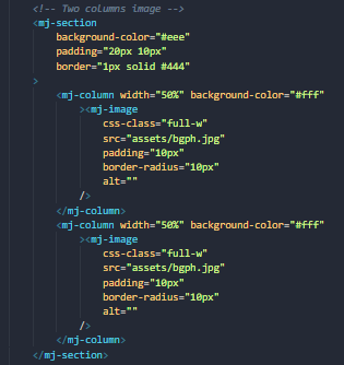
Ok so, here are the use case on MJ-Image that I have in mind :

  • Fixed width in dekstop, 100% in mobile
  • Fixed width in desktop, fixed width in mobile
  • 100% of column in desktop, fixed width in mobile ( useless ? )
  • 100% of column in desktop, 100% in mobile

As of today we cover only fixed width in both desktop/mobile. Problem is we should remain backward compatible with current template and it will be hard to keep all 4 behaviour inside a single component.

@blaugueux
Copy link
Contributor

We could use a specific parameter to manage both case FluidOnMobile?

@ngarnier ngarnier moved this from Mid Term to Long Term in MJML Roadmap Mar 1, 2017
@ngarnier ngarnier moved this from Long Term to Mid Term in MJML Roadmap Apr 6, 2017
@ngarnier ngarnier changed the title Images doesn't get scaled up to 100% width in multiple columns Small column images don't get scaled up to 100% width on mobile Sep 28, 2017
@Rick8rooke
Copy link

Rick8rooke commented Oct 12, 2017

Im having this problem with 2 mj-column inside a section. The surrounding table is not set to 100% width so the images do not scale up. Is there a fix for this yet?

<mj-section>
    <mj-column>
       <mj-image src="pic.jpg" />
    </mj-column>
    <mj-column>
       <mj-image src="pic.jpg" />
    </mj-column>
</mj-section>

@iRyusa
Copy link
Member

iRyusa commented Oct 12, 2017

Hi @Rick8rooke

As the issue is still opened : there's no fix for this atm. We're trying to working on this for MJML4 but no ETA yet.

@iRyusa
Copy link
Member

iRyusa commented Oct 17, 2017

Well, playing with max-width looks to be "the" solution here. Main issue is Outlook 2003 and older will totally fail at rendering larger image.

Anyone has an idea how to keep the Outlook 2000/2001/2003 for mj-image with max-width ?

@ngarnier ngarnier moved this from Mid Term to Near Term in MJML Roadmap Oct 27, 2017
@ngarnier ngarnier added this to the 4.1.0 milestone Jan 25, 2018
@ngarnier ngarnier moved this from Near Term to Soon to be released in MJML Roadmap Apr 25, 2018
kmcb777 added a commit that referenced this issue May 4, 2018
add fluid-on-mobile attribute on images, resolve #263
@Krulzor
Copy link

Krulzor commented Jun 5, 2018

So the max-with it's working as workaround for this?
Do you set img with width 100% and max-width 600?

Thank you!

@iRyusa
Copy link
Member

iRyusa commented Jun 5, 2018

Main issue is Outlook 2003 and older will totally fail at rendering larger image.

As mentioned here, they will overflow if larger than the column

@iRyusa iRyusa closed this as completed in d7dd513 Jun 28, 2018
MJML Roadmap automation moved this from Soon to be released to Released Jun 28, 2018
@ghost
Copy link

ghost commented Mar 10, 2022

Hello @iRyusa do you plan back to this issue? Outlook has only ~4% of the world market. Outlook 2003 and olders are only part of this.

Outlook also have got problems with a lot of things like for example: GIFs, which is used often in emails. If outlook clients want have correctly email view, they always can use link "show in browser".

@danterohlin
Copy link

danterohlin commented Dec 5, 2022

Is there any news on this?
My way is simply to add a css-class "full-w" to the mj-image element that has "full-w > table" as selector.
Example:
Skärmbild 2022-12-05 171424
Skärmbild 2022-12-05 171445

@iRyusa
Copy link
Member

iRyusa commented Dec 5, 2022

Check fluid-on-mobile attribute. It already does that for you.

@renchris
Copy link

renchris commented Jan 5, 2023

Is there an attribute like fluid-on-mobile but for mobile and desktop (just full width regardless of it being at the mobile or desktop breakpoint)?

Sign up for free to join this conversation on GitHub. Already have an account? Sign in to comment
Projects
No open projects
MJML Roadmap
  
Released
Development

No branches or pull requests

9 participants