[Tab Tray] Show longer titles (on 2 rows)..., to match current Fenix Home Screen #10683
Comments
|
@topotropic Do you have any comment or opinion around longer titles on tab names? For reference, here are examples of other browsers that display the tab’s page name and URLs in a list view: Samsung Internet UC Mini Yandex Browser |
|
For the sake of good comparison, I have updated the initial screenshots to match the sites on the other browsers's examples. |
|
Not really sure about three lines, but two lines is definitely an improvement over the current tab tray. |
|
Sorry I meant 3 lines including the url itself 😉 |
|
Back on this issue to stress the need of solving it, now that we can have a good experience of site previews in the nightly builds :) |

|
@topotropic for follow-up |
|
@betsymi @topotropic for follow-up |
|
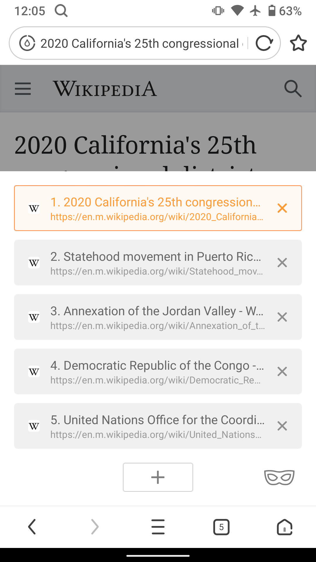
Following the PR for issue #11918 moved to nightly recently, it seems that the screenshots shown in the Tab Tray are now reflecting the current screen view of the page when the Tab Tray button was pressed, instead of the top of the page itself (maybe I'm wrong, but I think that before, the tops of pages would be shown in the Tab Tray). Which makes the pages less recognizable in the Tab Tray imho (the often proeminent title on the top the page being absent from the picture). |
Also update tab tray item layout according to specs posted in the issue.
Also update tab tray item layout according to specs posted in the issue.
Also update tab tray item layout according to specs posted in the issue.
|
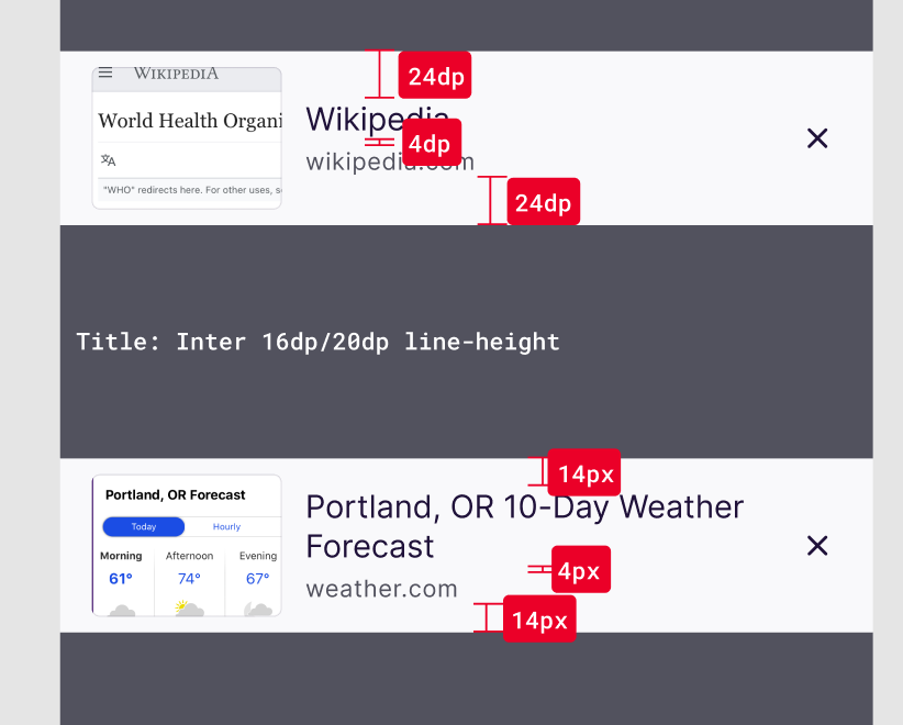
@topotropic Is it really necessary to have such a large gap between title and URL if the title has only one line? As I first saw the screenshot in the pull request for this issue I thought it's a bug in the implementation. I would expect that the spacing between the title and the URL doesn't depened on the number of lines for the title. The whole should be vertically centered so that it always looks good. What do you think? |
Also update tab tray item layout according to specs posted in the issue.
15886: For #10683: Show longer tab titles r=mcarare a=amkcpu

Also update tab tray item layout according to specs posted in the issue.
cc @mcarare because you reviewed the previous PR (#12684).

<img src="https://user-images.githubusercontent.com/46764284/96002370-55c79500-0e39-11eb-9abb-cd5ac901d687.png" width=300 />


### Pull Request checklist
<!-- Before submitting the PR, please address each item -->
- [ ] **Tests**: This PR includes thorough tests or an explanation of why it does not
- [x] **Screenshots**: This PR includes screenshots or GIFs of the changes made or an explanation of why it does not
- [ ] **Accessibility**: The code in this PR follows [accessibility best practices](https://github.com/mozilla-mobile/shared-docs/blob/master/android/accessibility_guide.md) or does not include any user facing features. In addition, it includes a screenshot of a successful [accessibility scan](https://play.google.com/store/apps/details?id=com.google.android.apps.accessibility.auditor&hl=en_US) to ensure no new defects are added to the product.

### To download an APK when reviewing a PR:
1. click on Show All Checks,
2. click Details next to "Taskcluster (pull_request)" after it appears and then finishes with a green checkmark,
3. click on the "Fenix - assemble" task, then click "Run Artifacts".
4. the APK links should be on the left side of the screen, named for each CPU architecture


Co-authored-by: amkcpu <amkcpu@outlook.com>
Also update tab tray item layout according to specs posted in the issue.
Thanks for your feedback. The assumption is that most sites have longer titles and the 1-liner will be a rare case (I'll keep an eye on that). And another point is to keep things starting in the same place for better scan-ability, so all titles have the same top margin, instead of aligning them to the URL. |
|
Ok, I tested it on various screen sizes and realized quickly that the assumption that most titles will span over two lines doesn't hold true. Thanks for the pointer @cadeyrn And apologies to this oversight @amkcpu – I'd appreciate it if you could update the implemented design to match the following (so center title and domain with 4dp spacing between them):
Thank you! |
Also update tab tray item layout according to specs posted in the issue.
Also update tab tray item layout according to specs posted in the issue.
|
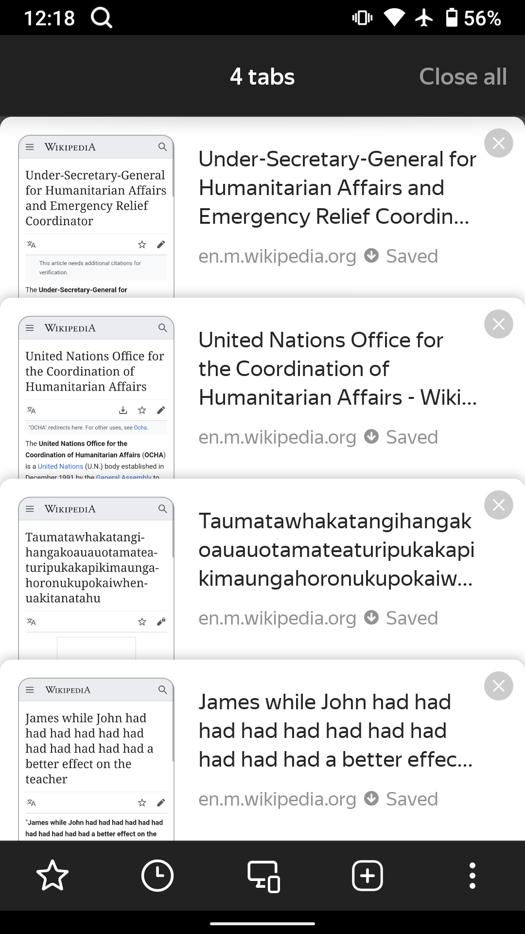
Hi, verified as fixed on the latest ►Screenshot |

Steps to reproduce
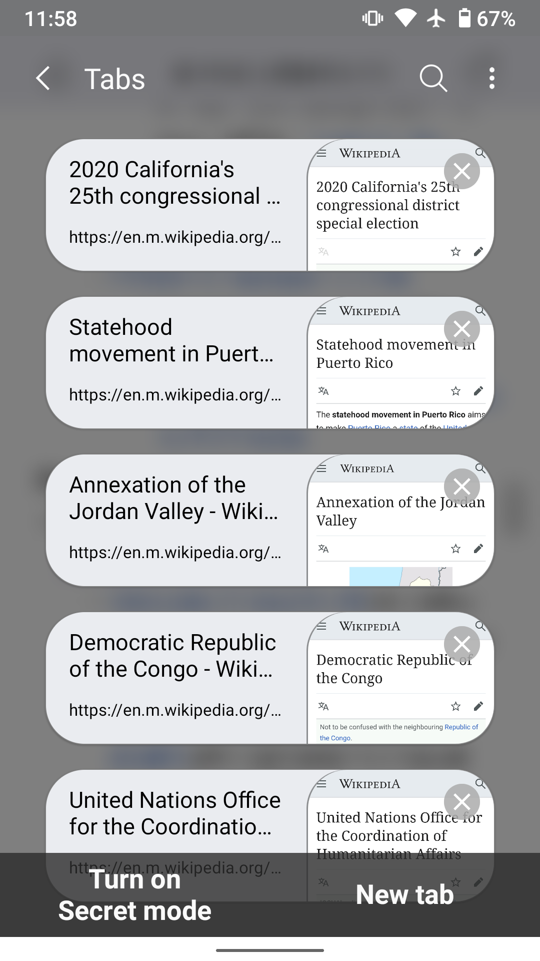
Activate new Tab Tray secret setting
Open some sites to feed the Tab Tray 😀
Move to Tab Tray
Expected behavior
Titles displayed for sites should be long enough to be meaningful (note that I don't rely on Site Previews where the expected information could not present/readable).
IMHO, the current Fenix Home Page as shown below shows a good example of what the information density should be:
Actual behavior
Titles displayed for sites are truncated on 1 row each, therefore they are not meaningful at all, as you can see below (same sites as above, in reverse order)
Device information
Thank you and pardon my French 😉
┆Issue is synchronized with this Jira Task
The text was updated successfully, but these errors were encountered: