Skip to content
New issue

Have a question about this project? Sign up for a free GitHub account to open an issue and contact its maintainers and the community.

By clicking “Sign up for GitHub”, you agree to our terms of service and privacy statement. We’ll occasionally send you account related emails.

Already on GitHub? Sign in to your account

New dashboard widgets have insufficient header contrast in dark mode #12219

Closed
sleepinggenius2 opened this issue Apr 11, 2023 · 7 comments · Fixed by #13753
Closed

New dashboard widgets have insufficient header contrast in dark mode #12219

sleepinggenius2 opened this issue Apr 11, 2023 · 7 comments · Fixed by #13753
Assignees
Labels
severity: low Does not significantly disrupt application functionality, or a workaround is available status: accepted This issue has been accepted for implementation topic: UI/UX User interface or user experience related work type: bug A confirmed report of unexpected behavior in the application

Comments

@sleepinggenius2
Copy link
Contributor

NetBox version

v3.5.0-dev

Python version

3.8

Steps to Reproduce

  1. Navigate to the dashboard screen with the new widgets.

Expected Behavior

The text and icon colors within the card header should maintain at least the same contrast ratio between light and dark modes. You can see this done within the search and log in buttons in the screenshots below.

Observed Behavior

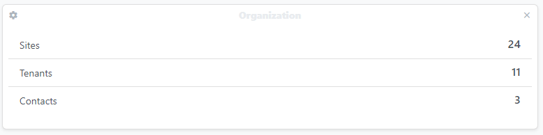
Currently, the colors used for the text and icons for card headers in dark mode do not provide much contrast against the background, making them very difficult to see. Screenshots below for reference.

beta-demo netbox dev_light
beta-demo netbox dev_dark

@sleepinggenius2 sleepinggenius2 added the type: bug A confirmed report of unexpected behavior in the application label Apr 11, 2023
@jeremystretch jeremystretch added status: needs owner This issue is tentatively accepted pending a volunteer committed to its implementation beta Concerns a bug/feature in a beta release labels Apr 11, 2023
@mmfreitas
Copy link

For the lighter colors this happens:
image

Could this be fixed the same way the #8088 was?

@jeremystretch
Copy link
Member

I don't think we'll be able to use foreground_color() directly, because it takes a discrete RGB value, whereas in this case we're working with named colors (e.g. blue vs. #0000ff). But we should be able to come up with a similar approach.

@sleepinggenius2
Copy link
Contributor Author

Just playing around with this a bit in Dev Tools, I changed the text-light class to text-black for the text and text-gray to text-black-50 for the icons and it certainly puts the contrast for the text at a good level. At 50% opacity though, the icons are still a little low on contrast, but at 100%, I think they have too much contrast (example on NetBox News widget). Those were the only out-of-the-box Bootstrap color classes that I saw available to try in the black space, but I haven't had a chance to look into the code to see if changing the classes like that between themes is even a viable option. Screenshot for reference:

beta-demo netbox dev_dark_black2

@jsenecal
Copy link
Contributor

Actually, just removing the class bg-secondary on the card-header div makes this much more readable and looks a bit more like the original ui:
image

The lighter version still needs it or at least the text and icons need a different class:
image

Same with text-dark applied:
image

If the proposed solution is accepted I can take ownership of this.

@jeremystretch
Copy link
Member

I much prefer keeping the card headers. IMO it looks better and the ability to select different colors helps provide visual clues.

@jsenecal
Copy link
Contributor

It wouldn't change the ability to change colors, only change the default gray looking one @jeremystretch .

@jeremystretch jeremystretch removed the beta Concerns a bug/feature in a beta release label May 2, 2023
@arthanson arthanson self-assigned this May 2, 2023
@arthanson arthanson removed the status: needs owner This issue is tentatively accepted pending a volunteer committed to its implementation label May 2, 2023
@jeremystretch jeremystretch added the status: accepted This issue has been accepted for implementation label May 4, 2023
@jsenecal jsenecal self-assigned this May 19, 2023
@jeremystretch jeremystretch added the severity: low Does not significantly disrupt application functionality, or a workaround is available label Jun 23, 2023
@jsenecal jsenecal added the topic: UI/UX User interface or user experience related work label Jul 31, 2023
@netbox-community netbox-community deleted a comment from heroin-moose Sep 5, 2023
@heroin-moose
Copy link

heroin-moose commented Sep 5, 2023

This is really an issue, because even for the demo site we have either:

  • Barely readable Default color in light mode (default color prior to v3.5)
  • Barely readable Gray color in dark mode (default color since v3.5)

jeremystretch added a commit that referenced this issue Sep 13, 2023
…trast (#13753)

* Fixes #12219: Ensure dashboard widget heading text has sufficient contrast in both light & dark modes

* Change foreground color for teal background
@github-actions github-actions bot locked as resolved and limited conversation to collaborators Dec 13, 2023
Sign up for free to subscribe to this conversation on GitHub. Already have an account? Sign in.
Labels
severity: low Does not significantly disrupt application functionality, or a workaround is available status: accepted This issue has been accepted for implementation topic: UI/UX User interface or user experience related work type: bug A confirmed report of unexpected behavior in the application
Projects
None yet
6 participants