Change the background #1892
Comments
|
You might want to pick the color from the android app? It`s already a light gray background. Not sure though what the nextcloud design guide says to this topic because i know there were lot efforts to reduce the different grey shades all over nextcloud. 🤷♂️ |
|
More often I use the Deck tool via laptop, my work focus on that. On the app it's perfect. I didn't even know there is a Nextcloud desing guide 😮 But I have installed the plugin which can change the background of the top element. I think that graying out the background or the ability to change it will have a positive effect on the view of the tool. The desing is really important. When I've started to use the Deck tool I had a little bit problem with organize and distinguishing between elements. Hope that you understand what I mean.
|

|
cc @nextcloud/designers I personally don't think that this fits the general Nextcloud design and it does not help to make the UI clearer. The shadow could probably be increased a bit although it seems to be a bit less obvious in your screenshot than it is on my 1.0.1 setup.
|

To be honest: I like this a lot :) |
|
Isn't this what the Custom CSS app is there for? With the app everyone can adjust these minor things as they want. |
Yes and no. We should also have some pleasing UI that most of the people will like and that is functional. In this case it would help to separate content from the back plane. It properly guides towards the stuff you are looking for. But this is something others also should have a saying on. |
It looks much better! The layout is clear, I can fast separate where there is the backgorund and tasks/notes. I can focus only on the tasks. 👌 It's going to be nice! Love it so much. |
It's great that there is such an application. It is definitely useful for users, just remember that not everyone likes to change in CSS. @stefan-niedermann I think that the standard Deck look should be improved so that it pleases the user's eye and at the same time is legible. |
Maybe the general Nexcloud design could be adjusted... See. We always have discussions with our users about using nextcloud or i.e. Trello. There is no real argument about the comparism of features or functionality, but about personal taste. Nextcloud looks boring or is not beautiful, Trello and Meistertask are fun.
IMHO it makes the UI clearer. It focuses the main area and seperates it visually from the navigation and the sidebar. I can imagine, that we would adopt this for the polls app, too. Mockup (sorry, I don't want to hijack this thread or start a discussion about general NC design): And to top it up and get some more "fancyness" top topup (with backdrop-filter, which is not supported by all browsers by default): Is it worth to talk about this in the server repo? Maybe https://github.com/nextcloud/unsplash has a chance to help here... |


|
Exactly! It makes more interesting and to be honest, the view is really clear and modern. My first rule, if something catches the eye, it means it's good and the user will stay longer. I could invest some time to make the look better (please don't be offended), I'm using some of solution at work (the corporate based on M$...) but personally I'm using Nextcloud and plugins for this. Believe me that the Deck organize the work and it's perfect tool for a lot of kinds of companies which are using Nextcloud and something like planner. If the planner tool is organized and the view is clear, it makes work more enjoyable. I remember that I had a dilemma which tool I should used. |
Nextcloud has thes variables in the standard stylesheet: Pretty sure the latter aren't meant for page backgrounds but for the background color of elements such as navigation items.
Anyway I consider this a nice improvement and added this to my custom css: |
|
Wow, who has the CSS to make the Deck only background to have A different color? Too bad it won't be considered to be added on the code. In as much as Employers love productive and functional tools, employees love Fun tools to use. |
|
@dartcafe How did you Add BG image, how can I add that Image in Deck alone, as well as in calendar alone. |
We are considering adjustments to the design, that is why this issue is still open and there is some discussion happening around that. I also see the issue with the low contrast of the cards and the background.
I don't agree with that. The additional boxes with shadows seem more like a visual distraction to me for the polls mockups. However the slightly dimmed background is looking more sane now thinking about it for a longer time, since there are a lot of elements (cards) that clearly need to be separated somehow. I'd like to get input from @jancborchardt here as well, since this is would be quite a breaking change compared to the current Nextcloud design unification. |
👍 |
This is your impression and for sure other people agree with that. And as we see, we also have another opinions. But in the end neither your nor my opinion is deciding, at least because we as the developers have a different perception of our apps. What customers/users say is relevant. So let's talk about user centricity. We should take their feedback serious and differentiate the target groups. I guess most nextcloud users are technically orientated and have another focus than non technically orientated users. And as long, as nextcloud understands itself as a collaboration platform, non technically users should get more focus. And that is the point, where I bring in my personal experience with these kind of users. Please take my mockup not that serious. It was just a quick throw, but it addresses the main critics about nextcloud I faced: "Boring UI", "Grey text on a white screen", "Must be made from men", "where can I ...". Any UX designer can do better than me and has better concepts for guiding the users eye. But only this little fancyness I added to polls (Background picture, blurry background, highlighting the main content) got a good spontaneous feedback from different users. So, let's not talk about shadows or boxes and design. We or better UX experts should talk about UX. And not only in the deck context... |
@compgeniuses Just CSS adjustments and some changes to the app structure. But I do not recomment to try this with other apps, because I am sure you will get unpredictable results. |
|
I certainly would appreciate it, if the background color could be changed individually to separate the different boards better or group different cards by means of the same background color ! regards, hitam4450 |
|
Different colors for headers could be a great addition, too.
Cusotm CSS: |

Would also say this isn’t too bad. The main issue is how this would look with other apps, since the only app where we really have a "background" like this is actually Collabora Online. And to force a card interface on everything just because it looks good for Kanban would be a bit short-sighted. So yeah, we could go for this in Deck and see how it flows. Also with the custom background, deck could be an experimentation ground. But your call @juliushaertl. @vollstock would you like to get involved more with design on the Deck app? We have a "Deck team" chat channel on our Talk instance where we could invite you with a guest account. :) |
|
Maybe that can help: https://github.com/nextcloud/polls/tree/backgroundExperimental |
Well, yes, in general. However I'm currently a little overwhelmed with juggling business and family in Corona times. So I wouldn't be able to contribute much atm. |
|
@vollstock Thanks for those CSS customizations, they have really come in handy. for now. Looking forward to a more colorful UI interface for the Deck app. This will definitely get even more users, and we can see about other more deck integrations. |
|
OK, let's give that a try with the light dimmed background as that indeed gives a nicer contrast:
Anyone up for providing a pull request for that since there is already some CSS flying around? Using the |

|
Using the Nextcloud app "custom css" I was able to insert some global css to get the job done. It would be great if these tweaks could be made in a settings UI for Deck but in the meantime, this will get the job done and apply it globally to all users.
|

|
We're clearly leaning towards trello's approach. I would just go all in and adopt trello's solution for this:
they also have list related actions beside the list title https://d2k1ftgv7pobq7.cloudfront.net/meta/u/res/images/create-a-board/2a6cc1bc24e782bb4dd4de4c3120054d/01.png |

|
I'm currently using a blurred picture background via custom CSS. Maybe this helps someone. But attention: Many browsers do not support It's not a perfect solution through and for production it should be done in another way with higher browser support, but hey - it is working!!! |

|
I've been using a custom CSS with a darker background for quite a while now and I can't go back!
.board-wrapper, .stack--header,
.overview-wrapper,
.dashboard-column>h3{
  background-color: var(--color-background-dark) !important;
  border: none !important;
}
.stack--header{
  box-shadow: 0 0 4px 2px var(--color-background-dark)
}
.stack--card-add{
  background: none !important;
}
.stack--card-add form{
  background: var(--color-main-background) !important;
}
.stack__header::before {
    background-image: linear-gradient(180deg, var(--color-background-dark) 3px, transparent 60%) !important;
}
I would say that this could at least be an option for people to select, or even, if we want to go further, we could let people choose any color or picture as a custom background for each board. |

|
If anyone is interested. We changed the styling options in polls to adopt the dashboard styling or chose an individual style as well. Example pictures, see nextcloud/polls#1985 |
( @marcoambrosini ) I wanted to add GitHub Projects as a reference too. What both have in common is they are clearly separating columns from the background as well as cards from their columns. I think it is a burden for novice users to learn the kanban workflow if the "columns with cards"-layout isn’t easily recognizable. With the current style of Deck there are lots of "+" (pluses) and "…" (dots) but its not intuitively glanceable were they belong to. Adding a light grey (or light but slightly tinted color derived from primary) plus bold headings for columns would solve several issues:
|

|
Here's my take on a minimal, mostly grey theme for the Decks app, using only existing CSS vars as colors. Also fixed some alignment stuff. You can apply this by using the Custom CSS app.
.board {
  padding-left: 14px !important;
}

.stack {
  background: var(--color-background-hover) !important;
  margin-bottom: 16px;
}

.stack__header::before {
  background-image: none !important;
}

.stack__header {
  background-color: var(--color-primary-light);
  align-items: center;
}

.stack__title {
  font-weight: bold;
}

.smooth-dnd-draggable-wrapper .stack:first-of-type {
  margin-left: 0;
}

.smooth-dnd-container.vertical {
  padding-top: 22px !important;
} |

|
Thank you for this! ^ However I recently upgraded to Nextcloud v28 and it seems the dividers between the lists is now gone. Edit. figured it out. had to add in margin-right: 6px; like so: |
|
To expand on @pReya theme above (thanks!), I prefer the flat look without shadowing. Also, a little color difference to the icons and highlighting the whole card on hover:
|

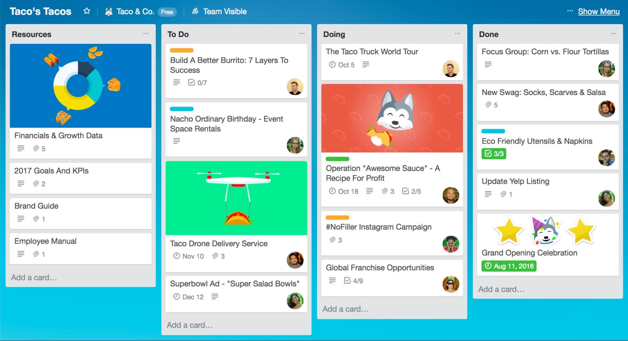
I know that it's cosmetic thing but it would be really nice if the possibility to change the background and color could be available. Of course there should be a parameter to set the opacity of the background.
As you can see on the below screen, the items/notes are merging with the white backround. Item/note card is white, the background is white as well.
On below example is presented that difference colors could make it more interesting and cleared for view. A light gray background and small shadow can do it better! 🥇
Please, keep going, your project organizes my work well.
The text was updated successfully, but these errors were encountered: