Skip to content
New issue

Have a question about this project? Sign up for a free GitHub account to open an issue and contact its maintainers and the community.

By clicking “Sign up for GitHub”, you agree to our terms of service and privacy statement. We’ll occasionally send you account related emails.

Already on GitHub? Sign in to your account

[WIP] Grid view for files #11050

Closed
wants to merge 3 commits into from
Closed

[WIP] Grid view for files #11050

wants to merge 3 commits into from

Conversation

jancborchardt
Copy link
Member

@jancborchardt jancborchardt commented Sep 4, 2018

This is a very basic start, moving Files from table to div layout. In the first step we should try to change as little as possible except the elements.

The old table layout also is present in other places:

  • Container of other views (favorites, recent etc)
  • File picker dialog (used in Mail for attachments, or personal settings for image)

TODO for the views:

  • File actions, sharing and favorite don’t show up, probably something broken in the fileactions.js?
  • In the grid view, favorite star should be left of the filename, share and fileactions on the right
  • We need bigger thumbnails for the grid view (but for list view should keep the small ones for quicker loading)
  • Selection view has some issues
  • Header and footer do not show up
  • Probably more, add your findings

From looking at it we really should focus on a minimally invasive change first, as outlined at #6 in the edited top post. cc @skjnldsv @danxuliu @juliushaertl @MorrisJobke

Current master:
screenshot from 2018-09-04 16-19-10

This branch currently (missing actions, header, stars and more)
screenshot from 2018-09-04 16-18-50

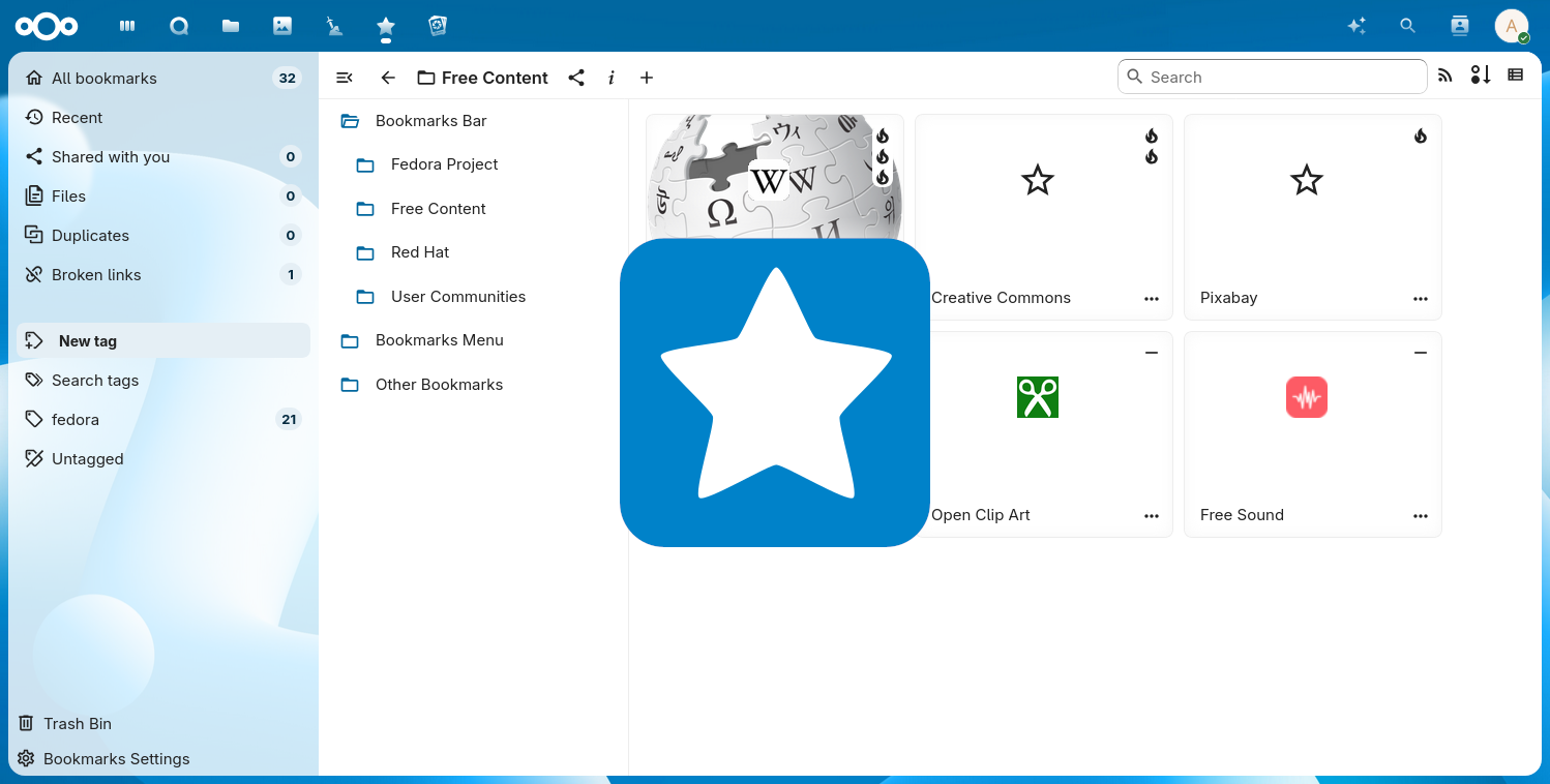
For the grid view design we can take the design of the Bookmarks app into account, where I worked with the maintainer on the design:

@jancborchardt jancborchardt added this to the Nextcloud 15 milestone Sep 4, 2018
@jancborchardt
Copy link
Member Author

And here’s the first quick and dirty grid view, with a toggle:

(TODOs added in the main post)
screenshot from 2018-09-04 17-11-02

@skjnldsv
Copy link
Member

skjnldsv commented Sep 5, 2018

The tiles are too small imho. :)
Depends on where we want to be heading, mozaique like file browsers? Or a grid like galleries?

@jancborchardt
Copy link
Member Author

For the first step we should simply look at Dropbox and Google Drive and use a similar size. :) We can always adjust later.

@sneibel
Copy link

sneibel commented Sep 9, 2018

Please show any images without cropping.

I know using square / quadratic thumbnails gives a better looking page, but for me, as a photographer, it is really necessary to see the full image in any overview or thumbnails page. Dropbox uses sqare thumbnails and because of that, Dropbox is useless for me and I think about using Nextcloud instead. And I am sure, many users will see their images without cropping to be able to compare them easily on one page and decide which one to choose/share/download. Thank you for considering that.

jancborchardt and others added 3 commits October 1, 2018 16:36
Signed-off-by: Jan-Christoph Borchardt <hey@jancborchardt.net>
…dview

Signed-off-by: John Molakvoæ (skjnldsv) <skjnldsv@protonmail.com>
@jancborchardt
Copy link
Member Author

Superseded by #11573

Sign up for free to join this conversation on GitHub. Already have an account? Sign in to comment
Labels
Projects
None yet
Development

Successfully merging this pull request may close these issues.

None yet

3 participants