Move task-body actions into Action dropdown #866
Conversation
Codecov Report
@@            Coverage Diff             @@
##           master     #866      +/-   ##
==========================================
+ Coverage   30.95%   31.11%   +0.15%
==========================================
  Files          25       25
  Lines        1305     1305
  Branches      235      235
==========================================
+ Hits          404      406       +2
+ Misses        766      764       -2
Partials 135 135 |
c7eaf23
to
23fe7ba
Compare
23fe7ba
to
ed29b17
Compare
ed29b17
to
d606fda
Compare
|
Updated my comment #866 (comment). PR is ready to be merged. |
db3a05f
to
192e02b
Compare
|
In my opinion, the date column should have a constant width. This would exclude shifting of the "Description" icon of the task, which for eg "Today" and "Yesterday" appears on the date field. It slightly disrupts the visualization.
Isn't that better? I know it takes up some space, but that's enough you can afford 😉.
|


I also thought about that, but the problem is that the width of the due date might vary with different languages. We would need to ellipsise the date in case this happens. I don't know if we want this. |
Yep, this is the issue without subgrid or table :( |
|
@raimund-schluessler This takes the minimum table width for the date and the maximum width for the word. I think that in another language they are not long enough to take up a lot of space. |
Let's do it like this. |
Signed-off-by: Raimund Schlüßler <raimund.schluessler@mailbox.org>
Signed-off-by: Raimund Schlüßler <raimund.schluessler@mailbox.org>
Signed-off-by: Raimund Schlüßler <raimund.schluessler@mailbox.org>
Remove after nextcloud-libraries/nextcloud-vue#641 is merged

Signed-off-by: Raimund Schlüßler <raimund.schluessler@mailbox.org>
192e02b
to
5ff4e51
Compare
Signed-off-by: Raimund Schlüßler <raimund.schluessler@mailbox.org>
|
I set a fixed width for the date now and put an ellipsis in case it overflows. Looks quite good. I realised the delete action might be clicked accidentally now that it is near the other actions, so I will add an undo option like we have it for the calendars list.
|
Signed-off-by: Raimund Schlüßler <raimund.schluessler@mailbox.org>
|
Looks like this now:
Task scheduled for deletion:
|


|
@raimund-schluessler It looks awesome now. Undoing task deletion - a very good idea 🏆. |
This PR moves the action icons / buttons into an Action component dropdown. This cleans up the task-body and allows to align the dates and icons better. We also have a delete action in the drop-down now which was requested as well at some point (and it makes sense, we have that for files as well).
It looks like this:

With menu open:
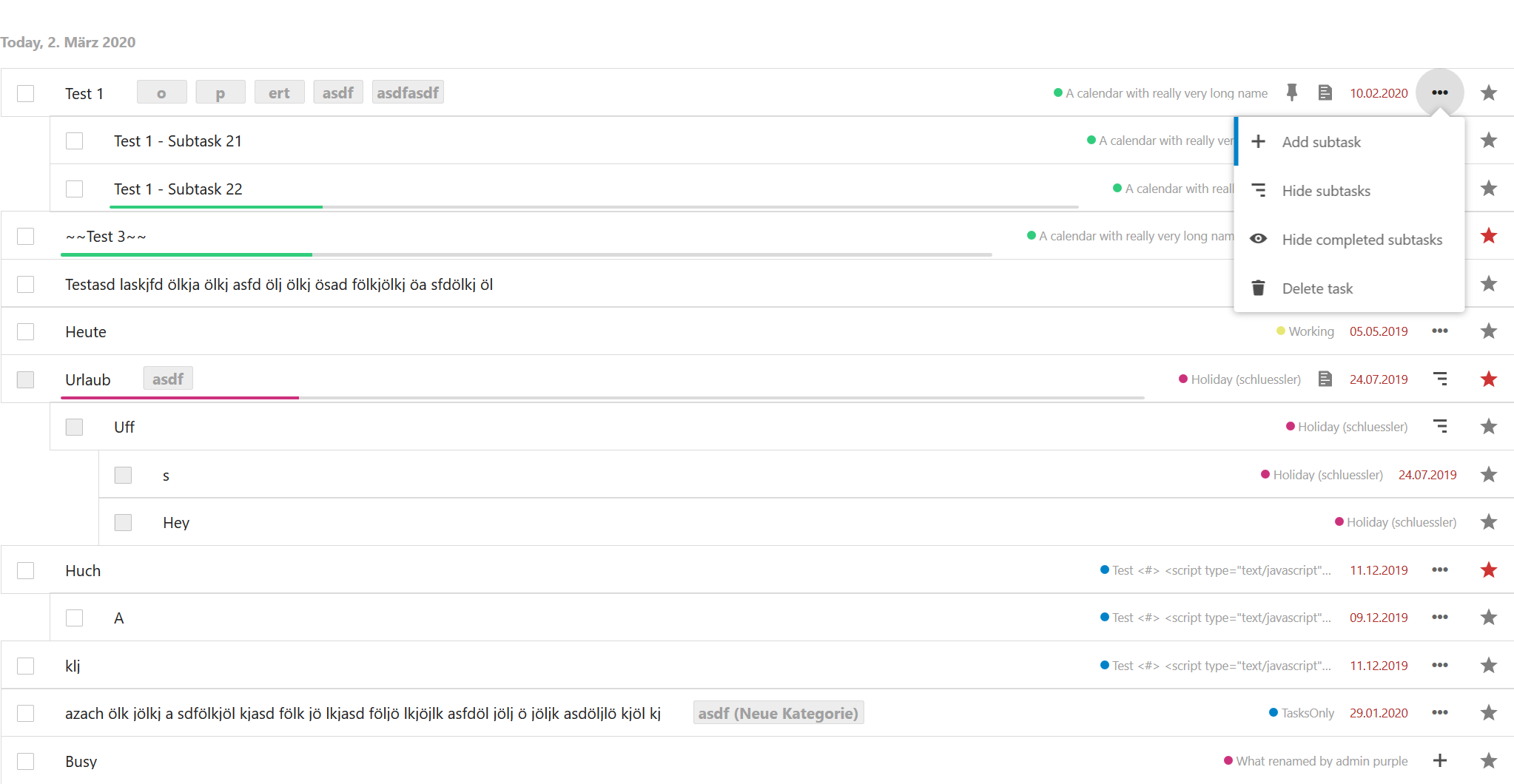
The alignment of the date is not perfect, since for some tasks there are no actions to show (tasks in read-only calendars without subtasks). And since the due dates might have different widths the position of the icons left of the due dates might also shift. But I think it is as good as it gets in terms of alignment. Also, it looks a bit cleaner now, since most of the icons are now in the action dropdown.
Closes #854.
Feedback would be welcome @jancborchardt @skjnldsv @nextcloud/designers.