Feedback Widget v7
- status : complete
- version : 7.x
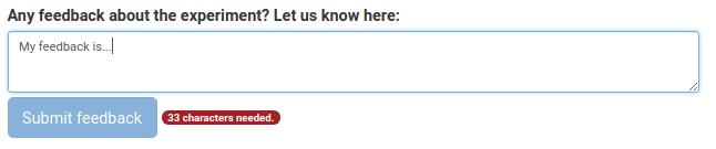
Feedback is a widget that displays a standard textarea form with validation for number of characters and words; optionally it adds a submit button.
- mainText: The main text above the textarea.
- hint: A smaller text after the main text providing extra information.
-
maxChars: The maximum number of characters allowed. Zero means no
limit. Default:
0 -
minChars: The minimum number of characters allowed. Zero means no
limit. Default:
0 -
maxWords: The maximum number of words allowed. Zero means no
limit. Default:
0 -
minWords: The maximum number of words allowed. Zero means no
limit. Default:
0 -
rows: The number of initial rows of the textarea. Default:
3 -
maxAttemptLength: The maximum number of characters for stored failed
attempts to submit a feedback (stored attempts can be longer than actual
transmitted feedback). Zero means no limit. Default:
0 - showSubmit: If TRUE, the submit button is shown.
- showCharCount: If TRUE, the character count is shown. Default: true
-
onsubmit: Options passed to
getValueswhen the submit button is pressed. Default:{ feedbackOnly: true, say: true, updateUI: true } -
setMsg: If TRUE, a
setmsg is sent instead of asaymsg. Default: FALSE.
- autoHit: The smaller sized label after the main text.
- submit: The text on the submit button (when displayed) before the feedback is sent.
- sent: The text on the submit button (when displayed) after the feedback is sent.
- counter: The text counting the characters or words left.
- label: The default main text label.
-
sendValues(opts): Sends a DATA message with label 'feedback' with feedback and paradata. Same options for
getValues, and in addition:- values: the values to send instead of the value in the textarea
- to: the recipient of the message. Default: SERVER.
-
showCounters: Shows the word and character counters.
-
hideCounters: Hides the word and character counters.
- feedbackOnly: If TRUE, returns just the feedback (default: FALSE),
-
keepBreaks: If TRUE, returns a value where all line breaks are
substituted with HTML
tags (default: FALSE) - verify: If TRUE, check if the feedback is valid (default: TRUE),
- reset: If TRUTHY and the feedback is valid, then it resets the feedback value before returning (default: FALSE),
- markAttempt: If TRUE, getting the value counts as an attempt (default: TRUE),
- updateUI: If TRUE, the UI (form, input, button) is updated. Default: FALSE.
- highlight: If TRUE, if feedback is not the valid, widget is is highlighted. Default: (updateUI || FALSE).
- send: If TRUE, and the email is valid, then it sends a data or set msg. Default: FALSE.
- sendAnyway: If TRUE, it sends a data or set msg regardless of the validity of the email. Default: FALSE.
- say: same as send, but deprecated.
- sayAnyway: same as sendAnyway, but deprecated.
If option feedbackOnly is TRUE:
{
    timeBegin: 12345, // Time from the first typed character in last attempt.
    feedback: 'This is my final feedback,
    attempts: [ 'I tried this before', 'and this' ],
    valid: true, //
    isCorrect: true // If markAttempt is TRUE
};
else the feedback string itself.
var root = W.getHeader() || document.body;
var feedback = node.widgets.append('Feedback', root, {
    maxWords: 200,
    showSubmit: false
});