Various CSS fixes #2497
Various CSS fixes #2497
Conversation
…lists to use list-group-flush

The descriptions are probably best not as a header, but still needs to be something more prominent than surrounding text.
This brings it into line with e.g. the new diary entry icon
|
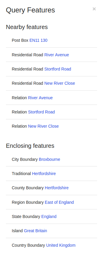
I've added one extra tweak in ffb671b to pull the query tool results back to the left as this change had, probably unintentionally, led to them being indented like this:
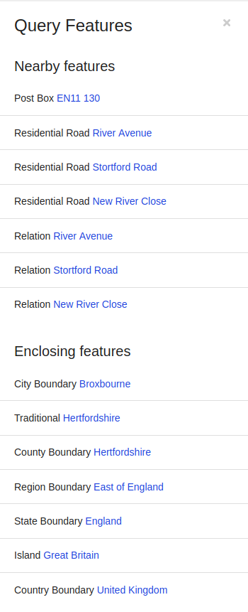
My change moves them back to the left in line with where they were before:
The geocoder search results could probably do with being converted to this new format as well... |
It was actually deliberate, but I'm not too fussed either way :-) I think the horizontal lines that stretch beyond the left-most character of the heading makes it look like the heading is part of one of the items. The above looks like a single list of four items with three dividers to me. The above looks more like two lists, with a header before each list and dividers between the list items. But like I say, there's perhaps bigger things to worry about! Just thought I should explain my reasoning. |
|
I think it was the lines sticking out beyond the text that I found odd - the actual indentation wasn't particularly unreasonable. Actually I think it's the combination - the lines sticking out would work if all the text was indented but having some text align with the lines and some not winds up looking a bit weird to me somehow? |
This PR fixes a few CSS issues that were highlighted in #2492 and others that I noticed while working on that. In summary: