Welcome message: fix display of 'close' button #2872
Conversation
|
Changing the width of the entire sidebar is a rather extreme way to resolve those bugs... Especially since we no idea how much longer the title that is overlapping the X might be in other languages... |
|
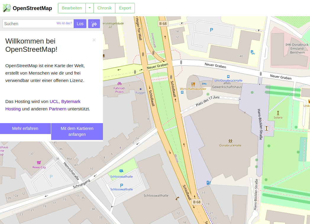
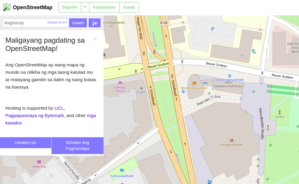
@tomhughes You are right. I reverted the sidebar width changes (although I still think they are a good idea). I added padding specifically for the header, as the cross is always 'behind' that line. English
German
Locale
Locale
|


|
The 2 blue buttons should have the same height. If one is on 2 lines (like for example in German), the other should have the same height (and vertically center the label) |
|
@dieterdreist I am willing to fix that, but the change is unrelated to the issues that the close button is behind the header text in some languages. The same goes for the blue Go button in the search bar in the |
|
Thanks for the PR, I reviewed it yesterday. This proposal is similar to #2537, and it has similar problems to #2537 , namely
Based on some of the discussions on #2537 by @bezdna , I've started work on replacing the h2+close button by a flex-box based solution. This in particular addresses the point made about the close button not being related to the header itself (and so it shouldn't appear within the h2 element). I ran out of time this week before finishing it, but you can see what I'm thinking at gravitystorm@b3fc5bc - feedback is welcome. I intend to use the same solution (maybe not the exact same partial, but at least the same divs and flexbox layout) for all of our current close buttons, so that they behave consistently. |
|
@gravitystorm The commit gravitystorm/openstreetmap-website@b3fc5bc looks good to fix the issue more consistently across all sidebar titles. A (draft) pull request would be nice to see that the problem is being worked on structurally. The close button has been invisible for some locales for a long time, which makes the site hard to use on mobile browsers (and some desktops). I will close this PR. |
Add padding to the welcome message, because the 'close' button overlaps with the title.
This fixes #2530, fixes #2850.
Reference #2537, https://twitter.com/EugenesDIYDen/status/1276804381132812291
Screenshots for many locales: #2872 (comment)