This is a template created based off my resume, and I wrote an article about it! You can read the article at owengretzinger.com/articles/html-resume.
I'm also copy and pasting the article into this readme, but there are some internal links that will be broken and it could be outdated.
In this article, I'll show you how to create an awesome web resume that can also be printed and used how you would expect a resume to be used. If you'd like to spare yourself from reading the whole thing, you can get code for the templete on GitHub. (Here's a preview of the template.)
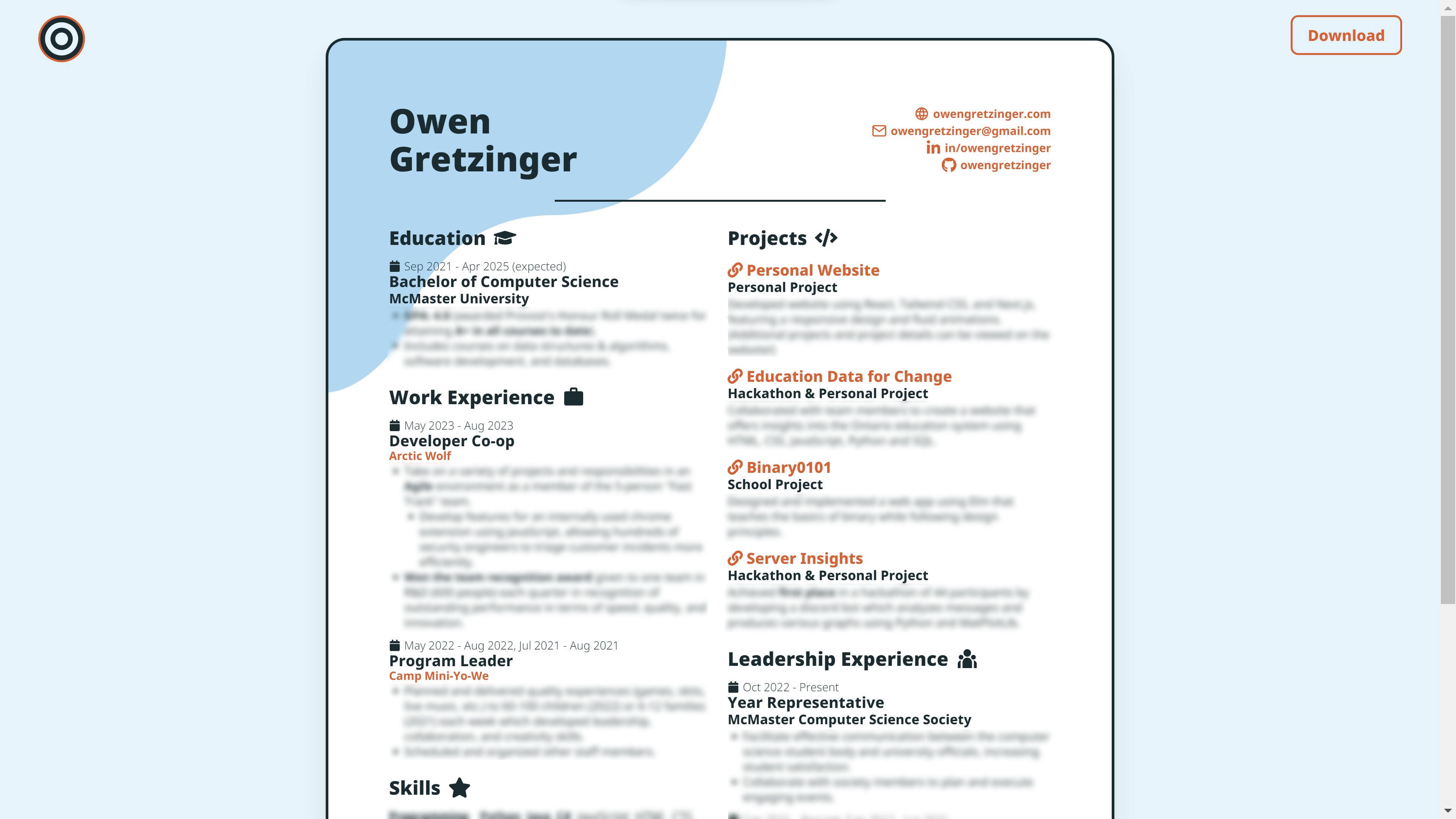
You can also check out my resume to see a finished product. Here are some screenshots from the time of writing:


After creating this website, I realized my resume was a bit outdated, so I wanted to make a new one that matched my website's theme.
I didn't want to use a document editor like Word because that's way too restricive, I didn't want to use Latex (like I did for my last resume) because that's too annoying and time consuming, and I didn't want to use Kickresume (even though all the LinkedIn influencers rave about it) because it still isn't flexible enough (especially the free version).
So I thought; if only I could create a resume using HTML, then I could make it however I want...
I use Tailwind CSS, but the concepts can be applied to other frameworks too.
The key to this is the existence of print-specific options. In Tailwind CSS, there's a super convenient print modifier (docs link). This way, we can make two column layouts collapse down on mobile, use cool styles (such as rounded edges), and have other things on the screen (such as buttons), then use the modifier to make the page the right size and hide those extra buttons when we print it.
There's an issue, though. No matter how hard you try to use print modifiers, there are still margins around the outside with these stamps when you try to print the page:

Luckily, there are two ways to solve this. When you are printing the page, you can open the "More settings" option and select "None" for "Margins".

The other solution works by default without messing with any settings. You can use the @page CSS rule to remove the margins:
@page {
	margin: 0;
}
That should get you started on creating your own resume, but you can also keep reading and I'll walk you through how I created the template I linked at the beginning!
You can check out the code for this website if you want to see exactly how I created my resume, but my project structure and all the code specific to my resume might make it harder to adapt my code for your own purposes. So, I've created a template for a static site using Tailwind CSS which you can use! You can find it on GitHub, or follow along with my explanations here.
For this tutorial, I'm assuming knowledge of Tailwind CSS.
To start, I created a project by following Tailwind's installation process. However, I changed a line in tailwind.congfig.js to content: ["./index.html"], and used npx tailwindcss -i input.css -o output.css --watch to build the CSS file. You can check the GitHub repository if you're having issues.

Now, we will create our resume inside index.html
<!DOCTYPE html>
<html lang="en">

<head>
  <meta charset="utf-8" />
  <link href="./output.css" rel="stylesheet">
  <link rel="icon" href="./favicon.ico" />
  <meta name="viewport" content="width=device-width, initial-scale=1" />
  <!-- other meta tags -->
</head>

<body>
  <div class="max-w-full min-h-screen bg-blue-100 px-4 print:px-0 py-10 print:py-0">
    <!-- resume page -->
    <div class="w-full sm:max-w-[52rem] lg:aspect-[8.5/11] bg-white rounded-3xl shadow-xl mx-auto
                print:w-[52rem] print:h-[100vh] print:aspect-[8.5/11] print:rounded-none print:shadow-none">
      <div class="w-full h-full flex flex-col p-4 md:p-16 print:p-16">

		<!-- resume content goes here -->

      </div>
    </div>
    <!-- resume page end -->
  </div>
</body>

</html>
In the body, the outer div is the background, and just adds some padding around the edges (but removes the padding when we print). The middle div is our actual page. I added some styles so that on big screens the page has an 8.5/11 aspect ratio which closely resembles how the page looks when it's actually printed, but on smaller screens the page is as long as it needs to be to fit all the content.
I also added rounding to the edges, a shadow, etc., but then removed those styles for printing.
A width of 52rem isn't particularly special, it was just a good size for me and worked well with some of the other things I had going on with my website. print:h-[100vh] ensures that the pdf is only one page (when you don't add that there's an empty second page).
The inner div adds padding around the edges and is a flex box to make sure our resume content fits inside the page how its supposed to.
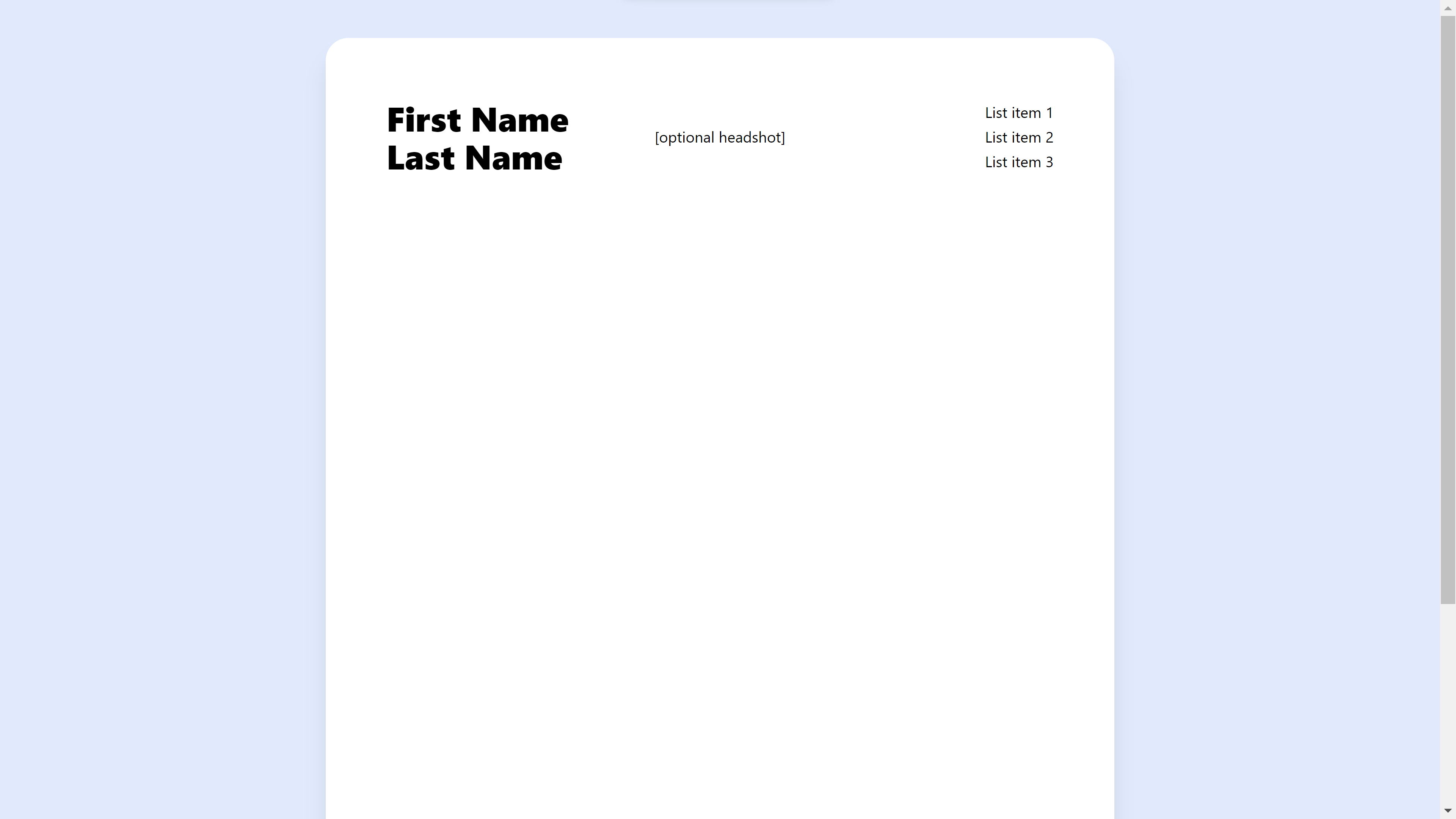
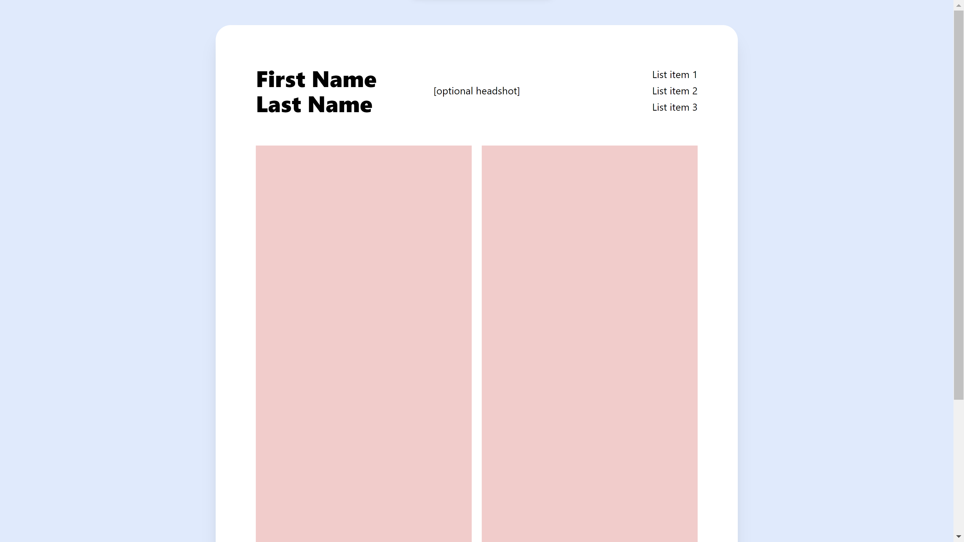
This is what we have so far (I made the background red to visualize the padding):

Now, let's add a header to the resume. Add the following where the "resume content goes here" comment was:
<!-- desktop header -->
<div class="w-full hidden sm:flex print:flex justify-between items-center">
  <h2 class="flex-1 text-4xl font-[1000]">First Name<br />Last Name</h2>
  <p>[optional headshot]</p>
  <div class="flex-1 flex sm:justify-end print:justify-end">
	<div class="flex flex-col w-fit sm:items-end print:items-end gap-[2px]">
	  <p>List item 1</p>
	  <p>List item 2</p>
	  <p>List item 3</p>
	</div>
  </div>
</div>
<!-- desktop header end -->
I put my name on the left and some social links on the right. You could add a headshot in the middle like the resume templates on Kickresume have, but I have heard recruiters say not to in order to avoid bias and for them to avoid bias accusations, so I removed the headshot from my resume. (Another idea is to have a version with a headshot and a version without, as it could add a nice touch if the person looking at your resume already knows who you are!)
Underneath, add the following:
<!-- mobile header -->
<div class="sm:hidden print:hidden">
  <div class="flex w-full max-w-full justify-between items-center gap-3">
	<h2 class="text-3xl [@media(min-width:400px)]:text-4xl font-[1000]">First Name<br />Last
	  Name</h2>
	<div>
	  <p>[optional headshot]</p>
	</div>
  </div>
</div>
<!-- mobile header end -->
The reason I made a separate mobile header is because on small screens, there's too much content to fit it all in a row. On mobile the links won't be in the header area, and we'll instead add the links underneath with the rest of the content in the next step (you can obviously switch up these details however you want):
<!-- body -->
<div class="w-full h-full flex flex-col sm:flex-row print:flex-row gap-4">
  <!-- left column -->
  <div class="flex-1 flex flex-col gap-4 bg-gray-100">
	<!-- links shown on mobile -->
	<div class="sm:hidden print:hidden">
	  <p>List item 1</p>
	  <p>List item 2</p>
	  <p>List item 3</p>
		</div>
	<!-- links shown on mobile end -->

	<!-- left column content here -->

  </div>
  <!-- left column end -->

  <!-- right column -->
  <div class="flex-1 flex flex-col gap-4 bg-gray-100">

	<!-- right column content here -->

  </div>
  <!-- right column end -->
</div>
<!-- body end -->
The outer div uses flex flex-col sm:flex-row so that on mobile screens it collapses down to one column.
I also put this between the header from earlier and the body from just now to add a gap:
<!-- gap between header and body -->
<span class="my-6"></span>
Lastly, make sure input.css looks like the following:
@tailwind base;
@tailwind components;
@tailwind utilities;

@page {
  margin: 0;
}
And we're done! Here's the final product (I made the columns red for the picture so that you can visualize them):
Now all you have to do is add some text bragging about yourself and (hopefully) get some interviews.
Here's the full code found on GitHub if you want to copy and paste (I also filled in the "content goes here" comments with some placeholder text):
<!-- index.html -->
<!DOCTYPE html>
<html lang="en">

<head>
  <meta charset="utf-8" />
  <link href="./output.css" rel="stylesheet">
  <link rel="icon" href="./favicon.ico" />
  <meta name="viewport" content="width=device-width, initial-scale=1" />
  <meta name="theme-color" content="#dbeafe" />
  <meta name="description"
    content="Template for creating a resume that is mobile-responsive, printable, ATS-friendly, and matches your theme using React and Tailwind CSS." />
  <title>HTML Resume Template</title>
</head>

<body>
  <div class="max-w-full min-h-screen bg-blue-100 px-4 print:px-0 py-10 print:py-0">
    <!-- resume page -->
    <div class="w-full sm:max-w-[52rem] lg:aspect-[8.5/11] bg-white rounded-3xl shadow-xl mx-auto
                print:w-[52rem] print:h-[100vh] print:aspect-[8.5/11] print:rounded-none print:shadow-none">
      <div class="w-full h-full flex flex-col p-4 md:p-16 print:p-16">
        <!-- desktop header -->
        <div class="w-full hidden sm:flex print:flex justify-between items-center">
          <h2 class="flex-1 text-4xl font-[1000]">First Name<br />Last Name</h2>
          <p>[optional headshot]</p>
          <div class="flex-1 flex sm:justify-end print:justify-end">
            <div class="flex flex-col w-fit sm:items-end print:items-end gap-[2px]">
              <p>List item 1</p>
              <p>List item 2</p>
              <p>List item 3</p>
            </div>
          </div>
        </div>
        <!-- desktop header end -->
        <!-- mobile header -->
        <div class="sm:hidden print:hidden">
          <div class="flex w-full max-w-full justify-between items-center gap-3">
            <h2 class="text-3xl [@media(min-width:400px)]:text-4xl font-[1000]">First Name<br />Last
              Name</h2>
            <div>
              <p>[optional headshot]</p>
            </div>
          </div>
        </div>
        <!-- mobile header end -->

        <!-- gap between header and body -->
        <span class="my-6"></span>

        <!-- body -->
        <div class="w-full h-full flex flex-col sm:flex-row print:flex-row gap-4">
          <!-- left column -->
          <div class="flex-1 flex flex-col gap-4 bg-gray-100">
            <!-- links shown on mobile -->
            <div class="sm:hidden print:hidden">
              <p>List item 1</p>
              <p>List item 2</p>
              <p>List item 3</p>
            </div>
            <!-- links shown on mobile end -->

            <!-- left column -->
            <p>First column</p>
            <p class="text-4xl my-12">...</p>
            <p>Template provided by <a href="https://owengretzinger.com" target="_blank" rel="noreferrer"
                class="text-blue-600 hover:underline print:underline">Owen Gretzinger</a> under <a
                href="https://unlicense.org/" target="_blank" rel="noreferrer"
                class="text-blue-600 hover:underline print:underline">the Unlicense</a>. I would
              love to connect with you on <a href="https://linkedin.com/in/owengretzinger" target="_blank"
                rel="noreferrer" class="text-blue-600 hover:underline print:underline">LinkedIn</a>!</p>
            <p>Also, feel free to check out <a href="https://owengretzinger.com/resume" target="_blank" rel="noreferrer"
                class="text-blue-600 hover:underline print:underline">my resume</a> (I created this
              template to share how I made it), see <a href="https://owengretzinger.com/articles/html-resume"
                target="_blank" rel="noreferrer" class="text-blue-600 hover:underline print:underline">the
                article I wrote about
                it</a> if that isn't where you came from already, and get the code on <a
                href="https://github.com/owengretzinger/html-resume-template" target="_blank" rel="noreferrer"
                class="text-blue-600 hover:underline print:underline">GitHub</a>!</p>
          </div>
          <!-- left column end -->

          <!-- right column -->
          <div class="flex-1 flex flex-col gap-4 bg-gray-100">
            <p>Second column</p>
            <p class="text-4xl my-12">...</p>
            <p>You can see how the resume looks on mobile (or other screen sizes) using inspect element, and how
              it looks when you export to pdf by doing Ctrl+P or Cmd+P!</p>
            <p>These grey boxes are just to visualize the columns. If they don't show up when you go to print and
              you're curious
              why, it's because you have to go to "More settings" and check the "Background graphics" box.</p>
            <p class="text-4xl my-12">...</p>
            <p class="text-4xl mb-12">...</p>
            <p>More content</p>
          </div>
          <!-- right column end -->
        </div>
        <!-- body end -->
      </div>
    </div>
    <!-- resume page end -->
  </div>
</body>

</html>
/* input.css */
@tailwind base;
@tailwind components;
@tailwind utilities;
@page {
margin: 0;
}// tailwind.config.js
/** @type {import('tailwindcss').Config} */
module.exports = {
content: ["./index.html"],
theme: {
extend: {},
},
plugins: [],
}
If you are interested in how I made other parts of my website, such as the sticky nav bar, turning markdown files into articles, links with cool underline animations, fade-in effects, etc., I would be happy to write articles explaining! Otherwise, let me know if you actually end up using my template. Also, message me on LinkedIn if you want me review your resume for free and tell you if I have any ideas on how to improve it!
Thanks for reading, I hope this was helpful!