Change layer highlight color #1308
Conversation
|
@davidlamhauge I really like this idea of having a more obvious highlight, while we're at it though, we should also make the base color for passive layers a bit darker as well, improving the contrast so the highlight really sticks out I feel the main problem has always been with low contrast, not quite much with color. One thing i'm worried though is that since each layer has a distinct color code that's been used for years, this could confuse veteran users (purple-blue for bitmaps, green for vectors, red for sound, yellow for camera, etc) If we were to maintain and improve the highlight I don't thing it's the right call to use "different" colors as a highlight, but rather to automatically have the "highlight" of an active layer be a lighter (value) version of the base color, however I feel this should either change a portion of the layer (particularly on the left side) or consider a full layer base color replacement. I also think what you implemented with the layer menu could become the base implementation for layer color tags. In after effects for example (click to see article) for example you have default color layers, and when you change the "color label" option the left side of the stack stays the same according to the theme except for a little box (where you click to select the color), but the layer color to the right (in the timeline) changes color to match appropriately. This is more of a customization thing to keep default color coding but allow users to change colors if they choose, per layer. In summary:
Thank you for taking the time to implement this, good work! 😃 |

@Jose-Moreno I more or less agree, it's true that the highlight or contrast could be better for the selected layer but I'm not sure that alone is enough. Putting that bit aside though, I based my timeline mockup on that too, that is that the highlight should represent a stronger version of the color beneath. The active layer has a black gradient which when you combine it with an "overlay" blending effect, creates a color that is more saturated, while the layer stack becomes darker because the background color there is darker. @davidlamhauge I think it's a good initiative to change the color but I don't think we need a UI to change this, let's just find a color that works, to keep it simple. |

|
Thanks for your comments @Jose-Moreno and @candyface . |
|
@davidlamhauge I think we can do a bit better than that, if saturate the colors a bit more than we can apply overlay blending which if you apply white over it would give something like this. 1.b To get this required 10 lines of code or so.. it's a very minor change that I think is fine and it would be a small step on the way to get to the new timeline, as the colors here are taken from my mockups. edit: 2.b |


|
@candyface Now that i see it I actually like the black gradient version(s) a bit more. Not only the "shadow" cast from top helps separate the active layer from the others, but also the feeling that a light source comes from above as if you "pressed" the layer might be more desirable. We also spoke before that selecting these layers will eventually lead to activating different "modes" visually (camera vs drawing vs sound/video clip handling) Besides I guess it's easier to see a hole than a bump when you're driving 😆 |
|
Looks fine @candyface . Like @Jose-Moreno , I like the black gradient better. |
|
Sure I can do that, then I'll make a PR with the small changes. 👍 edit: |
I have animated a lot with Pencil2D lately, and again and again I was drawing on the wrong layer.
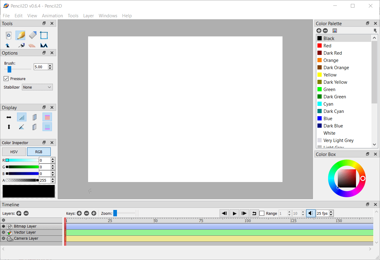
I really missed some indication on what layer I had selected, besides the small dot to the far left.
At one point I realized that there indeed was such an indication, in form of a faint white 'shadow' in the upper part of the layer. So I hard coded it to be green in stead of white, since I never use vector layers anyway. After that there were only a few times, where I made that mistake.
This PR has an context menu on the layer tracks, where you can select red, green or blue, besides the white overlay, that remain the default value.
My guess is that there are others with a similar story, who would like a more visible distinction of the active layer.