Simply use the bar() function:
- the
marker,color, andfillproperties of the bar plot could be changed using their respective parameters: markers and colors are described in their linked sections. - the
orientation(vertical by default) and relative barwidth(4/5by default) could also be changed using their respective parameters.
Here is an example:
import plotext as plt

pizzas = ["Sausage", "Pepperoni", "Mushrooms", "Cheese", "Chicken", "Beef"]
percentages = [14, 36, 11, 8, 7, 4]

plt.bar(pizzas, percentages)
plt.title("Most Favored Pizzas in the World")
plt.show()
or directly on terminal:
python3 -c "import plotext as plt; pizzas = ['Sausage', 'Pepperoni', 'Mushrooms', 'Cheese', 'Chicken', 'Beef']; percentages = [14, 36, 11, 8, 7, 4]; plt.bar(pizzas, percentages); plt.title('Most Favored Pizzas in the World'); plt.show()"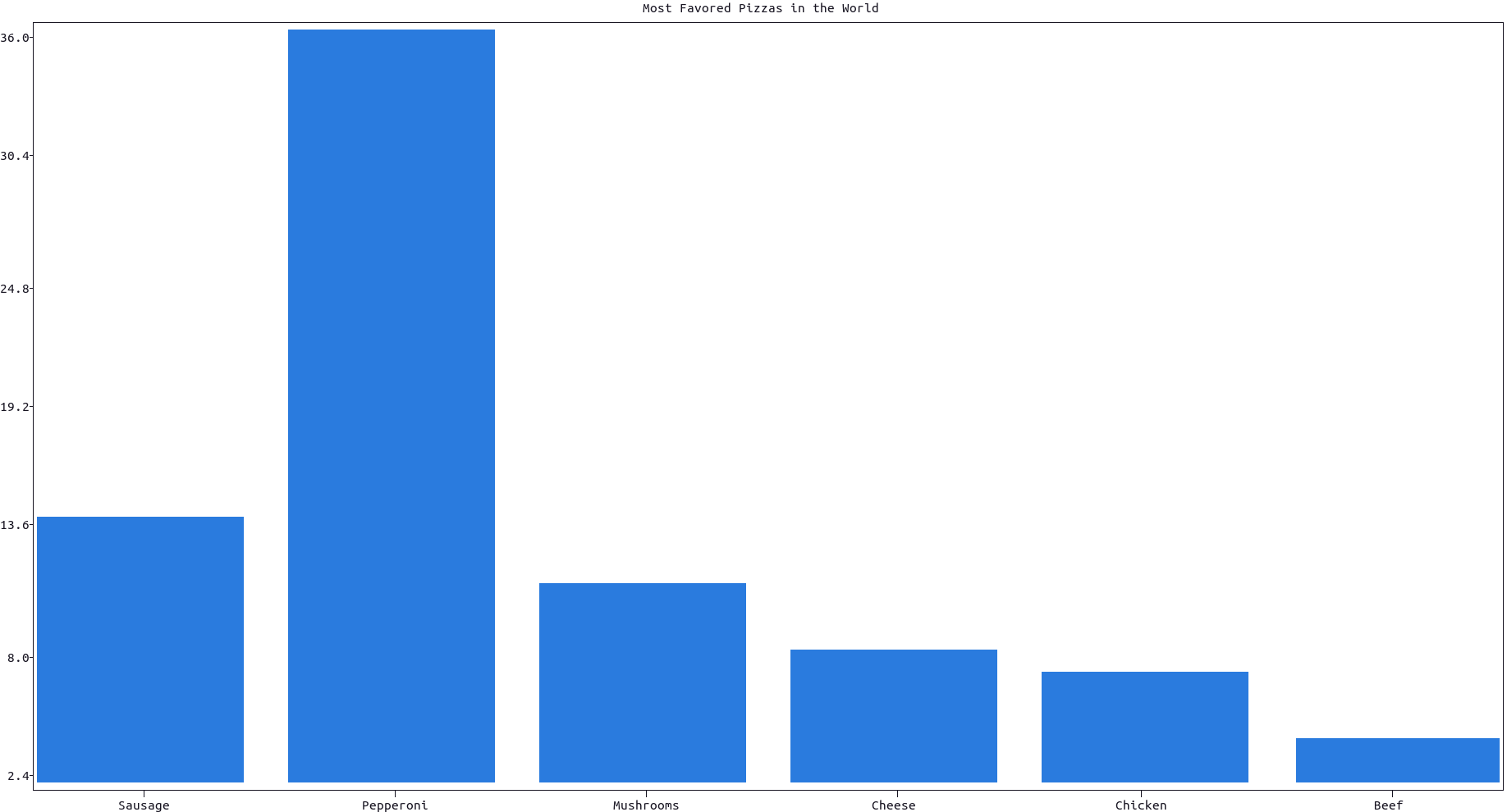
More documentation can be accessed with doc.bar().
Simply set orientation = "horizontal" in the bar() function. Here is an example:
import plotext as plt

pizzas = ["Sausage", "Pepperoni", "Mushrooms", "Cheese", "Chicken", "Beef"]
percentages = [14, 36, 11, 8, 7, 4]

plt.bar(pizzas, percentages, orientation = "horizontal", width = 3 / 5) # or in short orientation = 'h'
plt.title("Most Favoured Pizzas in the World")
plt.show()
or directly on terminal:
python3 -c "import plotext as plt; pizzas = ['Sausage', 'Pepperoni', 'Mushrooms', 'Cheese', 'Chicken', 'Beef']; percentages = [14, 36, 11, 8, 7, 4]; plt.bar(pizzas, percentages, orientation = 'h', width = 3 / 5); plt.title('Most Favored Pizzas in the World'); plt.show()"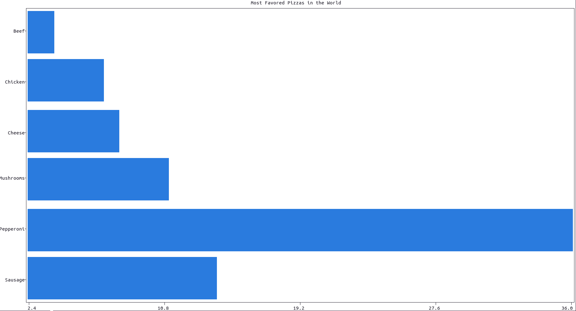
More documentation can be accessed with doc.bar().
To create a simpler and sketchier version of the same bar plot, use the function simple_bar() instead:
- the advantage of this bar plot is that it produces a very predictable output in terms of bar width (a single character),
- the disadvantages are that its only orientation is horizontal, it cannot be used inside a matrix of subplots and any setting method which follows will not have any effect (like
xlabel(),plotsize()and so on),
Here is an example:The default value for quintuples is False
import plotext as plt

pizzas = ["Sausage", "Pepperoni", "Mushrooms", "Cheese", "Chicken", "Beef"]
percentages = [14, 36, 11, 8, 7, 4]

plt.simple_bar(pizzas, percentages, width = 100, title = 'Most Favored Pizzas in the World')
plt.show()
or directly on terminal:
python3 -c "import plotext as plt; pizzas = ['Sausage', 'Pepperoni', 'Mushrooms', 'Cheese', 'Chicken', 'Beef']; percentages = [14, 36, 11, 8, 7, 4]; plt.simple_bar(pizzas, percentages, width = 100, title = 'Most Favored Pizzas in the World'); plt.show()"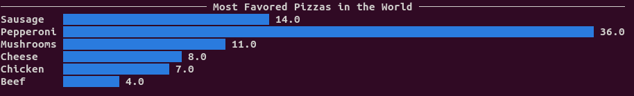
More documentation can be accessed with doc.simple_bar().
To plot multiple offsetted bars, each group with the same label, use the function plt.multiple_bar(), as in this example:
import plotext as plt

pizzas = ["Sausage", "Pepperoni", "Mushrooms", "Cheese", "Chicken", "Beef"]
male_percentages = [14, 36, 11, 8, 7, 4]
female_percentages = [12, 20, 35, 15, 2, 1]

plt.multiple_bar(pizzas, [male_percentages, female_percentages], labels = ["men", "women"])
plt.title("Most Favored Pizzas in the World by Gender")
plt.show()
or directly on terminal:
python3 -c "import plotext as plt; pizzas = ['Sausage', 'Pepperoni', 'Mushrooms', 'Cheese', 'Chicken', 'Beef']; male_percentages = [14, 36, 11, 8, 7, 4]; female_percentages = [12, 20, 35, 15, 2, 1]; plt.multiple_bar(pizzas, [male_percentages, female_percentages], labels = ['men', 'women']); plt.title('Most Favored Pizzas in the World by Gender'); plt.show()"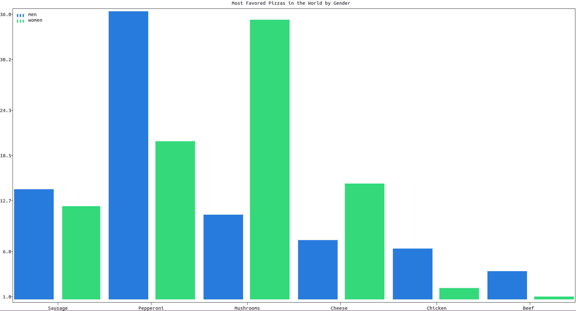
More documentation can be accessed with doc.multiple_bar().
To produce a simpler and sketchier version of the same bar plot, use the function simple_multiple_bar() instead, as in this example:
import plotext as plt
pizzas = ['Sausage', 'Pepperoni', 'Mushrooms', 'Cheese', 'Chicken', 'Beef']
male_percentages = [14, 36, 11, 8, 7, 4]
female_percentages = [12, 20, 35, 15, 2, 1]
plt.simple_multiple_bar(pizzas, [male_percentages, female_percentages], width = 100, labels = ['men', 'women'], title = 'Most Favored Pizzas in the World by Gender')
plt.show()
or directly on terminal:
python3 -c "import plotext as plt; pizzas = ['Sausage', 'Pepperoni', 'Mushrooms', 'Cheese', 'Chicken', 'Beef']; male_percentages = [14, 36, 11, 8, 7, 4]; female_percentages = [12, 20, 35, 15, 2, 1]; plt.simple_multiple_bar(pizzas, [male_percentages, female_percentages], width = 100, labels = ['men', 'women'], title = 'Most Favored Pizzas in the World by Gender'); plt.show()"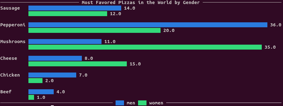
Note that this kind of plot has the same disadvantages as simple_bar(), as discussed in this section. More documentation can be accessed with doc.simple_multiple_bar().
To plot multiple bars on top of each other, each group with the same label, use the function plt.stacked_bar() as in this example:
import plotext as plt

pizzas = ["Sausage", "Pepperoni", "Mushrooms", "Cheese", "Chicken", "Beef"]
male_percentages = [14, 36, 11, 8, 7, 4]
female_percentages = [12, 20, 35, 15, 2, 1]

plt.stacked_bar(pizzas, [male_percentages, female_percentages], labels = ["men", "women"])
plt.title("Most Favored Pizzas in the World by Gender")
plt.show()
or directly on terminal:
python3 -c "import plotext as plt; pizzas = ['Sausage', 'Pepperoni', 'Mushrooms', 'Cheese', 'Chicken', 'Beef']; male_percentages = [14, 36, 11, 8, 7, 4]; female_percentages = [12, 20, 35, 15, 2, 1]; plt.stacked_bar(pizzas, [male_percentages, female_percentages], labels = ['men', 'women']); plt.title('Most Favored Pizzas in the World by Gender'); plt.show()"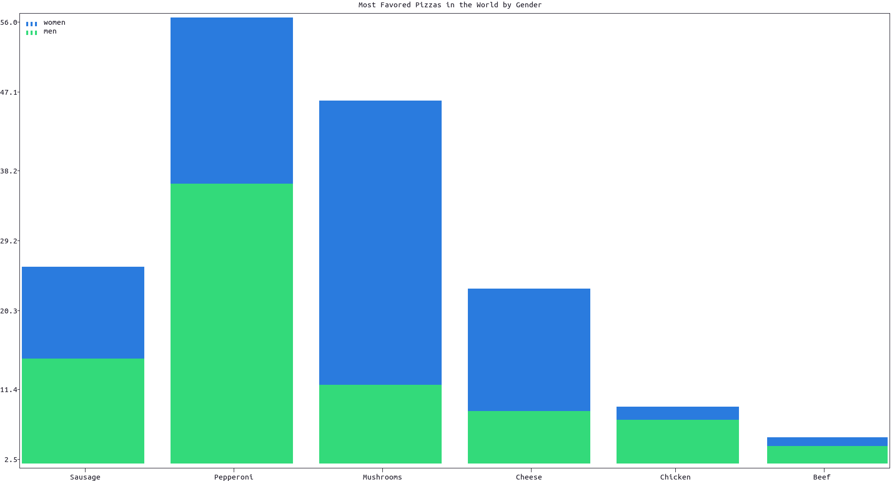
The full documentation of the stacked_bar() function can be accessed with doc.stacked_bar().
To produce a simpler and sketchier version of the same bar plot, use the function simple_stacked_bar() instead, as in this example:
import plotext as plt
pizzas = ['Sausage', 'Pepperoni', 'Mushrooms', 'Cheese', 'Chicken', 'Beef']
male_percentages = [14, 36, 11, 8, 7, 4]
female_percentages = [12, 20, 35, 15, 2, 1]
plt.simple_stacked_bar(pizzas, [male_percentages, female_percentages], width = 100, labels = ['men', 'women'], title = 'Most Favored Pizzas in the World by Gender')
plt.show()
or directly on terminal:
python3 -c "import plotext as plt; pizzas = ['Sausage', 'Pepperoni', 'Mushrooms', 'Cheese', 'Chicken', 'Beef']; male_percentages = [14, 36, 11, 8, 7, 4]; female_percentages = [12, 20, 35, 15, 2, 1]; plt.simple_stacked_bar(pizzas, [male_percentages, female_percentages], width = 100, labels = ['men', 'women'], title = 'Most Favored Pizzas in the World by Gender'); plt.show()"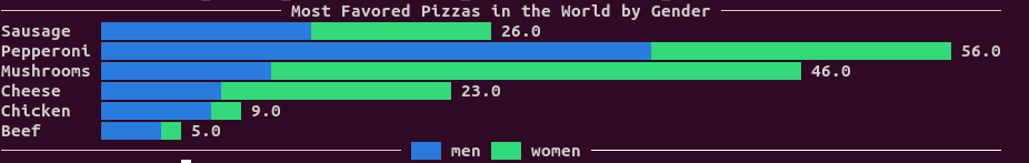
Note that this kind of plot has the same disadvantages as simple_bar(), as discussed in this section. More documentation can be accessed with doc.simple_stacked_bar().
Box plot is common and useful in statistics plot.
plot.box function supports two types of input data. The first form involves providing the raw data to calculate the distribution(quintuples=False, default). Alternatively, one can directly provide the pre-calculated metrics, namely the minimum, first quartile, median, third quartile, and maximum(quintuples=True).
the first form:
import plotext as plt

labels = ["apple", "orange", "pear", "banana"]
data = [
    [1,2,3,5,10,8],
    [4,9,6,12,20,13],
    [1,2,3,4,5,6],
    [3,9,12,16,9,8,3,7,2]]

plt.box(labels, data, width=0.3)
plt.title("The weight of the fruit")
plt.show()
or directly on terminal:
python3 -c 'import plotext as plt;labels = ["apple", "orange", "pear", "banana"];data = [[1,2,3,5,10,8],[4,9,6,12,20,13],[1,2,3,4,5,6],[3,9,12,16,9,8,3,7,2]];plt.box(labels, data, width=0.3);plt.title("The weight of the fruit");plt.show()'
the second form:
import plotext as plt

labels = ["apple", "orange", "pear", "banana"]
data = [
    # max, q75, q50, q25, min
    [10, 7, 5, 3, 1.5],
    [19, 12.3, 9, 7, 4],
    [15, 14, 11, 9, 8],
    [13, 12, 11, 10, 6]]

plt.box(labels, data, width=0.3, quintuples=True)
plt.title("The weight of the fruit")
plt.show()
or directly on terminal:
python3 -c 'import plotext as plt;labels = ["apple", "orange", "pear", "banana"];data = [[10, 7, 5, 3, 1.5],[19, 12.3, 9, 7, 4],[15, 14, 11, 9, 8],[13, 12, 11, 10, 6]];plt.box(labels, data, width=0.3, quintuples=True);plt.title("The weight of the fruit");plt.show()'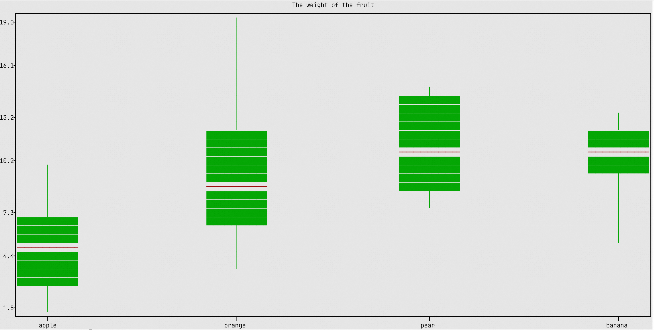 This feature may require further development.
Main Guide, Bar Plots
This feature may require further development.
Main Guide, Bar Plots
For a histogram plot use the function plt.hist(). Here is an example:
import plotext as plt
import random

l = 7 * 10 ** 4
data1 = [random.gauss(0, 1) for el in range(10 * l)]
data2 = [random.gauss(3, 1) for el in range(6 * l)]
data3 = [random.gauss(6, 1) for el in range(4 * l)]

bins = 60
plt.hist(data1, bins, label = "mean 0")
plt.hist(data2, bins, label = "mean 3")
plt.hist(data3, bins, label = "mean 6")

plt.title("Histogram Plot")
plt.show()
or directly on terminal:
python3 -c "import plotext as plt; import random; l = 7 * 10 ** 4; data1 = [random.gauss(0, 1) for el in range(10 * l)]; data2 = [random.gauss(3, 1) for el in range(6 * l)]; data3 = [random.gauss(6, 1) for el in range(4 * l)]; bins = 60; plt.hist(data1, bins, label = 'mean 0'); plt.hist(data2, bins, label = 'mean 3'); plt.hist(data3, bins, label = 'mean 6'); plt.title('Histogram Plot'); plt.show()"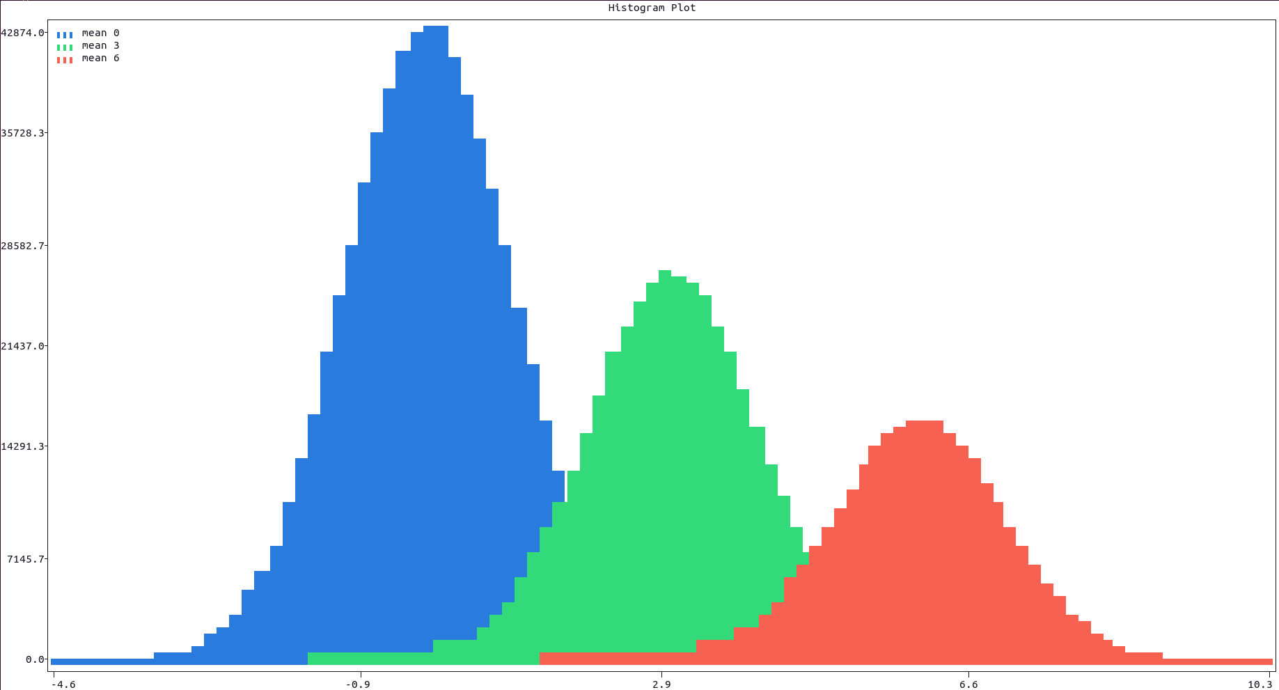
More documentation can be accessed with doc.hist().