To plot data with error bars, along either or both the x and y axes use the error() function as in this example:
import plotext as plt
from random import random
l = 20
n = 1
ye = [random() * n for i in range(l)]; xe = [random() * n for i in range(l)]
y = plt.sin(length = l);
plt.error(y, xerr = xe, yerr = ye)
plt.title('Error Plot')
plt.show()
or directly on terminal:
python3 -c "import plotext as plt; plt.clf(); from random import random; l = 20; n = 1; ye = [random() * n for i in range(l)]; xe = [random() * n for i in range(l)]; y = plt.sin(length = l); plt.error(y, xerr = xe, yerr = ye); plt.title('Error Plot'); plt.show();"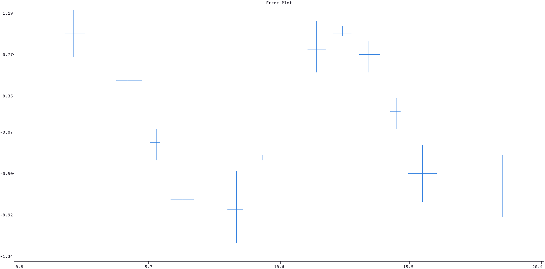
More documentation can be accessed with doc.error().
To signal the timing of certain events the event_plot() function could be of use. Here is an example:
import plotext as plt
from random import randint
from datetime import datetime, timedelta

plt.date_form("H:M") # also just "H" looks ok

times = [datetime(2022, 3, 27, randint(0, 23), randint(0, 59), randint(0, 59)) for i in range(100)] # A random list of times during the day
times = plt.datetimes_to_string(times)

plt.plotsize(None, 20) # Set the preferred height or comment for maximum size

plt.event_plot(times)

plt.show()
or directly on terminal:
python3 -c "import plotext as plt; from random import randint; from datetime import datetime, timedelta; plt.date_form('H:M'); times = [datetime(2022, 3, 27, randint(0, 23), randint(0, 59), randint(0, 59)) for i in range(100)]; times = plt.datetimes_to_string(times); plt.plotsize(None, 20); plt.event_plot(times); plt.show()"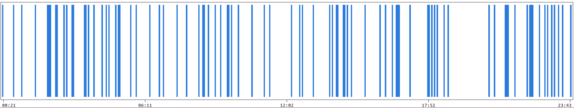
More documentation can be accessed with doc.event_plot().
When streaming a continuous flow of data, consider using the sleep() method, to reduce a possible screen flickering, and the clearing methods described here.
Here is a coded example:
import plotext as plt

l = 1000
frames = 200

plt.title("Streaming Data")
# plt.clc()

for i in range(frames):
    plt.clt() # to clear the terminal
    plt.cld() # to clear the data only

    y = plt.sin(periods = 2, length = l, phase = 2 * i  / frames)
    plt.scatter(y)

    #plt.sleep(0.001) # to add
    plt.show()
or directly on terminal:
python3 -c "import plotext as plt; l = 1000; frames = 200; plt.title('Streaming Data'); [(plt.cld(), plt.clt(), plt.plot(plt.sin(periods = 2, length = l, phase = 2 * i / frames)), plt.sleep(0), plt.show()) for i in range(frames)]"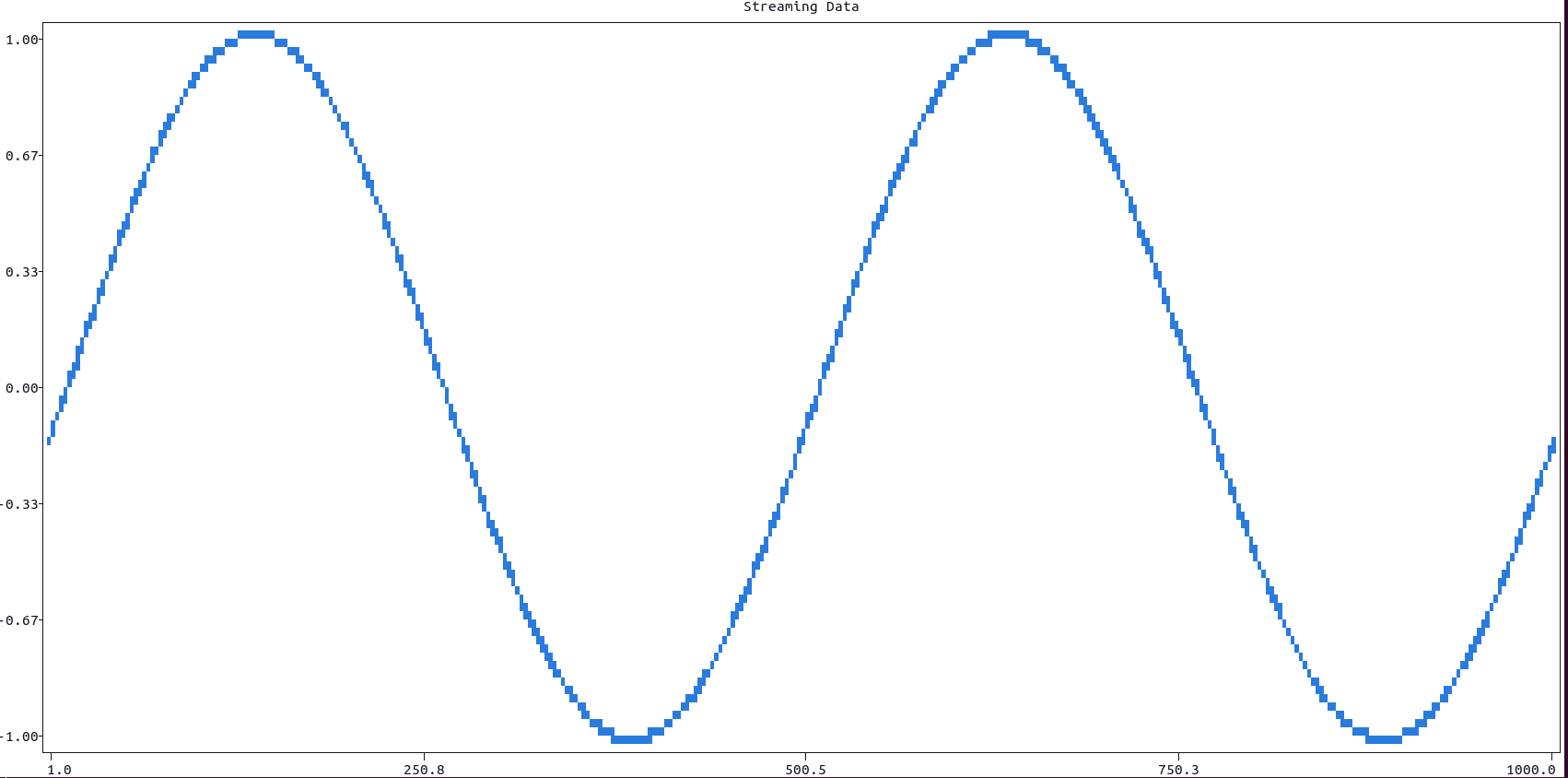
To plot a 2D representation of a matrix, use the function matrix_plot().
-
The intensity of the pixel (how light it is) is proportional to the correspondent element in the matrix.
-
The parameter
fast, if set to True, allows to plot much faster, but the plot final dimensions will be locked to the whatever size was previously chosen, and won't adapt to the terminal or subplot size; also any setting function which follows will not have any effect (likexlabel(),frame()and so on). -
The same function can plot in colors, if each pixel is an RGB tuple of three integers, between 0 and 255.
Here is a coded example:
import plotext as plt

cols, rows = 200, 45
p = 1
matrix = [[(abs(r - rows / 2) + abs(c - cols / 2)) ** p for c in range(cols)] for r in range(rows)]

plt.matrix_plot(matrix)
plt.plotsize(cols, rows)
plt.title("Matrix Plot")
plt.show()
or directly on terminal:
python3 -c "import plotext as plt; cols, rows = 200, 45; p = 1; matrix = [[(abs(r - rows / 2) + abs(c - cols / 2)) ** p for c in range(cols)] for r in range(rows)]; plt.matrix_plot(matrix); plt.plotsize(cols, rows); plt.title('Matrix Plot'); plt.show()"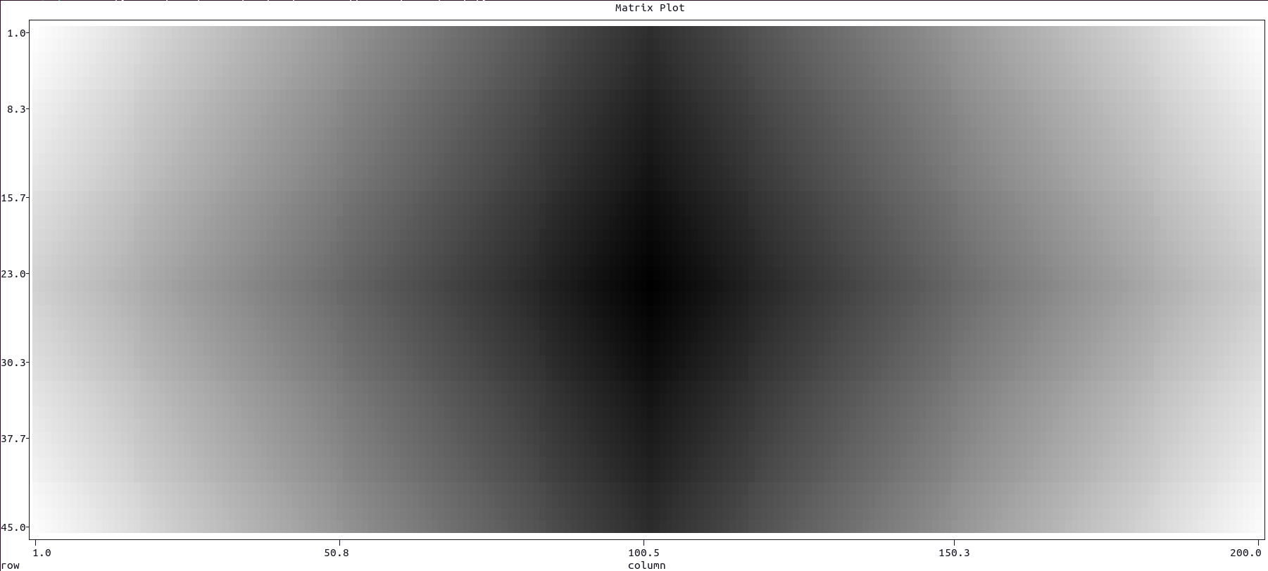
More documentation can be accessed with doc.matrix_plot().
To plot the confusion matrix correspondent to certain actual and predicted observations, use the confusion_matrix() function - in short cmatrix() - as in this example:
import plotext as plt; plt.clf()
from random import randrange
l = 300
actual = [randrange(0, 4) for i in range(l)]
predicted = [randrange(0,4) for i in range(l)]
labels = ['Autumn', 'Spring', 'Summer', 'Winter']

plt.cmatrix(actual, predicted, labels)
plt.show()
or directly on terminal:
python3 -c "import plotext as plt; from random import randrange; l = 300; actual = [randrange(0, 4) for i in range(l)]; predicted = [randrange(0,4) for i in range(l)]; labels = ['Autumn', 'Spring', 'Summer', 'Winter']; plt.cmatrix(actual, predicted, labels); plt.show()"
More documentation can be accessed with doc.confusion_matrix().
A heatmap is a graphical representation of data where values within a dataframe are represented as colors. It is a useful tool for visualizing and analyzing data, particularly when you want to show patterns or relationships in a large dataset.
Color Mapping: In a heatmap, each cell in a matrix is assigned a color based on its value. Typically, a color gradient is used. The color intensity represents the magnitude of the values.
To plot the Heatmap use the heatmap() function.
Here is a coded example:
import plotext as plt
import numpy as np
import pandas as pd
np.random.seed(0)
students = ['Student 1', 'Student 2', 'Student 3', 'Student 4', 'Student 5', 'Student 6', 'Student 7', 'Student 8', 'Student 9', 'Student 10']
subjects = ['Math', 'Science', 'History', 'English', 'Art', 'Physics', 'Chemistry', 'Biology']
data = {'Student 1': [94, 97, 50, 53, 53, 89, 59, 69], 'Student 2': [71, 86, 73, 56, 74, 74, 62, 51], 'Student 3': [88, 89, 73, 96, 74, 67, 87, 75], 'Student 4': [63, 58, 59, 70, 66, 55, 65, 97], 'Student 5': [50,68, 85, 74, 99, 79, 69, 69], 'Student 6': [64, 89, 82, 51, 59, 82, 81, 60], 'Student 7': [73, 85, 61, 78, 84, 50, 50, 86], 'Student 8': [55, 88, 90, 67, 65, 54, 91, 92], 'Student 9': [81, 51, 51, 89, 91, 85, 88, 61], 'Student 10': [96, 68, 77, 50, 64, 85, 62, 92]}
dataframe = pd.DataFrame(data, index=subjects)

plt.heatmap(dataframe)
plt.show()
or directly on terminal:
python -c "import plotext as plt; import numpy as np; import pandas as pd; np.random.seed(0); students = ['Student 1', 'Student 2', 'Student 3', 'Student 4', 'Student 5', 'Student 6', 'Student 7', 'Student 8', 'Student 9', 'Student 10']; subjects = ['Math', 'Science', 'History', 'English', 'Art', 'Physics', 'Chemistry', 'Biology']; data = {'Student 1': [94, 97, 50, 53, 53, 89, 59, 69], 'Student 2': [71, 86, 73, 56, 74, 74, 62, 51], 'Student 3': [88, 89, 73, 96, 74, 67, 87, 75], 'Student 4': [63, 58, 59, 70, 66, 55, 65, 97], 'Student 5': [50,68, 85, 74, 99, 79, 69, 69], 'Student 6': [64, 89, 82, 51, 59, 82, 81, 60], 'Student 7': [73, 85, 61, 78, 84, 50, 50, 86], 'Student 8': [55, 88, 90, 67, 65, 54, 91, 92], 'Student 9': [81, 51, 51, 89, 91, 85, 88, 61], 'Student 10': [96, 68, 77, 50, 64, 85, 62, 92]}; dataframe = pd.DataFrame(data, index=subjects); plt.heatmap(dataframe); plt.show();"
More documentation can be accessed with doc.heatmap().