# A Quick Introduction to Pygal
When it comes to interactive charts and the modules you can use, you may be familiar with Matplotlib, Seaborn, and Bokeh, which each allow interactivity and support additional features.
However, Pygal specializes in allowing the user to create SVGs. Besides the scalability of an SVG, you can edit them in any editor and print them in very high quality resolution. SVG formatting is easily integrated with Flask and Django as well. Lastly, you can easily and minimally create line charts, bar graphs, and Radar Charts (to name a few) with very little code, as we'll see shortly with the following examples:
```Click``` Pie Example
```Click``` Dot Example
```Click``` KPI Example
Open Terminal
$ pip install Pygal
Extra Help: Installing and Dependencies - Link
import pygal
For our first example we'll create a bar chart. We'll simply need to create a variable and store pygal.Bar() inside.
import pygal
b_chart = pygal.Bar()
You can easily use pygal.Line, pygal.pie, or any of the following.
Next we need to start creating our chart. I will be using Data that I scraped from a gaming tracker for the game Destiny 2. Eventually the graph will be live and I'll be able to see my stats change (hopefully) in real time.
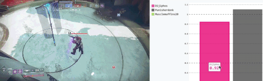
```Click``` Game Play + Graph Change Real Time Example
Let's not get ahead of ourselves.
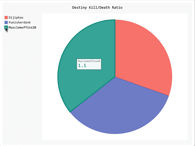
In short, everytime I play in a PvP or Crusible Match and eliminate an opponent or end up getting eliminated myself, the KD (Kill/Death Ratio) will change. I simply want to compare myself to my clan mates.
Thus, to start things off, we'll need a chart title.
import pygal
b_chart = pygal.Bar()
b_chart.title = "Destiny Kill/Death Ratio"
Now we can start adding in our data. I need 3 bars, one for each player. To accomplish this, I'll need to use add followed by a title and some values.
import pygal
b_chart = pygal.Bar()
b_chart.title = "Destiny Kill/Death Ratio"
b_chart.add("Dijiphos", [0.94])
b_chart.add("Punisherdonk", [1.05])
b_chart.add("Musclemuffins20", [1.10])
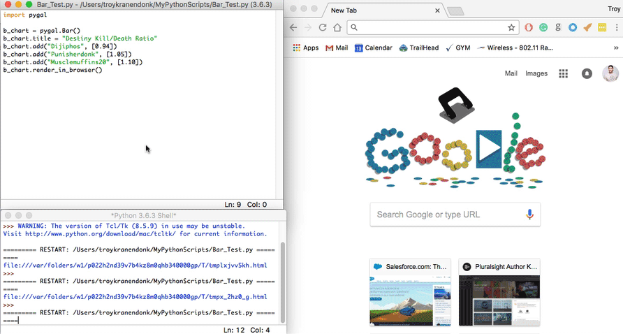
Technically, we can finish and render without further customization. To render quickly to a browser, we'll use render_in_browser() as our output.
import pygal
b_chart = pygal.Bar()
b_chart.title = "Destiny Kill/Death Ratio"
b_chart.add("Dijiphos", [0.94])
b_chart.add("Punisherdonk", [1.05])
b_chart.add("Musclemuffins20", [1.10])
b_chart.render_in_browser()
```Click``` To Reveal Our Example
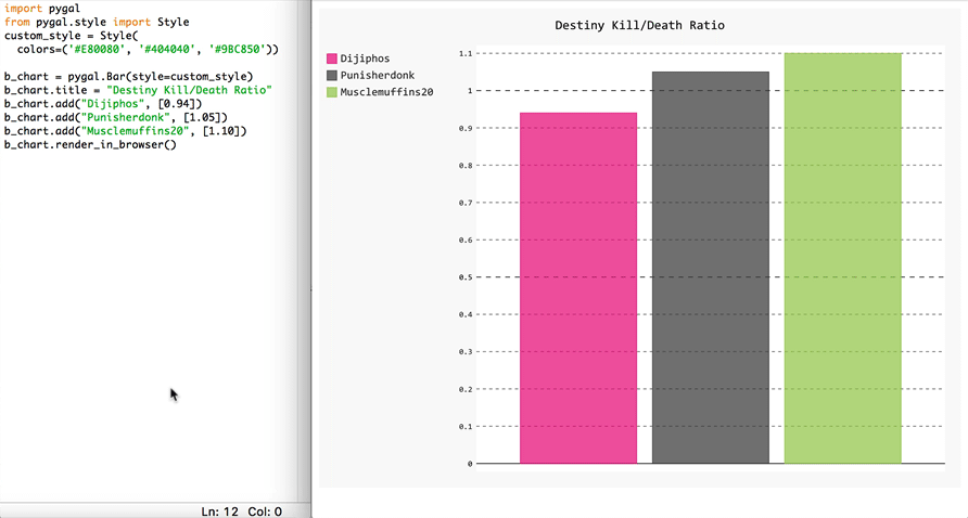
Say we want some custom colors added to our graph
#E80080
#404040
#9BC850
This is easy to do, and can actually be achieved in multiple ways.
First, import style from pygal.style.
import pygal
from pygal.style import Style

b_chart = pygal.Bar()
b_chart.title = "Destiny Kill/Death Ratio"
b_chart.add("Dijiphos", [0.94])
b_chart.add("Punisherdonk", [1.05])
b_chart.add("Musclemuffins20", [1.10])
b_chart.render_in_browser()
You can change a number of objects by simply adding:
import pygal
from pygal.style import Style
custom_style = Style(

b_chart = pygal.Bar()
b_chart.title = "Destiny Kill/Death Ratio"
b_chart.add("Dijiphos", [0.94])
b_chart.add("Punisherdonk", [1.05])
b_chart.add("Musclemuffins20", [1.10])
b_chart.render_in_browser()
Notice I left the parentheses open.
```Click``` To Reveal Some Objects
Properties & Description
plot_background The color of the chart area background
backgroundThe color of the image background
foreground |The main foregrond color
colorsThe serie color list
value_colorsThe print_values color list
Complete List: http://www.pygal.org/en/stable/documentation/custom_styles.html
Let's change the color of our bars by using the object colors.
Don't forget to indent and close our final parentheses.
import pygal
from pygal.style import Style
custom_style = Style(
  colors=('#E80080', '#404040', '#9BC850'))

b_chart = pygal.Bar()
b_chart.title = "Destiny Kill/Death Ratio"
b_chart.add("Dijiphos", [0.94])
b_chart.add("Punisherdonk", [1.05])
b_chart.add("Musclemuffins20", [1.10])
b_chart.render_in_browser()
Now, all we need to do is pass style=custom_style in our pygal.Bar() to get it to work.
import pygal
from pygal.style import Style
custom_style = Style(
  colors=('#E80080', '#404040', '#9BC850'))

b_chart = pygal.Bar(style=custom_style)
b_chart.title = "Destiny Kill/Death Ratio"
b_chart.add("Dijiphos", [0.94])
b_chart.add("Punisherdonk", [1.05])
b_chart.add("Musclemuffins20", [1.10])
b_chart.render_in_browser()
```Click``` To Reveal Our Example
It's that simple. I would check out Pygal's documentation for further builds. However, after reading this guide, you should have all the knowledge needed to create visually appealing graphs and charts with Python Pygal.
Thanks for reading this guide on using the Pygal module. Leave a comment with your favorite Pygal graph or reach out and say hi on Twitter. And, of course, please add this guide to your favorites if you found it informative or engaging.