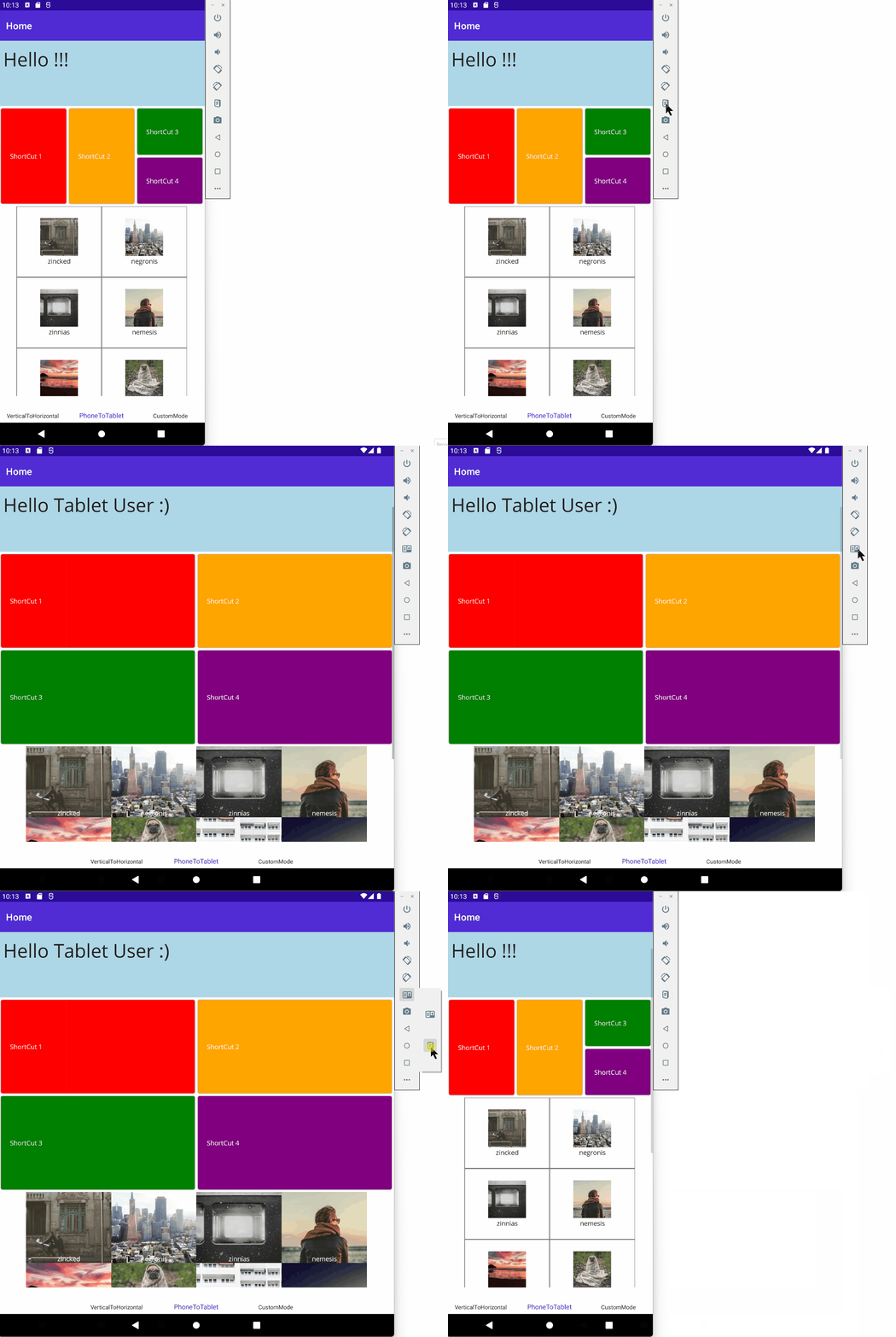
XAML is powerful! It allows to describe complex UI and a lot of mechanisms provide solutions to add dynamism: Triggers (DataTrigger, Adaptive Triggers), Visual States, Attached Properties, Behaviors, ...
However, out of the box, you have to write a lot of code in order to adapt UI depending on the running form factor, orientation or state: Phones, Tablets, Foldable Phones, Vertical/Horizontal orientation, ...
The goal of this library is to provide a simple way to develop and maintain UI that handles this complexity.
- Install the nuget package https://www.nuget.org/packages/AdaptiveProperties.MAUI
- Import the following in your view : xmlns:m="clr-namespace:AdaptiveProperties.MAUI.M;assembly=AdaptiveProperties.MAUI"
- Add properties to override basics properties for a given mode starting with m:{ModeName}.{PropertyName}="{Value}"
Example:
The following XAML defines a part of UI with a Phone First Approach and overrides properties for Tablet (or foldable phone in the opened state) (m:T.XX, m:TV.XX, m.TH.XX)
<VerticalStackLayout>
      <Grid HeightRequest="200"
            BackgroundColor="LightBlue">

          <Label Margin="10" VerticalOptions="Center"
                 FontSize="40"
                 Text="Hello !!!"
                 m:T.Text="Hello Tablet User :)" />
      </Grid>

      <Grid Padding="4" ColumnSpacing="4" RowSpacing="4" RowDefinitions="100,100" ColumnDefinitions="*,*,*"
            m:TH.RowDefinitions="200" m:TH.ColumnDefinitions="*,*,*,*"
            m:TV.RowDefinitions="200,200" m:TV.ColumnDefinitions="*,*">
          <Frame Grid.RowSpan="2"
                 m:T.RowSpan="1"
                 BackgroundColor="Red"
                 CornerRadius="4">
              <Label VerticalTextAlignment="Center"
                     TextColor="White"
                     Text="ShortCut 1" />
          </Frame>
          <Frame Grid.Column="1" Grid.RowSpan="2"
                 m:T.RowSpan="1"
                 BackgroundColor="Orange"
                 CornerRadius="4">
              <Label VerticalTextAlignment="Center"
                     TextColor="White"
                     Text="ShortCut 2" />
          </Frame>
          <Frame Grid.Column="2"
                 m:TV.Column="0" m:TV.Row="1"
                 BackgroundColor="Green"
                 CornerRadius="4">
              <Label VerticalTextAlignment="Center"
                     TextColor="White"
                     Text="ShortCut 3" />
          </Frame>
          <Frame Grid.Row="1" Grid.Column="2"
                 m:TH.Column="3"
                 m:TV.Column="1" m:TV.Row="1"
                 BackgroundColor="Purple"
                 CornerRadius="4">
              <Label VerticalTextAlignment="Center"
                     TextColor="White"
                     Text="ShortCut 4" />
          </Frame>
      </Grid>

      <FlexLayout BindableLayout.ItemsSource="{Binding ShelfList}"
                  JustifyContent="Center" Wrap="Wrap">
          <BindableLayout.ItemTemplate>
              <DataTemplate x:DataType="Model:Shelf">
                  <Grid WidthRequest="180" HeightRequest="150">
                      <Button BackgroundColor="White" BorderColor="Gray"
                              Command="{Binding BindingContext.GotToShelfCommand, Source={x:Reference HomePageInstance}}"
                              CommandParameter="{Binding}"
                              BorderWidth="1" CornerRadius="0" />

                      <Grid HeightRequest="100" VerticalOptions="Center" RowDefinitions="80,20"
                            m:T.HeightRequest="-1" m:T.VerticalOptions="Fill" m:T.RowDefinitions="*"
                            InputTransparent="True">
                          <Image Source="{Binding ImageUrl}"
                                 m:T.Aspect="AspectFill" />
                          <Label Grid.Row="1" HorizontalOptions="Center"
                                 m:T.Row="0" m:T.VerticalOptions="End"
                                 m:T.TextColor="White"
                                 Text="{Binding Name}" />
                      </Grid>
                  </Grid>
              </DataTemplate>
          </BindableLayout.ItemTemplate>
      </FlexLayout>
</VerticalStackLayout>
You can use the following modes in order to override properties:
| Description | {Prefix}:{Name}.{PropertyName} |
|---|---|
| Phone/Tablet Vertical mode | m:V.{PropertyName} |
| Phone/Tablet Horizontal mode | m:H.{PropertyName} |
| Phone mode | m:P.{PropertyName} |
| Phone Vertical mode | m:PV.{PropertyName} |
| Phone Horizontal mode | m:PH.{PropertyName} |
| Tablet mode | m:T.{PropertyName} |
| Tablet Vertical mode | m:TV.{PropertyName} |
| Tablet Horizontal mode | m:TH.{PropertyName} |
| Custom mode | m:X.{PropertyName} |
If you need to handle other modes based on another state (depending on accessibility for example), you can override properties by using m:X.{PropertyName}, m:X2.{PropertyName}, m:X3.{PropertyName}. In order to define conditions and trigger a custom mode, you have to use the 2 following methods:
- X.SetModeActivationChecking(() => return ConditionInstruction());
- X.TriggerModeActivationChecking();
See more in the sample here: https://github.com/rudyspano/MAUI-Adaptive-Properties/tree/main/sources/AdaptiveProperties.Demo/Views/3-CustomMode
A lot but not all properties of MAUI are available. You can easily see which ones in the definition class here: https://github.com/rudyspano/MAUI-Adaptive-Properties/blob/main/sources/AdaptiveProperties.Configuration/Code.Configuration.cs
If some other properties are important for you, please ask for them. Future versions are coming :)
The project is designed to easily evolve. Provided properties are called Attached Properties: https://learn.microsoft.com/en-us/dotnet/maui/fundamentals/attached-properties?view=net-maui-7.0
All definitions are created using T4 code Generation: https://learn.microsoft.com/en-us/visualstudio/modeling/code-generation-and-t4-text-templates?view=vs-2022
The real benefit of this Library depends, of course, of your needs. It is really efficient if the amount of adapations is reasonable => if a lot of adaptations are required, you should probably create specific views. If your adaptations are mainly based on colors, fontSize (...) and do not concern layout properties, you should simply use Theming out-of-the-box features: https://learn.microsoft.com/en-us/dotnet/maui/user-interface/theming?view=net-maui-7.0
For the moment, properties does'nt handle DataBinding with value tracking and it's not really a goal considering efficient existing mechanisms.
If this project interests you, please share or contribute :)
