mobile-friendly UI #68
Comments
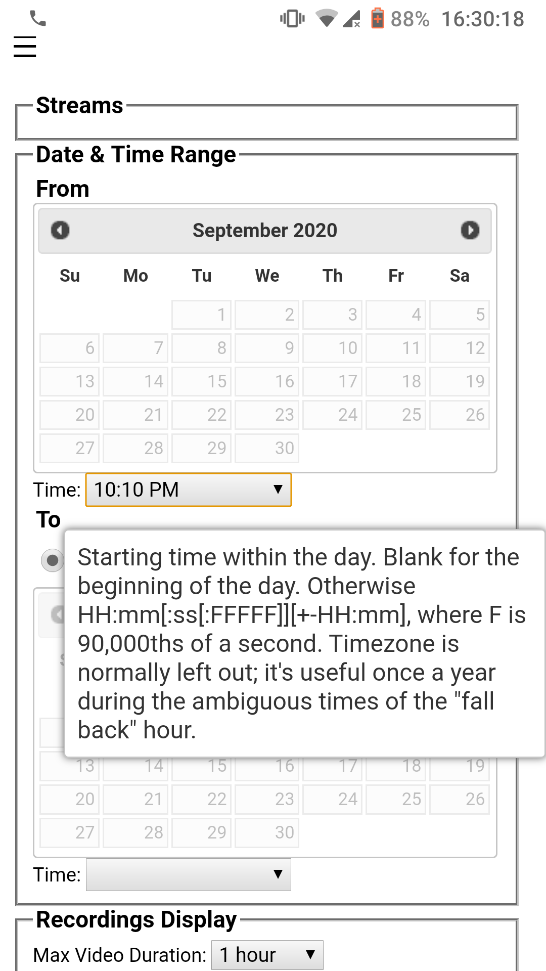
nav div changes:
* make it togglable (on all devices) by hamburger button
* on narrow devices, make it closed by default and
  be at the top rather than on the left

open zoomed by default

trim some arguably less important columns on narrow displays,
and reduce some horizontal padding

always show videos full-screen on narrow displays
* make it togglable (on all devices) by hamburger button
* on narrow devices, make it closed by default and
  be at the top rather than on the left

Improves #68 significantly
|
|
|
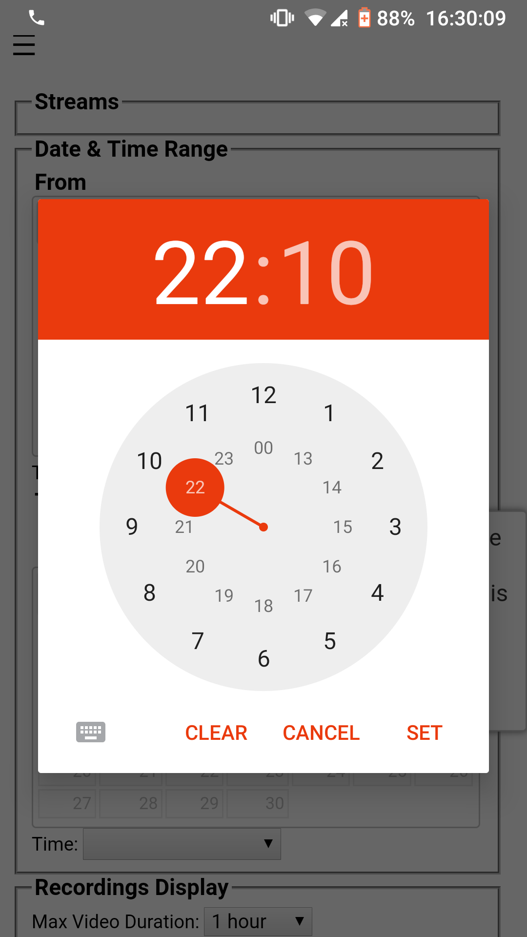
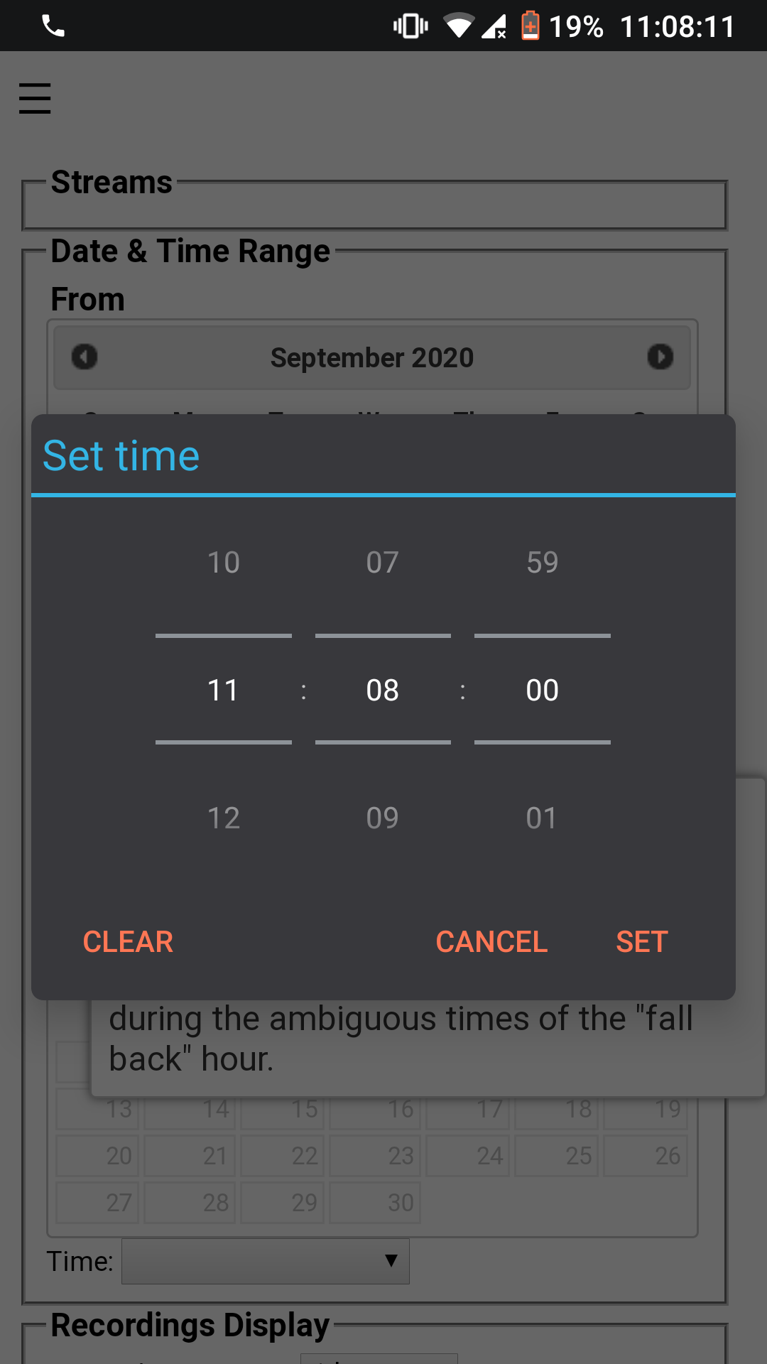
Thanks for pointing that out! That certainly looks more pleasant. Does it have to be minute granularity? I think giving up subseconds isn't a big deal but going all the way up to minute granularity means giving up a lot in terms of ability to create a clip of just an event of interest. I suppose as a last resort, there could be a checkbox in the UI for using that time picker or not, similar to the output time format. |
|
On a side note, do you prefer PRs on separate branches, or in master? |
|
Also, for cips, I was thinking that scrub bar markers would be more intuitive. Simply move the start and end marker on the scrub bar / timeline, then losslessly export (nearest key frame split) the clip for downloading in the web client. This would be akin to a video editing workflow. |
|
The new react-based UI has an actual time picker. (It also has some annoying time zone flaws as mentioned in #111 but overall I think it's an improvement.) I missed a couple comments from way back, sorry!
For small stuff, master is great. I use branches myself for longer-running development like completely rewriting the UI or a new database schema version.
I definitely want this! And I think the server-side components are ready for a real Media Source Extension-based scrub bar UI. The live view is based on this, but it should also be possible to use for looking at historical recordings. |
Questions about how to contribute come up from time to time, eg:
#84 (comment)
#68 (comment)

I hope this helps answer them. I think github adds a couple links to
a file called CONTRIBUTING or CONTRIBUTING.md so this filename gives it
some extra visibility.
The current (table-based) UI is meant to be temporary (see #32) but will probably last a while longer.
It's quite unpleasant to use on a phone. Some ideas to improve this:
div#navon the left could be a pull-out menu, or just stacked on top rather than on the left. Maybe the column list could be trimmed to the essentials (just start and end time really).The text was updated successfully, but these errors were encountered: