Quickly swap KiCad themes/colorschemes.
KiCad's default colors appear to be chosen from the values [0, 132, 194, 255] for each value of the R, G, and B components. We can modify these colors for a more aesthetically pleasing outcome.
Original idea & inspiration from https://github.com/pointhi/kicad-color-schemes
❗ Invoking the Makefile will modify your current configuration files in-place ❗
- macOS:
~/Library/Preferences/kicad/eeschema - Linux:
~/.config/kicad/eeschema
❗ MAKE A BACKUP ❗
# list available themes for eeschema
$ make show_eeschema_options
set_eeschema_base16_dracula
set_eeschema_base16_nord
set_eeschema_base16_oceanicnext
set_eeschema_base16_onedark
set_eeschema_base16_rebecca
set_eeschema_default
set_eeschema_handpicked_nord
set_eeschema_handpicked_onedark

# select specific theme for eeschema
$ make set_eeschema_base16_nord

# switch back to original eeschema colors
$ make set_eeschema_defaultColors in eeschema can be treated as a form of syntax highlighting since all
objects on the canvas are drawn on top of a generic background. Therefore, we
can get reasonable results by generating themes based on existing terminal
colorschemes. They are displayed below.
| color-scheme | screenshot |
|---|---|
| default | 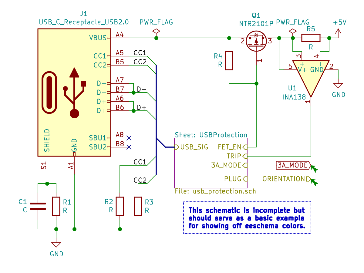 |
| handpicked_onedark | 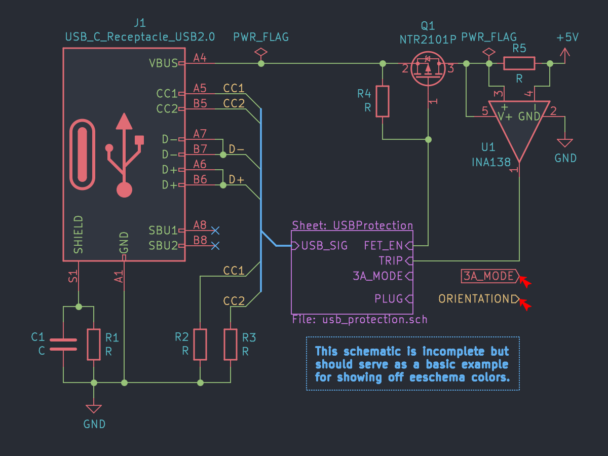 |
| handpicked_nord | 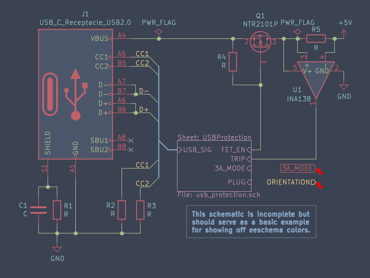 |
| base16_onedark |  |
| base16_nord | 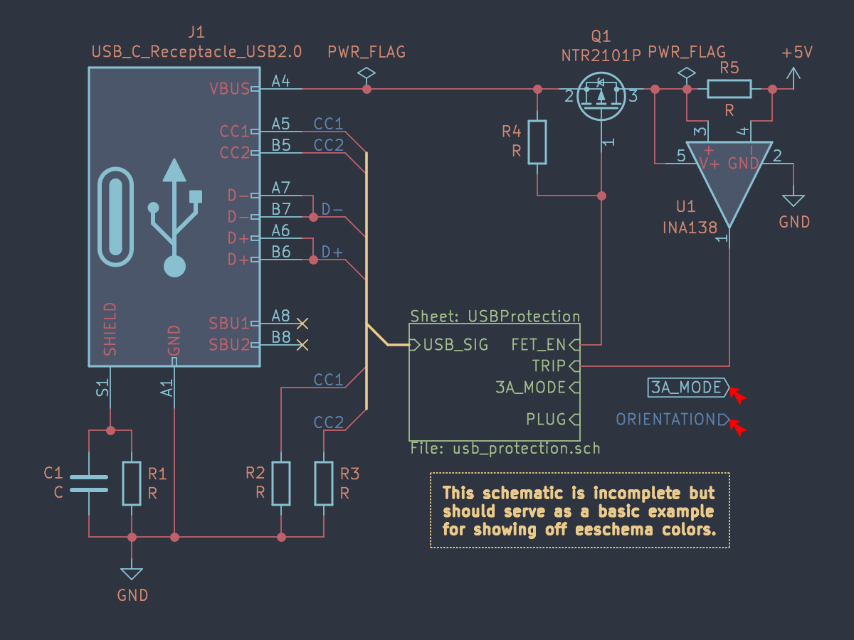 |
| base16_rebecca | 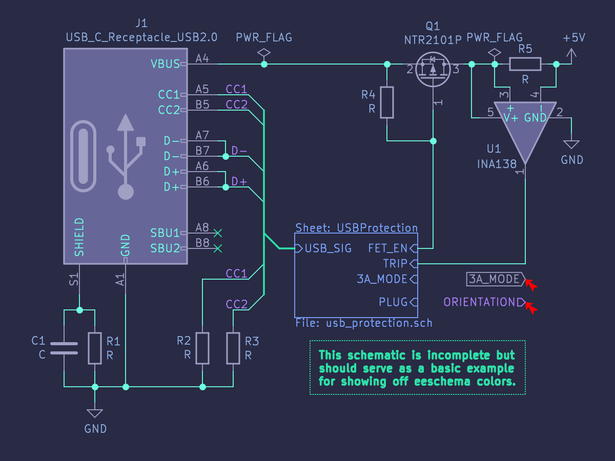 |
| base16_dracula | 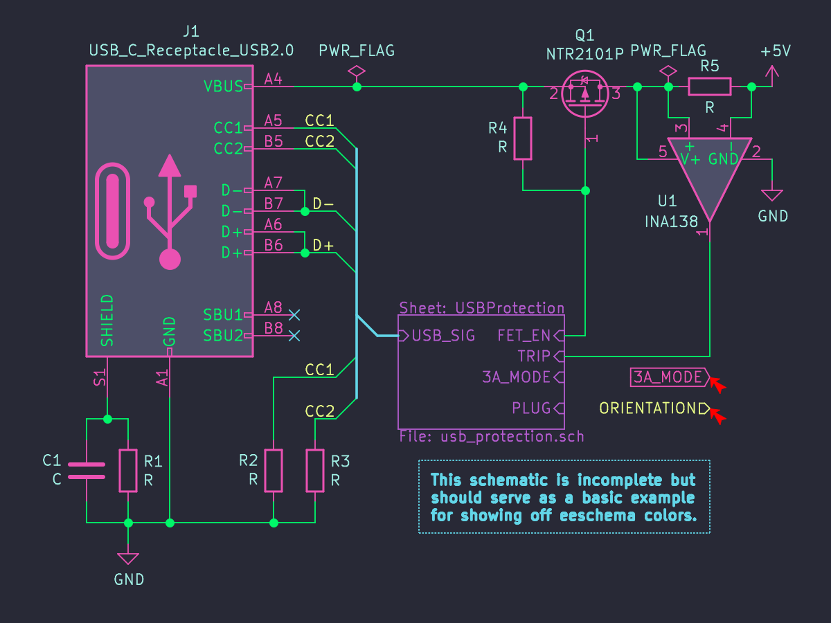 |
| base16_oceanicnext | 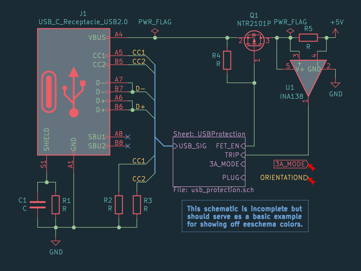 |
Coloring pcbnew is a harder task because layers allow for overlapping
information. It is no longer sufficient for an object to have a color with
passable contrast to a single background. Each object must now contrast its
color against all objects it in the visible stackup. Doing so in an
aesthetically pleasing way is difficult.
Since I am not even an "armchair expert" in optics or the color gamut,
the task as defined above is beyond what I care to put effort into.
Instead, I will restrict my problem space by aiming to have high contrast
only on specific layers. This makes aesthetics my de facto priority. Since
the Makefile makes it easy to switch between themes, this won't be a deal
breaker for me. I can choose a theme well suited for each specific subtask
and switch back to the default for final review.