Ability to disable ColorPicker, FileUploader, Multiselect, & Selectbox #4148
Conversation
This file contains bidirectional Unicode text that may be interpreted or compiled differently than what appears below. To review, open the file in an editor that reveals hidden Unicode characters.
Learn more about bidirectional Unicode characters
LukasMasuch
approved these changes
Dec 9, 2021
|
|
||
| interface Props { |
There was a problem hiding this comment.
From looking at other components, it seems like that styled-components should only contain Style-related props (in this case: StyledWidgetLabelProps with the disabled attribute). And the component file contains Props with all relevant attributes. For example:
But I'm not sure if this is a general convention to follow.
5 tasks
mayagbarnes
added a commit
that referenced
this pull request
Dec 13, 2021
* Ability to disable Button, DownloadButton, Checkbox, Radio, & Slider Widgets (#4146)

* Update styling for WidgetLabel

* Implement & test disabled - button widget

* Implement & test disabled - download button widget

* Implement & test disabled - checkbox widget

* Implement & test disabled - radio widget

* Implement & test disabled - slider widget

* Plumb widget disabled params to FE through ElementNodeRenderer

* Improve disabled radio

* Ability to disable DateInput, NumberInput, TimeInput, TextInput, & TextArea (#4147)

* Implement & test disabled - time input widget

* Implement & test disabled - date input widget

* Implement & test disabled - number input widget

* Implement & test disabled - text input widget

* Implement & test disabled - text area widget

* Update styling for WidgetLabel

* Plumb widget disabled params to FE in ElementNodeRenderer

* Update number input increment/decrement styling

* Fix number_input e2e test

* Update placeholder styling & screenshots for text widgets

* Update disabled param descriptions

* Fix lint

* Ability to disable ColorPicker, FileUploader, Multiselect, & Selectbox (#4148)

* Update styling for WidgetLabel

* Implement & test disabled - color picker widget

* Implement & test disabled - file uploader widget

* Implement & test disabled - multiselect widget

* Implement & test disabled - selectbox widget

* Plumb widget disabled params to FE in ElementNodeRenderer

* Update disabled param descriptions

* Refactor WidgetLabel Props
Sign up for free
to join this conversation on GitHub.
Already have an account?
Sign in to comment
Add this suggestion to a batch that can be applied as a single commit.
This suggestion is invalid because no changes were made to the code.
Suggestions cannot be applied while the pull request is closed.
Suggestions cannot be applied while viewing a subset of changes.
Only one suggestion per line can be applied in a batch.
Add this suggestion to a batch that can be applied as a single commit.
Applying suggestions on deleted lines is not supported.
You must change the existing code in this line in order to create a valid suggestion.
Outdated suggestions cannot be applied.
This suggestion has been applied or marked resolved.
Suggestions cannot be applied from pending reviews.
Suggestions cannot be applied on multi-line comments.
Suggestions cannot be applied while the pull request is queued to merge.
Suggestion cannot be applied right now. Please check back later.
📚 Context
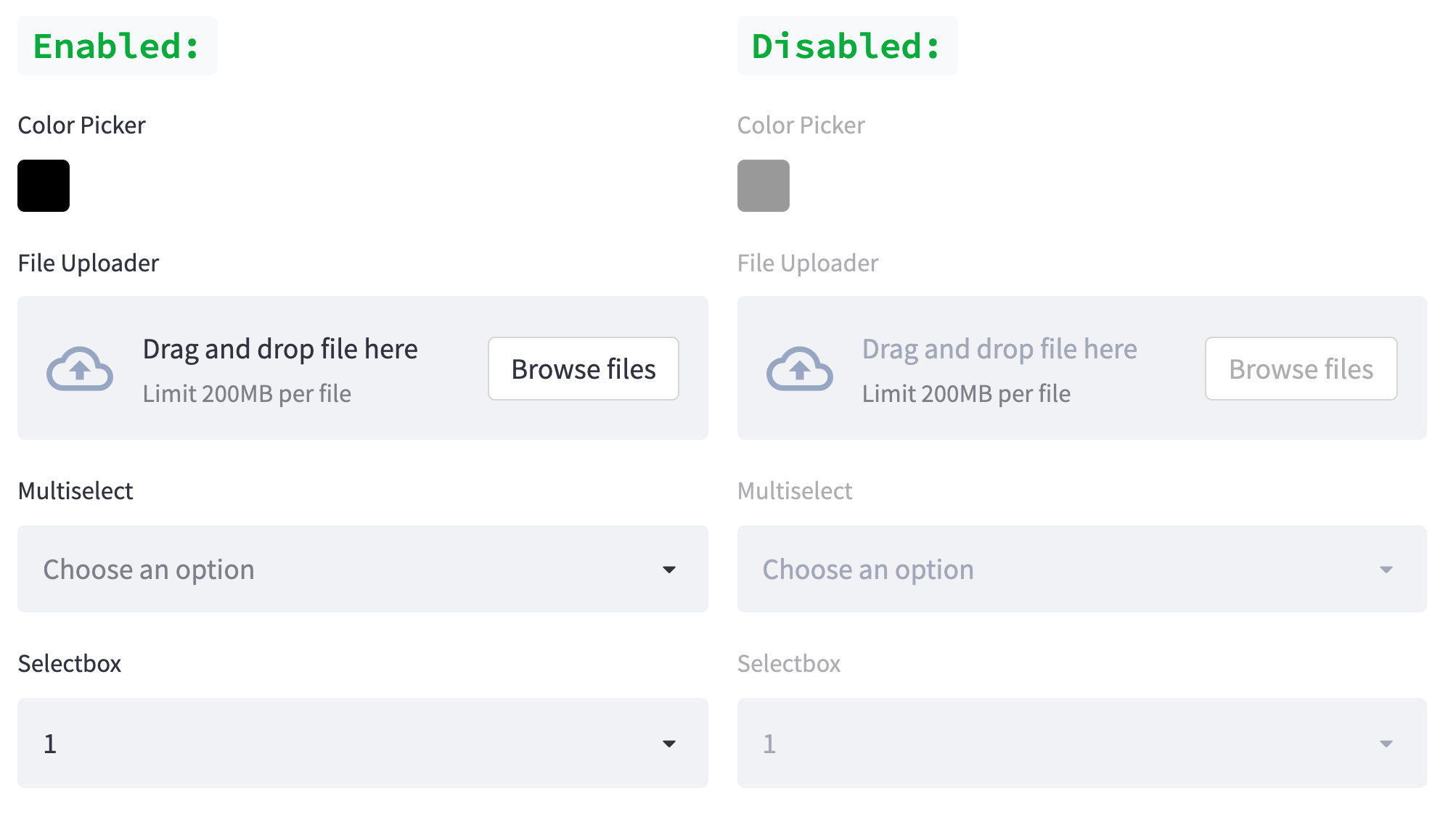
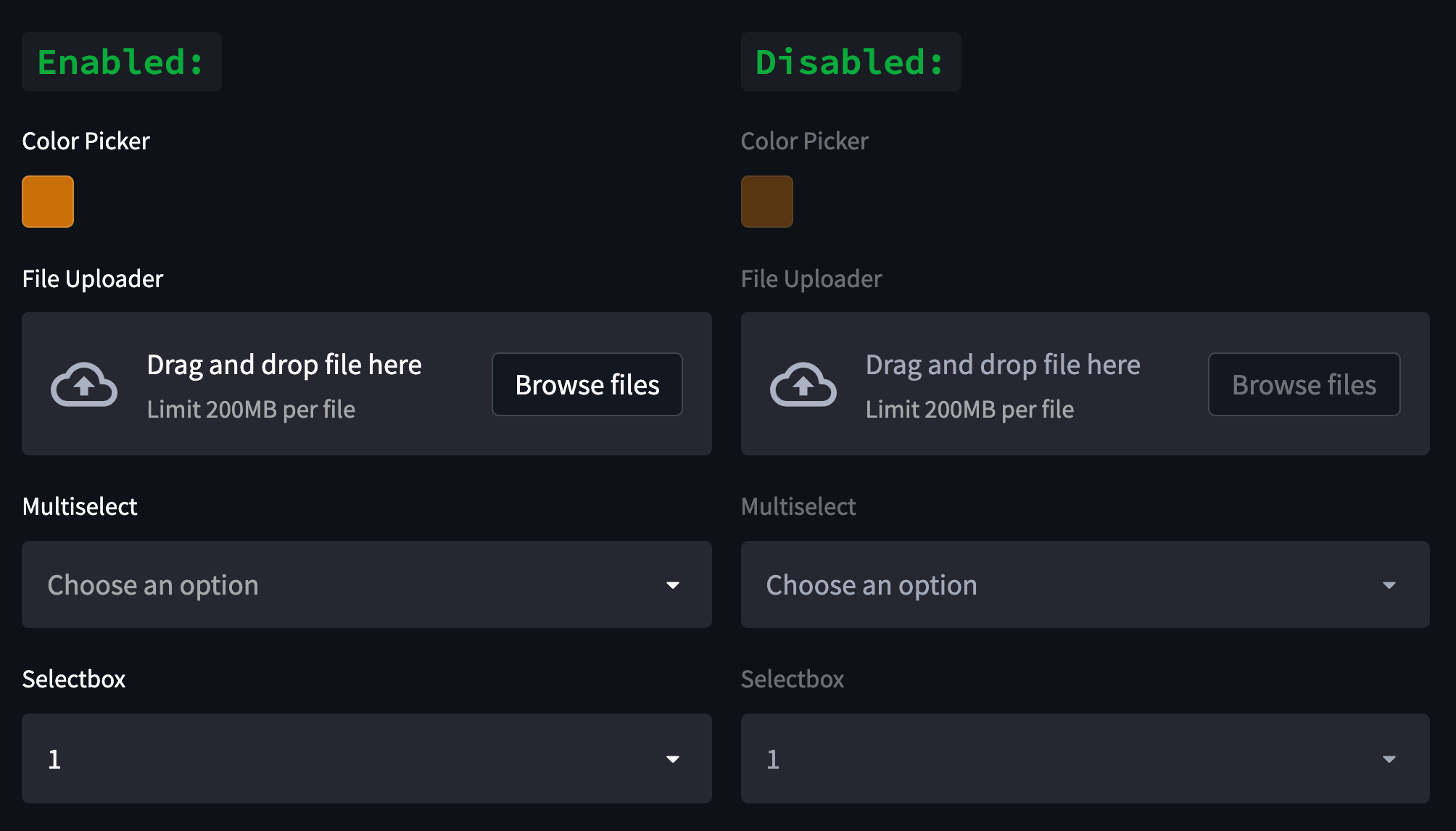
We want to add the ability to disable widgets through their
st.widget()calls, so they cannot be interacted with. Thedisabledparam was implemented as a keyword-only arg to avoid a breaking change.This PR covers the following widgets:
st.color_picker,st.file_uploader,st.multiselect, &st.selectbox🧠 Description of Changes
Add
disabledkeyword only param to widget functions with a default ofFalsePass
disabledvalue to corresponding protosReconcile widget proto's
disabledvalue and disabled state inElementNodeRenderer.tsxRevise styling of
WidgetLabelif widget is disabledScreenshots:
Revised Light Mode:
Revised Dark Mode:
🧪 Testing Done
🌐 References
Part 3 of 3 PRs to address:
Contribution License Agreement
By submitting this pull request you agree that all contributions to this project are made under the Apache 2.0 license.