Svelte/Sapper Visual Identity #335
Comments
|
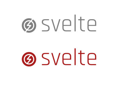
Thanks so much @simonlayfield! I like the idea of having these fairly abstract logos, they would work nicely as favicons/twitter avatars and the like. Of the two Svelte logos I prefer the second one — the first one is possibly a little too subtle :) In terms of layout, my natural instinct is to align the logo with the name so that it's not poking out by itself, like this...
...but maybe that's just me being unimaginative? What sort of things did you anticipate having in the grey box? Presumably it would be best if it was something visual (i.e. not more text like 'recent blog posts' or whatever) — maybe a video introduction, or a slimmed-down REPL. That is a much nicer shade of green. I'm tempted to go and change that right away... |

|
The second logo by Simon has already a bit of that going on, just needs polishing up and making even more "speedy" |
|
Potential gray box content: actual embedded REPL content/examples. So, maybe a carousel or tabbed group with 6 or more examples? |
|
Also, I like the idea of speed in the logo design. I also like the idea of somehow visually showing the "disappearing framework" parts coming together to make a whole idea. Which that second design somewhat conveys. |
|
@Rich-Harris I reckon you're spot on with that idea. The logo form to the side also tends to work better in mastheads/headers etc, and generally be easier to align to other elements. Good thinkin'. The grey box was just a visual placeholder. I havent put any real thought in to the layout of the homepages just yet - the reason I've displayed them this way is that I like to give some context when posting logo ideas because I find it helps see it roughly in situ. BUT one thing I used to like about the Ractive homepage was that you had a live example to tinker with, so the REPL idea like @arxpoetica suggests is pretty neat. That being said, I think that visually presenting the benefits of Svelte using some cool little diagrams could be an idea too. Perhaps a graphic to represent each of the three points mentioned in the text beneath the logo? @tomcon Yeah, I have a couple of ideas of how I might more obviously tie in the idea of speed with the second idea. I'll have a play and see how it goes. @arxpoetica Actually, the 'speed' tie in is coincidental. Originally I was trying to make half of the circle appear as if it was partially disappearing (the magical disappearing UI framework). Either way it works! |
|
Yeeesh. I've been nudging this concept around for a week or so and just going round in circles with it. Something about it doesn't feel on the money. It's the rough concept as shown originally just developed a bit further, with the 'speed' perhaps better represented by the staggered lines?
In the interests of moving things along I'll post it and then have a think about where to go from here. |
|
What if we did this with it?
For reals though, I like it. |

|
Needs more horses. And more flames. But sure I'm cool with it. As I said, I feel like there's something not quite there with it, but I might draw a line under this one and move on to another idea. |
|
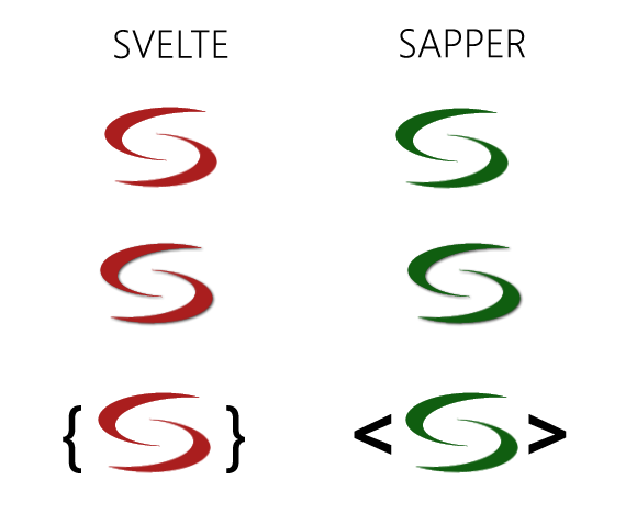
More tweaks.
I think this is actually an improvement in some ways BUT does move away from the solid circle shape a bit. In my original whipped together concept above both Svelte and Sapper share branding characteristics to appear as related projects. It's also taking more of a literal form (a meteor, perhaps, and yeah I'm aware of Meteor JS) and originally I was trying to keep things on the abstract side. Just my thoughts. I might be overthinking it. Feel free to share yours. |

|
Also looks like a hand. |
|
@arxpoetica this is true. |
|
Ok so, moving on. Back to simple shapes.
This was a progression of two lines creating an S shape in the negative space, which I didn't think had enough impact so I connected the lines. Thoughts? |

|
Further developments.
So, I think as far as form goes this is pretty tidy. It's an S and also a bolt-like shape so I think this conveys speed quite well. Happy to hear feedback though! |
|
Oh man that last one is awesome! When I saw the one right before, it made me think of lightning — I even fired up Illustrator to try and show what was in my head but predictably it looks garbage next to that one. I vote for it. I also really like the idea of Svelte and Sapper both having circular logos — it works well in avatars, and can be extended to any future sibling projects we dream up. I had to at least try to see what a flaming horse logo would look like:
(You may recognise the horse in question.)
|

|
Ha! Well, if it's a flaming horse we want I'm up for the challenge. [rolls up sleeves] "This is going to be a long night." |
|
LOL horse logo I'm with Rich; that last one looks fantastic. |
|
There's been a bit of a speedbump, potentially. A comment was made on the Discord channel that the above concept (or part of it) bears a notable resemblance to an Armanen rune, which in itself isn't bad, but was used to represent 'Schutzstaffel' - an organisation under the Nazi party during WW2. https://en.m.wikipedia.org/wiki/Schutzstaffel https://i.pinimg.com/564x/51/55/5f/51555fa4e4e947d03b3f17d0551a94f5.jpg I have mixed feelings on this, but ultimately don't feel as though I'm in a particularly good position to judge on my own whether the degree of similarity may offend, so look to the good people of Svelte to let me know what they think. I have a few hours free tonight so will try to tweak it enough that the resemblance is perhaps even less noticeable. Let me know thoughts. |
|
Ok so I've added some variation to the width of the bolt shape.
To be honest if anything I think this makes it look even closer - so.... I don't know. I'm stuck now. |

|
I think the sensitivity is important, but (my take), in this case there's enough dissimilarity to not worry about it at all. Just do a search for lightning bolt on Google and you'll see it's really not an issue: https://www.google.com/search?q=lightning+bolt+logos&pws=0&gl=us&source=lnms&tbm=isch&sa=X&ved=0ahUKEwi31LftuO_cAhVk74MKHYPCBYUQ_AUICigB&biw=1440&bih=803 Again, my take. |
|
I think the fact that it's meant to represent 'S' for 'Svelte' makes it slightly more treacherous. One thing we could consider — don't know if this is a good idea, just throwing it out there — is going for a diamond shape instead of a circle to increase the dissimilarity.
|


|
2001 is a good association to have! Shame the monolith doesn't lend itself too well to a logo.
We could do HAL... not sure it's recognisable enough though.
For real though, what if we did do a horse with a mane of fire? It's playful, unique, and it has a horse (no animal better represents the word 'svelte' — they conjure associations of strength, speed, beauty, independence etc). This is the best my Illustrator skills (plus the noun project) will permit, but you get the idea...
Simon is probably cringing by now so I'll shut up for a while. |


|
Ha ha ha love the horse. |
|
|
|
Just a quick update. For now, I've rotated the logo form. It still reads as an S and I think has the same visual impact as before.
My only concern now would be that it looks a bit similar to the Opel logo (German cars) but to be quite honest this really doesn't bother me, personally. I am willing to try other ideas, but I'd like to explore variations of what we already have first. |

|
If the Opel reference is a concern maybe we can just change the colour of the S part slightly and leave the circle white? |
|
I actually like the lightning going through like an "s" but I prefer it without the white circle around it. Also note that the opel logo looks more like a "z". |
|
I also like this one, but think if it was something more like what @Rich-Harris mentioned right below it. |
|
Ha, I can't unsee the Opel thing now! Even if it is flipped vertically. @tomcon I think if we can have a single-colour logomark it's better — it's more adaptable to different forms, and means that you can have the Svelte colour and the Sapper colour etc. |
|
Tonight I have been mostly praying to the design gods.
@Rich-Harris Me and my mouth. I shouldn't have mentioned it! On that point, though, I will say that it's not uncommon for logos to have similarities. I realise we want something that looks super rad and fit with what svelte is about (I totally do too), but the chances are whatever we decide on will bear a notable resemblance to some other logo, somewhere.
This isn't me saying I don't care - just to keep expectations realistic. |


|
Hot cannons that is awesome @Rich-Harris! I like subtle, so here's my take: https://svelte.technology/repl?version=2.11.0&gist=da7a7575b9c571827e644329a3dcc65b |
|
Soooooo....I was digging around on Bitbucket this afternoon minding my own business when BAM!
That didn't take long. |
|
@simonlayfield I personally don't think it looks anything like what you have created. |
|
Yeah, I think we're in a good place — the logo is fresh, unique and works well for the project. I say we go with it. @simonlayfield fantastic work — are you able to share an .ai or .svg or did you have more things in mind? |
|
@arxpoetica Cool! I like the last one of this group @silentworks Fair enough. I've been looking at lightning bolts for too long, clearly! Those animations. Lawdy. Very cool. @Rich-Harris Sure, ok. Yeah happy to provide an svg that's easy enough. Am I 100% happy with it? It's probably more like 80%, but I think it's a solid option and provided the general community opinion is the same then that's a good place to be. I think it's probably a slight improvement not to rotate it so much. Maybe this is better:
That way the bottom looks more flush with the typeface (it isn't precisely, but you get what I mean)
|


|
As far as next steps go, should we focus on the Svelte doc site (homepage mostly), close off Svelte completely and then move on to Sapper? |
|
Totally think the correct tipping degree took that logo from 10 to 11. Awesome work. |
Sounds like a good idea, yeah. Let's do that |
|
(@arxpoetica did you mean to close the issue? reopening in case you just fat-fingered the button 😀 ) |
|
That was totally fat finger, sorry... |
|
As I learned from the neverending rebranding of BSkyB's NowTV back in the day, the correct name for the "tipping" is "cheekiness". The right cheeky slant can make or break a logo 🤣 In all seriousness, love the new logo. See you all at the next rebrand. |
|
Hey all, First of all: So I created two layout-sheets for sapper-svelte: In every case, I really would like to hear your opinion. svelte-sapper-identity-1.0.pdf |
|
@vedam, those are some amazing contributions. I could see either logo (yours and @simonlayfield's) working...honestly I'd be hard pressed to pick a favorite, they both have saliency. I really like the clear idea of "links," i.e., Svelte is more than just it's links/parts. I think I like the first color scheme in 1.1 a bit more. Orange-y, and green. Awesome work. |
Yeah. Sapper too. |
|
@vedam This is some great work - hats off to you! The icon you've put together is really strong and is highly memorable/recognisable which I think is a really great achievement there. The assets around the brand you've created are also clean and distinct. Really nice work. I would say that one of the challenges I set out to solve was to create slightly different brand identities for both Svelte and Sapper - even if very similar - because to anyone that doesn't know they're related will see the logos as the same and perhaps be confused. Colour alone doesn't really give you enough distinction between the two, I don't think. On top of that I don't think it's a good idea to only rely on colour as the only difference because at some point the logos may need to be shown in monochrome (i.e. alongside each other, black on white) in which case you lose the distinction between the two. Needless to say this was a pretty big challenge, and I found myself constantly juggling both Svelte and Sapper concepts to make sure they both looked good independently, but also together.
^ Here, for example, the Svelte icon shows an abstract 'S' and the same lines are reconfigured for Sapper to show a wing (ties in with it's military meaning and also I guess represents a production state - in flight?). Anyway - the work you've done is awesome and stylistically a cut above my contributions IMO. Really appreciate you getting involved and putting so much time in! |

|
@simonlayfield thx a lot for your opinion. I was really afraid that this proposal could be interpreted negatively or arrogant, because I basically arrive after decisions have already been made, lots of work had to be done, and countless designer-emotions have been incorporated. So I'm very grateful for your constructive and factual analysis.
I absolutely agree with you on this point, and I stumbled upon this question more than one time during the development process. But, This leads me to the combined S which both can use. If I missinterpreted this point completely, then we maybe should think about different Logos.
On this point I cannot agree really (In a print-media disscussion I would allways do)
Overall, you're right. The creators have to decide how strong or loose the separation/relationship has to be visualized and if the design met this point. Showing before asking was my motto in this special case. I hope this all is halfway understandable. ( A ) How can I explain what I mean by "Identity is more than a Logo", if I'm not visualising what I'm talking of. Words aren't enough in this case, so I decided to follow my interpretation. |
|
It's not negative or arrogant at all, you've produced some really nice work. The two points we've discussed are pretty much coupled together. Personally, I think that two different products with the same logo form has the potential for confusion. It may not be confusing for everyone, but it could be for some. Not everyone will land on the homepage and understand the precise context of the product. Perhaps users land on a documentation page and just see instructions and code. Perhaps people have multiple tabs open and just see a favicon. With two logo forms the same, people either already know that the products are related, or they have to have an intuitive guess, or they have a click around or google it and find out. All but the first scenario are hurdles for the user, which I think can be avoided altogether. Colour can be used as a point of difference but I think in situations where it's the only point of difference it opens up scenarios where people get confused, and if people with flawless vision are confused, I guarantee those with vision impairment will have an even tougher time. Edge cases they may be, but cases that can be avoided. I think what you've done is great, by the way, and this isn't a critique of the form itself. Perhaps others can provide opinions on whether the potential for confusion is significant. |
|
@simonlayfield great summary.
For sure. With two "normal cosumer-products" I would be totally with you and try to avoid this. But from my understanding of these Two special ones, without paying attention to design conventions at first, especially the binding makes them really strong. Maybe I'm completely wrong on this, maybe interpreting too much. Beside the binding-factor, the color alone doesn't have to do all the differentiation work. On the pages there are always the logotypes (S V E L T E and S A P P E R) present to make absolutely clear where you have landed. And as always with corporate design: In any case...
... you came up with the ultimate solution and clearification. |
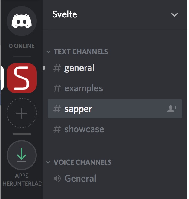
Heh. First one is discord:
The question is, if the two are really dividable ;D btw |
|
Just chiming in to say I generally agree with @simonlayfield regarding form, factor, and differentiation. Probably best to have separate-enough logos. |
|
Recalling Mozilla's rebranding... I am wondering how the logos would look like on a button / mug / shirt? For example, if some of the maintainers attend a conference and hand out swags. |
|
Plus, would it be worth looking at the used type or is that one set in stone? |
|
@vedam Okay, found the shirt variant (Superman! :-D) What about the font? Which font family is used? |
I've set this issue up to track the conversation around the visual elements of Svelte and Sapper, in particular the logos and any proposed visual improvements to their documentation sites.
There's already been a thread concerning the tagline of Sapper sveltejs/sapper#263 which we can factor in.
Feel free to make suggestions, textual or graphic, but let's try and keep a concerted effort not to stray too far from what already exists. Our approach should be evolutionary not revolutionary!
I'll kick things off with a couple of loose ideas.
The text was updated successfully, but these errors were encountered: