Checkboxes
Checkboxes can be used to offer a number of options that can be selected or not and then processed.
Specify one or more --checkbox <text> parameters and dialog will display a checkbox with <text> as the label.
Checkboxes can also be displayed as a switch instead of a checkbox.
The default is as a checkbox next to the label:

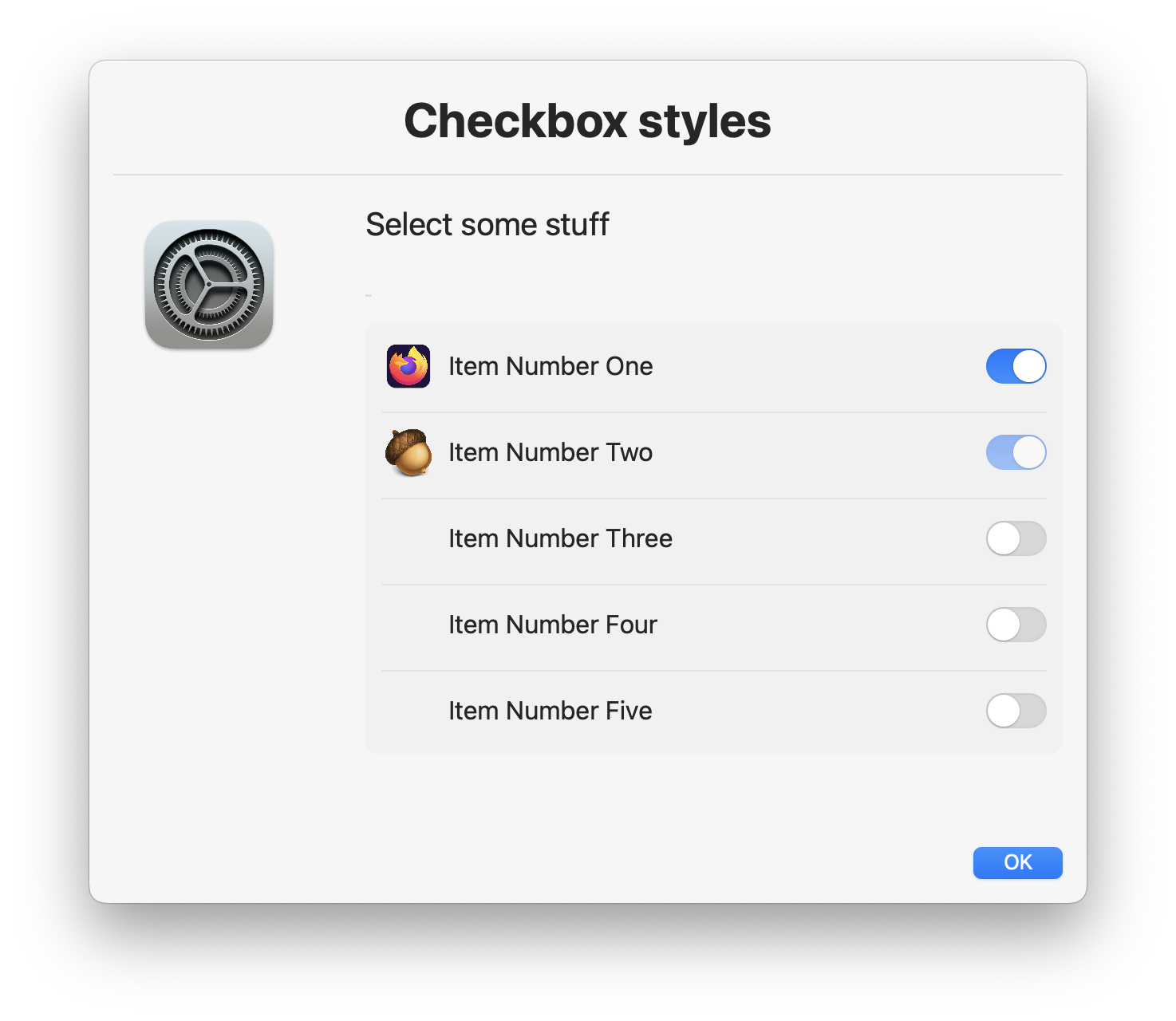
Use the --checkboxstyle switch option to change to the switch style:

If you prefer a larger switch style, you can specify this as a property on the switch style:
The options are mini, small, regular or large
--checkboxstyle switch,large

When using --jsonfile or --jsonstring to set Dialog options, optional checkbox parameters become available.
The json takes the form:
{
  "checkbox" : [
	  {"label" : "<label>", "checked" : false, "disabled" : false, "icon" : "<file|url>" }
	],
 "checkboxstyle" : {
    "style" : "switch",
    "size"  : "regular"
	}
}
"checked" : [true|false] - will initialise the checkbox in the checked state if set to true. The default is unchecked.
"disabled" : [true|false] - will disable the checkbox if set to true regardless of checked state
"icon" : "<file|url>" - is available as json paramater when checkboxstyle is set to switch, otherwise it will be ignored
The following JSON and resulting dialog screenshot illustrate how these settings behave:
{
  "checkbox" : [
	  {"label" : "Option 1", "checked" : true, "disabled" : true },
	  {"label" : "Option 2", "checked" : true, "disabled" : false },
	  {"label" : "Option 3", "checked" : false },
	  {"label" : "Option 4", "checked" : true, "disabled" : true },
	  {"label" : "Option 5" },
	  {"label" : "Option 6", "disabled" : true }
	]
}
You can use a checkbox to control the state of the default button. This is useful if you want to ensure that the user has selected a required option before proceeding.
Example:
dialog --checkbox "I Agree",enableButton1 --button1disabled


This can also be set using json:
{
  "checkbox" : [
    {"label" : "I Agree", "enableButton1" : true }
  ],
  "button1disabled" : true
}
It's important to set button1 to disabled initially, otherwise the user can click the button before the checkbox is checked. This is not set by default. It should also be stated that setting the
disabledproperty as well asenablebutton1on a checkbox is not advised as it will make the checkbox not accessible.
Results are sent to sdtout and by default look as follows:
Option 1 : true
Option 2 : true
Option 3 : false
Option 4 : true
Option 5 : false
Option 6 : false
Optionally you can specify the --json parameter and get the results in json format:
{
  "Option 2" : true,
  "Option 4" : true,
  "Option 5" : false,
  "Option 6" : true,
  "Option 1" : true,
  "Option 3" : false
}