new: Promo/flag/ribbon/special marker #48
Comments
 jackreeves
added
type: new component 🎁
jackreeves
added
type: new component 🎁
|
Our team (HS R+L) will be building this component as we have a requirement for it in our current sprint. |
|
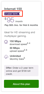
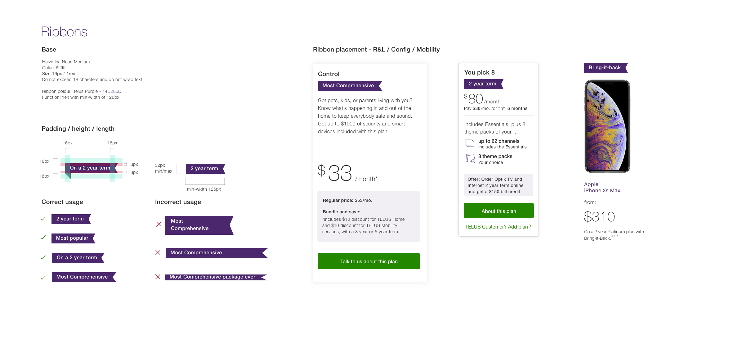
Home Solutions Ribbon: Usage criteria: for use on a product card to signify a term length contract on an offer (e.g. 2 year term) must:
|
|
@sketchidea are you/ your team still planning to develop this component? |
|
Hi Everyone, our designer Francisco has new designs @twirlingsky |
|
Connected with Francisco regarding "ribbon". Please review the following file: https://invis.io/a/HJ5CGILLKWQT I've done the following:
Next steps:
|
|
Oh! If it's released in code, then:
|
 varunj90
added
status: DPA design review needed
varunj90
moved this from Design review
to In development (code and design)
in Community Backlog
varunj90
added
status: DPA design review needed
varunj90
moved this from Design review
to In development (code and design)
in Community Backlog
|
Hello folks, as per my discussion with Francisco, I've added the ribbon component in TDS Community DSM library under "Components (not coded)". When dev is completed, we can move to "Components (coded)". Cheerios! https://telus.invisionapp.com/dsm/telus/tds-community/folder/components/5ca657910cb8d13e823259f7 |
varunj90
added
status: DPA design approved
|
Acceptance criteria added |
|
Starting Development today |
adding ribbon component for clear way for customers to see sale or special feature items

new: Promo/flag/ribbon/special marker #48
adding ribbon component for clear way for customers to see sale or special feature items

new: Promo/flag/ribbon/special marker #48
adding ribbon component for clear way for customers to see sale or special feature items

new: Promo/flag/ribbon/special marker #48
adding ribbon component for clear way for customers to see sale or special feature items

new: Promo/flag/ribbon/special marker #48
adding ribbon component for clear way for customers to see sale or special feature items

new: Promo/flag/ribbon/special marker #48
adding ribbon component for clear way for customers to see sale or special feature items

new: Promo/flag/ribbon/special marker #48
* new lock file

* feat(community-ribbon): adding new ribbon component to tds-community

adding ribbon component for clear way for customers to see sale or special feature items

new: Promo/flag/ribbon/special marker #48

* fix(community-ribbon): changes to code according to PR

updating usage criteria

* fix(community-ribbon): changes to code according to PR

updating usage criteria

* fix(community-ribbon): snapshots and e2e tests

updating usage criteria along with tests

* fix(community-side-navigation): updating snapshots and e2e tests

updating tests

* fix(community-ribbon): updating tests

:Skip

* fix(community-side-navigation): updating e2e tests

* fix(community-pagination): updating e2e tests

* fix(community-testimonial): updating e2e tests

* fix: Update e2e shots

* fix(community-ribbon): making style adjustments

* new e2e test

* fix(community-ribbon): removing props in jest test

:sjip
|
Adding notes for reference:
|
|
@twirlingsky Could you confirm if the left padding should be changed to 8px or keep 16px? Did you want to keep the 24px right padding? Did you want to keep a minimum width or just have the ribbon background expand to whatever the label is? |
|
I just gave it a double check and posted a new symbol to DSM. Padding left: 8px |
|
Hello all, As per @twirlingsky's confirmation, here's an updated specs and examples: Details
Sketch use
https://telus.invisionapp.com/share/5TRB1UFAD4U TDS Community DSM library has been updated accordingly. |

|
Please note that the latest working file for this is: https://invis.io/a/HJ5CGILLKWQT |
|
|
Are their docs to see what's been done for accessibility? Saw this was getting released! Exciting! |
|
@mejsullivan Thank you for bring that up. Reaching out to you and @twirlingsky for additional context where applicable. It's not an interactive element, but it is a visual callout - so maybe there is an opportunity to enhance the a11y experience. Unfortunately, the use is so free form that it's not limited to "sale", "offer", or "program". Maybe, the only addition is to include such term in the ribbon label? Please advise and recommend, if folks have suggestions. |
varunj90
moved this from In development (code and design)
to In QA
in Community Backlog
|
Just adding a note here that design a11y review has been double checked. While the opportunity to enhance the component by providing more meaningful context can be an enhancement; to be considered with @twirlingsky and design direction/CX. |
|
Docs: https://tds.telus.com/community/index.html#ribbon |
|
@varunj90 @donnavitan - sorry I don't understand what was said above. Is it accessible? y/n? :) |
|
@mejsullivan Yes, it's accessible! 😃 Just wanted to make a note that there's still a potential to make an accessibility enhancement that will help indicate that the ribbon is a special feature/offer/discount. |
|
Is that what the visual (the shape) is trying to tell people? Or does the text in the ribbon provide that content? |
Problem Statement
as a customer i would like a clear way of seeing if something is on sale or a special feature or new so that i can focus my attention
as a designer i would like a way for all teams to consistently approach flags so that we can improve user experience
Acceptance Criteria:
Recommendation
Designs
Meta
https://www.telus.com/en/bc/mobility/phones/?linktype=nav
MOB/HS/B2B
The text was updated successfully, but these errors were encountered: