How we calculate factor scores
The Scrum Team Survey allows you to visualize how your teams are doing. We use a lot of data from individual participants and aggregate it into snapshots, teams, and even entire organizations. There are a lot of statistics and rules involved in that process. And we don't want that to be a black box. So this page describes how the results come about.
- For individual participants, we calculate the mean average for each factor based on the questions that are connected to it.
- For teams, we calculate the median average from the factor scores of all individual participants for that team.
- For groups of teams, we calculate the mean average from the factor scores of all teams in the selection (their most recent measurement).
- We calculate the delta (improvement) by subtracting the factor score of the current period from the factor score of the previous period.
- Present data on a scale that is meaningful to people (1-100 is easier than 1-7)
- Reduce bias in the results as much as possible (e.g. social bias)
- Prefer robust statistics over very sensitive statistics to avoid leading teams on goose chases (e.g. median versus mean)
- Prefer statistics that include more data over less data (e.g. weighing of averages versus not weighing)
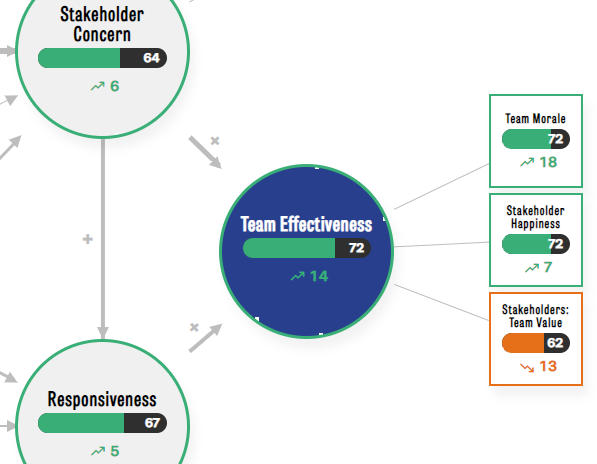
Below is a screenshot of one core factor (Team Effectiveness) and three of its lower-order factors. Although we use this area of the model as an example, the same principle applies to all factors and core factors. Only Management Support is calculated slightly differently (see further down).
The Scrum Team Survey is based on psychometric scales. Each scale consists of two or more questions that are designed to measure a concept. Examples of such concepts are Team Morale, Team Effectiveness, and so on. Learn more about our model here.
Below is a breakdown of scores for two participants of a team, one team member, and one stakeholder. We will use this table to explain how we calculate scores for participants, which are then used to calculate team-level scores and even organization-level scores.
| Question | Team Member 1 | Stakeholder 1 |
|---|---|---|
| Team Morale 1 | 4.5 | |
| Team Morale 2 | 5.4 | |
| Team Morale 3 | 5.4 | |
| Stakeholder Happiness 1 | 5.5 | |
| Stakeholder Happiness 2 | 6.5 | |
| Stakeholder Happiness 3 | 6.5 | |
| Stakeholders: Team Value 1 | 6 | |
| Stakeholders: Team Value 2 | 5 |
This table shows the questions and results for three lower-order factors, Team Morale, Stakeholder Happiness, and Stakeholders: Team Value. The core factor Team Effectiveness is not measured with separate questions, but is based on all the questions of the lower-order factors together. Note that team members and stakeholders receive different questions, hence the empty cells.
The grouping of questions into lower-order factors and a core factor is not arbitrary. We use Exploratory Factor Analysis (EFA), Confirmatory Factor Analysis (CFA), and Statistical Equation Modelling (SEM) to identify clusters of questions and factors in the data. See our research paper for all excruciating technical details.
So how do we calculate the score for Team Morale for a member of your team? We:
- Take all the answers that were given for questions that load on a factor
- Perform a bias correction for social desirability (measured separately). We already applied this correction to the scores in the table above.
- Calculate the mean average of the available answers
- Transform the mean average from a 7-point Likert scale to a 100-point scale, with
((mean - 1) / 6) * 100. - Round to the nearest integer for readability
We follow this approach for all lower-order factors. For the core factor Team Effectiveness, we take all answers to all questions of the lower-order factors. So this is theoretically 8 for this core factor (3+3+2), but in practice 6 questions for team members and 2 questions for stakeholders. This approach results in the following outcomes:
| Factor* | Team Member 1 | Stakeholder 1 |
|---|---|---|
| Team Morale | ||
| Mean (1-7 scale) | 5.1 | |
| Transformed (1-100 scale) | 68.5 | |
| Stakeholder Happiness | ||
| Mean (1-7 scale) | 6.2 | |
| Transformed (1-100 scale) | 86.2 | |
| Stakeholders: Team Value | ||
| Mean (1-7 scale) | 5.5 | |
| Transformed (1-100 scale) | 75.0 | |
| Team Effectiveness | ||
| Mean (1-7 scale) | 5.6 | 5.5 |
| Transformed (1-100 scale) | 77.3 | 75.0 |
So Team Member 1 scores 69 for Team Morale, 86 for Stakeholder Happiness and 77 for Team Effectiveness. Stakeholder 1 scored a 75 on Stakeholders: Team Value and Team Effectiveness.
So now that we have individual-level scores for the factors, we can aggregate this to the team level. Below is a table of individual-level scores from 7 team members and 4 stakeholders from our demo team.
| Participant | Team Effectiveness | Team Morale | Stakeholders: Team Value | Stakeholder Happiness |
|---|---|---|---|---|
| Team Member 1 | 77,3 | 68,5 | 86,2 | |
| Team Member 2 | 77,7 | 74,7 | 80,5 | |
| Team Member 3 | 75,0 | 83,3 | 66,7 | |
| Team Member 4 | 75,0 | 77,8 | 72,2 | |
| Team Member 5 | 66,5 | 69,2 | 63,8 | |
| Team Member 6 | 63,7 | 63,5 | 63,8 | |
| Team Member 7 | 72,2 | 72,2 | 72,2 | |
| Stakeholder 1 | 75,0 | 75,0 | ||
| Stakeholder 2 | 50,0 | 50,0 | ||
| Stakeholder 3 | 58,3 | 58,3 | ||
| Stakeholder 4 | 66,7 | 66,7 | ||
| Factor Score (Median) | 72,2 | 72,2 | 62,5 | 72,2 |
We arrive at the team-level score for Team Effectiveness by:
- Taking all the individual-level scores for this core factor for each participant.
- Calculating the median average
- Round to the nearest integer
So this results in a score of 72 for Team Effectiveness for this team. And also 72 for Team Morale, 63 for Stakeholder Happiness, and 72 for Stakeholders: Team Value. This matches the scores in the screenshot.
Why do we calculate the median and not the mean for the team-level average? The reason is that median averages are much less susceptible to extreme scores, especially for smaller groups of scores (~20). A mean-based average can dive down or soar up due to a single highly dissatisfied or satisfied participant, whereas a median remains more stable and requires more low or high scores to tilt more strongly up or down. We felt that this was a particular risk for team-level scores, so we used medians here.
If you use the Team Dashboard that is available to subscribers, you can also view reports that aggregate multiple teams together. So how do we calculate these numbers? Here are the scores for three teams on Team Effectiveness:
| Participant | Team Effectiveness | Size |
|---|---|---|
| Team 1 | 50.0 | 10 |
| Team 2 | 75.0 | 5 |
| Team 3 | 66.0 | 3 |
| Weighted Average | 60 |
The procedure is quite straightforward. We:
- For each team in the selection, we load the most recent measurement/snapshot of this team within the requested date range
- For each factor in our model, we calculate a weighted mean average. The weight is determined by the size of each team.
- Round to the nearest integer for readability
Why do we use a weighted mean average and not a regular one? We do this to create more robust results that are less sensitive to small (but strong) deviations. In unweighted averages, each value that is included in the calculation makes the same contribution. This means that a very small team (of 2 members) makes the same impact as a large team (of 12 members) on the overall result. But we feel this is unfair to individual participants, as the results of the 12 in the large team contribute less to the overall result than the 2 members in the small team. So we calculate a weighted mean average to control for this.
The thickness of the arrows represents the overall strength of the effects across most Scrum/Agile teams. So in the model, the effect of Continuous Improvement on Stakeholder Concern is much stronger than from Team Autonomy to Responsiveness. We derived these effects from a sample of close to 2.000 Scrum/Agile teams. See our research paper for the details.
Why is this helpful? We feel it offers evidence-based guidance on what is most likely to improve as improvements elsewhere. Say that your team is struggling with low Stakeholder Concern. A clear opportunity is to invest in low-scoring lower-order factors of this core factor, like Sprint Goals of Value Focus. But the thick arrow from Continuous Improvement means that improvements in that area also tend to improve Stakeholder Concern. So it's a good alternative option to invest in.
The screenshot at the top of this post shows the Stakeholder Concern improved by 6 points, and that Team Effectiveness improved by 14 points. There is little magic behind this calculation. We simply take the current factor score for each factor and compare it to the factor score from the previous period (e.g. 3 months before, 6 months before).
Sharp users have wondered why it is that the scores of the various core factors are different from the means of their lower-order factors. The screenshot provides a nice example of this. The scores for the lower-order factors of Team Effectiveness are 72, 72, and 62 respectively. The mean of this is 68.6, which is indeed different from the score of 72 that is reported. This isn't a bug but a conscious decision on our part.
A challenge of data aggregation is that you're trying to summarize detailed, low-level data with a single number. The quality of the resulting number depends on the quality and spread of underlying data points. For example, most of us know that averages are sensitive to extreme scores. A mean average can take a nosedive when even a single very low score exists in a larger set of high scores. One way to dampen this kind of bias is to maximize the number of data points used in analyses, which is what we always strive for.
In the aforementioned simple calculation of Team Effectiveness, we would calculate its score for each participant by averaging the participants' score for Team morale, Stakeholder Happiness, and Stakeholders: Team Value. But this average would be based on only 3 data points and prone to bias. Instead, for each participant we take all 8 responses to the lower-order factors and calculate a mean average from that. This gives us 8 data points per participant and less bias.
Why are lower-order factors all trending up or down while the higher-order factor is trending in the other direction?
In very rare instances, you may encounter a scenario like this:

Why does this happen? This is the result of how we calculate factor scores for lower-order and core factors. Consult this topic for more detail. One caveat of our approach is that its increased accuracy comes at the cost of less intuitive results in some scenarios that manifest like the picture above.
In some teams, one set of members may rate a factor very high whereas another set rates it very low (e.g. three scores of 10 and four scores of 90). Averages, like means and medians, lose their meaning in such cases because there isn't an actual "average". In such teams, the results for lower-order factors, that rely on 2, 3, or 4 questions, will be much more prone to statistical bias in such teams than the higher-order factors that rely on many more data points (12 in the case of Stakeholder Concern). This statistical bias can lead to the erratic results shown above.
We could resolve this issue superficially by simplifying our calculation of scores for core factors. Instead of using the full information, we could simply calculate the average of the lower-order factors. This would make the picture more intuitive. But it would also hide the erratic nature of the data underneath it. It would fix the visual issue but obscure a real problem in a team.
To diagnose this in your team, go to the Team Report and toggle "Show range of scores in my team". Generally speaking, if the range of scores for a factor is very wide (most or two-thirds of the full bar) you should interpret the average score with caution. It is more helpful in such cases to first discuss with your team why the scores vary so wildly. The experience of members can be very different indeed, or people interpret the questions very differently.
Teams with a subscription can see the range of scores for their team in addition to the average result. This is useful to get a sense of the distribution of scores. If the average score is 70 and the range falls between 65 and 75, this indicates a high level of consensus in the team. But if the range goes from 30 to 90 with the same average, it means that some people gave very low scores and others gave very high ones.
An extreme example is shown below and is useful to explain why this happens.

In the example, the stakeholders (yellow) score a 70 on average for "Stakeholder Concern". The range of their scores (the yellow bar) ranges from 7 to about 9. So the average is clearly not in the middle of the yellow bar. Why does this happen?
The (fictional) data for this snapshot shows that the three stakeholders gave an average score of 70, 70, and 100. This results in:
- A median average of 70
- The lowest end of the range is calculated with the 15% percentile and is 70
- The highest end of the range is calculated with the 85% percentile and is 91
These results correspond with the screenshot. The fact that the average falls all the way on the left of its range indicates that the underlying distribution is strongly positively skewed. Or more simply put, most scores cluster around the low end (or the high end) instead of somewhere in the middle. The range is helpful in this case because it helps us understand the distribution of scores and how to interpret it. If the average score falls somewhere in the middle of the range, this indicates a normal distribution. The scores in such distributions cluster around the middle with a few at the lower end and a similar number at the higher end. In our tool, distributions often become more normal as more people participate. So the more participants you have, the more normal the distribution tends to be. On the other hand, with relatively few participants you often end up with a positively or negatively skewed distribution. This doesn't impact the meaning of your scores.
A problem with self-reported questionnaires is that they are sensitive to bias. Some participants may be eager to "do well" on a survey, whereas others are overly optimistic or overly pessimistic. There is no perfect way to prevent this. A well-known method in survey design is to include some questions in the survey that allow us to measure some of this bias and then control for it in our calculations. For this, we use 2 questions from the SDRS-5 scale for social desirability by Hays, Hayashi & Steward (1989).
We use a "common-method factor" approach to control for social desirability. In practice, it means that we dampen the deviation of answers from the average based on how each participant scores on the factor Social Desirability. The more socially biased a participant is, the stronger we dampen the difference between the answer and the average. How strong this damping effect is varied by question, as some questions have shown to be more or less susceptible to social bias than others. The details of this are explained in our research paper.
All the statistics on this page are ultimately aimed at summarizing complex data into something more digestible. Although we follow statistical recommendations where they exist, there is a gray area where we are making judgment calls on what we feel is most valuable to you. So we are always curious to hear about ideas that you have, improvements that you see, or even mistakes in our approach. Let us know!