dropdown menu in a .table-responsive #11037
Comments
|
Also have same issue. Not yet figured easy way to fix it |
|
It is possible by However, I don't know how work these definitions doing. // in navbar.less
// Responsive tables
//
// Wrap your tables in `.table-responsive` and we'll make them mobile friendly
// by enabling horizontal scrolling. Only applies <768px. Everything above that
// will display normally.
@media (max-width: @screen-xs-max) {
.table-responsive {
width: 100%;
margin-bottom: (@line-height-computed * 0.75);
overflow-y: hidden;
overflow-x: scroll; |
|
I have the same problem. This is not a solution because the table is not scrollable on small devices (or small browser windows) and .table-responsive loses all interest... |
|
@nvrch You're right. I'm going to think about scrollable ways on this issue. |
|
Well, I gave it some thought, but the example here is a small table that you wouldn't even need the wrapper on. So see if this works, it did for me. First you add a class to the table "table-drop" Then add some css after the table-responsive classes: Inside your media query where the .table-responsive is 500px is the guestimated height of the drop downs. Then you add some jQuery: If the user does not use the toggle to close the menu and just clicks off, and then clicks the other one, it won't toggle. I don't know a work around except to turn off the ability to click anywhere to close a menu. Perhaps it can be isolated for just not turning off inside a table-responsive div or create a new dropdown script (fork it for tables). I usually avoid doing things that are not in the docs with examples, I would try it first then roll my own solution based on the situation. I would never consider using a table with a dropdown on a mobile device. I would use a php class to create content for desktop and if it were a touch device at a certain size that needs a different view, create a list item or some other mark up so that this stuff can be avoided. What the table-responsive does is just wrap it in an overflow div. I've been doing that for about two years to address tables on responsive sites, and anything that is added dynamically to a table with a wrapper on it, will behave like this, you won't be able to see the stuff without scrolling and since the dropdown menu closes when tap off, on a touch device this is not a good plan. There are other options for responsive tables: |
|
In a real situation, if the table at all smaller sizes from the 767px and below point is taller than the height of your dropdowns, then only on the last several rows (depending on the height) would you need this, but it won't mess up stuff it you do it on all, except that the height will toggle while the user is messing with the dropdown content. |
|
I think positioning via JavaScript is the good solution. Specify container 'body' like tooltips plugin to position the element in the body at another place in the DOM. |
|
nvrch agree, the only one way to solve this is to pull dropdown out of current position and stick to the body with absolute positioning. |
|
The difference between this and a tooltip is that one is generated content and the other is not. For the time being, we won't be supporting dropdowns within responsive tables (or anything else with an |
|
This simple line of jQuery did the trick for me: $('.table-responsive tbody tr').slice(-2).find('.dropdown').addClass('dropup'); I'm 100% sure that this is not a real solution but solves the usability problem quickly. |
|
Could you please someone check if the solution using position:static works? |
|
@leocaseiro for me the following gave a useable result: It includes the dropdown inside the table for mobile devices and makes is simply overflow on desktop devices |
|
Nice one @kaystrobach. In this case is completely responsive and mobile-first :D |
|
|


|
Here is my solution, when This way works if your drop down menu height is more than table. https://gist.github.com/wellwind/8ca3a4d1568f18619574 $(document).ready(function(){
$('.dropdown-menu').parent().on('show.bs.dropdown', function () {
var parentResponsiveTable = $(this).parents('.table-responsive');
var parentTarget = $(parentResponsiveTable).first().hasClass('table-responsive') ? $(parentResponsiveTable) : $(window);
var parentTop = $(parentResponsiveTable).first().hasClass('table-responsive') ? $(parentResponsiveTable).offset().top : 0;
var parentLeft = $(parentResponsiveTable).first().hasClass('table-responsive') ? $(parentResponsiveTable).offset().left : 0;
var dropdownMenu = $(this).children('.dropdown-menu').first();
if (!$(this).hasClass('dropdown') && !$(this).hasClass('dropup')) {
$(this).addClass('dropdown');
}
$(this).attr('olddrop', $(this).hasClass('dropup') ? 'dropup' : 'dropdown');
$(this).children('.dropdown-menu').each(function () {
$(this).attr('olddrop-pull', $(this).hasClass('dropdown-menu-right') ? 'dropdown-menu-right' : '');
});
if ($(this).hasClass('dropdown')) {
if ($(this).offset().top + $(this).height() + $(dropdownMenu).height() + 10 >= parentTop + $(parentTarget).height()) {
$(this).removeClass('dropdown');
$(this).addClass('dropup');
}
} else if ($(this).hasClass('dropup')) {
if ($(this).offset().top - $(dropdownMenu).height() - 10 <= parentTop) {
$(this).removeClass('dropup');
$(this).addClass('dropdown');
}
}
if ($(this).offset().left + $(dropdownMenu).width() >= parentLeft + $(parentTarget).width()) {
$(this).children('.dropdown-menu').addClass('dropdown-menu-right');
}
});
$('.dropdown-menu').parent().on('hide.bs.dropdown', function () {
if ($(this).attr('olddrop') != '') {
$(this).removeClass('dropup dropdown');
$(this).addClass($(this).attr('olddrop'));
$(this).attr('olddrop', '');
}
$(this).children('.dropdown-menu').each(function () {
$(this).removeClass('dropdown-menu-right');
$(this).addClass($(this).attr('olddrop-pull'));
});
});
}); |
|
mhmm sadly not reliable, fails, if you have just one row in the table, but 10 in them menu :( which can occur, if you filter data sets |
|
imho the best option would be to move the dropdown directly into the body and then simply use absolute positioning ... this way we will not have problems with overlays :( |
however, doing that will severely mess up focus order (for keyboard users - yes, even on small screen devices like phones/tablets, there are users with paired bluetooth keyboard - and assistive technology users) unless you add extra code to explicitly set/unset the focus to the correct place |
|
mhmm right ... |
|
Still believe the best solution would be only with CSS: @media (max-width: 767px) {
.table-responsive .dropdown-menu,
.table-responsive .dropdown-toggle {
position: static !important;
}
}
@media (min-width: 768px) {
    .table-responsive {
        overflow: visible;
    }
} |
|
position:static for dropdown-menu, datepicker, timepicker (parent OR parents) inside .table-responsive |
|
Im currently running into the same exact issue. Weird thing is it only seems to happen on safari on iphones. Mobile chrome and mobile firefox is fine. |
|
This is what worked for me (combination of several solutions above including @kaystrobach and @julianmontagna ) ` @media (min-width: 768px) { ^ the margin doesn't really do anything and can be replaced with a CSS property that would not change the look and feel drastically. Make it anything you want if you have margins set for your drowndown. ` }
^ Get "n" number of btnGroup items at the bottom and change them to a drop up. If the user is resizing, then change them back to dropdowns. This has room for improvement. |
|
@baltazarqc you have the best solution so far. Thanks a lot! I just improved it a little bit... jQuery.fn.hasHScrollBar = function(){
return this.get(0).scrollWidth > this.innerWidth();
}
$('.table-responsive .dropdown').on('show.bs.dropdown', function (e) {
var $table = $(this).closest('.table-responsive');
if(!$table.hasHScrollBar()){
$('.table-responsive').css("overflow", "visible");
}
});
$('.table-responsive .dropdown').on('shown.bs.dropdown', function (e) {
var $table = $(this).closest('.table-responsive');
if($table.hasHScrollBar()){
var $menu = $(this).find('.dropdown-menu'),
tableOffsetHeight = $table.offset().top + $table.height(),
menuOffsetHeight = $menu.offset().top + $menu.outerHeight(true);
if (menuOffsetHeight > tableOffsetHeight)
$table.css("padding-bottom", menuOffsetHeight - tableOffsetHeight + 15);
}
});
$('.table-responsive .dropdown').on('hide.bs.dropdown', function () {
$(this).closest('.table-responsive').css({"padding-bottom":"", "overflow":""});
})If we haven't a horizontal scroll bar, we do not need to padding bottom, so overflow visible seems to be a best solution. |
|
Nice @llins! I love how you modified this! ;) |
This is not good if the table may need to scroll even on bigger devices |
|
@baltazarqc & @llins, great work! Some more improvments: |
|
@simon21587 It works perfectly |
|
Another solution working on small screens: https://www.npmjs.com/package/bootstrap-responsive-table-dropdown |
|
@simon21587 working like a charm, thank you so much. Bets solution until we get a proper fix (in BS4 ?) |
|
This is still an issue in the Bootstrap 4.0.0 release. Is there any official comment on whether this is going to be fixed? I found lot of "closed" cases, but no official fix/solution. |
|
There is an official solution in the dropdown documentation, you can specify the "boundary" option as: viewport or window for work inside table with overflow |
|
try this ` $('body').on('hide.bs.dropdown', function (e) { |
|
as @claudioalmeiida mentioned, for me adding data-boundary="viewport" to the button that toggles the dropdown (the one with the class "dropdown-toggle"), solved it. See https://getbootstrap.com/docs/4.1/components/dropdowns/#options |
works for me thanks |
|
For me, this is the best solution with bootstrap from version 3 to 5, thanks
|
|
For BS v5.1 |
It looks like you have 1 extra curly brace in the example. But the example worked for me. |
|
None of the solutions worked for me, I have a big-ass table with like 12 big-ass columns, I need the |
|
After more than a few hours and various attempts I found the working version: |
why? based on all the discussions on these, even in 2022, this should be a priority |
on the same boat as you on this. |
|
I have solved the problem by changing the position of the dropdown menu from 'absolute' to 'fixed', and now it works. If you are using jQuery then you can use this code or rewrite equivalent vanilla code. |
|
Bootstrap 4. I'm adding a class "dropup" on the dropdown class when it's the last element of the last. |
 and others
If you have an Dropdown (e.g. from a Button) inside a table-respnsive object than the dropdown is not display correct on small devices (or small browser Windows).
here the example:
If you have a big screen, all looks good.
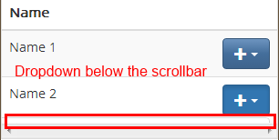
If you make the screen very small than the dropdown is not displayed correctly:
By the way:
Tested on Chrome 29 and Bootstrap 3
The text was updated successfully, but these errors were encountered: