Skip to content
New issue

Have a question about this project? Sign up for a free GitHub account to open an issue and contact its maintainers and the community.

By clicking “Sign up for GitHub”, you agree to our terms of service and privacy statement. We’ll occasionally send you account related emails.

Already on GitHub? Sign in to your account

U4-11588 - Adjustments of color picker #2864

Merged
merged 8 commits into from Sep 30, 2018

Conversation

bjarnef
Copy link
Contributor

@bjarnef bjarnef commented Aug 20, 2018

Prerequisites

Description

This fixed a bit styling of the color picker prevalues, so longer labels doesn't push the remove button.

Before

2018-08-20_15-42-26

After

image

Before

2018-08-20_15-43-05

After

image

@bjarnef
Copy link
Contributor Author

bjarnef commented Aug 20, 2018

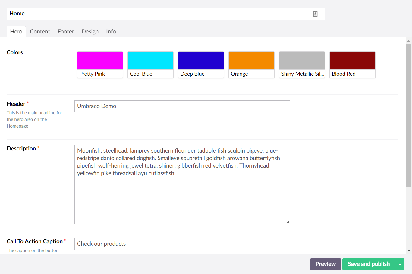
Furthemore I have adjusted the color pickers a bit when using labels, so it is a bit more clean compared with the current styling.

image

image

For longer labels it truncate the text, but has the full title in a tooltip.

image

@madsrasmussen
Copy link
Contributor

Hi Bjarne,

Any reason use don't reuse the same component which was made for the icon picker?

@bjarnef
Copy link
Contributor Author

bjarnef commented Aug 20, 2018

@madsrasmussen the style of the color picker already looks a bit like the umb-color-swatches component, which I added and introduced in Umbraco v7.12.0, but it is a very basic start and it is also the plan it can be re-used in other parts of the UI :)

The umb-color-swatches can probably be re-used in color picker, when the color pickers doesn't use labels.

For now a have just updated a bit of the current styling, so it works a bit better with longer labels and I use same markup and styles in both "modes".

But maybe the umb-color-swatches should have a property to support labels or similar and the UI could look something similar to the screenshots.

@bjarnef bjarnef changed the title WIP - U4-11588 - Adjustments of color picker U4-11588 - Adjustments of color picker Aug 20, 2018
@madsrasmussen
Copy link
Contributor

That was exactly my thought. We could add an option to the umb-color-swatches component to show the labels. It might also make sense to have an option to render the squares in different sizes.

@bjarnef
Copy link
Contributor Author

bjarnef commented Aug 20, 2018

It could have a property like use-labels or similary, but it guess it would also need a property to send an array of object which include the labels?

For the size, it is also the the thought I had about the size property:

@bjarnef
Copy link
Contributor Author

bjarnef commented Aug 20, 2018

It would also be great the re-use this component for color picker prevalues editor (which I think has been missing) #1503

@bjarnef
Copy link
Contributor Author

bjarnef commented Aug 21, 2018

@madsrasmussen can we merge this first and look at replace this with the umb-color-swatches afterwards?

I would also like to use this component for a color picker prevalue editor, which e.g. can be used on grid config.

@madsrasmussen
Copy link
Contributor

I think the colors with labels look a little chunky. I think it would help if we removed the border and made the label name a little bit smaller and lighter.

I did a quick search online and maybe something in the lines of this. With a little less spacing and labels on one line.

screenshot 2018-08-23 19 17 30

@bjarnef
Copy link
Contributor Author

bjarnef commented Aug 23, 2018

@madsrasmussen I wonder how it will look with multiple lines/rows of colors and if they keep its closure.

Maybe it could also be something like this?
https://dribbble.com/shots/2684569-Color-Palette-Sketch-Template

or something like this:
https://dribbble.com/shots/5186604-New-TP-Color-Scheme

@nul800sebastiaan
Copy link
Member

@bjarnef Just to get back on this one, we've just discussed this and it would be great if you would like to finish it using your directive with some extra height/width options and basically like the example Mads posted. The color palettes one is a bit too high for our liking but if we can vary the width and height in the directive we could just play with it to see what makes sense. Does that help move this forward?

Good stuff, keep up the great work!! ⭐️

@bjarnef
Copy link
Contributor Author

bjarnef commented Sep 9, 2018

I have adjusted the code, so it now re-use the umb-color-swatches directive/component.

image

The component use the hex-bg-color directive to apply the background color as it use in the current property editor, however the document type icon colors use classes, where the background colors are styled from these classes:

$scope.colors = [
{ name: "Black", value: "color-black" },
{ name: "Blue Grey", value: "color-blue-grey" },
{ name: "Grey", value: "color-grey" },
{ name: "Brown", value: "color-brown" },
{ name: "Blue", value: "color-blue" },
{ name: "Light Blue", value: "color-light-blue" },
{ name: "Indigo", value: "color-indigo" },
{ name: "Purple", value: "color-purple" },
{ name: "Deep Purple", value: "color-deep-purple" },
{ name: "Cyan", value: "color-cyan" },
{ name: "Green", value: "color-green" },
{ name: "Light Green", value: "color-light-green" },
{ name: "Lime", value: "color-lime" },
{ name: "Yellow", value: "color-yellow" },
{ name: "Amber", value: "color-amber" },
{ name: "Orange", value: "color-orange" },
{ name: "Deep Orange", value: "color-deep-orange" },
{ name: "Red", value: "color-red" },
{ name: "Pink", value: "color-pink" }
];

I am nore sure how to handle this to use either to class style or the inline background color applied from hex-bg-color? It seems when the value for hex-bg-color is an invalid hex code, it fallback to white, which at the moment the override the class styles in doctype icon picker (colors).

image

Should the hex-bg-color directive only apply the background, when the value is a valid hex code, or have another property to decide whether to inline background style should be applied to the element?

Furhermore the object in the array here

$scope.colors = [
{ name: "Black", value: "color-black" },
{ name: "Blue Grey", value: "color-blue-grey" },
{ name: "Grey", value: "color-grey" },
{ name: "Brown", value: "color-brown" },
{ name: "Blue", value: "color-blue" },
{ name: "Light Blue", value: "color-light-blue" },
{ name: "Indigo", value: "color-indigo" },
{ name: "Purple", value: "color-purple" },
{ name: "Deep Purple", value: "color-deep-purple" },
{ name: "Cyan", value: "color-cyan" },
{ name: "Green", value: "color-green" },
{ name: "Light Green", value: "color-light-green" },
{ name: "Lime", value: "color-lime" },
{ name: "Yellow", value: "color-yellow" },
{ name: "Amber", value: "color-amber" },
{ name: "Orange", value: "color-orange" },
{ name: "Deep Orange", value: "color-deep-orange" },
{ name: "Red", value: "color-red" },
{ name: "Pink", value: "color-pink" }
];
is a bit different from the stored json/objects in color picker prevalues, where it has a property label insted of name.
I guess the easiest would be to changethis property name to label?

Also note that I have added type=button to the button elements, so it doesn't submit the form each time you select a color as @madsrasmussen also changed in this commit 6c0d14e

@bjarnef
Copy link
Contributor Author

bjarnef commented Sep 9, 2018

An example of overflow for longer color labels:

image

@nul800sebastiaan
Copy link
Member

Thanks again @bjarnef - it looks super cool!!

I am nore sure how to handle this to use either to class style or the inline background color applied from hex-bg-color? It seems when the value for hex-bg-color is an invalid hex code, it fallback to white, which at the moment the override the class styles in doctype icon picker (colors).

Yes, it would be awesome if you could fallback to the class style if the hex-bg-color is an invalid hex, can you update that please?

@bjarnef
Copy link
Contributor Author

bjarnef commented Sep 27, 2018

@nul800sebastiaan yes, I can have a look at this when a have some time :)
At the moment it seems hex-bg-color fallback to white, when the hex code is invalid. I guess we can change this so it only add the background color in style attribute if the hex code is valid, but maybe an additional property on the directive to turn it on/off based on a condition would be nice too?

@bjarnef
Copy link
Contributor Author

bjarnef commented Sep 27, 2018

@nul800sebastiaan can you review this again? :)
I have added a property, so it is possible to "disable" the hex-bg-color, e.g. in icon picker on document types, where the colors are based on class names.

It could fallback to the class style if the hex-bg-color is an invalid hex, but I guess people in theory could name the class name e.g. "ff0000" which is a valid hex code and it then add the background color, so I think it is okay, to set (true/false) whether the colors are defined via hex codes or class names. Also if you are using the class names it doesn't need to observe, test for valid hex codes, etc.

At the moment the hex-bg-color is defined like this: hex-bg-color="{{color.value}}"

e.g. hex-bg-color="#ff0000"or hex-bg-color="ff0000" or hex-bg-color="#f00" returns red colors

However these formats doesn't seem to work, which fallback to white (which seems to be the border color unless a hex-bg-orig is defined).
hex-bg-color="rgb(255,0,0)" or hex-bg-color="red"

It could maybe later use tinyColor for this, e.g. so the prevalues sended to the color picker (which probably should use this one with color swatchers) works with defining colors with their color names, rgb(a) or hex code as in this PR #1503

Not sure if you have other suggestions for the directive properties useLabel and useColorClass?
Maybe in plural instead? useLabels and useColorClasses? But it is also great to keep it short and I think the label in color picker prevalues is named useLabel.

But for now I think this one is ready.

@nul800sebastiaan nul800sebastiaan merged commit 865cdc0 into umbraco:dev-v7 Sep 30, 2018
@nul800sebastiaan
Copy link
Member

I think it's fine for now that it doesn't work with rgb or named colors, at least it does what we need to do at the moment. It looks beautiful!

Yep, I think keeping it short and singular is absolutely fine.

Great work, as usual, thanks so much @bjarnef ! ⭐️

@nul800sebastiaan
Copy link
Member

Ah, you forgot to rename the name property in the iconpicker, fixed here: 3c73f6a

@bjarnef bjarnef deleted the dev-v7-U4-11588 branch September 12, 2020 12:15
Sign up for free to join this conversation on GitHub. Already have an account? Sign in to comment
Labels
None yet
Projects
None yet
Development

Successfully merging this pull request may close these issues.

None yet

3 participants