Tappable/Clickable things should look tappable/clickable #2379
Labels
Milestone
Comments
Sign up for free
to join this conversation on GitHub.
Already have an account?
Sign in to comment
Expected behaviour
All interactive elements need minimum 2 unique visual/semantic clues that differentiate them from normal text on mobile (i.e. hover states don't count because they only work on desktop). This can take many forms, including colour change (e.g. "link blue", font weight, font styling, appending graphical elements like chevrons and/or icons).
This is an endemic usability/accessibility problem in platform.
Actual behaviour
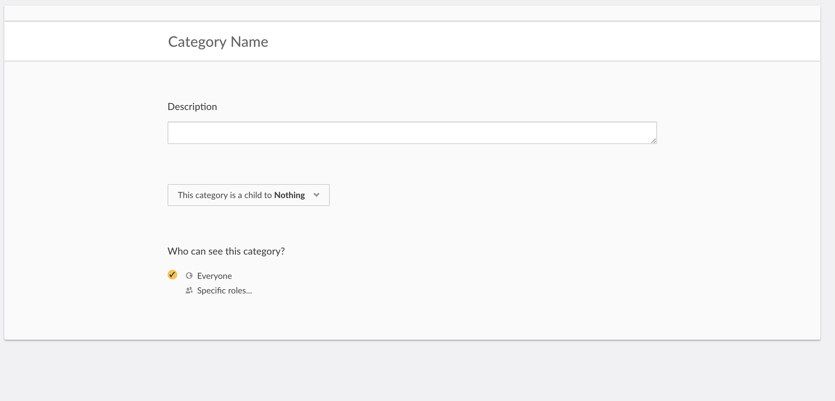
^^ How can you tell which things are clickable and which aren't?^^How do I select the category? The yellow button? The checkbox? the card background? the text? In this case, many test participants actually delete the category by accident because it's the only thing that looks tappable on the page that isn't the yellow FAB.
Solution
We need to:
Aha! Link: https://ushahiditeam.aha.io/features/PROD-461
The text was updated successfully, but these errors were encountered: