Example of central-baseline alignment of sideways-ed Latin glyphs within a vertical Japanese line box #246
Comments
|
Simply, historically, there is no 'baseline' for Japanese typography. /cc @kidayasuo if any additional information. |
|
It is not true that the Latin glyphs are centrally aligned in vertical -- they ride on their own Latin baseline that is placed at an appropriate point (derived e.g. by centering the cap height) inside the cjk embox. If there were mixed sizes, I would expect the Latin baseline to be common and those glyphs align to it (e.g. be rotated and left-aligned to their Latin baseline), rather than have them centered on their cap heights, that then lie on the cjk embox center of the line (although perhaps some users want this -- therefore we need both). It is the calculation of Latin baselines and other metrics relative to a CJK embox that makes Japanese typography, even with mixed scripts, complex. Especially since the imaging systems and digital fonts are based on Latin metrics, the CJK embox concept is an overlay of the layout software for the benefit of Japanese users who do not think of layout in terms of a "baseline" as Shimono-san describes above. |
|
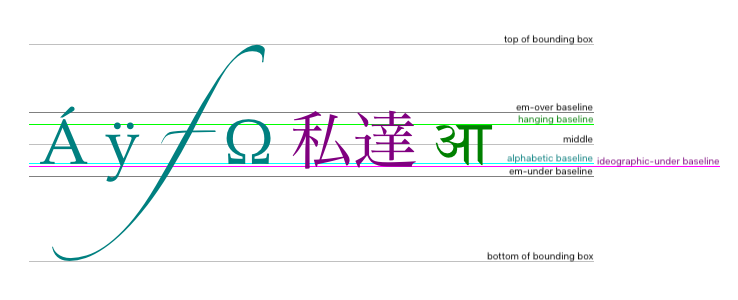
http://www.gtalbot.org/BugzillaSection/Bug1673499-Mixed-fonts-line-height-v7.html Each font can (preferably should) have a baseline table so that glyphs in a mixed script scenario can be positioned according to the dominant baseline. The dominant baseline for 'writing-mode: vertical-rl' is center (assuming 'text-orientation' is 'mixed'). So, rotated sideways 90° clockwise Latin glyphs must use the central baseline, must be centrally-baseline aligned within the line box. The demo { If I understand you correctly (and I think I do), then this is not what Firefox and Chrome do and this is not what the CSS spec states (although not very clearly, I admit). |
|
Creating "balance" across scripts and using the normal baseline for each script, with mixed sizes, is perhaps an edge case with several possible answers. I should have said "It is not always true that..." |
|
In section 2.3.2 , sub-section b, sub-sub-section ii, after figure 25, I would insert another example where the Japanese line box is increased, something like http://www.gtalbot.org/BugzillaSection/Bug1673499-Mixed-fonts-line-height-v5.html http://www.gtalbot.org/BugzillaSection/Bug1673499-Mixed-fonts-line-height-v4.html |
You may find examples (incl. line gap arrangement) at: |
|
A fundamental issue is that if you position two runs next to each other with the same Roman baseline (origin), and then show the Japanese metrics next to the Latin metrics, you will see how the two systems are incompatible -- The Latin metrics are not useful when setting text in a Japanese metrics model (CJK emboxes). |

In Figure 301, how the larger characters jut (symetrically, on both sides) into interlinear space is barely noticeable in the image. There is no concept of line gap in CSS. There is no vertical space between line boxes in CSS.
CSS defines that. CSS specifies that. Not markup though. |
|
The jutting into interlinear space is showing how gridding in J layout is needed to keep the line leading (as measured from the line centers) constant even in the face of larger sized text. Each line center is pinned to the grid, in other words. Yes, not markup; CSS. But such a mode in CSS doesn't exist, at least in the way I was trying to describe. |
Yes. Agreed. But the example in figure 301 makes this barely noticeable: it is not easy to see in the example-image. My request in this issue is to have an example of sideways-ed Latin text within a vertical Japanese line box in the "Requirements for Japanese Text Layout" document.
Such system exists in CSS. CSS3 Writing-modes, section 4.2 Also, dominant-baseline property when implemented will allow web authors to specify 'hanging' or 'ideographic' if that is what they want. |
|
Perhaps what @macnmm's means (clarification from @macnmm is welcome) is not just the dominant baseline (not to mention that Japanese typography is based on CJK embox rather than baseline), but also font matching, character spacing rules, line breaking, punctuation width adjustment and other aspects, somewhat like the Adobe Japanese Composers in Adobe InDesign? |
|
Thank you, @xfq. Yes, I was trying to say that in a purely Japanese typographic model, the line height is embox-based, the line gap is derived from several systems of line positioning (that differ from Latin leading and from CSS line heights and existing grids), the prioritization of character spacing by character class and then script, are all unique to Japanese convention, and favor Japanese fonts and glyph design over the rest. The Latin-based world and rules and priorities and conventions are different from this, and so I keep thinking we need a mode switch rather than a compromise of all rules to a single one-size-fits-all solution that does none of them well. (Of course measured by comparison to the print world; perhaps one's measure of quality can vary widely). |
Dear fellow jlreq colleagues,
In section 2.3.2
https://www.w3.org/TR/jlreq/#major_differences_between_vertical_writing_mode_and_horizontal_writing_mode
I believe there ought to be an example of central-baseline alignment of sideways-ed Latin glyphs within a vertical Japanese line box . Why?
does not have an example of this and because
its section 4.2 statement
" In vertical typographic mode, the central baseline is used as the dominant baseline when text-orientation is mixed "
is actually fully understood only by few (technical-advanced) people like ourselves
Please note that the current version of "Requirements for Japanese Text Layout" does not use the word "baseline" anywhere. Not even once, in the whole document!
Thank you for your understanding,
Gérard
The text was updated successfully, but these errors were encountered: