[Discussion] Bump Minimum Version to 1809 #3440
Comments
 michael-hawker
added
question ❔
michael-hawker
added
question ❔
Also fixed issues with keyboard navigation in control.
Note: Requires 1809, otherwise crash (IsEditable), needs conditional? See CommunityToolkit#3440
|
This would also help us with some of the issues we've been facing due to microsoft/microsoft-ui-xaml#2556, as I didn't notice the SDK bump helping, but was also trying on a weird property (IsEditable) which exists just behavior change on older versions. |
|
I don't think that conditional XAML would make much sense to use any of this properties on WinUI3, since everything will be lifted and available (that is one of the value propositions of it).
@michael-hawker Sorry but, why is that the case? |
|
@azchohfi for WinUI 3 I was saying by bumping our min version we'll be removing a lot of conditional XAML in the Toolkit, so we'll be one step closer as we wouldn't need it in WinUI 3 later anyway.
As for this, if we have a min of 1809, an application developer can't go below that as their minimum target and include the Toolkit. Otherwise the tools won't load it, even if you use conditional XAML to try and not use Toolkit components when the app is running below that. It's seems like something that was missed as part of the build system to support having an app min lower than any include library. So, up until this question, we've left the minimum down so that application developers can target anything in-between 16299 and now, but I think for the project maintenance, it'd be easier to bump it up now for 7.0. That also means we still target a LTSC release, which I think is a good bar to keep at least, as that's probably what most folks would be min targeting as things move forward (as everything else will out of support by November except the LTSC of Redstone 1 (which we don't support now anyway))? |

|
Our min right now is 16299 (1709). When we move to WinUI3, our min should align with whatever min WinUI3 supports since, AFAIK, there will be no reason to be any higher since WinUI3 will support everything down to that min. That is one of the advantages of WinUI3. WinUI3's min version is 17134 (1803), so we'll need to bump our min anyway, but only to that. I'm not seeing the benefit of bumping our min to something higher than 1803. WinUI is only the UI layer, but a dev might need to target something lower to reach an audience that just didn't update windows (which does happen on Enterprises). By bumping our min to something higher that 1803, no dev would be able to have their min lower than than, since we would be saying that we don't support that. Why wouldn't why? I might just not be understanding the issue. A different discussion is the lack of support for 1803. We should loop in some one from the WinUI team to understand what the out-of-support of 1803 means for WinUI3, since that will be their min. |
|
FYI, Lottie-Windows requires 1809 in order to actually render a Lottie. LottieVisualSource will load on earlier versions but we can't render a Lottie, so AnimatedVisualPlayer will render its FallbackContent on Windows< 1809. Therefore, moving up to 1809 will not change anything in Lottie-Windows behavior, and will be very welcome (because I always feel like we're disappointing customers who expect things to work < 1809). |
|
Based on the support dates, 1803 is almost no longer supported. By the time the toolkit ship, it will probably no longer be supported at all. Targeting 1809 for the min version seems to be a good choice for now, most of the users are there, it is compliant with WinUI3 min version and it targets an LTSC Windows build. We can also directly target 1903 but that would mean no longer supporting in the toolkit a Windows build which is still officially supported for ~10 months. |
|
@azchohfi this should be pretty straight-forward to implement, eh? The main thing is just if we want to go and clean-up all the conditional XAML and any other weird checks, eh? I synced with @andrewleader on the notifications package. We'll leave the min down where it is excluded from this bump, but we'll make sure the target version aligns with the rest of the toolkit still so we can still get a single SDK requirement across the Toolkit and the Sample App needed for development. |
|
Yes, literally just change it, and the TFMs for the nugets. |
|
We can just target what WinUI 3/Project Reunion does!! |
|
@Nirmal4G we absolutely can, on 8.x. This change is for 7.x. |
|
So 7.x is not on top of WinUI 3? |
|
No. 7.x is still on OS XAML UWP. |
|
Also, XAML Islands only works on 18362 (1903). |
…on paths. (#3478)

Also, removed any WinJS reference.

## Fixes #3440

## PR Type
What kind of change does this PR introduce?
<!-- Please uncomment one or more that apply to this PR. -->

- Build or CI related changes

## What is the current behavior?
Target SDK = 18362
Min SDK = 16299

## What is the new behavior?
Target SDK = 19041
Min SDK = 17763

## PR Checklist

Please check if your PR fulfills the following requirements:

- [X] Tested code with current [supported SDKs](../readme.md#supported)
- [ ] Pull Request has been submitted to the documentation repository [instructions](..\contributing.md#docs). Link: <!-- docs PR link -->
- [X] Sample in sample app has been added / updated (for bug fixes / features)
    - [ ] Icon has been created (if new sample) following the [Thumbnail Style Guide and templates](https://github.com/windows-toolkit/WindowsCommunityToolkit-design-assets)
- [ ] Tests for the changes have been added (for bug fixes / features) (if applicable)
- [X] Header has been added to all new source files (run *build/UpdateHeaders.bat*)
- [ ] Contains **NO** breaking changes

This PR does have breaking changes, as expected by #3062.
## Fixes #3528
<!-- Add the relevant issue number after the "#" mentioned above (for ex: Fixes #1234) which will automatically close the issue once the PR is merged. -->

<!-- Add a brief overview here of the feature/bug & fix. -->

## PR Type
What kind of change does this PR introduce?
<!-- Please uncomment one or more that apply to this PR. -->

- Bugfix
<!-- - Feature -->
<!-- - Code style update (formatting) -->
<!-- - Refactoring (no functional changes, no api changes) -->
<!-- - Build or CI related changes -->
<!-- - Documentation content changes -->
<!-- - Sample app changes -->
<!-- - Other... Please describe: -->


## What is the current behavior?
<!-- Please describe the current behavior that you are modifying, or link to a relevant issue. -->
The `ImageEx.CornerRadius` property isn't working anymore.

## What is the new behavior?
<!-- Describe how was this issue resolved or changed? -->
Modifying `ImageEx.CornerRadius` works correctly.

## Additional detail
With #3440, we bumped the minimum SDK to 1809 (build 17763), which is the first one with the `CornerRadius` being available in the `Control` class. I suspect building the controls package with that minimum SDK caused an issue with `ImageEx` defining the `CornerRadius` property again (using `new`), so that the XAML `TemplateBinding` ended up failing to find the correct property to bind to. It might also be because setting the property in XAML ended up setting the value for the incorrect duplicate one, so that binding was never update. Regardless, with that minimum version available there's no reason to duplicate that property in the first place, we can just use the built-in one and bind to that. This PR removes that duplicate property, fixing the issue.

> **NOTE:** this is _technically_ a breaking change as we're removing a public property, but users should effectively not really notice any difference, unless they were for some reason setting that very specific property through reflection, which is highly unlikely. Adding the tag for correctness, since this is still in fact a breaking change. Not likely to be noticed though 😄

## PR Checklist

Please check if your PR fulfills the following requirements:

- [X] Tested code with current [supported SDKs](../readme.md#supported)
- [ ] ~~Pull Request has been submitted to the documentation repository [instructions](..\contributing.md#docs). Link: <!-- docs PR link -->~~
- [ ] ~~Sample in sample app has been added / updated (for bug fixes / features)~~
    - [ ] ~~Icon has been created (if new sample) following the [Thumbnail Style Guide and templates](https://github.com/windows-toolkit/WindowsCommunityToolkit-design-assets)~~
- [X] Tests for the changes have been added (for bug fixes / features) (if applicable)
- [X] Header has been added to all new source files (run *build/UpdateHeaders.bat*)
- [ ] Contains **NO** breaking changes
# Add ColorPickerButton to the Toolkit Closes #3363 ## PR Type What kind of change does this PR introduce? Feature Documentation content changes Sample app changes ## What is the current behavior? The toolkit, and WinUI/UWP, has no flyout ColorPicker. The color picker that currently exists is a large canvas-type control (that is incorrectly named). This existing control has lots of usability concerns discussed in #3363 and the WinUI repository. ## What is the new behavior? A brand-new control is added to allow selecting and editing a color within a flyout. The selected color is always visible in the content area of a drop-down button as a preview. 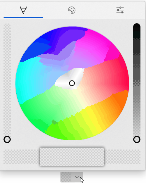 The new properties for this picker are below. Note that these are purposely name 'CustomPalette...' instead of 'Palette...' as multiple palettes may be supported in the future (windows colors, recent colors, custom palette all in different sections visible at the same time). ```csharp /// <summary> /// Gets the list of custom palette colors. /// </summary> public ObservableCollection<Windows.UI.Color> CustomPaletteColors { get; } /// <summary> /// Gets or sets the number of colors in each row (section) of the custom color palette. /// A section is the number of columns within an entire row in the palette. /// Within a standard palette, rows are shades and columns are unique colors. /// </summary> public int CustomPaletteColumns { get; set; } /// <summary> /// Gets or sets a custom IColorPalette . /// This will automatically set <see cref="CustomPaletteColors"/> and <see cref="CustomPaletteSectionCount"/> /// overwriting any existing values. /// </summary> public IColorPalette CustomPalette { get; set; } /// <summary> /// Gets or sets a value indicating whether the color palette is visible. /// </summary> public bool IsColorPaletteVisible { get; set; } ``` Making all of this easier is a new IColorPalette interface. Any class can implement this interface to provide a custom color palette such as windows colors (the default), RYB colors, Flat UI colors, etc. Colors could also be algorithmically generated. ```csharp /// <summary> /// Interface to define a color palette. /// </summary> public interface IColorPalette { /// <summary> /// Gets the total number of colors in this palette. /// A color is not necessarily a single value and may be composed of several shades. /// </summary> int ColorCount { get; } /// <summary> /// Gets the total number of shades for each color in this palette. /// Shades are usually a variation of the color lightening or darkening it. /// </summary> int ShadeCount { get; } /// <summary> /// Gets a color in the palette by index. /// </summary> /// <param name="colorIndex">The index of the color in the palette. /// The index must be between zero and <see cref="ColorCount"/>.</param> /// <param name="shadeIndex">The index of the color shade in the palette. /// The index must be between zero and <see cref="ShadeCount"/>.</param> /// <returns>The color at the specified index or an exception.</returns> Color GetColor(int colorIndex, int shadeIndex); } ``` ## PR Checklist Please check if your PR fulfills the following requirements: - [x] Tested code with current [supported SDKs](../readme.md#supported) - [ ] Pull Request has been submitted to the documentation repository [instructions](..\contributing.md#docs). Link: <!-- docs PR link --> - [x] Sample in sample app has been added / updated (for bug fixes / features) - [x] Icon has been created (if new sample) following the [Thumbnail Style Guide and templates](https://github.com/windows-toolkit/WindowsCommunityToolkit-design-assets) - [ ] Tests for the changes have been added (for bug fixes / features) (if applicable) - [x] Header has been added to all new source files (run *build/UpdateHeaders.bat*) - [x] Contains **NO** breaking changes ## Other information **Control** * [x] Ensure the name ColorPickerButton is accepted * [x] Rename ColorPickerSlider to ColorPickerButtonSlider. ColorPickerSlider is already used by WinUI. * [x] Implement all accessibility functionality. Check tab ordering. * [x] This control originally used NumberBoxes for channel numerical input. Complete porting this functionality over to TextBoxes as the Toolkit does not have a dependency on WinUI. * [x] Support all visual state groups in the original ColorPicker. Connect all functionality * [x] Test changing all ColorPicker properties. Determine which ones make sense to ignore * [x] Trim displayed hex if alpha is not enabled * [x] ~~Switch to radio buttons to switch between RGB/HSV representation. A ComboBox within a Flyout is generally bad practice and is also limited by some bugs in UWP (#1467).~~ * [x] Switch to ToggleButton instead of RadioButton for RGB/HSV representation. Radio buttons don't work in flyouts and controls well due to UWP bugs. ToggleButtons may also visually look better. The design follows a 'segmented control' concept discussed here: microsoft/microsoft-ui-xaml#2310 * [x] Switch the default color palette to be the windows colors (if possible) * [x] Align formatting to the toolkit conventions * [x] Handle CornerRadius in the template. Conditional XAML? Check how other controls do this. * [x] Rename 'CustomPaletteSectionCount' to ~~'CustomPaletteWrapCount'~~ or 'CustomPaletteColumns' like UniformGrid * [x] Update selected palette color data template to provide correct contrast of the border with the selected color ~~to match with windows settings app (check mark overlay)~~ The check mark is not included as the size of swatches in the palette could be smaller than the check mark itself. * [x] Rename 'CustomPaletteColumns' to 'CustomPaletteColumnCount' * [ ] Treat negative/zero numbers in CustomPaletteColumnCount as 'auto' and automatically calculate a good column count to keep rows/columns even. Set the default of this property to 0 'auto'. * [x] Improve spacing above/below channel sliders -- try 24px (2 x 12px) * [ ] Move localizable strings into resources * [x] ~Do not show the color (set the preview border visibility to collapsed) while the control is initializing. This prevents the default color from briefly appearing during initial load. Instead, the background will just show through.~ * [x] Do not change the saturation and value in the hue slider background. Keep SV at maximum. This allows the hue to always be clear to the user and is in line with other implementations (like in Inkscape). * [x] Rename `WindowsColorPalette` to `FluentColorPalette` * [x] Show palette color display name in a tooltip * [x] Use the WinUI algorithm for light/dark color switching * [x] Each tab should have independent visibility using IsColorPaletteVisible (new), IsColorSpectrumVisible (existing) and IsColorChannelTextInputVisible (repurposed to mean the entire tab). The tabs still visible should take up available space remaining. With only one tab visible the tab header should disappear. **Code Review** 1. [x] The mini-palette and color preview will be all one color when the selected color is black or white. The calculated accent colors will not change and pressing them will not change the selected color. * Requires feedback from Microsoft on how the accent colors are calculated in Windows * It is possible to specially handle when the color is as max/min value (black or white) at least the two accent colors to the left/right could be different shades of gray. 1. [x] The mini-palette accent colors are destructive. Pressing back and forward by 1 will not restore the original color. * Again, requires feedback from Microsoft on how the accent colors are calculated in Windows. * Due to perceptual adjustments it's likely this will always be destructive. 1. [x] The third dimension slider in the spectrum tab will vary the other dimensions in the spectrum. This results in the spectrum cursor jumping around as the slider value changes. This might be related to HSV/RGB conversion but needs to be investigated. 1. [x] Adjust the design of the sample app page to move the ColorPickerButton closer to the description. 1. [x] Check if a ColorToDisplayName converter already exists. Consider adding control specific converters to their own sub-namespace. 1. [x] The ColorPickerButton will derive from DropDownButton and have a ColorPicker property. Dependent on #3440 1. [x] The ColorPicker will have the same new style as the ColorPickerButton flyout. While it's a new concept to have tabs in a panel-type control, this is considered acceptable. 1. [x] Merge @michael-hawker branch into this one when given the thumb's up. Both controls will be in the same directory. 1. [x] Remove conditional XAML for corner radius after WinUI 3.0. Conditional XAML doesn't work correctly in resource dictionaries and with setters. See microsoft/microsoft-ui-xaml#2556, fixed with #3440 1. [ ] All slider rendering will be broken out and put into a new ColorPickerSlider. This should simplify code-behind and the default template. 1. [x] The Pivot tab width and show/hide of tabs will be controlled in code-behind. use of the pivot itself is somewhat dependent on issues with touch. The pivot, or switching to a new control, will not hold the release. 1. [ ] Sliders should vary only 1-channel and keep the other channels at maximum. This ensures the gradient always makes sense and never becomes fully black/white/transparent. This could also be made a configuration of the ColorPickerSlider control. Edit: This does need to be configurable as it's only required in HSV mode. 1. [ ] Add color history palette to the sample app **Other** * [x] Complete integration with the sample app. Add XAML to dynamically change the control. * [ ] Complete documentation of the control **Future** These changes should be considered for future versions of the control. They are recorded here for lack of a better location. * [ ] The mini selected color palette may follow the Windows accent color lighter/darker shades algorithm. However, the implementation of this algorithm is currently unknown. This algorithm may be in the XAML fluent theme editor: https://github.com/microsoft/fluent-xaml-theme-editor * [ ] Switch back to NumberBox for all color channel numerical input. This will require WinUI 3.0 and the corresponding release of the toolkit. When microsoft/microsoft-ui-xaml#2757 is implemented, also use NumberBox for hex color input. * [ ] ~Remove the custom 'ColorPickerButtonSlider' after switch to WinUI 3.0. This assumes there is no additional control-specific code at that point. (It currently exists just to work-around UWP bugs).~ This should be turned into it's own full primitive control. * [ ] Update ColorSpectrum_GotFocus event handler (instructions are within code) after/if ColorSpectrum bugs are fixed (likely after WinUI 3.0 * [ ] Use Color.IsEmpty if microsoft/microsoft-ui-xaml#2826 is implemented * [ ] ~Ensure PivotItems are properly removed once/if microsoft/microsoft-ui-xaml#2952 is closed.~
 ghost
locked as resolved and limited conversation to collaborators
ghost
locked as resolved and limited conversation to collaborators
We're going to be updating our Target to 19041/19042 for our 7.0 release (depending on SDK timing in the future as that's TBD).
However, we're still currently targeting 16299 to make it easier for developers to target projects back to that platform. This does add a lot of complexity for newer properties like
CornerRadius, ComboBoxIsEditable, TextBoxDescription, etc... that we want to use in the toolkit.According to AdDuplex here, 95.5% of folks are running on 1809 (17763) and later, based on store apps usage.
1809 is also the latest LTSC version for extended support.
WinUI 3 currently does support 1803 and newer, so it'd be a bit weird for us to be higher than that, but I think we gain the benefit of their expanded reach when we release "8.0" later on top of it.
For now, I think it'd simplify our development process and remove some conditional XAML (which would prepare us better for WinUI 3) to move our minimum target to 1809.
Any thoughts or concerns on this? @azchohfi @simeoncran @vgromfeld @Sergio0694 @marb2000 @skendrot
The text was updated successfully, but these errors were encountered: