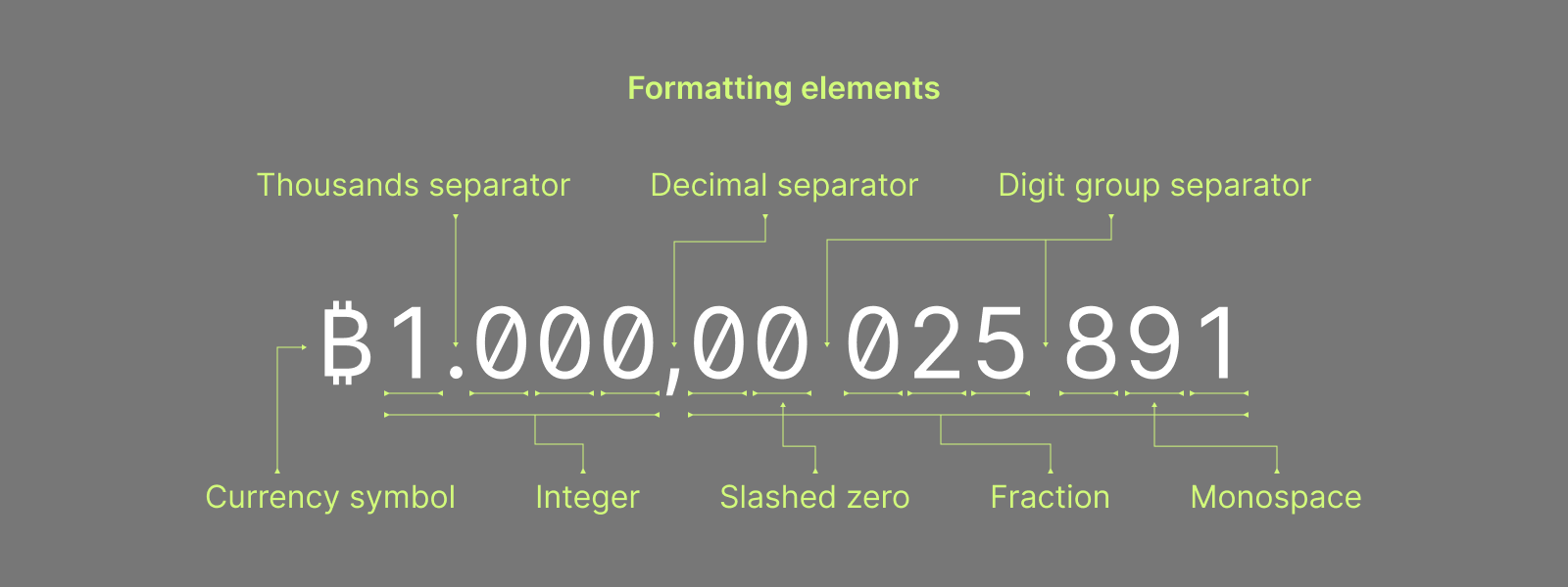
Separate OR color differentiate amounts in 3 digit chunks #2588
Comments
|
I've never seen this done anywhere else to separate decimals. I'm again't the idea, It would create awkwardness and confusion. The reality is you can just look at first 5 decimal and the rest are barely worth a penny so they're not worth even looking at. If there were to be a visual aid spacing standard, I'd make it simply be different shades digits 0.12345678 Last 4 digits being lighter. |
|
One thing is sure we can't have both separation and lighter digits. |
|
@yahiheb agreed, both would be redundant, and either does the job just fine - the goal is to make it easier to view which number is which digit behind the point - I'm not tied to either of the solutions. @Transisto my idea of space separation is based on other data standards, like PGP finterprints or hex files or such. Yes, the incumbent math system might not use such - but we are in future cyberspace now, where old rules don't apply 😉 I would say, that adding a new color to the UI might make it more cluttered, which is something we try to reduce. By having it space separated, we can use the same color and font size with less clutter. But we should also consider how much effort it is to implement, since this is rather a minor improvement. And here I really don't know exactly which of the two options would be more of a hassle, so that's for smarter people to decide. |
|
the screenshots here are very insightful in how some block explorers handle the topic. Most of them go for the color differential approach. One greys out only when it is a There is one who does space separation, but in |
The difference is those are string of relevant data, where a single wrong digit ruin the final outcome. Here we're talking about number precision. When I see a 2nd blob of digit after the decimal place I think it's something else unrelated to the amount and I'm very confused. The only one block explorer with space separation in Bitcoin.com, meaning it's most likely a bad idea, like almost everything they do. ;) People are used to 3 decimals for large integers if a BTC could be divided to the 9th decimal it might make some sense to divide it up this way, (although it's still extremely uncommon and akward) 2 X 4 mean, it's a 2nd piece of data.
2nd or 3rd looks reasonable. |

|
After the dev-call and the chat here in the issue, I think we reached rough consensus on not separating by spaces, but instead using the slightly lighter color scheme. There's worry that decreasing the font size takes away the beautyfulness of the monospace alignment, but I guess that is to be seen in the final picture if implemented. There are some concerns that this will take a considerable amount of dev time and a bit hacky approach. Ultimately this is not a priority issue, and there are more important tasks for the GUI devs. |
|
I think it's more like a trial and error work than a specify upfront one, so let's not call it consensus just yet:) |
|
implemented |
|
Current implementation disregard everything we wrote. The brain shouldn't be hurting from just looking at insignificant decimals. |
|
"After the dev-call and the chat here in the issue, I think we reached rough consensus on not separating by spaces, but instead using the slightly lighter color scheme." What happened in the meantime? |
|
Subtle, clean, effective. |

|
ACK. Added to backlog: https://github.com/orgs/zkSNACKs/projects/18/views/1 |
|
fwiw, I start to think that |
|
Are there any other applications that split decimals with a space? I thought maybe Geo coordinates, There is no problem separating sats in groups of 1000 but not the decimals. There's a lot of other clunky things in this wallet, this is the first glaring one. |

|
Stumbled on another implementation of dimmed decimals. |

|
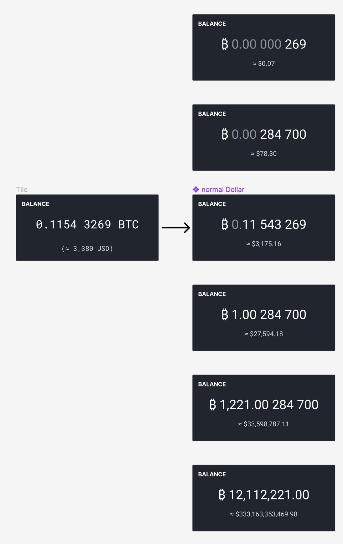
From https://bitcoin.design/guide/designing-products/units-and-symbols/#current-adoption This is very easy to read the sats amount with this separation:
|

|
CACK, but I would not have the |
|
I would reduce the space size so that it doesn't look like a 2nd column of numbers. Monospace makes the spacing too large. While I'm sure a lot of thought has been put into that, nobody's yet using this format and I think we should focus on going to a stat standard. So IMO this whole dividing of 8 decimals into blocks of 3 and 2 should not be a priority. |
Yeah, I mean we just need to distinguish between "open topics" and "issues we are working on". I think this issue was (perhaps incorrectly) closed in an attempt to better organize, but we can find a way to do so without closing issues even when they are not ready for being closed. |
I am voting for the no color distinction, since that is not that much better than the actual gap (only better from technical side, but for user it is the same). |
|
Fading or shrinking the last 4 digits makes less sense the smaller the amount being displayed is. Amounts under 10k sats would look like 0.0000xxxx where all of the zeros are in bold/big text while the actual information the user needs to know is grey or small. |
|
So far it seems like there's only a consensus that reverting it back to normal 8 decimal is better by default. If not only for the standard look of it. |
|
Display amounts both in BTC and Sats denomination, as used by peachbitcoin: https://mobile.twitter.com/BTCMentoring/status/1645531187799105536
|

Notice too that the spacing between the 0s is smaller than a full character width. Currently Wasabi amounts looks mentally like two numbers |

|
This should get to the UX board. |
|
i would also like to throw in my 2 sats
i also added that style to the history table (see figma), with just colour difference and mono font but also colour difference and regular font + 2% letter spacing
|

|
Great! Everyone feel free to give your concept feedback, rather than after it's implemented! I only have one thing to note:
Wasabi is currently culture invariant. We're planning to briefly open this can of worms and reconsider this decision when we start working on localizations to different languages.
|
|
To simplify implementation So 1221.00 284 700 The most important part is that the spacing between decimals is much narrower than a character and your design seems to strike the right spacing. |
thats ok, but it should be part of the localization, such details are the important ones when it comes to user experience and offload mental gymnastics by our users.
sure that's ok. just wanted to cover also that case, just in case ;)
intrestingly I did that with normal spaces, because Figma apparently doesn't support "thin space" unicode. |
|
Regarding localization, I don't think we have a problem here, because there's only the sub btc separator That's why I'm against showing |
|
in Europe it should be also its that's already different, but its ok to stick with American one and redo this with localization. |
Here I disagree, it should just be |
|
ok, but please only with the "thin space" not the "normal space". its absolutely valid to separate with dot, comma and space. and I think its only confusing for people wandering between both worlds so frequently ;) |
|
The spacing better be very thin,
|

|
true, the way trezor implemented it is really hard to consume. |
|
do it like this: https://mempool.space/tools/calculator |
Problem
Currently Wasabi shows the entire 8 digits behind the point in one blob, like
0.12345678. This makes it rather cumbersome to look for an exact amount, it's simply too many numbers in one place.Solution
similar to #2118, separate the numbers after 4 digits, like
0.1234 5678, this increases readability greatly.Alternative
Make the second chunk in a lighter grey, so it indicates that the first chunk is where the main value is.
The text was updated successfully, but these errors were encountered: