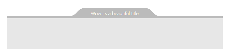
A fully-customizable tab UI component to go with your beautiful designs
npm install svelte-tabcontent --save<script>
import TabContent from 'svelte-tabcontent'
</script>
<TabContent
backgroundColor="orange"
borderColor="brown"
borderWidth={2}
>
<h1>What an awesone component !</h1>
</TabContent>| Prop | Type | Default | Description |
|---|---|---|---|
backgroundColor |
CSS color | #BBB | The background color. |
borderColor |
CSS color | #BBB | The border color. |
borderWidth |
number | 0 | Border width in pixel. |
roundTop |
number | 50 | Roundness aspect of the top curve (in %). |
roundBottom |
number | 50 | Roundness aspect of the bottom curve (in %). |
curveWidth |
number | 50 | Total width of the roundness part (in px). |
depth |
number | 80 | Depth of the tab (in %). |
padding |
number | 0 | x padding arround the content. |
inversed |
boolean | false | Set to true to make it hand from above. |
align |
string | 'center' | Align on the x axis ('left','center','right') |
shiftX |
number | 0 | Shift on the x axis in px). |
pattern |
string | null | SVG pattern element |
patternId |
string | 'pattern' | Name of the pattern element |