Add reusable blocks #2659
Add reusable blocks #2659
Conversation
|
I was talking with @nb and the topic of alternative approaches came up. Pasting my thoughts here, in case someone has any opinions on the matter. I'm pretty convinced that the redux approach that this PR takes is the right path, but I've been wrong before! 😄 The big alternative approach I’ve been mulling over is to enhance the Gutenberg blocks API to the point where reusable blocks could be added as a plain old block type that doesn’t need to touch redux at all. To do this, the blocks API needs three things:
If we had these things then reusable blocks could, I think, look something like this: registerBlockType( 'core/reusable-block', {
...
attributes: {
ref: { type: 'string' },
_referencedBlock: { type: 'object' } // the underscore denotes that this is "private"
},
transforms: {
from: [
{
type: 'block',
match: ( destinationBlock, sourceBlock ) => destinationBlock.name === sourceBlock.attributes._referencedBlock.name,
transform( sourceBlock ) {
return createBlock( sourceBlock.attributes._referencedBlock.name, sourceBlock.attributes._referencedBlock.attributes );
}
}
],
to: [
{
type: 'block',
match: () => true,
transform( sourceBlock ) {
return createBlock( 'core/reusable-block', {
ref: uuid(),
_referencedBlock: sourceBlock,
} );
}
}
],
}
} );Pros:
Cons:
|
|
OK, most of the major pieces of reusable blocks are now implemented. I'd love to get some initial feedback on this PR before I start adding tests, cleaning it up, and breaking it up into smaller PRs! ❤️😃 Here's a lil' demo:
|

|
This looks great @noisysocks If I am not missing, the possibility of making multiple blocks or a group of blocks reuseable is also on the roadmap after this? |
|
Good question, @munirkamal! I agree with @jasmussen's sentiments in #1516 (comment):
|
|
That makes sense, and I also agree with what @jasmussen suggested there. Keep up the great work folks, Gutenberg is coming along really well. |
|
Awesome work here! Before digging into the code, I'd like to think a bit about the "modal" for the reusable block interactions and whether it's a good flow or not. How does it work now:
But still, I find this confusing. I'd suggest the following flow if possible:
cc @mtias |
|
Thanks for your thoughts @youknowriad! I agree that the modal is a little confusing. Something I've been noticing too is that it's especially confusing when there are multiple instances of the same reusable block in the post. I like the toolbar idea—I'll spend some time experimenting with this approach! 😄 Would be good to get @jasmussen's opinion on this. |
|
Great work all around, and great thoughts too. I think the modals work fine, but I also think Riads suggestion is potentially better. This is such a nice feature, it might be worth looking at it in two phases. One which features the modal as it is — seems like it might be worth getting this PR merged in and tested as is. Then in phase two we can take the learnings from V1 and look at the UI improvements that Riad suggested. Unless of course there are technical underpinnings that would need this to change sooner rather than later, in which case I'd defer to Riad (and correct me if I'm wrong). In both cases, we should do something about the visual appearance of the global block, if we can. Just like how collaborative editing has a colored border, we should have a distinguishing look to a block that is registered as global. It could, for example, have a dashed line instead of the solid line (and the way to do this as we learned from the collab editing stuff is add a CSS class to global blocks and assign the dashed border there). I do agree with Riad that if the block appears to be completely like other blocks, editable and all, it's easy to forget that it's global, and the modal then becomes jarring. Perhaps an intermediate fix is to dim add a very subtle gray dimming overlay to the entire block (perhaps instead of, or in addition to the dashed border), change the cursor to a pointer instead of the caret. You'd then be able to click the block to get the "detach" prompt, instead of having this happen onChange. |
|
Robert brought to my attention a problem with the idea suggested above:
In this situation you couldn't ever select a block (to move it or delete it, say), because that would trigger the prompt. Which means we're back to either being fine with the onchange prompt for V1 and then making Riads suggested improvements for V2, or doing those changes before merging. I'm fine with either, but would defer to @karmatosed, @mtias or @youknowriad's feelings on this matter. However you are able to edit a global block, it should still have a distinct style, seems like it's worth trying with a dashed line. |
|
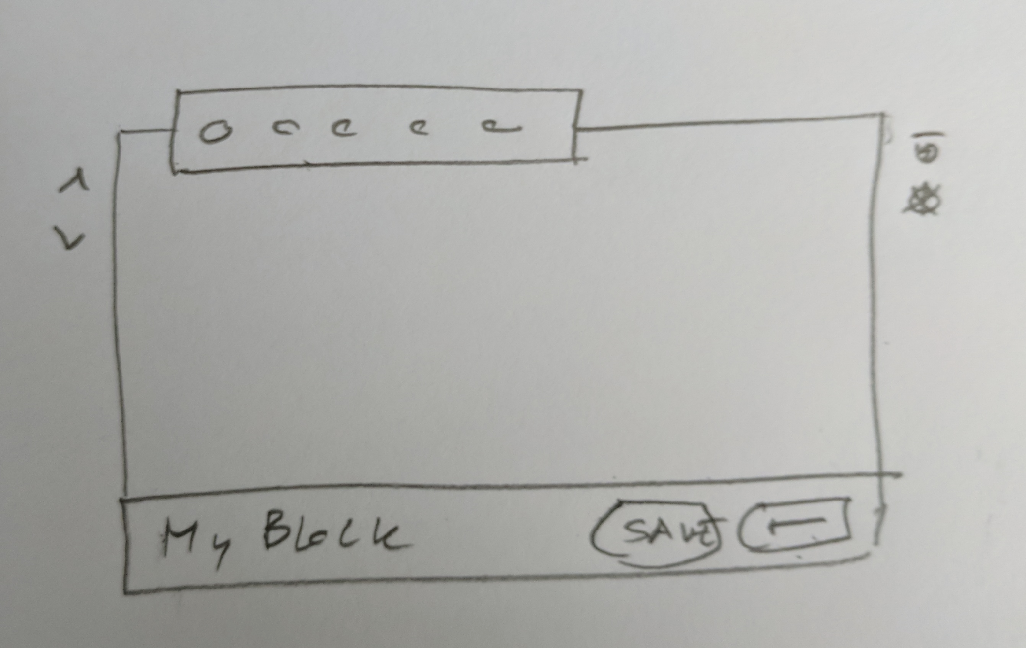
After further discussions with Robert, we mocked up this:
That's what happens when you select a reusable block — a panel at the bottom pops out at the bottom. When the block is just selected, it has "Edit" and "Detach" buttons, as well as a name there. When you've clicked "Edit", the name becomes editable, and there's a "Save" button there. Thoughts? Also, is that still a V2, or should that be V1? |
I'd be happy to do it for V1. The two approaches are much of a muchness, code wise. Removing the modal would feel kind of nice since it'd mean one less |
|
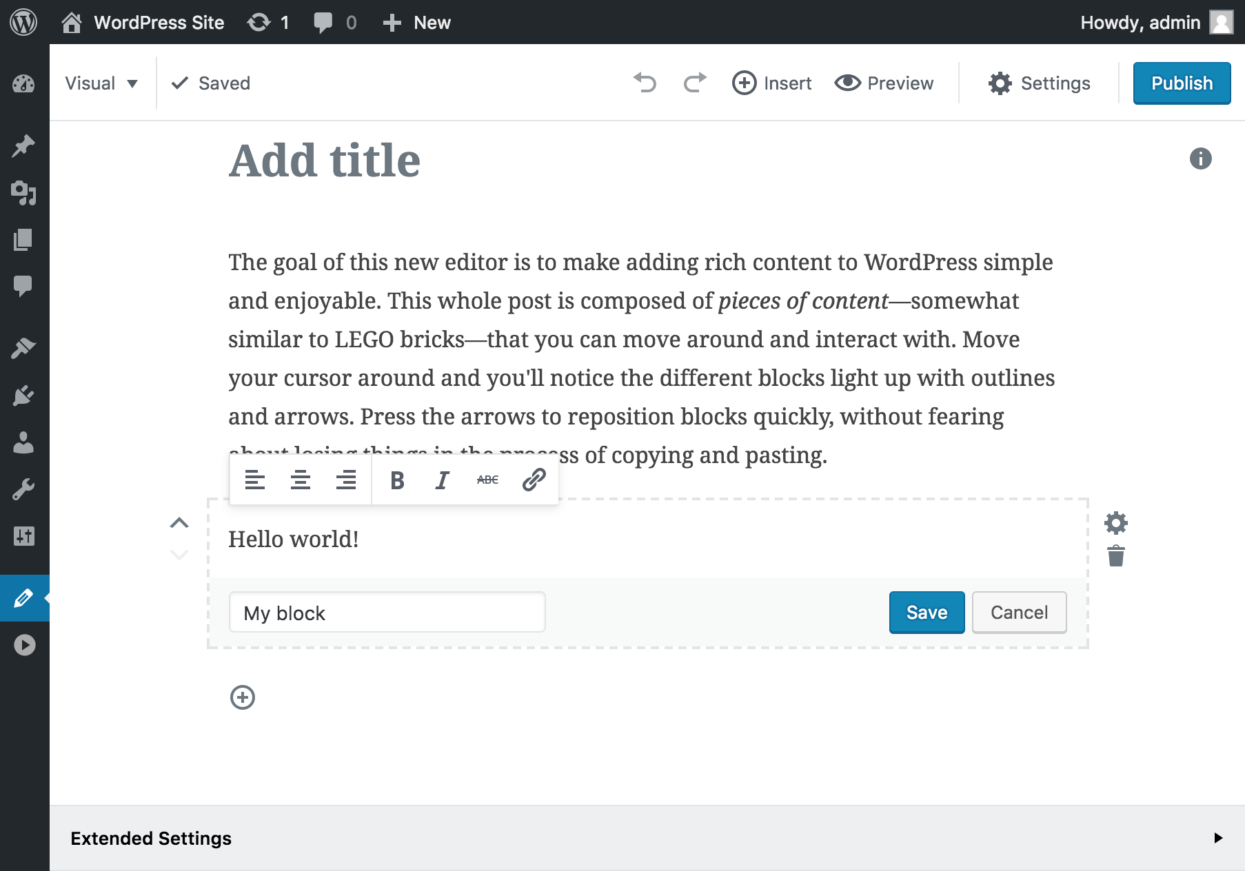
I replaced the modals with the panel that @jasmussen and I discussed. Here's a GIF:
Check out this video for a higher quality demonstration. I'm really into it. Thoughts? |
|
@noisysocks Nice, that looks good! Question: are the "Edit" and "Detach" buttons as well as the title field hidden when the block is unselected? If so then 👍 👍 — see also https://github.com/WordPress/gutenberg/blob/master/docs/design.md#block-design-checklist-dos-and-donts-and-examples Can you make it so the panel itself either has a background (imagine that quick doodle above had a gray background same as the border color), or a border separator above the fields? Just sort of separate content from chrome so to speak. Does it work well on mobile? I.e. does it use available space in a good way? Remember you can use flexbox if you need the textfield to resize to available space. Buttons might be localized and grow bigger. Given those tweaks I think we're ship shape to go! |
|
@jasmussen this should be handled the same way in which we'll handle blocks that save to places outside of the post (i.e a site title block). Those blocks, at least in the post editor incarnation, would likely need their own "save" mechanism for clarity, so they should all do a similar thing. |
Yep! It looks similar to what happens at the end of my demonstration when I click the Detach button.
It has a light grey background right now. You can't see it in the low quality GIF, but if you watch the the video that I linked to, you'll spot it 😄
Good point. I'll spend some time optimising it for small screens today. |
|
Tweaked the styles a bit. Here's how it all looks now:
|


|
I like those changes, nice work 👍 👍 @mtias as I'm still trying to grok the full extent of your comments above, can you chime in also? Thanks. |
| import './style.scss'; | ||
|
|
||
| function ButtonControl( { instanceId, label, value, help, ...props } ) { | ||
| const id = 'inspector-button-control-' + instanceId; |
There was a problem hiding this comment.
Is the instanceId and the id useful in this component? Generally, we're using it to match labels and inputs but there's no input in this component.
There was a problem hiding this comment.
Good catch. <button> elements are labelable, but I wasn't passing id along to the <Button> component. I've fixed this in 224eb27f54a397b3c64f3793174fcb9c2e0cd252.
| // TODO: Can these two actions be combined? | ||
| // TODO: Think about a loading indicator, success message, failure message, etc. | ||
| this.props.updateReusableBlock( pickBy( { name, attributes } ) ); | ||
| this.props.saveReusableBlock(); |
There was a problem hiding this comment.
Yes, maybe the saveReusableBlockaction could take the updated name and attributes as arguments and optimistically update the state (similarly to how we do this for the savePost effect).
There was a problem hiding this comment.
The only problem is that saveReusableBlock is also dispatched when converting a static block into a reusable block. But maybe I could combine addReusableBlocks, updateReusableBlock, and saveReusableBlock into one action... 🤔
| * TODO: | ||
| * These should use selectors and action creators that we gather from context. | ||
| * OR this entire component should move to `editor`, I can't decide. | ||
| */ |
|
|
||
| registerBlockType( 'core/reusable-block', { | ||
| title: __( 'Reusable Block' ), | ||
| category: null, |
There was a problem hiding this comment.
What does a null category mean? If I understand correctly, this hides the block from the inserter. this is probably just a side effect of how the inserter is built. Should we be more explicit and add a "private" flag instead?
There was a problem hiding this comment.
Yeah, that's right. I made it so that category can be marked null so as to have it not appear in the inserter.
A more explicit flag is a good idea. I've introduced this in ddc491b32e7e8bcc269caf220401f7005713f9ad.
| return $block_type->render( $block_attributes, $block_content ); | ||
| } else { | ||
| return $block_content; | ||
| } |
There was a problem hiding this comment.
I wonder if we can factorize some code between here and the do_blocks function into a render_block( block ) function
There was a problem hiding this comment.
Great catch! Cleaned up in ccf3024e1f317f918463e956f967e949e0514b51 🌈
| $block_type = WP_Block_Type_Registry::get_instance()->get_registered( $block_name ); | ||
| if ( $block_type ) { | ||
| return $block_type->render( $block_attributes, $block_content ); | ||
| } else { |
There was a problem hiding this comment.
Minor: the else is useless here.
There was a problem hiding this comment.
👌 removed in b1562b90c7cd5cb00eb63539568ec1c23bd2ca46.
editor/effects.js
Outdated
| dispatch( addReusableBlocks( reusableBlock ) ); | ||
| dispatch( saveReusableBlock( reusableBlock.id ) ); | ||
| dispatch( replaceBlocks( [ oldBlock.uid ], [ newBlock ] ) ); | ||
| }, |
There was a problem hiding this comment.
I'm confused, are these two actions reversed (attache/detach). Attach should create a reusable block and detach should create a regular block (as I understand it at least)
There was a problem hiding this comment.
Yeah, I wrote this all thinking that attach would create a regular block since you're taking a block that is unattached from the post (i.e., it's saved separately from the post) and attaching it to a post.
I was thinking of avoiding the issue altogether by making the actions MAKE_BLOCK_REUSABLE and MAKE_BLOCK_STATIC. Thoughts?
There was a problem hiding this comment.
I was thinking of avoiding the issue altogether by making the actions MAKE_BLOCK_REUSABLE and MAKE_BLOCK_STATIC. Thoughts?
sounds good to me 👍
editor/effects.js
Outdated
| @@ -273,4 +284,106 @@ export default { | |||
|
|
|||
| return effects; | |||
| }, | |||
| // TODO: FETCH_REUSABLE_BLOCKS and FETCH_REUSABLE_BLOCK can probably be combined. | |||
| FETCH_REUSABLE_BLOCKS( action, store ) { | |||
There was a problem hiding this comment.
can't we replace all those custom fetching actions with the withApiData? Maybe not because we want these in the Redux state? in which case, maybe there's something we can do here. A wrapper to withApiData dealing with the state or something? @aduth any thoughts on this?
There was a problem hiding this comment.
Like you say, we'd need to change withApiData to store the models it fetches in Redux. It could be a cool abstraction. I feel it's best to punt on it for now, though.
There was a problem hiding this comment.
This is exactly what I'm looking for today :) It would be nice to be able to have an option to use the same API without a component, e.g. inside Redux middleware.
Codecov Report
@@            Coverage Diff             @@
##           master    #2659      +/-   ##
==========================================
+ Coverage   34.37%   34.81%   +0.44%
==========================================
  Files         196      199       +3
  Lines        5792     5885      +93
  Branches     1019     1024       +5
==========================================
+ Hits         1991     2049      +58
- Misses       3217     3250      +33
- Partials      584      586       +2
Continue to review full report at Codecov.
|

|
I've moved some things around, cleaned up some of the redux actions, and added these really simple progress and failure states to the UI:
I think this feature is looking pretty good. I'm going to start breaking it up into smaller PRs that are easier to review and merge 💃 |


|
@noisysocks Nice job so far, I'm fine with merging this PR directly without splitting, Could you rebase it, now that the REST API is merged? It'll make reviewing easier :) |
I wonder if these are better as global notices (the post published one), as it provides a consistent place for their display. I can see the proximity being useful, but also can see how it could be missed if you scroll, look elsewhere. cc @jasmussen @karmatosed |
|
I think I agree with Matías, it seems like notices would be a good place for this. Although I'm conflicted because it totally makes sense if there's a spinner in the area that's saving, it makes sense to see message in context of that. Tammie, final word? |
|
I think the "save" button could have the same treatment we use for the "publish" button with the stripes. That signals something is happening. But the confirmation then happens via global notices. |
There was a problem hiding this comment.
In taking this for a test-drive prior to looking at code, it works very well and feels quite cool. Nice work 👍
To code, my two overall concerns are:
- How much reusable blocks needs to be integrated into global state of the application, vs. isolated to the individual reusable block implementation
- The forced distinction we're creating between reusable blocks and posts, which are effectively the same, but we're implementing many things (REST API endpoint, UUID as queryable slug) as if they weren't.
| function ButtonControl( { instanceId, label, value, help, ...props } ) { | ||
| const id = 'inspector-button-control-' + instanceId; | ||
| return ( | ||
| <BaseControl id={ id } label={ label } help={ help } className={ 'blocks-button-control' }> |
There was a problem hiding this comment.
Minor: Curly bracket syntax isn't necessary for plain text strings:
// Before:
className={ 'blocks-button-control' }

// After:
className="blocks-button-control"There was a problem hiding this comment.
👌 Fixed in 134114d42a40fbd6e15310623d3b7458474def40.
| const id = 'inspector-button-control-' + instanceId; | ||
| return ( | ||
| <BaseControl id={ id } label={ label } help={ help } className={ 'blocks-button-control' }> | ||
| <Button { ...props } id={ id } isLarge className={ 'blocks-button-control__button' }>{ value }</Button> |
There was a problem hiding this comment.
Minor: This is a long line and we could move the children onto its own separate line:
<Button { ...props } id={ id } isLarge className="blocks-button-control__button">
	{ value }
</Button>There was a problem hiding this comment.
👌 Fixed in 134114d42a40fbd6e15310623d3b7458474def40.
| @@ -0,0 +1,5 @@ | |||
| .blocks-button-control { | |||
| .blocks-button-control__button { | |||
There was a problem hiding this comment.
Minor: We're not really taking advantage of nesting here and could collapse this into the parent:
.blocks-button-control .blocks-button-control__button {
	margin-bottom: 0.5em;
}
In fact, we may omit specifying the parent selector altogether. One of the advantages of a BEM pattern like the one we use is that class names are relatively unique, so you're not forced to apply awkward scoping (except maybe to win battles of specificity).
.blocks-button-control__button {
	margin-bottom: 0.5em;
}There was a problem hiding this comment.
👌 Fixed in 134114d42a40fbd6e15310623d3b7458474def40.
|
|
||
| componentDidMount() { | ||
| if ( ! this.props.reusableBlock ) { | ||
| this.props.fetchReusableBlock(); |
There was a problem hiding this comment.
My first reaction to seeing this and related Redux actions: Could we simplify this by using the withAPIData higher-order component instead to keep the network logic local to the component? It doesn't seem to follow to me that the broader application state needs to be concerned with this data.
There was a problem hiding this comment.
The major problem with using withAPIData is that our 'Detach from Reusable Block' functionality needs to have the attributes of the reusable block that it is detaching. Currently, it gets this by accessing the store. If we moved the fetched reusable block to inside the edit component's local state, then we would not be able to access this from outside of the component.
Also: right now, if you have two instances of the same reusable block in the post, editing one will immediately update the other. We get this for free because the UI is derived from what's in the store. It's a small thing, but kind of nice.
|
|
||
| updateReusableBlock() { | ||
| const { name, attributes } = this.state; | ||
| this.props.updateReusableBlock( pickBy( { name, attributes } ) ); |
There was a problem hiding this comment.
Clever use of pickBy. Maybe too clever 😄 Could be worth adding a clarifying comment:
// Use pickBy to include only changed (assigned) values in payload
const payload = pickBy( {
	name,
	attributes,
} );

this.props.updateReusableBlock( payload );| } | ||
|
|
||
| /** | ||
| * Returns an action object used to convert a reusable block into a static |
There was a problem hiding this comment.
Personally I like the convert wording better as a name for the function / action type as well, vs. "make". e.g. convertBlockToStatic
| @@ -283,7 +306,7 @@ export class InserterMenu extends Component { | |||
| role="menuitem" | |||
| key={ block.name } | |||
| className="editor-inserter__block" | |||
| onClick={ this.selectBlock( block.name ) } | |||
| onClick={ this.selectBlock( block.name, block.attributes ) } | |||
There was a problem hiding this comment.
I find it a bit odd at a glance that in arguments to "selecting" a block we pass attributes. What does attributes have to do with a selection? Seems like this is a convenience for something we could be looking up later in the logic to map that selection into a block creation?
There was a problem hiding this comment.
Yeah, that's a good point. I'll play with making selectBlock pass up an enum-ish object (e.g. { name: 'core/paragraph' } or { name: 'core/reusable-block', ref: '6c08c662-3825-4f9b-9512-ff8a2d209a6b' }) instead of a string.
There was a problem hiding this comment.
I think the right thing to do here is to refactor InserterMenu so that it no longer calls getCategories, getBlockTypes, getBlocks, etc. Instead, InserterMenu would be a "dumb" component that renders a list of items that Inserter passes it and calls item.onSelect() when one of these items is selected.
Some code to illustrate what I mean:
const staticItems = getBlockTypes()
	.filter( ( blockType ) => ! blockType.isPrivate )
	.map( ( blockType ) => ( {
		category: blockType.category,
		icon: blockType.icon,
		title: blockType.title,
		isDisabled: blockType.useOnce && find( blocks, ( { name } ) => blockType.name === name ),
		isRecent: find( recentlyUsedBlocks, ( { name } ) => blockType.name === name ),
		onSelect() {
			onInsertBlock( blockType.name, {}, insertionPoint );
			onClose();
		},
	} ) );

const reusableItems = /* omitted for brevity */;

return (
	<InserterMenu
		categories={ getCategories() }
		items={ [ ...staticItems, ...reusableItems ] } />
);
My fear though is that this is quite a lot to change in this already large PR—I'd prefer to ticket this and come back to it later.
editor/layout/index.js
Outdated
| @@ -48,6 +49,7 @@ function Layout( { mode, isSidebarOpened, notices, ...props } ) { | |||
| <MetaBoxes /> | |||
| </div> | |||
| { isSidebarOpened && <Sidebar /> } | |||
| <Slot name="Editor.Modal" fillChildProps={ { isSidebarOpened } } /> | |||
There was a problem hiding this comment.
You noted a comment here: #2659 (comment)
I'd be happy to do it for V1. The two approaches are much of a muchness, code wise. Removing the modal would feel kind of nice since it'd mean one less in the app.
Should we be removing this?
There was a problem hiding this comment.
Oops! Fixed in 883c7835
| * | ||
| * @see WP_REST_Controller | ||
| */ | ||
| class WP_REST_Reusable_Blocks_Controller extends WP_REST_Controller { |
There was a problem hiding this comment.
A reusable block is saved as just a post, yeah? Could we be leveraging more of the existing posts endpoint? The endpoint itself? extends WP_REST_Posts_Controller?
| wp_add_inline_script( | ||
| 'wp-editor', | ||
| ( | ||
| 'jQuery.when( wp.api.init(), wp.api.init( { versionString: \'gutenberg/v1/\' } ) ).done( function() {' |
There was a problem hiding this comment.
Do we need to initialize twice like this?
jQuery is not an explicit dependency of wp-editor and should be added as one if we're going to call on it. Currently it works likely because it's incidentally a dependency of another script on the page, but we can't rely on it to exist this way.
There was a problem hiding this comment.
wp_add_inline_script doesn't seem to support specifying dependencies and so I've added a manual check for jQuery in 3d1b66c1.
Do we need to initialize twice like this?
I'm... not sure.
I couldn't find any documentation about this stuff. The source seems to imply that init() is to be called once for every API root and version string. In our case, we have two version strings: /wp/v2 and /gutenberg/v1. I'd love for someone who knows more about the WP API client to chime in 😅
This lets us parse reusable blocks from the HTML, and not much else.
Stubs out some of the editor UI so that we have a base to work from.
Also adds the reducers and effects necessary to support fetching and
local editing.
 Adds an effect that responds to the PERSIST_REUSABLE_BLOCK action, and
 some UI for the confirmation dialog that appears when a reusable block
 is first modified.
Adds an effect which lets us turn reusable blocks into regular blocks.
|
@aduth: Thanks so much reviewing! I've addressed or responded to your feedback.
@mtias: Great idea! I've implemented this in ec61310a7ce17982aa199cea5e53b4bb294a54a6. |
Allow reusable blocks to be rendered by the server for posts and pages
by registering them in PHP and defininig a `render_callback`.
Replaces SaveConfirmationDialog, NewReusableBlockDialog, and Modal with
ReusableBlockEditPanel. This panel sits at the bottom of a reusable
block when selected and allows the user to explicitly edit and save the
reusable block. The end result is a less ambiguous and more explicit
UX.
This makes the `<label>` in the control behave correctly. According to
the spec, `<button>` is a labelable element:
https://developer.mozilla.org/en-US/docs/Web/Guide/HTML/Content_categories#Form_labelable
We don't wish to show the 'core/reusable-block' block type in the
inserter. We were doing this by taking advantage of the fact that the
inserter would ignore block types with a null category. This change
makes this behaviour more explicit.
Refactor the common logic in `do_blocks` and
`gutenberg_render_block_core_reusable_block` into a new
`gutenberg_render_block` function.
Simplify fetching logic a little by DRYing up these two mostly-similar effects.
Collapses the ADD_REUSABLE_BLOCKS action into UPDATE_REUSABLE_BLOCK and
FETCH_REUSABLE_BLOCKS_SUCCESS. Also makes it so that the Redux store
keeps track of whether or not a reusable block is being saved or has had
an error while saving.
Adds a spinner that indicates whether or not a reusable block is saving,
and some UI that allows the user to retry the save if it fails.
Avoid ambiguity around what 'attach' and 'detach' means by avoiding the
its use in code alltogether.
Slightly clean up the tests for reusable block actions and selectors,
and change our effects tests to reduce our dependency on mocking
selectors by taking advantage of the fact that MAKE_BLOCK_STATIC and
MAKE_BLOCK_REUSABLE are relatively pure functions.
Remove unnecessary {}s, split up long line, and collapse SCSS selectors
into one line.
Add a comment which clarifies this weird way we're using _.pickBy.
Fix this typo. There's no such thing as `blockType.create`!
…ble}

It's a clearer action name since 'convert' is a less ambigious verb.
- Makes the 'Save' button animate when a reusable block is saving
- Makes a 'Reusable block updated' notice appear when the save is
  successful
- Makes a 'Reusable block update failed' notice appear when the save
  fails
|
Thanks for all the feedback, everyone! 🙏 I'm closing this and splitting up the work into three smaller PRs. The first is right here: #3017 |
 aduth
added
the
[Feature] Synced Patterns
aduth
added
the
[Feature] Synced Patterns
✨ Hello, reusable blocks! ✨
This PR adds all of the frontend code necessary to support viewing, creating, inserting, and editing reusable blocks.
#1516 describes the feature and #2081 (#2081 (comment), in particular) describes the technical approach I'm taking. We're using the backend API that #2503 added.
How to test