Skip to content
New issue

Have a question about this project? Sign up for a free GitHub account to open an issue and contact its maintainers and the community.

By clicking “Sign up for GitHub”, you agree to our terms of service and privacy statement. We’ll occasionally send you account related emails.

Already on GitHub? Sign in to your account

Transaction design for signing messages. #134

Closed
tschubotz opened this issue Feb 13, 2019 · 33 comments
Closed

Transaction design for signing messages. #134

tschubotz opened this issue Feb 13, 2019 · 33 comments
Assignees

Comments

@tschubotz
Copy link
Member

tschubotz commented Feb 13, 2019

Background

  • On Ethereum, accounts can perform 2 main actions: (1) on-chain transactions (2) sign off chain messages.
  • Off-chain signing is used e.g. for user authentication by many apps such as Airswap, Kickback, CryptoKitties and more.
  • We have been approached by quite some dapps that would interested in using the Safe, but are missing that signing feature.

Task / details

  • There are now 2 types of "things" where the user needs to sign something (with 2FA): (1) regular tx and (2) signature requests.
  • Signature requests will not show up in the transaction history (since they are not persisted anywhere and there are no, well, transactions ;) )
  • Signature requests are always triggered by dapps, never by the user via the wallet.
  • We need to display the data that is being signed. This could either be a random (or not so random) string of characters or a JSON like structure (EIP712)
  • We need the transaction review screen for Android, iOS and the Chrome extension for this.
  • At this point, we just need A design to display the data. It shouldn't be our task explaining that data to users. That's the dapps task and we could iterate on this in the future.

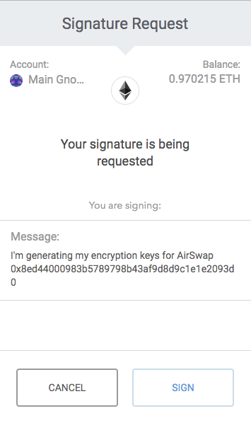
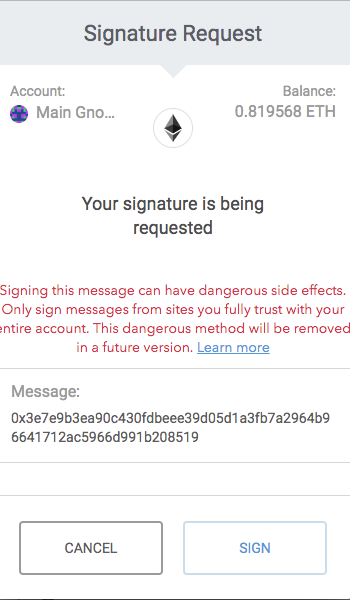
Examples from Metamask:
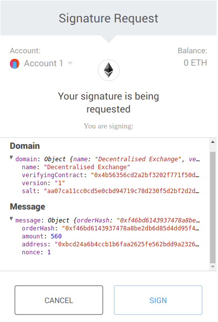
EIP712 typed signed data:
image.png
(from https://cdn-images-1.medium.com/max/800/0*Xk26NjDpM8FURwdp)

Diceether:
image

Airswap:
image.png

Idex:
image.png

@posthnikova
Copy link

Signing simple string: https://invis.io/FBPH0OFQ57P#/350856184_01_Sign_

Signing json like message, message can scroll: https://invis.io/FBPH0OFQ57P#/350856192_02_Sign_Json_

@tschubotz
Copy link
Member Author

I think as a v1 this design is enough. We need also that screen where we are waiting for the signature from the extension. (Where the push can be re-send etc.)

@rmeissner @sche @DmitryBespalov What do you think about these basic versions?

@germartinez this is the ticket where we would create also the extension screens. :)

@rmeissner
Copy link
Member

would like to see an android version of this ;) since the sign button will be at the bottom (I assume)

@rmeissner
Copy link
Member

Just for clearification:

  • we currently don't allow "message" signing, so only typed data (so the Signing simple string would not apply)
  • the domain has some predefined fields, so we could properly display them (e.g. this could include the address of the contract for which the signature is, so we could display a blockies) -> just mentioning this, since this is easier on android than performing syntax highlighting in json
  • also we could maybe use the example data from the EIP-712 example to have a better feeling in the invision prototype (https://github.com/ethereum/EIPs/blob/master/assets/eip-712/Example.js#L5 -> only domain and message, no need to display the types)

Else I think this looks clean and easy to understand 😄

@sche
Copy link

sche commented Mar 26, 2019

I also agree that seeing some real data example would help. For the first iteration, I don't see big issues otherwise.

@tschubotz
Copy link
Member Author

UX sync:

  • Behavior of transaction flow should be imitated. Just with "Sign" instead of "Submit"
  • There is the case where the signature request is triggered from the phone and the extension needs to confirm and vice versa. And also there is the case where there is no 2FA device connected.
  • The message to sign is usually rather short, but there no technical limitation of the end.
  • Collapsible section could be added later. Let's no add it right now.

@posthnikova
Copy link

Changes after UX sync:

Start screen: https://invis.io/FBPH0OFQ57P#/355143691_01_Signature_Request_
Middle part should scroll. As the bottom part sticks to the bottom, on smaller phones there is not enough space. So I decided to maybe display this part without illustration. iPhone 5 screen looks like this:

02_Signature_Request_iPhone_5_@2x.png

Confirmed by browser extension: https://invis.io/FBPH0OFQ57P#/355143693_03_Confirmed_

Rejected by browser extension: https://invis.io/FBPH0OFQ57P#/355143694_04_Rejected_

Without the extension: https://invis.io/FBPH0OFQ57P#/355143695_05_Without_Browser_Extension_

Browser extension:

Extension_Signature_Request_@2x.png

Middle part should scroll.

@DmitryBespalov
Copy link
Contributor

@posthnikova for the smaller screens I would actually reduce the bottom sticky part to just a toolbar (64-point height) and put button (s) in there, that would increase the scrollable content height. Also, for that screen size, the header part takes ~30% of the height, I think it could be compressed - the most important thing on this screen is the content to be signed, that's why I think we should increase the space for it.

Regarding colorization of the message itself: that looks like a lot of work to me, I would reduce to just 2 colors: 1) is color of the keys 2) color of the values (string, numbers, and so on). Making just the colon ':' different color is making things more complicated.

@tschubotz do we allow to select the text in the middle part? I assume not.

@fairlighteth
Copy link

fairlighteth commented Mar 29, 2019

In terms of the middle part scrolling, I think we should prevent that. As the area you can actually scroll is tiny compared to the rest of the view. Couple of ways I see we could improve this:

  • Create a more compact header
  • Remove 'Domain' title or make it way smaller. The titles and keys are essentially the same right now.

If real estate is still a problem:

  • Show a short summary of each key/value pair with the option to show details in a full screen modal. I think we need to distinguish between 'I recognize this object I want to sign by the short snippet shown' vs. 'I actually want to read the whole object'. Question is what we should optimize for.
  • Probably not for this release: Collapsed root structuring where you can expand/collapse keys (+/-).

@tschubotz
Copy link
Member Author

@tschubotz do we allow to select the text in the middle part? I assume not.

No need to be able to select something.

Regarding colorization of the message itself: that looks like a lot of work to me, I would reduce to just 2 colors: 1) is color of the keys 2) color of the values (string, numbers, and so on). Making just the colon ':' different color is making things more complicated.

I also agree, just the colon in red add no real value.

We also still need the inverse flow, i.e. (1) signature request is triggered by extension and (2) phone confirms. Essentially it's this flow https://zpl.io/awrBg3M + the submission screen on the phone. (Potentially a version of this screen: https://zpl.io/bWq5JqM)

@rmeissner
Copy link
Member

rmeissner commented Apr 2, 2019

I also agree, just the colon in red add no real value.

Why do we need coloring at all? Maybe we should display the data differently. It makes no sense to display it as JSON, since that is just the format how it is transmitted. Maybe we should use proper labels and text fields to display the data. With the current format there is a lot of unnecessary information (duplicate message and domain, all the { and other json specific stuff, no identicon for addresses).

For me it makes no sense to put effort into proper json syntax highlighting if we gonna remove it soon anyways, that's why I would probably rather go directly to a version where the data is nicely formatted/ displayed.

Note:
Also I am not sure about text wrapping vs horizontal scroll, since it can be stacked quite deep, which might cause problems.

@rmeissner
Copy link
Member

Also what about not making the buttons sticky and forcing the user to scroll through the whole message?

@fairlighteth
Copy link

Also what about not making the buttons sticky and forcing the user to scroll through the whole message?

I'd not be in favor of this, as the upfront available actions (CANCEL / SIGN) aren't initially visible.

In terms of putting effort in formatting/stylizing JSON, I agree with @rmeissner that we need to be sure if we'll replace it soon or not. What data can we standardize in specifically formatted labels? Perhaps going forward we should explore other options to display this specifically on mobile.

@rmeissner
Copy link
Member

rmeissner commented Apr 2, 2019

I'd not be in favor of this, as the upfront available actions (CANCEL / SIGN) aren't initially visible.

While I think that canceling from the get go is fine, this is security critical data, signing it without knowing its content might be harmfull (e.g. cause loss of funds)

@tschubotz
Copy link
Member Author

UX sync:

  • @tschubotz if the standard really has no method of knowing the source or dapps or sth similar
  • Don't show all the data, there is no need. But allow the user to see the whole data on a button tap or something.
  • Inverse direction is needed as well.

@rmeissner
Copy link
Member

Don't show all the data, there is no need

What data should we show? (e.g. if a Safe signs a Safe transaction and we don't show the gasPrice, this allows stealing of funds)

@tschubotz
Copy link
Member Author

The data to be signed :)
Usually people won't read through that. But there should be a way to display the data, at least for devs of partners integrating the Safe for signing things.

@tschubotz
Copy link
Member Author

@tschubotz if the standard really has no method of knowing the source or dapps or sth similar

Just checked EIP712 again. Essentially, the "Domain" contains the info about the dapps. We have the following attributes we could display, besides the actual data:

  • name - user readable name of signing domain, i.e. the name of the DApp or the protocol.
  • version - current major version of the signing domain
  • chainId - EIP-155 chain id. The user-agent should refuse signing if it does not match the currently active chain.
  • verifyingContract - address of the contract that will verify the signature. The user-agent may do contract specific phishing prevention.

I think name and verifying contract are 2 things we could display upfront. And then there is a button to show the entire thing to sign. (cf. Metamask - No clue how they figure out the "url", it's not part of the EIP)

@tschubotz
Copy link
Member Author

Concerning the URL: Richard says it's from the page that triggered the popup, so that's something we can definitely also display.

@posthnikova
Copy link

New version is ready. What's been done:

  1. Name, verifying contract, url displayed upfront. Full message opens on a separate page, no coloring.

Signature request: https://invis.io/FBPH0OFQ57P#/356316626_01_Signature_Request_
On small device: https://invis.io/FBPH0OFQ57P#/356316628_03_Signature_Request_IPhone_5_
Full message preview: https://invis.io/FBPH0OFQ57P#/356316627_02_Message_
Confirmed by extension: https://invis.io/FBPH0OFQ57P#/356316629_04_Signature_Request_Confirmed_
Rejected by extension: https://invis.io/FBPH0OFQ57P#/356316630_05_Signature_Request_Rejected_
Without extension: https://invis.io/FBPH0OFQ57P#/356316631_06_Signature_Request_W-O_Extension_

  1. Inverse flow added.

There are two flows: from mobile to extension and from extension to mobile:

Mobile_To_Extension.png

Extension_To_Mobile.png

Full message in extension looks like this:

Extension_02_Full_Message.png

@sche
Copy link

sche commented Apr 5, 2019

lgtm

@DmitryBespalov
Copy link
Contributor

👍

@fairlighteth
Copy link

fairlighteth commented Apr 5, 2019

Some comments:

  • As @rmeissner pointed out, we could use an identicon in front of the 'verifying contract' address. This helps the user for identification purposes.
  • On https://projects.invisionapp.com/share/FBPH0OFQ57P#/screens/356316628_03_Signature_Request_IPhone_5 I noticed the text inside the card is not wrapping. That definitely should happen, even if it makes the card, vertically, larger.
  • Also I assume the user can scroll down in that case? Is the 'You are signing' title essential to have? Because it proportionally takes quite some space. If we'd remove then less scrolling (or maybe even no scrolling) would be needed.

@posthnikova posthnikova self-assigned this Apr 8, 2019
@posthnikova
Copy link

posthnikova commented Apr 16, 2019

New version https://invis.io/FBPH0OFQ57P#/358454862_Divider

What's been done:

  1. Changed appearance of contract. Full address is viewable on tap/long tap like on Send screen

  2. Removed "You are signing"

There are two flows: from mobile to extension and from extension to mobile:

Mobile_To_Extension.png

Extension_To_Mobile.png

Full message in extension:

Extension_02_Full_Message.png

@posthnikova
Copy link

Small changes: https://invis.io/FBPH0OFQ57P#/358454862_Divider
Text is changed (all mentions of "transaction" removed)

Mobile_To_Extension.png

Extension_To_Mobile.png

@posthnikova
Copy link

@biocom We need android for this

@sche
Copy link

sche commented Apr 23, 2019

lgtm

@lukasschor
Copy link
Member

lgtm2 :)

@fairlighteth
Copy link

Hereby my proposal for the Android screens:

Yesterday I added a suggestion to relocate the 2FA card as a bottom sheet overlay. I feel this solves for a lot of spacing issues. The ticket with a visual suggestion: #186

@fairlighteth
Copy link

Added the Android screens to Zeplin.
@lukasschor for all screens we need to review the screen names:
@posthnikova Make sure to remove the URL label.

Signature request -> https://zpl.io/agQKm10

  • The text Open the browser extension to confirm this signature request. differs, given I rewrote it to have the 'confirm' and 'request' word in it. Review or sync up.

View full message -> https://zpl.io/2j5mqKO
Signature request [2FA Confirmed] -> https://zpl.io/anyMBXr
Signature request [2FA Rejected] -> https://zpl.io/VQveJgm
Signature request [Without 2FA] -> https://zpl.io/a7WogY8

@fairlighteth
Copy link

@posthnikova Noticed a subtle difference:

iOS -----> https://zpl.io/aNDEx84 -> The browser extension has approved this transaction.
Android -> https://zpl.io/bPx0BRL -> The browser extension has approved this signature request.

Given it's a signature request and technically not a transaction, I think the Android text is factually the correct one?

@posthnikova
Copy link

@biocom You're right, on the other screens it's also called request. Corrected https://zpl.io/aNDEx84

Sign up for free to join this conversation on GitHub. Already have an account? Sign in to comment
Labels
None yet
Projects
None yet
Development

No branches or pull requests

7 participants