Visualizing Statistical Distribution
Statistical distribution visualizer is a Python script to plot the following statistical distributions and transitions from the generated transaction graph.
- Number of transactions for each step
- Account degree distribution
- Weakly connected component size distribution
- Clustering coefficient transition
- Diameter and average path length
- Number of total alert patterns
- matplotlib version 2.2.3
- powerlaw
python3 scripts/visualize/plot_distributions.py [ConfJSON]-
ConfJSON: Configuration JSON file
Example:
python3 scripts/visualize/plot_distributions.py paramFiles/10K/conf.jsonAfter running this script, the following image files can be found at outputs/[SimulationName] directory.
See here for more examples.
| Description | Output Image |
|---|---|
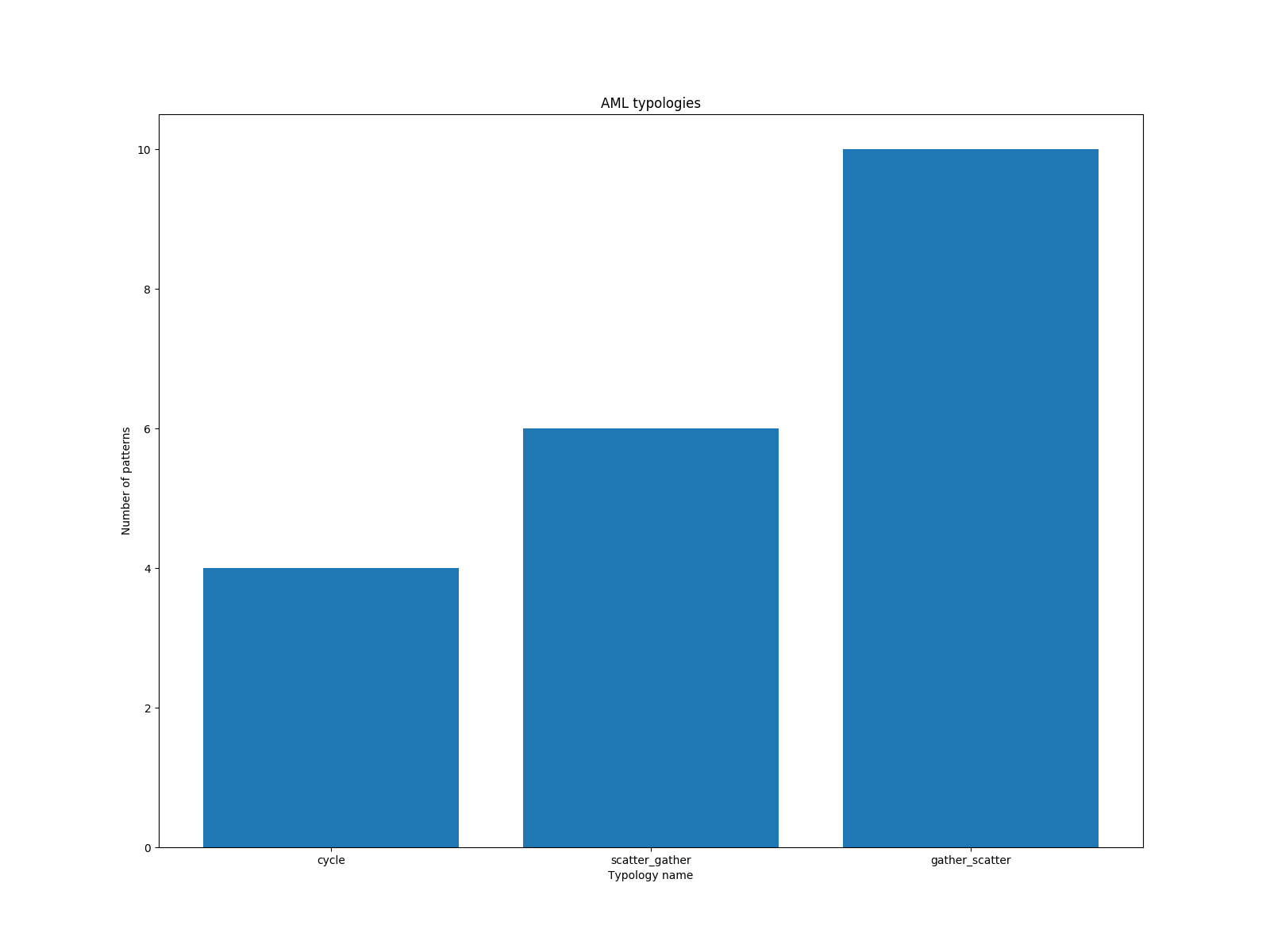
alert.png Number of total alert patterns for each AML typology. |
 |
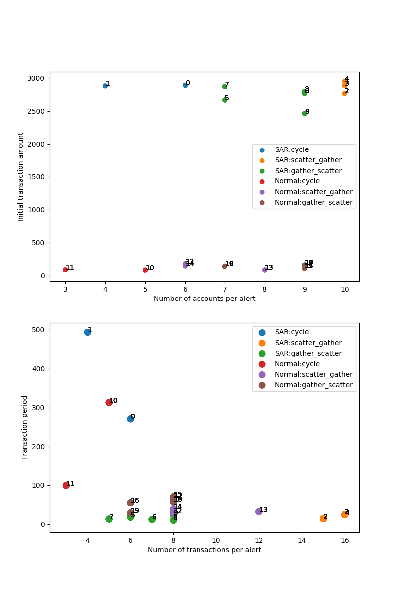
alert_dist.png Number of accounts and transactions, initial transaction amount and transaction period for each alert. |
 |
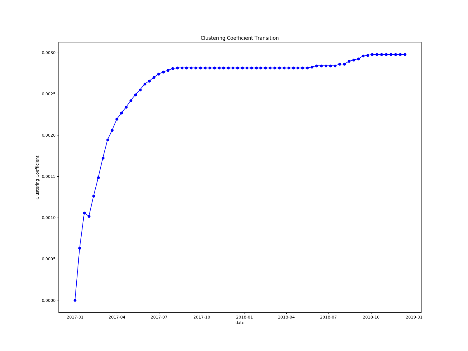
cc.png Clustering coefficient transition of the transaction graph. The x-axis indicates the simulation step, and the y-axis indicates the clustering coefficient at the step. |
 |
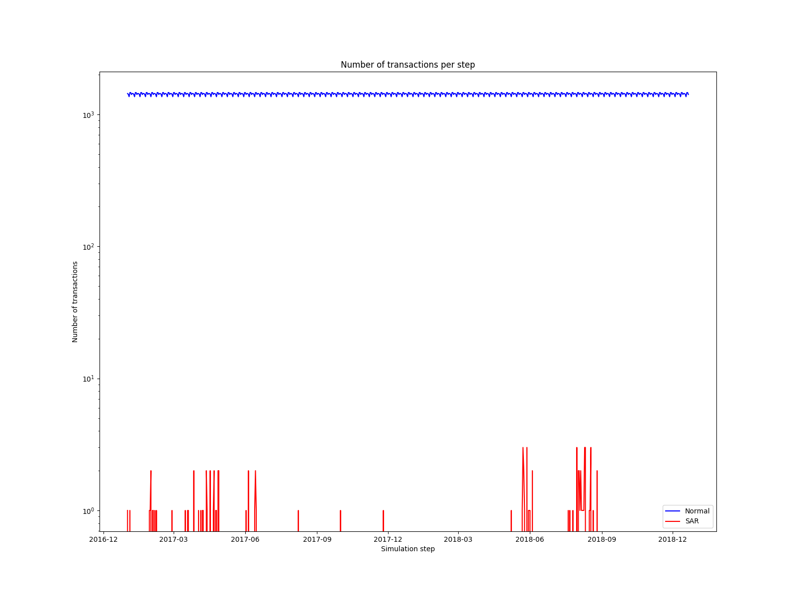
count.png Number of transactions for each step. The x-axis indicates the simulation step, and the y-axis indicates the number of transactions at the step (log-scale). The blue line is the normal transactions, and the red line is the SAR transactions. |
 |
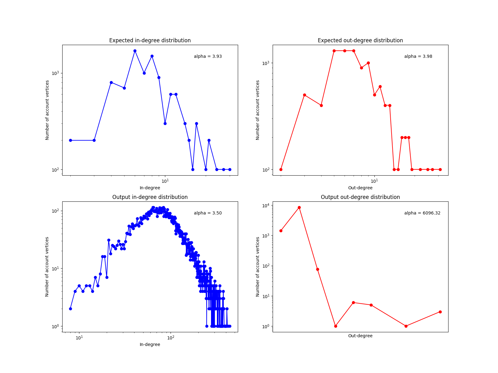
deg.png Account degree (number of transactions) distribution (log-log scale). The x-axis indicates the degree of accounts and the y-axis indicates the number of transactions. The value alpha is the parameter of scale-free distribution. |
 |
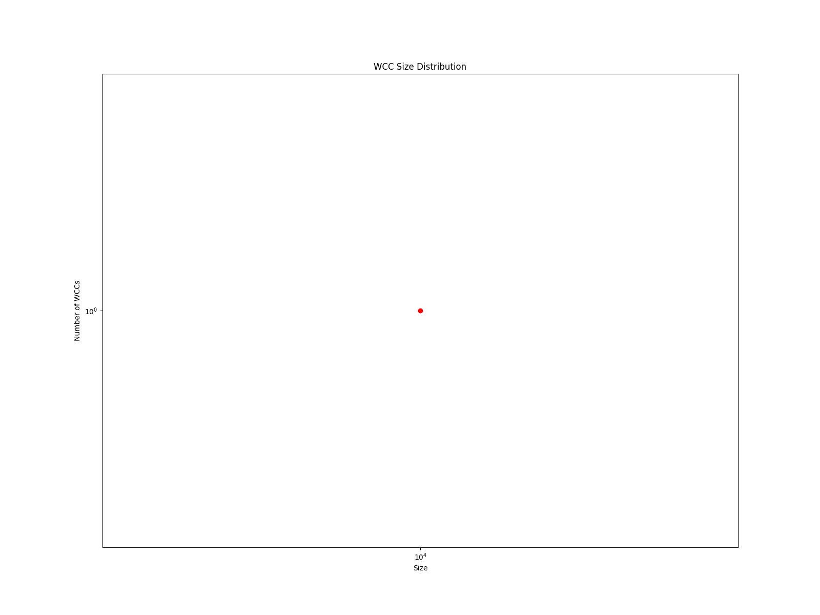
wcc.png Weakly connected component (WCC) size distribution (log-log scale). The x-axis indicates the WCC size and the y-axis indicates the number of the WCCs. |
 |
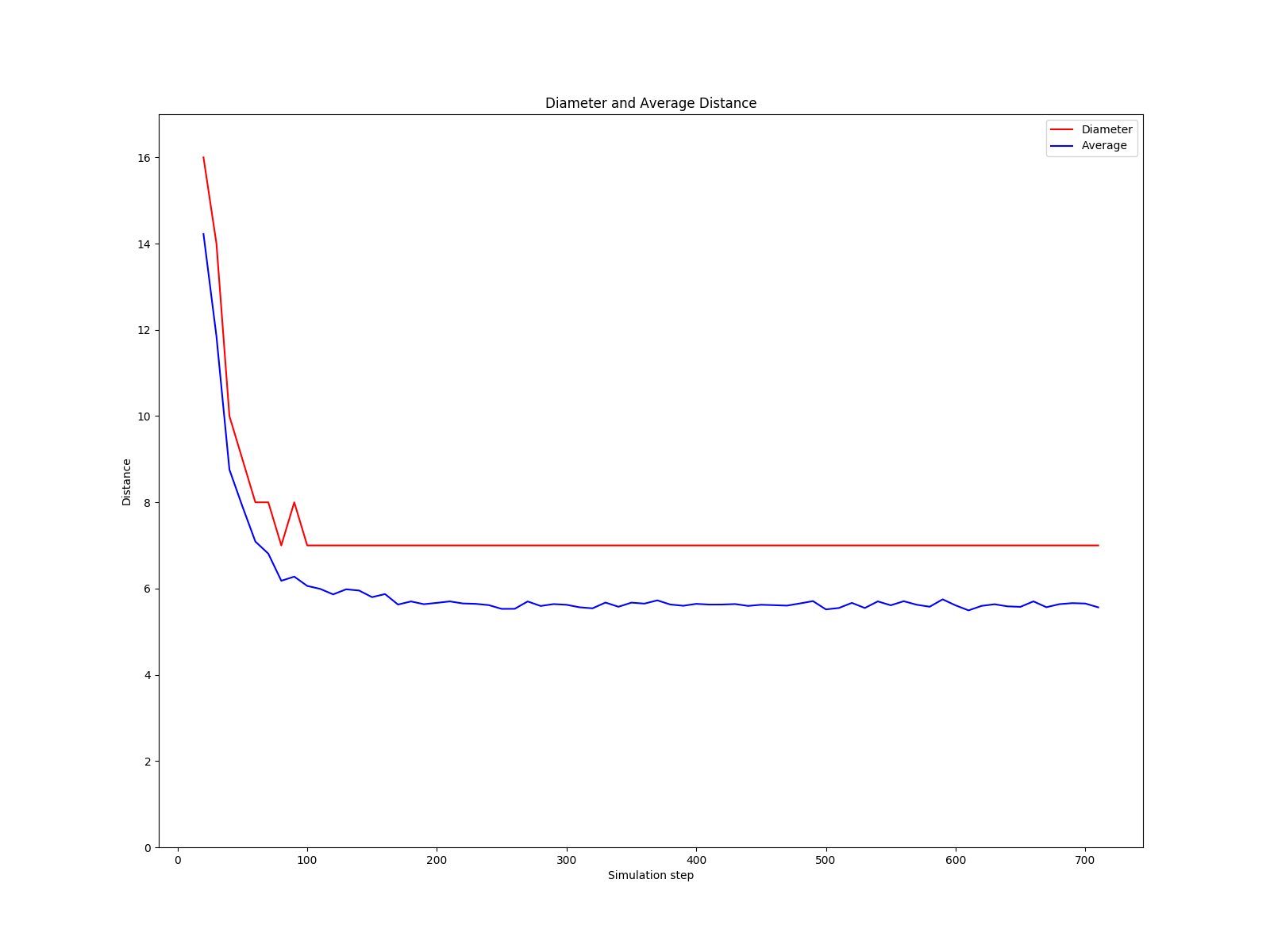
diameter.png Diameter and average path length of the transaction graph. The x-axis indicates the simulation step, and the y-axis indicates the diameter (red line) or average path length (blue line). |
 |
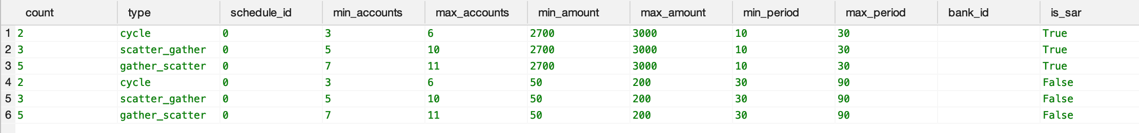
Users can verify the attribute of alerts by comparing the image of alert attribute distributions (alert_dist.png) the content of the alert parameter CSV file (alertPatterns.csv) they edit.
Alert Attribute Image alert_dist.png
|
Alert Parameter CSV alertPatterns.csv
|
|---|---|
|
 |