-
Notifications
You must be signed in to change notification settings - Fork 20
New issue
Have a question about this project? Sign up for a free GitHub account to open an issue and contact its maintainers and the community.
By clicking “Sign up for GitHub”, you agree to our terms of service and privacy statement. We’ll occasionally send you account related emails.
Already on GitHub? Sign in to your account
Update OBF logo #43
Comments
|
Do we have the contact information from the BoF meeting last night for the artist who had those quick sketches? I thought they were pretty great! |
|
A couple of people at the BoF were interested in there -we'd love to hear from you both! @mccalluc was one of them. |
|
@sjthursby was interested too |
|
I've put some rough ideas on google docs: pick one, or suggest changes you'd like to see, and I'll make a clean SVG. |
|
Quick sketches also on this google doc - numbered by style. Clean SVG available on request. |
|
It may be better to keep logo black and white so it's easy to recognise/read/print. I had a look at google docs, really nice ideas! How about we combine these ideas? For example, use UC Sans but replace B with a B made up of binary numbers (and, if it looks good, replace stem/height of B with DNA helix). Just some suggestions I thought to share :) |
|
Some interesting ideas from @mccalluc, although I didn't like the O as a halo (first image, top left), the simple text based ones have a elegance to them. I like the O as a globe idea from @sjthursby - although I agree we need to keep greyscale or even black and white in mind too. P.S. For context, I am one of the current OBF board members. |
|
Thanks for working on this! I will take a look and give more specific comments, but regarding color, I would like to have a color logo that also looks good in greyscale. I think that's what Peter was saying as well. |
|
I can modify the binary globe into greyscale and add a dna helix to the B in UC Sans - will provide an update when completed |
|
I like the "open"-iconography in #8. The world lock logo series looks nice, but the lock is hard to recognize, let alone that it's open (is it?). Perhaps it's worth enumerating our major values, so that at least some of them would be embodied in the logo somehow:
I'm just speaking on my own here, so others, and especially other @OBF/board members please weigh in and/or comment. |
|
See previous google doc for requested adjustments |
|
@lafita I like your design. I'm not clear on what the line alternating 4x from concave to convex is meant to invoke. Perhaps I'm still in West Coast time and need more coffee. And perhaps turn the arm of the lock the other way so that it's clear even at small sizes (such as favicon, or 128x128) that it's open. |
|
@lafita I think the double strand is better. I didn't even get the allusion to DNA from the single line--I thought it was purely decorative. |
|
Great work everyone! @lafita I agree w/ Hilmar and Nomi on the lock and using double-stranded lines. |
|
I think the double lines are better too. But I disagree on the position of the opened lock. That would make it look it more unbalanced as the centering wouldn’t work as nicely. Maybe the gap of the open-position could just be increased a bit to make it clearer? |
|
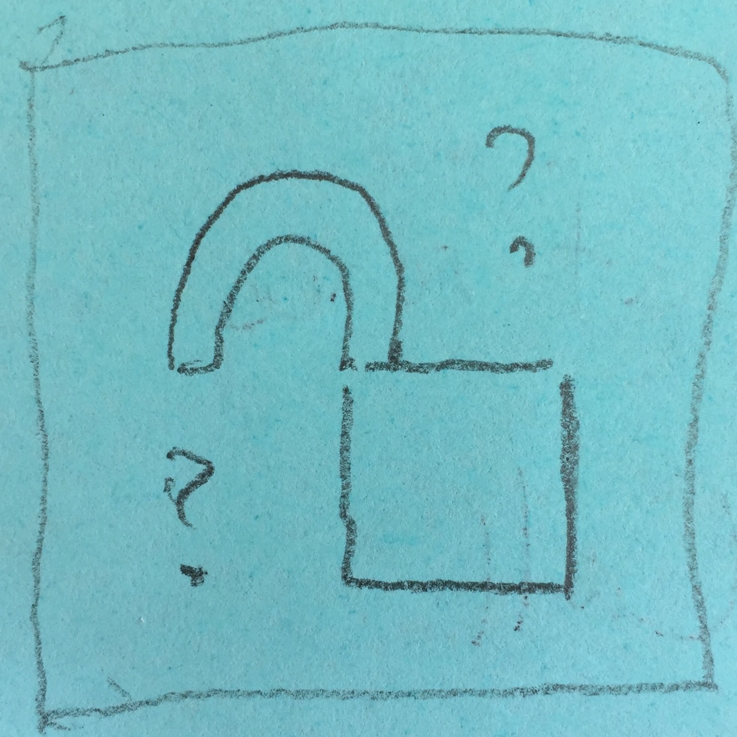
@gedankenstuecke true, I wondered about that. Maybe make it a square and file in the edges with something? My Adobe Illustrator-based version (okay, it's really on a post-it): |
|
I think along with the square and the doubled lines things might come out rather busy? But I'm at the airport on my phone right now, so I can't scribble things up to see how it would come out. :) |
|
@gedankenstuecke yes, true. Safe travels! |
|
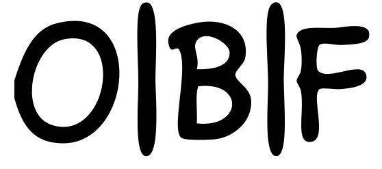
Nice! That makes it clearer that the lock is open without taking up too much horizontal space. One thing I'd like to see is if the logos that spell out the word Open Bioinformatics Foundation could somehow make the initial O, B and F bigger or something to make the OBF acronym more obvious. (I'm not sure how to do that in an attractive way, though.) |
|
Would alternate versions work? For small / square area just have obf, for
large / rectangle spaces use the fully spelled out logo...
…On Mon, 2 Jul 2018, 22:13 Nomi Harris, ***@***.***> wrote:
Nice! That makes it clearer that the lock is open without taking up too
much horizontal space.
One thing I'd like to see is if the logos that spell out the word Open
Bioinformatics Foundation could somehow make the initial O, B and F bigger
or something to make the OBF acronym more obvious. (I'm not sure how to do
that in an attractive way, though.)
—
You are receiving this because you authored the thread.
Reply to this email directly, view it on GitHub
<#43 (comment)>, or mute
the thread
<https://github.com/notifications/unsubscribe-auth/AI14jvN9r2rm8W701iTIIGy5AI8ASW_1ks5uCozegaJpZM4U6yQI>
.
|
|
That one is fantastic, my favorite so far @lafita! |
|
Yes, the latest revision is pretty good, @lafita!
I'm not sure that would make for a good aesthetic. And I don't see that very often either. Also agree with @yochannah, there'd be separate versions to accommodate different space constraints (square, circular, banner, etc). |
|
My fav as well @lafita ! |
|
Looks great! Thanks @lafita! I agree with @nlharris , I think it's important to make acronym a bit prominent. I was just wondering would it be too much text to print out as a sticker (for e.g. laptop?) it would be nice to have a small version with OBF (as suggested by @yochannah) or, if possible, place text within (or maybe outside/around) the circle with two words at the top 'Open Bioinformatics' and 'Foundation' at the bottom xD |
|
Stickerz 💯 |
|
@lafita that'd be great of you can open up a pull request with the SVG versions (and feel free to include the PNG too)! |
|
I really like that idea! awesome! Is the color decided to be green? or can we have some more example to see how other colors look like? |
|
+1 to what @lpantano said. Maybe a range of different (web-friendly?) colors? |
|
@lafita @sjthursby @mccalluc - thanks for all the work you've put in so far! The plan for going forwards is a follows: We'll be running a poll in a Google Form and asking community members from the OBF to vote on their preferred logo. @lafita @sjthursby @mccalluc - can you each share a large-ish png of your preferred logo(s) (please not more than one or two) in response to this comment so I can set the form up? Thanks!! :) Edit to add: sooner is better if possible - we'll be sending this out with our newsletter within the next week or two. |
|
Chiming in late here (another OBF board member). Thanks for all of the creativity! I like the @lafita logo a lot. Not sure it needs more detail in the alternating lines - would make it too complicated to be recognized from afar, or to be use in small size (i.e. favicon). I'd like to see some other colours, though. Also like the globe-with-lock idea from @sjthursby and would like to see some iteration on that (simpler, with lock emphasized). |
|
The colors of the logo can of course be changed, it should be easy to do! I chose green because it looks more biological, but I could try any other color. @yochannah are the three latest pictures from my last two comments I posted in this issue of enough quality for the poll? Thanks for organizing this! |
|
@yochannah: lafita's look great to me! but if you want to run a poll, here are two of the plain text options: |
|
ok, those two look suitable for the poll. @sjthursby of the items in your doc, which would you like to put forward? |
|
Nice improvement, @sjthursby! In the version with the Open Bioinformatics Foundation text, I'd suggest (1) changing the font of "Bioinformatics" so it's at least sans-serif, and ideally the same as "Open" and "Foundation"; and (2) consider making the font bigger so that the text occupies about the same height as the globe. The globe is Americas-centric, which unfortunately is the most common representation, and I guess we can't have it rotating in a static image 😞 If you happen to have other rotations of the globe available to you, it might be worth comparing, or producing different versions (perhaps one that's Europe/Africa centric instead). |
|
@hlapp Thank you! If selected (and if desired), I could make a gif with the globe rotating in the binary style with a static lock for the website? I have a Europe-centric version of the globe also, which can be used if a globe design is selected. Please find below the requested alterations: |
|
Maybe it makes sense to just vote between the 3 different styles and leave some room for final improvements after the vote (e.g. changing colours, centering the globe, etc.)? That way we don't split the vote for options 1 & 2 and @sjthursby, @mccalluc and @lafita don't have to provide all possible versions right now. |
|
That definitely sounds easier!
…On Tue, 17 Jul 2018, 23:00 Bastian Greshake Tzovaras, < ***@***.***> wrote:
Maybe it makes sense to just vote between the 3 different styles and leave
some room for final improvements after the vote (e.g. changing colours,
centering the globe, etc.)?
That way we don't split the vote for options 1 & 2 and @sjthursby
<https://github.com/sjthursby>, @mccalluc <https://github.com/mccalluc>
and @lafita <https://github.com/lafita> don't have to provide all
possible versions right now.
—
You are receiving this because you were mentioned.
Reply to this email directly, view it on GitHub
<#43 (comment)>, or mute
the thread
<https://github.com/notifications/unsubscribe-auth/AI14jjsp7YJmzIV75PYi0VTA5nI4mPYyks5uHl6LgaJpZM4U6yQI>
.
|
|
Also a bit fairer. 😊 |
|
I agree, 1a and 1b are variants of the same logo concept, as are 2a and 2b. @yochannah I think for Option 3, the counterpart to the square variation needs to be the one here. |
|
@yochannah Could you just put 1a in the vote for me please? Thank you! |
|
ok, VOTING IS OPEN! Share with your friends, family and bioinformaticians.... |
|
We need to wrap this up and finalise the vote. So far we have around ~70 votes - let's set the closing date for the 27th. Feel free to share with anyone who you think may not have voted yet. Thanks everyone who's shared and voted already! |
|
So, we closed the poll yesterday and the results are in!! 🎉 We had 89 responses, and just over 49% of the votes went to option 3, so the logo by @lafita is the winner! Well done @lafita! Huge thanks to @sjthursby and @mccalluc for your fantastic contributions as well; we value the time and effort you put in to this. |
|
@lafita when you are able, could you please PR the logo files to /logos in this repo? Thank you!! |
|
@lafita to add to this: if you have a vectorized version (SVG, EPS, maybe PDF) it's also quite useful, we can update site logos, fonts, etc. Let me know if you need some help on this. |


The OBF logo is a little outdated and we'd like to replace it with something a bit more modern and exciting.
Current logo:

Interested in helping out?
Anyone is welcome to give this a go, if you have some ideas! Maybe you'd like to create a graphic that reflects aspects of the biological/computational/open nature of the OBF.
Pop a comment on this issue to say you'd like to contribute, and share any sketches / mocks / attempts you've made, or run ideas by us first in this issue if you like.
Specs
Once we've agreed on a basic design, we'll need the following:
When you're ready, fork this repo, clone it to your computer, and place the files in the logo directory. You can then make a PR for the logo to be merged in to this repo.
You'll be credited in the repo for your contribution as well as reaping eternal fame and glory.
What to do if you need help
Mention @yochannah, tweet @yoyehudi, or if needed email yochannah@gmail.com
The text was updated successfully, but these errors were encountered: