Block-specific responsive controls #13363
Comments
|
I'll share some initial explorations arount this topic. The block that's most urgently in need of responsive controls at this point is the column block. Currently, columns stack automatically on small screens, without any indication that's going to happen. The Media & Text block also can stack on mobile, but it includes a toggle switch to turn that behavior on or off. This is a great baseline for responsive controls:
For many users, this toggle offers more than enough control: it's reasonable to assume that a modern website builder can handle this all automatically if we ask it to. But we should offer some level of fine-tuned control for those users who will want to specify how many columns should appear at various breakpoints. With that in mind, I built my exploration up around a couple core ideas:
With those in mind, I built a couple prototypes: Desktop Prototype (Figma) Screenshots for reference:
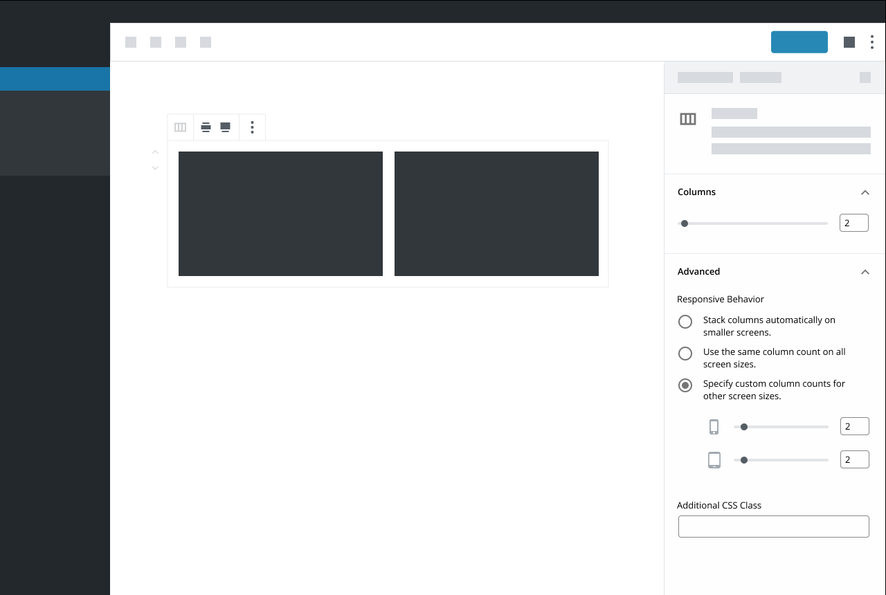
As you’ll notice when you click through: when you have option (C) selected, the only device options shown in the “Devices” panel are the devices you’re not using. If you’re on a phone, the default slider under “Columns” will control the number of columns you’d see on a mobile device. If you keep option (C) selected and access this block from a desktop machine, the default slider will control the number of columns you’d see on a desktop view. This prevents duplicating controls that do the same thing, but I'm not totally sure whether it’s intuitive or confusing. An alternative would be to show all devices down there, and disable the default slider when option (C) is selected, but that seemed weird to me. I'm Interested in some feedback! I'm also curious how these sorts of controls might extend to other types of settings: What other blocks would benefit for responsive controls like this? |


|
I've been building a rather large theme recently for a work project launching in the next couple of weeks. I thought I should probably shared some of my thoughts. The following panel is what I've implemented for handling stacked columns on various devices. Each Device can have it set explicitly and also have the order reversed. (Using flex for columns css).
The top portion (margin / padding) is also available on all blocks. Allowing us to create some pretty fantastic layouts entirely from the editor. What I would love to see is desktop/tablet/mobile buttons available at the top of the editor to switch the editor into the respective modes without resizing the window. This would allow for very rapid building for all response levels. While those three modes work for my purposes, potentially a range of response levels could be configured in the theme allowing you to switch between any of them. As we no longer have an iframe based editor, this is clearly going to take a bit more trickery to pull off. Having thought a bit about how I could accomplish something similar, I would imagine that the editor could not use media queries, and instead css would need to be developed specifically for the editor for every block. I'm currently doing this anyway for my own theme. If the "editor-styles-wrapper" div had the current response added to the class, you could easily substitute media queries for class based responses. |

Thanks for sharing, @mattbolt. In case you haven't seen it, we're discussing that exact sort of thing right over here: #13203 As for the responsive margin/padding rules: I'd love to see more fine-tuned controls for margin + padding. But for the majority of users, I imagine those would be more beneficial on a global level. That's why I left them out of my explorations above. I do think we should definitely include margin/padding controls somewhere, but per-block seems a little too granular to me (at least for core). |
|
heya @mapk @kjellr - I left a comment on #13203, but I think it's worth highlighting a portion of it in this issue as well. This is the latest prototype we're working on - It's based on feedback we got from our recent usability test that I noted in #13203.
Our blocks have a few different settings, and not all of them should be editable on a device by device basis. As such, we think placing responsive controls in individual settings makes sense. In the example above, the responsive controls for layout can be adjusted, but filtering by category can't. (filtering by a category should always apply to all device sizes) We'd also want to use smart defaults, so folks wouldn't have to go in and adjust the layout for each device size. The first portion of our test was run using live blocks which didn't feature any responsive layout controls. Many of our participants asked questions along the lines of, "How do I change these layout settings for mobile devices?" It leads me to belive that more people are going to want this kind of granular control than we think. Putting responsive controls in the advanced settings is another option, however, I belive it would make it more difficult to find... granted that's a bit of a one time problem - once you find it, you know where to look for it the next time. That said, I also think there's something to keeping responsive controls in the context of the setting that a user is adjusting as well. We haven't had a chance to test this latest version, but we hope to soon. |

I really like how you took something so complex and simplified it in a usable way for anyone to understand. Another block that could benefit is the Gallery block which already has some rudimentary column adjustment settings.
Thanks Matt! Your exploration into margins and padding is a good one to share here as well. #11824
Really interesting!
This makes sense in context to the Woo block that also allows adjusting the product number as well. Do you think it's necessary when there's only one adjustment (ie. columns) as in @kjellr's mockups? |
|
I'm noticing that most of the mockups so far use icon-only controls. Ideally, for accessibility (and general usability), it would be best if the responsive controls had visible labels. I'm not sure how feasible this is, but I just wanted to point it out, since Gutenberg has struggled with accessibility in various areas, and it would be a good idea to try and avoid adding any more icon-only UI. |
|
Another thing we'll need to consider is toolbar options that might require responsive settings. For example the block width feature found on the Cover block. You might want narrow width on desktop and full-width on mobile. |
|
Heya @mapk
I do. Discoverability is a big part of that reason for me. It puts the responsive settings directly in the context of the setting(s) that are being manipulated. I think there are going to be many cases where a block has multiple responsive settings, and not all of them are going to fit neatly in a single bucket like, layout. For example, your second question above.
In my previous usage of page builders, the answer to that question has been yes. Adding a "Visibility" settings with it's own responsive controls would allow for that.
|

|
In hindsight - Visibility might not be the best example in this case, as something like that would probably be better suited as simple list of toggles. [toggle] Show on desktop |
@LevinMedia I wanted to followup on this finding: can you share any more details about the pool of users who were part of this test? This finding surprised me a bit, so I'd like to learn more. Thanks! |
|
I think a key consideration here is our expectation for how much of an impact responsive manipulation will have on the overall authoring experience. Not only now but in the future as well.
That question is top of mind for me right now. I like @kjellr's design a lot for the reasons @mapk mentioned above, but I'm not sure how well it would transition to a "mobile first" experience? As @LevinMedia said, most participants in our recent usability tests showed a keen interest in mobile settings already and declared it to be "very important" to them. Of course it must be said that there is some bias there as each participant was a WooCommerce user and perhaps more "tech savvy" than other users. My inclination at the moment is to agree with @LevinMedia - context will be vitally important here. I think it should be very easy for users to find these settings and understand what they do. On a related note, I personally do not like the "Advanced" section of the settings panel - for almost any use case. It feels arbitrary to me and I've literally no expectation what settings I might find in there when first interacting with a block. |
Along these lines, one of the considerations in my approach above is that it's aware of which screen you're editing from. In other words, the device you're on is the one you're designing for "first". If you visit from a mobile phone, the only slider you'd see in the main area is the mobile slider. The rest are down in Advanced. Or, if you visited from a tablet: the tablet would be shown as the default control, and the others would be down below. This could very well end up being confusing: splitting the controls between the regular sidebar panel and Advanced feels a bit off to me, as I mentioned originally in my notes above. But in general, I do like the general idea of being device-aware. In the mockups @LevinMedia posted, that'd equate to defaulting to selecting the mobile tab when visiting on a mobile device, or to tablet when you're visiting from tablet, etc. (I actually think I saw that in one of your mockups, but I can't find it now.) |
|
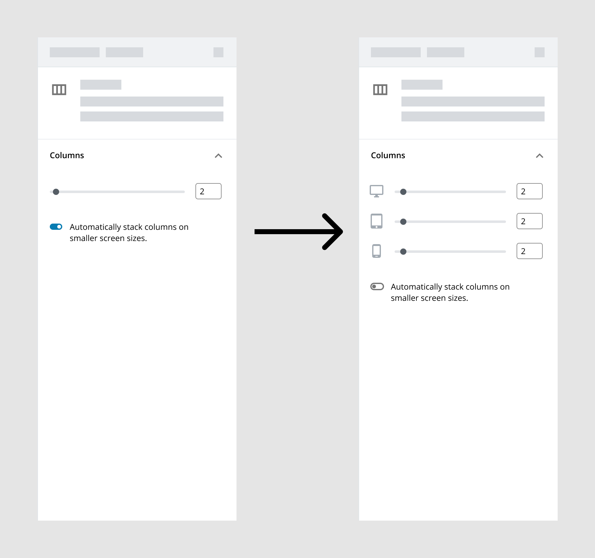
Spent a little bit of time thinking through a slightly different direction for this. One thing that hasn't quite sat right with me from my previous iteration was how I separated out the columns controls between the main sidebar "Columns" panel and the "Advanced" panel. This exploration simplifies the options a bit and moves everything back into the main "Columns" area:
The first frame just adds the "Stack on mobile" toggle we currently have available to the Media & Text block. By default, it's turned on, and everything's handled automatically. This is the best setting for users who do not want to manage these settings. Unlike today, if a user were to toggle that off though, they'd be presented with more fine-tuned controls there instead. From here, they can either leave it alone (it'd default to the same size for each), or adjust to set a different column count for each device type. Some considerations:
One question I keep coming back to as I'm exploring and reading through the thoughts here: how simple or complicated should this be in core? Some custom blocks will include certainly include a ton of individual settings for each breakpoint: margin, padding, showing + hiding blocks, etc. That may be what their user base is comfortable with. But we don't necessarily want to include that level of control in the default blocks since it may be overwhelming for a novice user. That said... it's likely beneficial for us to establish design patterns that can scale up to those super-complicated scenarios, so that we can help demonstrate how this should be handled in all cases. How can we define a simple pattern that scales between people who do not want to have to manage responsive settings and those who want to be really specific about these things? |
|
Nice mockups, @kjellr!
At the very least, the device icons should be moved to labels for each of the sliders, e.g. "🖵 Desktop".
I think the answer to this lies in the toggle. What if every responsive control had a toggle to enable/disable customizing the responsiveness of the setting? Divi Builder has something pretty similar to this.
I think I would prefer having the toggle above the sliders, since toggling it affects the sliders.
I think that a lot of stuff could be hidden behind toggles like the ones in your mockup by default, or by simply keeping them in closed accordions by default. Margin and padding could both be in the same accordion, and you could toggle responsiveness for those controls with toggles like in your mockup. I don't think this would overload the user with options if this accordion is placed below all the more common options and is closed by default. |
|
@kjellr - Following up to Jay's comment. We had a small sample size (eight participants) so as I mentioned before, more testing/research is definitely warranted. All of the participants came from the WooCommerce Design Feedback Group - As jay mentioned, our participants, and this group of participants in particular skewed heavily towards the more experience builder / Store Assembler profile, rather than a DIY shop owner. |
|
A small followup to the mockup I posted yesterday:
After taking through it with @jasmussen and some other folks, I tried using a ButtonGroup instead of a Toggle, alongside some (hopefully) clearer copy. Changing the formatting and copy this way allows us to more naturally place the control on top of the columns control. That feels a lot more expected hierarchically. One thing I really like about this approach is that it sets the precedent that, these controls should be handled by the block by default. Block designers will have infinitely more control than users will, since they'll be able to define their own breakpoints. Block designers will also have a lot more experience with responsive design than many users, and should be able to apply best practices here. Also, if a user switched to manual, made a bunch of adjustments to breakpoint settings, and messed things up, the "Auto" option is a quick escape hatch for them. There are still some weird things to sort out here (for instance, who chooses these exact breakpoints?). But this seems like the sort of setting that may be able to scale to more complicated setups, and I think we're getting closer. |

|
Love it, Kjell. It allows a default that is best in most cases, yet granularity for those who want it. It also feels like a pattern that can scale from the columns block, to other blocks, to even third party blocks. Well done. |
|
Very nice, @kjellr! I still think that each of the sliders should have visible textual labels for accessibility and clarity reasons, but other than that, I think we're getting close to being able to actually implement this functionality! Also, in terms of accessibility, are we sure a button group is more appropriate than a toggle in this context? |
|
I like these concepts and they work well for columns but I see some small issues with both. The concept with the toggle is my favorite of the two, but it won't be consistent across settings as the label will be different each time. So it won't be immediately obvious that the setting has mobile options. I worry about scalability. The concept with the segmented control feels a little odd to me because you're asking the author to make a choice of auto vs manual before actually interacting with the column setting. That's not what I'd expect to see when opening a "columns" section in the settings. The labels don't feel particularly clear to me either. I'm keen to hear more thoughts around the concept @LevinMedia shared earlier. We came to that solution after a round of usability testing and it seems fairly consistent with what other block authors are doing. Is there a reason we're discounting that approach? |
Sure! I don't meant to discount that solution. The key thing I see missing from that direction is the presentation of a "let us handle it" option. While more advanced users will jump right in and edit everything under each of those device icons, that'll be a lot of work for a notice user. Especially when we could just handle it automatically for them. Aside from that, the crux of that direction is the segmented control for devices:
I think works fairly well and could be a pattern to use here, though if we incorporated a segmented control above it that could get weird. |
Gotcha. So the concern is that the tablet / mobile toggles don't feel optional? That makes sense. But I feel the device segmented control would provide a more consistent pattern across different setting types and therefore scale better. Ease of use vs. Consistency and scalability is a hard one! To stress test these concepts a little more might I suggest adding another option beneath columns, that would also have a responsive component: Rows. |
|
@x4fingers what are your specific needs regarding this issue? I’ve created multiple custom blocks, adding responsive controls to most of them. I’ve even added the capability to control the values for each breakpoint too. |
|
@rodrigodagostino I think you are misunderstanding. I need a native feature in Gutenberg itself instead of creating a lot of custom blocks just to handle a simple design. And of course, I tried many custom plugins before but nothing is perfect and doesn't work at all. |
|
Ya @rodrigodagostino the issue is that a lot of us are making custom block or using plugins, to replace blocks such as the group block, the headings, etc because we can't add 150px bottom padding to a group and have mobile still look good. The best and really only way I have found to currently use the built in blocks this way is to use a class based sizing system for my theme, somthing like how tailwild works https://tailwindcss.com/docs/margin then I can do my spacing with classes, not ideal for sites being handed off to a client though. |
|
@x4fingers I did not misunderstand, I was asking. I still do not know what are the specific problems you’re having, mate. I’m pretty sure there’s some custom solution out there that could help you. I got tired of waiting several years ago, so I created my own solution (you might’ve seen what I posted on April 19, 2020), and it’s working quite well along Gutenberg :) I might be able to cover your particular needs, or it could even be that I’ve covered them already. Let me know :) @nickfmc yes, I totally get that. It is really strange to me that a proper solution hasn’t been provided by the WP team yet. What you did with the custom classes is pretty clever, but (as you mentioned) not the best approach to leave it on the hands of the user. I wish this would be solved from the core itself, but for the moment my own custom blocks have been doing wonders for me :) |
|
@rodrigodagostino I need a stable solution to write custom CSS at every single breakpoint inside any block. At the moment, I'm building a website with a block theme that heavily relies on Lazy Blocks and custom CSS classes. Over time, my code becomes larger and hard to maintain. |
I think there should be a plugin which injects CSS responsive settings into every block. We are currently building such stuff as a premium feature to our block theme:
As far as I can say, it helps the devs a lot to have less custom code / custom styles, but is hard to use for clients without random css knowledge. So native responsive settings for smartphone / tablet would be quite an achievement. But you have to do that for nearly every block dedicated due the different html markup. Just compare groups with media-text or covers with images. I can understand that this takes a lot of time to implement in the current structure. If you start working on this you will realize quickly that there are more layers of complexity like opt-in responsive triggers, media query generator, breakpoint settings and default values etc. I think these are the most important settings needed (responsive):
|

Would you like to have a text field that allows you to write your custom CSS code however you wish on each block or would you rather have a group of fields that cover your every need (including breakpoints features)? I’m guessing it’s the first one, which shouldn’t be difficult to implement :) |
Then have to use the anchor field to get a unique selector because the client ids / block class ids are not static. Btw. there is already the HTML block (IMO) which provides custom code capabilities. Still, this is not a good solution over custom code in a child theme file. It's even harder to maintain. |
|
@dennisheiden I agree, but I don’t think that’s what x4fingers is looking for. |
I need a tab control on every block, each tab has a text area to write custom CSS for a breakpoint. As I said before, I tried many plugins to enable this feature before but no plugin can do it perfectly. I can't implement any feature that I want or code my own block because I'm not a React developer, it will take a lots times. |
|
If you are going to write out custom CSS for each breakpoint and it's not for the end user, you might as well just use class based styles anyway then to limit the amount of re-used code you would need to write out for each individual block. The biggest concern is for the added fields built into Gutenberg for margin/padding of a block that you can opt into but only 1 setting for all breakpoints, this is the first thing they need to make responsive because the functionality is already in WP and you can't assume a design would have 200px bottom margin on desktop and also on mobile, that is crazy and it makes the built in tool for Gutenberg unusable as far as I'm concerned. even the "spacer" block is almost never usable because of this lack of a setting. But adding responsive controls to anything that provides spacing should be the first thing addressed. |
This. It was relatively easy to implement a responsive height setting for the spacer block for us. This is something clients demanded across the board besides column spacing and it feels very intuitive since then. |
 kathrynwp
added
[Type] Discussion
kathrynwp
added
[Type] Discussion
|
Here I am in 2023, still adding hacky code to my themes to meet the needs of designers and clients. The work that has been done with theme.json is lovely but the need for responsive controls must be addressed. Not everything can be handled with intrinsic design principles and theme.json |
@ouw-jvt I agree, and I think this is one of the reason that prevents full site editing adoption. |
|
Where can I track any movement on this or is there an ETA for this feature? |
|
lets continue here |
|
@sinanisler The above ticket was closed. |
|
Is there any ETA for this? |
|
@robi09 well it is already 5 years so give it 5 more year ;)
|

|
Really helpful feature. A lot of people are waiting it |
|
I want to thank you for your amazing work on Gutenberg! It’s truly a great tool for creating content. But you know, it would be absolutely fantastic if you could add the ability to set separate styles for mobile devices, tablets, and desktops right in the editor. After all, who wouldn’t want their site to look perfect on all devices without needing extra plugins? I think it would be the "cherry on top." I understand it might be a challenging task, but just imagine how cool it would be to tell your friends: "Yes, I work with Gutenberg, and it can do EVERYTHING!" |
|
Interacting with different clients, I see the need to adjust the padding and margins of the sections. Two simple settings for mobile and desktop will not complicate the interface but will make life much easier. Of course, the ideal option should include a perfectly thought-out design system, but in the realities of web development, this is a very exotic thing. Therefore, in my opinion, this less-than-ideal solution will solve a serious problem right now |
|
Hello, We all need responsive controls! Full Site Editing is a really great idea. It allows you to organize your work superbly. It's 2024, the mobile version of websites is really important. Every "mini" compromise will help promote the idea of FSE. Elementor, Divi, Kadence - they all have it and need it. We too! This thread has been going on since 2019 and should be a priority. Collaboration, Negative margins or grid can wait, but responsiveness? Don't make us wait another year 😅 |
|
Hello, Responsive controls are essential for modern web design, and Full Site Editing (FSE) is a powerful concept that can greatly enhance the way we build and manage websites. Ensuring that our sites are mobile-friendly and responsive is crucial in 2024, as more users access the web through their mobile devices. Elementor, Divi, and Kadence have all embraced responsive design, making it a standard feature in their toolkits. It’s clear that responsiveness is a non-negotiable aspect of web development, and it's something that should be prioritized in FSE as well. Since this discussion has been ongoing since 2019, it’s time to make responsive controls a top priority. Features like collaboration, negative margins, or grid layouts are important but can take a back seat to responsiveness. Let’s focus on what’s most critical and ensure we don't have to wait another year for this essential capability. Cheers to making FSE more powerful and user-friendly! |
|
Hello, |
 and others
Problem
Many blocks need to adjust responsively depending on the screen size. Right now block developers are baking in these controls into the block inspector. Let's make sure we provide a unified way to achieve this action.
Solution
Think through ways in which we might implement responsive controls for specific blocks.
Questions
Related to #13203
Issue #13203 is about an overall responsive layout option. This particular issue is focused more on individual block responsive controls.
The text was updated successfully, but these errors were encountered: