Remove unintentional right-margin on last odd-item. #12199
Conversation
Looks like it wasn't intended to for the last column to have a `right-margin`, but the `:not(:last-child)` used here would only "not add" the margin. It didn't remove it if the column was odd numbered.

This simplifies the logic and adds right and left margin to all columns but removes it from first-left and last-right.

I also replaced the `flex: 1;` property with `flex-grow: 1;`.
`flex: 1` is = to `flex-grow: 1; flex-shrink: 1; flex-basis: 0;`
In this case `flex-shrink` keeps it's default value of `1` and `flex-basis` overwritten and is set to `100%` a couple lines after. So `flex-grow` is all we need.
|
This is still broken b/w the 600px and 782px breakpoints. |
|
Noting a related comment I found in a recent PR at #11904 (comment).
|
|
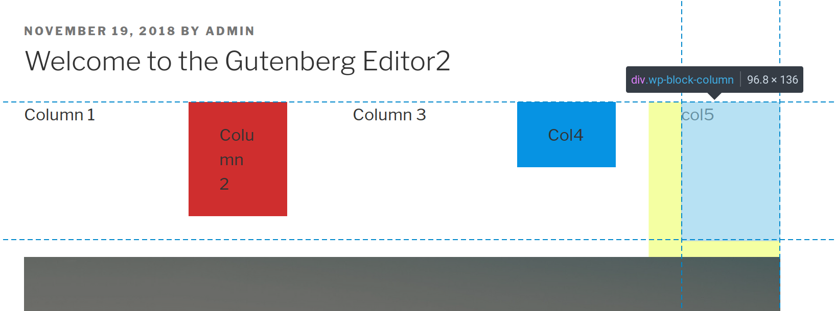
@designsimply Thanks for linking that PR! I had previously tried to find discussion about how the columns were even supposed to look but hadn't seen that. The best way to show what's going on with the margins is to use a CSS debugging utility like Pesticide. The screenshot below are three rows of column blocks. A 2 column, a 3 column, and a 4 column.
As you can see, all rows have 0px margin on the left but the 3 column row is given a margin-right. This is because the row ends with an odd( The logic used here for the column margins doesn't add up.
The method used for the text-column CSS works correctly: Maybe we should go with something like that. The other separate problem noticed and mentioned by @drdogbot7 above, is that the design isn't fluid between breakpoints since our columns CSS is splitting one major layout change between two breakpoints, @jasmussen does this make sense? |
|
This solution works, but I think you're eliminating one of the original breakpoints. Based on the comments, this is the original intent: Mobile: less than 600px Small: 600px - 782px Medium: bigger than 782px My solution #12408, attempts to keep the Small breakpoint and make it work. Honestly… I'd be fine with simplifying things and losing the 2-column breakpoint. I just want it fixed! |
|
Thanks, all, for the work here. This needs a thorough testing and I will test as soon as I can. In the mean time, this just a 👍 👍 for helping uncover and fix these issues.
I think that's fine too if it solves a problem or simplifies things. |
|
Thanks again for working on this. Took it for a good spin, and it seems to be working as intended. Nice work. It also doesn't seem to break a few of the flex things that were difficult to get working, notably around making sure content doesn't grow larger than its parent contents:
As I look at this on admittedly extreme 8-column setups, I'm finding myself missing the 2-column midway breakpoint as noted in #12199 (comment). But if there's a good reason for why we can't restore that, that's okay too, just want to make sure we do this with a will. Expanding the testing range to Kjell who was instrumental in helping to ship this. |

|
Some more testing, on twentyeleven and twentynineteen, with forced backgrounds to clearly verify. Interestingly, the twentynineteen theme "cheated" by bundling their own fix. twentyeleven
twentynineteen
(The extended height of the last column in twentynineteen may be an unintended consequence of this style rule?) |

|
This seems to fix things on the front end:
... but I'm still seeing additional margins applied on the back end:
Can anyone else confirm that? Like @jasmussen, I do miss the 2-columns at middle-breakpoints a bit. It'd be cool to include that if possible.
|


There was a problem hiding this comment.
As mentioned by @drdogbot7 at #12199 (comment), this is still broken at some viewport ranges:

(650px width in this screenshot)
However, it's no more or less broken than the current state of master, so I'd still consider this to be an improvement. Or would you want to take a stab at fixing that here?
|
|
||
| // Add space between columns. Themes can customize this if they wish to work differently. | ||
| // Only apply this beyond the mobile breakpoint, as there's only a single column on mobile. | ||
| margin-right: $grid-size-large * 2; |
There was a problem hiding this comment.
These seem like a generally much easier set of rules to follow. I kept thinking I'd have thought this would have the effect of doubling up the margin from what had existed previously since only one or the other horizontal margin was applied, but I realized after some time I'd totally missed the previous &:not(:last-child) { rule.
There was a problem hiding this comment.
Using &:not(:last-child) and &:not(:first-child) requires fewer lines of code, but it's admittedly a little confusing. I think it just depends on what your priorities are. Both do the same thing.
| &:not(:first-child) { | ||
| margin-left: $grid-size-large * 2; | ||
| // Beyond mobile, allow 2 columns. | ||
| flex-basis: 50%; |
There was a problem hiding this comment.
If we're getting rid of the 2-column breakpoint, then flex-basis:auto; would make more sense here wouldn't it?
At 600px, a most 3+ column layouts are gonna look squished. If we're going to lose the 2-column breakpoint, then I think I'd prefer to keep the columns stacked until 782px. That would also make it easier for theme developers to add a 600px-782px breakpoint if they want to, because they wouldn't have to override as many styles. |
|
Submitted a new pull request (#12816) that fixes the margins and keeps the 2-column breakpoint. Added fixes to the editor stylesheet as well. |
|
I can't remember if I noticed the extra margin in the editor or not. I don't see where this style was duplicated or any styles at all for I think a breakpoint at 2 columns would be nice too. Does it currently have one. If I removed it, I didn't intend to. |
The issue is that there's a lot of extra markup in the editor view, so the editor.scss needs to be adjusted to account for that. In the editor the
I think it was supposed to have a 2-column breakpoint, but it didn't really work. Styles were added at the 'small' breakpoint that should have been split between 'small' and 'medium'. From what I can tell, the margins that were added with ODD and EVEN rules were supposed to be for the 'small' (2-column) breakpoint where the columns wrap, and the At the 'medium' breakpoint, the ODD/EVEN rules also need to be reset or you end up with that "unintentional right margin". |
|
I just updated the editor.css to match style.css for the margins if @kjellr or anyone wants to test. Seems to have done the trick for me in the editor. One other thing I wanted to clarify about intended design for "columns". The styles in this PR more or less duplicate the styles for Text Column block except that the text column has a 16px right/left margin while this column has 32px right/left margin. vs the general column block: Realize with the columns sitting side by side, our column block here actually has 64px of separation between columns while the text-column has 32px between. Is this the original intent? I'm wondering if like @aduth was thinking here #12199 (comment) the intent of the even/odd was to not double up margins in between. And 32px is actually the desired space between columns? |
Yes, that latest update works on my end. 👍 |
|
Thanks to @drdogbot7 I finally think I understand the overall design intent of the current CSS. I'll break down my understanding and the code to accomplish it.
The column width should be half the screen(50%) - half our margin since we have 2 cols but only one margin We only need the margin before the second column in the row (even)
We add the margin before all columns except for the first in the row. Right margins are never add so we don't worry about the last column I'm not crazy about the specificity added by pseudo-classes but I don't think it's avoidable and it's not too bad here. I've updated this PR and tested. |
| @@ -89,30 +89,24 @@ | |||
|
|
|||
| // Beyond mobile, allow 2 columns. | |||
| @include break-small() { | |||
| flex-basis: 50%; | |||
| flex-basis: calc(50% - #{$grid-size-large}); | |||
There was a problem hiding this comment.
Need to account for the additional padding added in the editor.
flex-basis: calc(50% - #{$grid-size-large} - #{$block-padding * 2});
There was a problem hiding this comment.
As noted in feedback here, https://github.com/WordPress/gutenberg/pull/12816/files#r242051845, this has an unintentional side-effect. Are you sure it needs this additional padding into consideration? I believe it does not, because of the negative margins present in the editor. Yeah this is a bit of a headache, I'd love refactoring this in the future to simplify things, but for now I think we might need separate rules for the editor and the front-end.
Both kinda. I'm guessing that's how it was intended to look before all the iterations took it elsewhere. |
| flex-grow: 0; | ||
| } | ||
|
|
||
| // Add space between columns. Themes can customize this if they wish to work differently. | ||
| // This has to match the same padding applied in style.scss. | ||
| // Only apply this beyond the mobile breakpoint, as there's only a single column on mobile. | ||
| @include break-small() { | ||
| &:nth-child(odd) { | ||
| margin-right: $grid-size-large * 2; | ||
| } | ||
| &:nth-child(even) { | ||
| margin-left: $grid-size-large * 2; |
There was a problem hiding this comment.
EDITED b/c my initial fix was wrong.
Column gutters are too narrow in editor view compared to frontend. I think you need to do (2 * $grid-size-large) + $block-padding here to account for the negative margins added by the editor. See #12816.
| @@ -10,41 +10,37 @@ | |||
| } | |||
|
|
|||
| .wp-block-column { | |||
| flex: 1; | |||
| flex-grow: 1; | |||
There was a problem hiding this comment.
I don't think this property is necessary since we are setting the width to 100% below.
| @@ -10,41 +10,37 @@ | |||
| } | |||
|
|
|||
| .wp-block-column { | |||
| flex: 1; | |||
| flex-grow: 1; | |||
| margin-bottom: 1em; | |||
|
|
|||
| // Responsiveness: Show at most one columns on mobile. | |||
| flex-basis: 100%; | |||
There was a problem hiding this comment.
If we change this to width:100%; we accomplish the same thing and make it easier to override.
(content < width < flex-basis)
|
|
||
| // Beyond mobile, allow 2 columns. | ||
| flex-basis: calc(50% - #{$grid-size-large}); | ||
| flex-grow: 0; |
There was a problem hiding this comment.
flex-grow:0; isn't necessary here, if we remove flex-grow:1; above.
|
Exactly right @drdogbot7! I just updated to account for the negative margins added by the editor. |
Does it mean it's ready to merge? Can someone give it ✅ after the recent changes applied? |
|
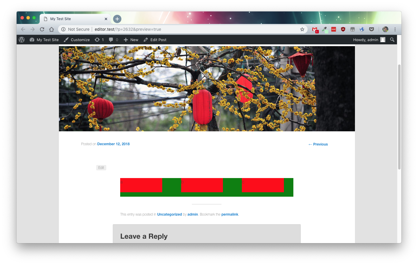
This is a MASSIVE improvement. Thank you so much @m-e-h and @drdogbot7 for your valiant work. I agree let's get this in ASAP and then push additional fixes separately. However I'm seeing a small regression in Chrome, and it's directly related to this conversation here #12199 (comment) — GIFs: This is master, this shows the bug that this PR tries to fix:
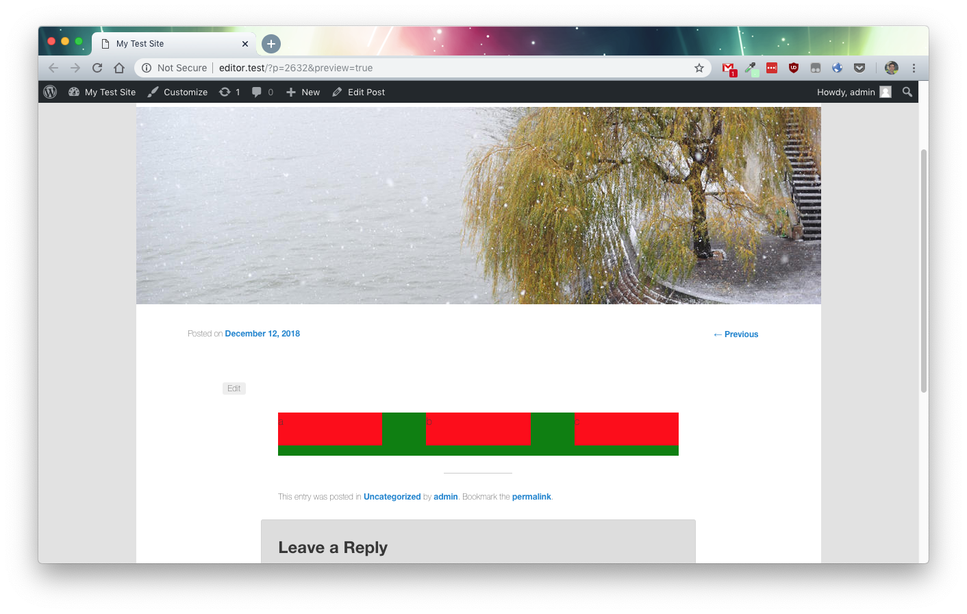
Note the additional margin on odd numberd (3, 5) columns. The following is this branch as it is right now:
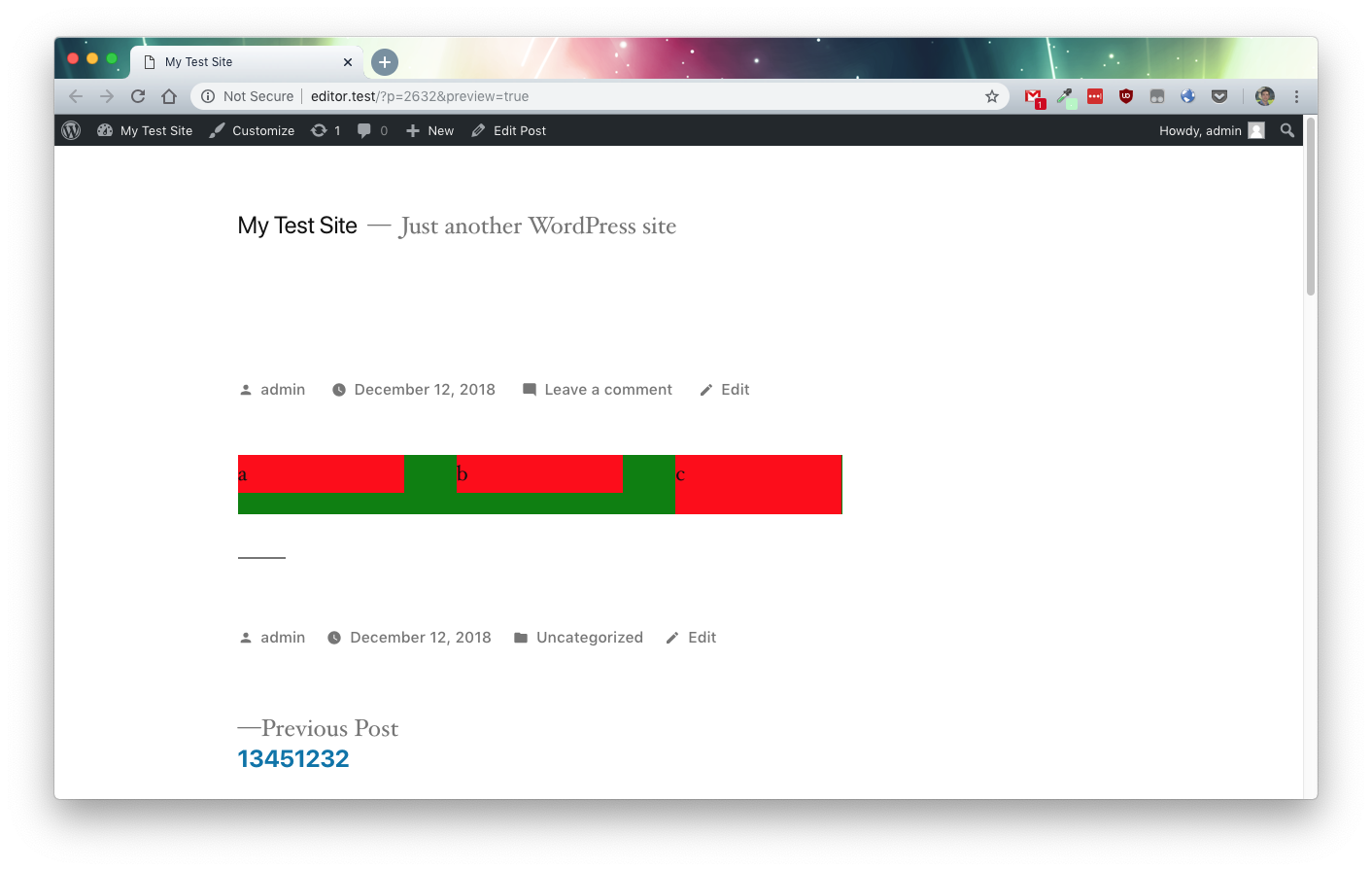
A vast improvement, but notice how on EVEN numbered columns (2, 4, 6) the last child has an additional tiny padding. What's up? When the code looks like this, the column width is accurate ONLY for odd numbers of columns: When the code looks like this, everything appears to work for me, AND the initial issue appears fixed: Here's how that looks:
The issue ALSO appears to be fixed if we add the suggested change by @drdogbot7: Here's how that looks:
I just tested and both
Final step: We need figure out why both |


 gziolo
added
[Block] Columns
gziolo
added
[Block] Columns
|
Remember, at the One unintended consequence of this is that if you have a single column, it won't use all the available space:
|


|
I've spent the last few hours fussing with this, and I really think that the only reasonable thing for us to do is to remove the
Let's remove it now when it will be least disruptive. This will save us and users a lot of headache moving forward. I think this would be the right course of action even if it means delaying the fix. EDIT: I created a PR #13605, that does this… just as an example. |
|
I updated the flex-basis calculation. The math is lost on me but it appears to be the values we need. 🤔 I do see the issue with twentynineteen. It's setting the As much as I prefer having the two column bp, perhaps @drdogbot7 is correct. While it seems we're fixing a broken implementation of the medium breakpoint, we're actually introducing a new medium breakpoint since there never actually was one. A breaking change? Maybe. |
To be fair, there were distinct At this point some important actively developed themes |
I would almost suggest an argument can be made this is intentional. In any case it can be fixed separately and shouldn't block this.
Yep. My bad. But we can trivially fix TwentyNineteen with an update, so that's not a problem. However if you both agree that the medium breakpoint is not productive for this block, I strongly agree it's a good time to remove it. In light of new responsive controls being worked on, perhaps it's even moreso the time. @m-e-h can you make this final change, and then let's ship this thing? |
If we want to ship it in Gutenberg 5.0 it needs to be in the shippable state by tomorrow. |
|
I've been playing with different variations WAY too much tonight. I say ship it like this, with the two column breakpoint. Twentyninetine will need some tweaks but I think that'll be the case even without the 2 column bp. When testing an unstyled Underscores theme, the 2 column breakpoint version is the only thing that looks great without a total re-write of this CSS. A complete rewrite will come but I'm thinking the best thing to do now is to fix what's "broken", which is the right margin on medium+ screens and the jagged layout small+ screens. #13363 is looking like the proper way to handle column styles. Not that it matters too much but I also think having the "mobile","tablet","desktop" breakpoints in place already seems to be in line with the direction of that discussion so far. |
|
Thank you all for the thoughtful feedback, I'm for merging this now as a vast improvement over what's in master today. You all have good points, and let's continue to explore enhancements in #13363 and even through methods such as #13605. Inaction is only going to make matters worse, and this PR fixes problems. Here are some GIFs:
It is unfortunate that themes have had to fix issues present, and it will be unfortunate if this bugfix causes further issues. However: a) this will be not make it to WordPress 5.1 and will likely land in 5.2, so there will be some runway both to become aware of any breakage, and perhaps to even land further improvements b) themes thankfully have a relatively seamless method of providing updates I would recommend we merge this in the current state, for all of the discussion provided above. |


…rnmobile/372-use-RichText-on-Title-block

* 'master' of https://github.com/WordPress/gutenberg:
  Try alternate list item jump fix. (#12941)
  Mobile bottom sheet component (#13612)
  Remove unintentional right-margin on last odd-item. (#12199)
  Introduce left and right float alignment options to latest posts block (#8814)
  Fix Google Docs table paste (#13543)
  Increase bottom padding on gallery image caption (#13623)
  Fix the editor save keyboard shortcut not working in code editor view (#13159)
  Plugin: Deprecate gutenberg_add_admin_body_class (#13572)
  Rnmobile/upload media failed state (#13615)
  Make clickOnMoreMenuItem not dependent on aria labels (#13166)
  Add: className prop support to server side render. (#13568)
  Fix: Categories Block: hierarchical Dropdown (#13567)
  Docs: Add clarification about git workflow (#13534)
  Plugin: Remove `user_can_richedit` filtering (#13608)
  eslint-plugin: Add rule `no-unused-vars-before-return` (#12828)
  Image settings button (#13597)
  Fixed wording for the color picker saturation (#13479)

# Conflicts:
#	packages/block-library/src/image/edit.native.js
* Remove unintentional right-margin on last odd-item.

Looks like it wasn't intended to for the last column to have a `right-margin`, but the `:not(:last-child)` used here would only "not add" the margin. It didn't remove it if the column was odd numbered.

This simplifies the logic and adds right and left margin to all columns but removes it from first-left and last-right.

I also replaced the `flex: 1;` property with `flex-grow: 1;`.
`flex: 1` is = to `flex-grow: 1; flex-shrink: 1; flex-basis: 0;`
In this case `flex-shrink` keeps it's default value of `1` and `flex-basis` overwritten and is set to `100%` a couple lines after. So `flex-grow` is all we need.

* update editor to match style.css column margin changes

* account for beginning and end margins with breakpoints

* update editor.css to match style.css

* account for editor block padding and the medium breakpoint

* remove whitespace

* account for negative margins added by the editor

* correct flex-basis calculation for column width
Description
Looks like it wasn't intended to for the last column to have a
right-margin, but the:not(:last-child)used on the column would only "not add" the margin. It didn't remove it if the column was odd numbered.This simplifies the logic and adds right and left margin to all columns but removes it from first-left and last-right.
I also replaced the
flex: 1;property withflex-grow: 1;.flex: 1is = toflex-grow: 1; flex-shrink: 1; flex-basis: 0;In this case
flex-shrinkkeeps it's default value of1andflex-basisoverwritten and is set to100%a couple lines after. Soflex-growis all we need.How has this been tested?
visually in chrome and firefox.
Screenshots
Before:

After
Types of changes
Bug fix (non-breaking change which fixes an issue)
Checklist: