Try a white sidebar #10062
Try a white sidebar #10062
Conversation
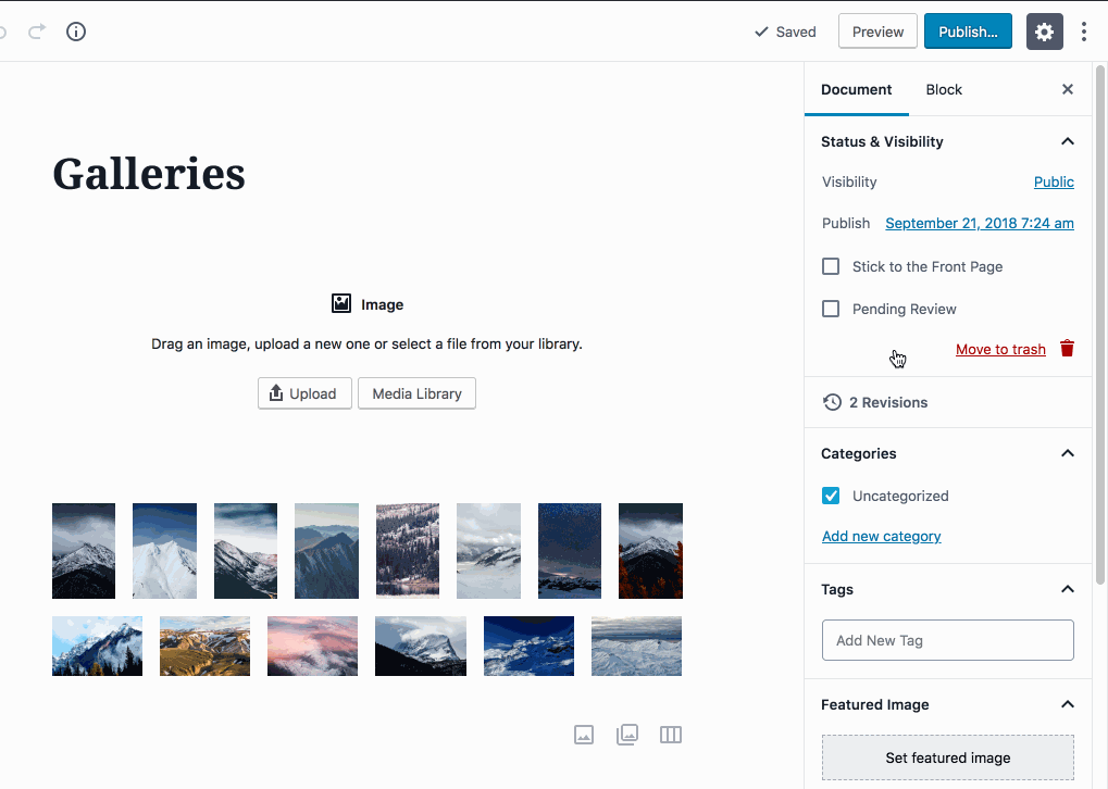
This PR extracts an idea from #9784, a white sidebar.

This looks a little jarring at first, but can grow on you. Because it's sort of a jarring change, I think it needs to be tested in a PR, rather than be discussed. That way people can actually _feel_ it, rather than look at screenshots.

What do you think?
There was a problem hiding this comment.
I took it for a local test drive, as recommended!
My first instinct is indeed that it's just too much white and too spartan. I've thought we should put less white in the sidebar, so everything being that way makes it really tough for my eyes to lock onto different pieces of the editor.
I do think it has a benefit and that's having not-full-height-sidebars look more consistent:

I like that, but when everything is scrolled down and the grey header is gone it all looks a bit indistinguishable:

I think this all-white sidebar could work if the bottom remained white but the header was:
- a darker background
- stickied
So the "Document" and "Block" selector were always at the top. It's an important context to have and being able to scroll it out of view isn't great UX anyhow. We could fix its position (maybe restore its dark colour too) and I think this would actually be cool, even from Mr. I Don't Like White Sidebars Me.
|
Thanks for breaking this out into its own PR — this is helpful to see in action. I'm a little mixed on it initially, but leaning towards liking it. Here are a few first impressions:
|
|
Pushed a change in bd564cd
Not sure I love it yet, but it addressed feedback from both of you: white bottom area, lighter gray tabs, sticky position. If we do decide we dig it, we'd want to test this properly on mobile, including physical iphones, sticky positioning is always ugly on mobilesafari. We'd also want to use the z index mixin. |
|
Interesting! I think I like the sticky, but it's not working for me at any breakpoints above In general though, I do really like the light gray bar, as well as the removal of the gray at the very bottom of the page. This seems like a reasonable update to me. |
|
Okay I addressed the feedback. Keeping design feedback label for now. |
|
I've been going back and forth on this. First try, have to admit didn't really like it. However, I have sat with it a bit and let the experience settle. I now love the latest iteration with the grey at the top. Great work everyone it really opens up the design and feels fresher. |
|
🎉 |
|
Yay! Let's ship it! |
|
Worth considering the sidebar header sticky position hides elements that are currently focused. This is a known issue with all similar fixed toolbars, especially when tabbing backwards. See in the screenshot below, where focus is on the publish date button, which is completely hidden behind the sidebar header:
|

|
Hmm, interesting point. Is the recommendation not to use a sticky menu then? It adds a lot of context to the menu. If it's a big problem though, please file an issue and we can consider removing the fixed position here, as long as it doesn't impact usability re: contrast. |
This PR extracts an idea from #9784, a white sidebar.
This looks a little jarring at first, but can grow on you. Because it's sort of a jarring change, I think it needs to be tested in a PR, rather than be discussed. That way people can actually feel it, rather than look at screenshots.
What do you think?
Before:
After:
Especially in fullscreen mode this works: