Components: Add a WAI-ARIA compliant custom select. #17926
Conversation
 epiqueras
added
[Focus] Accessibility (a11y)
epiqueras
requested review from
ajitbohra,
chrisvanpatten,
gziolo,
jorgefilipecosta,
talldan and
youknowriad
as code owners
epiqueras
added
[Focus] Accessibility (a11y)
epiqueras
requested review from
ajitbohra,
chrisvanpatten,
gziolo,
jorgefilipecosta,
talldan and
youknowriad
as code owners
|
Design-wise the options should be shown in a Popover I think. |
I want to tick all the |
epiqueras
force-pushed
the
add/a11y-custom-select
branch
2 times, most recently
from
70ae1d5
to
421f9fb
Compare
There was a problem hiding this comment.
Good work on this! Checked with VO/Safari and NVDA/Firefox and it's behaving pretty well on both, apart from the repetition of "Font size" label I commented on below.
One thing I noticed on NVDA but was unable to reproduce consistently is that sometimes the font size button is announced as "expanded" when focused, and with the dropdown closed. I realise this may not be very helpful, will try and debug further 😄
Another potential issue is that focus is not being limited to the component when it is open, so if we open the dropdown and then press tab we move out of it but the dropdown stays open. Shift-tabbing until the font size button is focused again allows us to continue interacting with the dropdown, but after that pressing esc will not close it.
Also, minor styling issue on Firefox and IE:

Removing display: inline-flex and adding text-align: left to components-button will fix it for both browsers 🙂
| import { Button, Dashicon } from '../'; | ||
|
|
||
| const itemToString = ( item ) => item.name; | ||
| // This is needed so that in Windows, where |
There was a problem hiding this comment.
Just checked this on Windows and the behaviour is identical to Mac: on arrow down/up the menu opens. I don't see that as a major issue though. If we did want the arrow keys to work with the menu closed we'd probably have to make sure the options always render, and hide them with CSS, but then it's not clear that we could limit that behaviour to Windows 🤷♀
There was a problem hiding this comment.
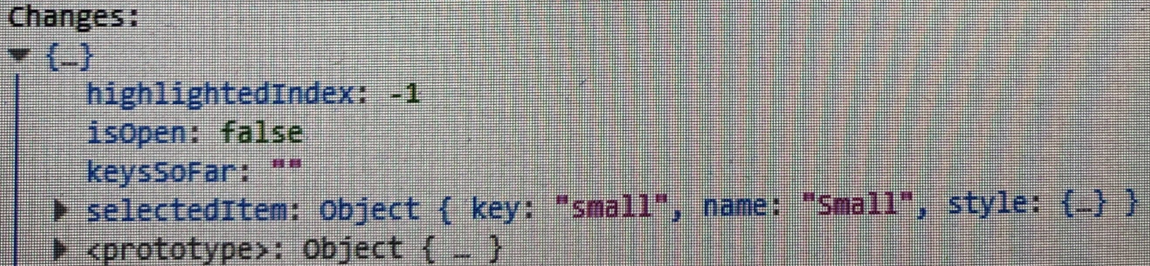
the issue here is the returned changes. @epiqueras just return the selectedItem because if you also return the rest of the changes then one of them is isOpen that comes as true :D
| { ...getLabelProps( { className: 'components-custom-select__label' } ) } | ||
| > | ||
| { label } | ||
| </span> |
There was a problem hiding this comment.
Any reason not to make this an actual <label> instead of using aria-labelledby? Then we might not need the aria-label. Having both, VoiceOver and NVDA are announcing the button as "Font size font size". Would be good to avoid the repetition.
There was a problem hiding this comment.
The way I wrote useSelect was with having a physical label that also labels the button and the menu. As I understood there was an issue with Dragon Speech because of this.
Having said that, anyone tried Dragonn Speech to select an item then check what the console.log prints?
There was a problem hiding this comment.
Any reason not to make this an actual instead of using aria-labelledby? Then we might not need the aria-label. Having both, VoiceOver and NVDA are announcing the button as "Font size font size". Would be good to avoid the repetition.
Dragon Speech still needs the explicit aria label on the toggle to be able to click on it.
Having said that, anyone tried Dragonn Speech to select an item then check what the console.log prints?
It registers a click on the toggle button I think:
In that test^^ "Small" was already the selected item.
There was a problem hiding this comment.
Hmm can we use the semantic <label> and add aria-label too? @enriquesanchez 's testing on #17418 showed that approach works with Dragon, and aria-label seems to supersede <label> so the screen readers don't read out both.
With the current font size controls we're already having an issue where VoiceOver reads out the fieldset legend twice (that's a VO bug, but still annoying), so it would be good to avoid unnecessary repetition wherever we can.
|
@tellthemachines Thanks for the help!
Done 😄 |
There was a problem hiding this comment.
We're getting there!
One remaining issue, apart from the comments I left: pressing Tab when the dropdown is open still causes focus to be moved to the button control. Subsequently pressing Esc will not close the dropdown, but pressing any arrow key will close it.
Also, would be good to test replacing the current font size picker with this component, to check focus management when entering/exiting it.
| { ...getLabelProps( { className: 'components-custom-select__label' } ) } | ||
| > | ||
| { label } | ||
| </span> |
There was a problem hiding this comment.
Hmm can we use the semantic <label> and add aria-label too? @enriquesanchez 's testing on #17418 showed that approach works with Dragon, and aria-label seems to supersede <label> so the screen readers don't read out both.
With the current font size controls we're already having an issue where VoiceOver reads out the fieldset legend twice (that's a VO bug, but still annoying), so it would be good to avoid unnecessary repetition wherever we can.
| border: 1px solid $dark-gray-200; | ||
| border-radius: 4px; | ||
| color: $dark-gray-500; | ||
| display: initial; |
There was a problem hiding this comment.
I'm afraid IE doesn't support initial 🙀
Can we replace this with inline, which is iirc the default value for <button>?
|
I ran some tests of the component in https://deploy-preview-17926--gutenberg-playground.netlify.com/design-system/components/?path=/story/customselect--default with Dragon, NVDA and Voice Over. Here are the videos of the test: With Dragon: https://cldup.com/cihauaUTN4.m4v With NVDA: https://cldup.com/7n79VbZMo3.m4v (sorry for the shaky camera) With Voice Over: https://cldup.com/A12FmcNrSn.m4v |
@enriquesanchez this happens because NVDA is not switching into forms mode when entering this component. If you manually switch by pressing Insert+Space then you'll be able to use up/down keys. It would be worth investigating if it's possible to make NVDA switch automatically as that would be closer in behaviour to a native control. |
|
It still needs to be included in the published
https://webpack.js.org/guides/tree-shaking/#mark-the-file-as-side-effect-free |
|
It looks like it will still try to tree-shake most things, but will trip up with things like HOCs without directives: https://webpack.js.org/guides/tree-shaking/#clarifying-tree-shaking-and-sideeffects @silviuavram can we add the |
|
I am really interested to try this out, I will make changes on |
|
@silviuavram it's |
|
Can you create a PR and I will look over it tomorrow? Thank you! Do we need
to publish an alpha version to test if it works?
…On Wed, 4 Dec 2019 at 18:19, Enrique Piqueras ***@***.***> wrote:
@silviuavram <https://github.com/silviuavram> it's Downshift that is
missing the sideEffects property, we need to add it there.
—
You are receiving this because you were mentioned.
Reply to this email directly, view it on GitHub
<#17926?email_source=notifications&email_token=ACWAZAEBES6R3WBPJB3BDA3QW7RCXA5CNFSM4JAIMOL2YY3PNVWWK3TUL52HS4DFVREXG43VMVBW63LNMVXHJKTDN5WW2ZLOORPWSZGOEF5YV4I#issuecomment-561744625>,
or unsubscribe
<https://github.com/notifications/unsubscribe-auth/ACWAZAEFWUKASHJVNY2NJW3QW7RCXANCNFSM4JAIMOLQ>
.
|
|
@silviuavram downshift-js/downshift#843
Yeah, that would be helpful. It should work, unless |
|
Thanks very much! I will publish an alpha tomorrow from that branch and
test it out.
…On Wed, 4 Dec 2019 at 18:35, Enrique Piqueras ***@***.***> wrote:
@silviuavram <https://github.com/silviuavram> downshift-js/downshift#843
<downshift-js/downshift#843>
Do we need
to publish an alpha version to test if it works?
Yeah, that would be helpful. It should work, unless Downshift has side
effects, but better to be safe.
—
You are receiving this because you were mentioned.
Reply to this email directly, view it on GitHub
<#17926?email_source=notifications&email_token=ACWAZACDGJCFX4WO4ZEKWXDQW7S6XA5CNFSM4JAIMOL2YY3PNVWWK3TUL52HS4DFVREXG43VMVBW63LNMVXHJKTDN5WW2ZLOORPWSZGOEF533UQ#issuecomment-561757650>,
or unsubscribe
<https://github.com/notifications/unsubscribe-auth/ACWAZADXQ3NX46KJ3SOKF23QW7S6XANCNFSM4JAIMOLQ>
.
|
|
I published downshift@3.5.0-alpha.0 and could not manage to properly test it. Maybe my testing project is not configured as it should. If you have any tips that will help me looking into it tomorrow that will be super helpful. |
|
What was the issue?
…On Thu, Dec 5, 2019 at 12:15 PM Silviu Alexandru Avram < ***@***.***> wrote:
I published ***@***.*** and could not manage to properly test
it. Maybe my testing project is not configured as it should. If you have
any tips that will help me looking into it tomorrow that will be super
helpful.
—
You are receiving this because you modified the open/close state.
Reply to this email directly, view it on GitHub
<#17926?email_source=notifications&email_token=AESFA2GOTNEADODBACKASW3QXFONDA5CNFSM4JAIMOL2YY3PNVWWK3TUL52HS4DFVREXG43VMVBW63LNMVXHJKTDN5WW2ZLOORPWSZGOEGB76SQ#issuecomment-562298698>,
or unsubscribe
<https://github.com/notifications/unsubscribe-auth/AESFA2EGR6DXCORG43C43ETQXFONDANCNFSM4JAIMOLQ>
.
|
|
I probably did not know what to look for in the minified file. In the
main.map.js I could still find all the exports (useSelect, Downshift,
useCombobox) even though I only imported: import {useCombobox} from
‘downshift’. I probably did not configure the webpack in my test project
correctly. Or it’s something wrong in Downshift’s rollup config or
index.js. Or maybe it works and I could not figure tjat out from the
minified file. I don’t know yet.
On Thu, 5 Dec 2019 at 21:55, Enrique Piqueras <notifications@github.com>
wrote:
… What was the issue?
On Thu, Dec 5, 2019 at 12:15 PM Silviu Alexandru Avram <
***@***.***> wrote:
> I published ***@***.*** and could not manage to properly
test
> it. Maybe my testing project is not configured as it should. If you have
> any tips that will help me looking into it tomorrow that will be super
> helpful.
>
> —
> You are receiving this because you modified the open/close state.
> Reply to this email directly, view it on GitHub
> <
#17926?email_source=notifications&email_token=AESFA2GOTNEADODBACKASW3QXFONDA5CNFSM4JAIMOL2YY3PNVWWK3TUL52HS4DFVREXG43VMVBW63LNMVXHJKTDN5WW2ZLOORPWSZGOEGB76SQ#issuecomment-562298698
>,
> or unsubscribe
> <
https://github.com/notifications/unsubscribe-auth/AESFA2EGR6DXCORG43C43ETQXFONDANCNFSM4JAIMOLQ
>
> .
>
—
You are receiving this because you were mentioned.
Reply to this email directly, view it on GitHub
<#17926?email_source=notifications&email_token=ACWAZABWTCLZN6KD6HMHY63QXFTF5A5CNFSM4JAIMOL2YY3PNVWWK3TUL52HS4DFVREXG43VMVBW63LNMVXHJKTDN5WW2ZLOORPWSZGOEGCDWII#issuecomment-562314017>,
or unsubscribe
<https://github.com/notifications/unsubscribe-auth/ACWAZAGQVQCTX7ZLIGTEZ5TQXFTF5ANCNFSM4JAIMOLQ>
.
|
|
Can you push your test somewhere? |
|
https://github.com/silviuavram/check-downshift-shake tried it here. But I probably did not configure webpack or babel. The alpha version contains |
|
I updated the repo with some things I tried on babel. Still it imports the whole things in the ES bundle. |
|
Yeah, you're building in development mode: |
|
I tried to build with —production as well. The es has the same size as the
cjs.
…On Fri, 6 Dec 2019 at 18:40, Enrique Piqueras ***@***.***> wrote:
Yeah, you're building in development mode:
https://github.com/silviuavram/check-downshift-shake/blob/27a5fcb763ce2b837017a948a6c859ccfa0a0148/package.json#L11-L12
See, https://webpack.js.org/guides/tree-shaking/.
—
You are receiving this because you were mentioned.
Reply to this email directly, view it on GitHub
<#17926?email_source=notifications&email_token=ACWAZAGDSWVR44R3RIMB25TQXKE7ZA5CNFSM4JAIMOL2YY3PNVWWK3TUL52HS4DFVREXG43VMVBW63LNMVXHJKTDN5WW2ZLOORPWSZGOEGE2LHQ#issuecomment-562668958>,
or unsubscribe
<https://github.com/notifications/unsubscribe-auth/ACWAZAEL6VZESKP6KJFGAKTQXKE7ZANCNFSM4JAIMOLQ>
.
|
|
I just debugged this and it's probably because of how There are a lot of static property assignments in there like Some prior discussion: |
|
Looks good, I was also suspicious about those state change things while going through the bundled code. Thanks so much for looking into this! The bad part is the fact that we need to deliver a breaking change to make the bundle tree-shakeable again: exporting those |
|
There are other workarounds:
Related discussion: styled-components/babel-plugin-styled-components#245. |
|
Found a few problems with today's investigation: The hooks were not tree-shaken because of const validatePropTypes = getPropTypesValidator(useSelect, propTypes)
process.env.NODE_ENV !== "production" ? Downshift.propTypes = {
  children: PropTypes.func,
  ...
Probably I could add this same check manually to the hooks, because I don't need that prop types check function to run in production. On the |
|
Yeah, both should work, albeit the first one is a better long-term solution that will work for future code as well. |
|
Any plans to add a README for this component. |
|
With Downshift merged, we should reconsider using it elsewhere (eg for Author selection, page parent selection, etc... eg #7478). @afercia I missed most of the work/conversation here - does the progress on Downshift address the feedback from the original ticket? shall I work on a new PR for you to review? |
|
Yes, that is a good next step with it. |
Closes #16473
Description
This PR implements a fully accessible and customizable select component with individually style-able items, in the
@wordpress/componentspackage.It uses Downshift, a library that will be very useful for any of our other complex a11y input needs.
It has some modifications hooked on top of it to make it fully compliant with the spec. These modifications might soon make it into a future Downshift release and at that point we should remove them from our implementations.
The story for the component is:
https://deploy-preview-17926--gutenberg-playground.netlify.com/design-system/components/?path=/story/customselect--default
How has this been tested?
It was verified that the component works as expected.
Although the libraries used are heavily tested, unit testing this implementation once the approach is approved wouldn't be a bad idea to make sure we never regress to configuring something incorrectly.
Screenshots
Types of Changes
New Feature:
@wordpress/componentsnow has a fully WAI-ARIA compliant custom select.Checklist: