alacrity fancy icon! #285
Comments
|
In my opinion, as an uninvolved bystander, maybe a rust-brown version of the logo would look cool, and give a nod to its "written in Rust" nature? Your designs look pretty nice, tho! |
|
Good point - I forgot about the rusty roots- was all winter cheerful and didn't though about the cog. Will do. |
|
Here some more rusty approach: |


|
Just for clarity. This is unofficial- I'm not the project owner, and my 'relationship' is what you see above. Let's see what the authors says, maybe this is just unnecessary and he got's his own idea (and rightly so if he does). If not then other could give more feedback and I can smooth out the kinks to make it offical if approved. |
|
I'm actually interested in soliciting the community for input here, and I like your abstract A. WRT including Rust branding, I'm strictly against that. Although the project benefits greatly from being written in Rust, and I will continue using the project to promote the language and vis-versa, Alacritty is interesting in its own right. In my imagination, I am hoping for a more interesting take on a standard terminal icon with something like your A. |
|
Hi Joe, Thanks for your feedback. Huh, funny- You more or less wrote what I thought initially. Alacritty might not want to be seen as a PR around Rust, and Rust is "just" the language used. I also like the flipped prompt > :) I'll play with it further and will expand the word. The "cog icon", can be a nice sticker or stamp- a simple addition the main project 'branding' Thanks for your input. That clears the topic. I'll come with further proposals once I chew on this. |
|
Although I really like the abstract A inside the Rust cog, I totally understand the reason why you guys don't fancy it. While all the logos look really nice to me, I really like the colors in first two with "more rusty approach". Just my two cents :) |
|
I think this should be in jwilm's hands, I just hope jankun doesn't throw away the rusty approach, so that it remains as an alternative ;) |
|
No worries, I'll post further designs in the next 2 days- need some time to sit down over the weekend and sketch the ideas. |
|
@jankun -- I was bothered the same way! A project this cool must have a great icon. I'd vote for the the all black rotated > in the cog (2nd option in the 2nd batch) |
|
I really like the rusty color scheme of the ^ in 1st one in the cog series, but the cog itself IMHO doesn't really fit in there. |
|
The minimal ones with some internal shadows look great! |
|
I really like the none rusty ones. The minimalism seems appropriate. However they do look very similar to the logo for Autodesk, but without the flick at the bottom, which could be a problem depending on how bored their lawyers are. :-) |
|
Obviously this is one of those major bike shed type of issues, but nonetheless I'll add my input: I think the icon should encapsulate the principles of alacritty: fast, minimal, terminal emulator. Possibly some reference to using the GPU. I agree with others above that Rust should not necessarily be featured in the icon. Fast can be represented with speed lines, like in this: https://cdn3.iconfinder.com/data/icons/hero/500/fast-512.png Minimal can be represented by keeping the icon minimal. Lastly I think the overall icon shape should be a terminal. So maybe a terminal shape with the A shape from @jankun inside, that has speed lines coming off it. |
|
I like all icons in the first post. |
|
Seems like this (super exciting) issue has stalled a bit. I for one would be delighted to have any of the icons herein available for use in Alacritty by default, with (perhaps) a README or Wiki entry describing how to change out the icon. Does anyone on this thread feel super strongly any particular option presented? |
|
I'm sorry for not-updating, something come along and well... lame excuse. I'm gonna do this in few days and post the "source" files somewhere for anyone who would like to fiddle with them. All of them are vector, can export them to .eps or .svg or .ai or whatever. |
|
Not a fan of the first ones—too much corner radius. The Rust ones look really nice. |
|
I adapted @jankun 's design to look more native on mac
I think the 'A' shape could be used as the project logo and then every platform should have it's own application icon with it. |


|
What about making this abstract "A" horizontal: something like ">" also suggests a terminal prompt. |
|
Used the idea of speed lines of @leavengood and went for a retro aesthetic. |

|
@MaximDeloof I think the A with speed lines is really fitting as a logo and the colors are awesome. Looks like you also used the mac icon template? any chance you can share a link to the |
|
@robertgzr Sure!
I didn't use the mac icon template, but I did try to emulate the terminal shape used on other icons. |
|
Made some refinements and created a couple of variations.
The |

|
@MaximDeloof I really like the direction you've gone with it! Would it be easy to see a variation where the speed line triangles are flat at the bottom instead of the top? |
|
Maybe try this design with a triangle mesh wireframe? |

|
@MaximDeloof |
|
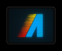
I think I'd like to move forward with @net's rocket icon. Although the retro flaming A is a lot of fun, I don't think it's quite right for the project logo. Thanks @MaximDeloof for all of the iterations on it. Copy of image to be completely unambiguous:
@net -- Are you willing to release the icon source files under the project license? Would also love to talk about the website mockup -- I really like it! |

|
FWIW I have been using the @net icon now for several weeks and I think it is great. The web design he (or she) made is also very nice. |
|
@jwilm Glad you like it. I'm absolutely willing to release the icon under the project's license. Is an SVG sufficient? We can definitely improve upon the website mockup. @leavengood thanks! |
|
@net @jwilm Is there an .svg of the logo available? I can't find one. Trying to add it to https://trevordmiller.com/projects/nova plugins list. Right now I'm just using a generic terminal icon but I'd like to replace it with the official Alacritty .svg icon:
|

|
Net has not responded since sharing the icon, so unless he does we'll probably have to look for something else. |
|
What's the status on this one? I'm here to offer help with the website or the logo if needed. |
|
I've converted the logo to an SVG here: #1451 However it still has a few issues and needs some finishing touches. Unfortunately I'm not very comfortable with image/svg editors, so it has been on the backburner for a while. |
|
@chrisduerr if you provide with some clear instructions for what you want, I can probably help with the SVG polishing. Let me know. |
|
@MarioRicalde You can see the SVG version here: The SVG files are all available in the PR I believe. We have permission to modify this icon to our liking. The original icon by net looks like this: While I've tried reproducing this icon, it's not quite 100% there and the icon designed by net still looks a bit better. The biggest issue with net's icon though is that the border with the gradient makes things really hard to see on some backgrounds, so the goal would be to change the border to fix this and make this icon easily recognizable on all backgrounds. The linked issues have some more details. The SVG I've created might not look great, however it should be very clean and simple to work with, so hopefully that will help with getting anyone started. |

|
I noticed Alacritty doesn't have an icon when I install on Arch Linux, but it does when I install on macOS from Homebrew. Is Mac just testing this icon? Or is something in my install not configuring the icon correctly for GNOME? |
|
The proposed icon has not yet been converted to SVG successfully. While some distributions and package managers have already taken what is available, unfortunately it hasn't been standardized yet. Unfortunately I'm no artist myself and there are definitely still some finishing touches required. So until that is done there won't be an 'official' icon available in standard formats. |
It needs to be more square and bezeled like all the new macOS icons. Can you share the SVG or source file to edit this? |

|
Couple I came up with - one is Dark Side of the Moon-ish and one is kind of take off of one of original Star Wars - A New Hope posters. |


|
Pardon me asking, but what the f***k has a teletype terminal common with Star Wars - force allegiances aside? Maybe I missed something but I do not recall Death Star run on VT100 |
John Williams wrote the score for the VT100 in 1978 after Star Wars in '77....little known fact. |
|
|
Ohh I am sorry, that's beyond my capacity to reason about. Need a pointer to the uhmm original, little known ASCII Music notation probably known in very exclusive circles, especially if John Williams send his compositions around orginally in 78 for a 77 released movie. |
It nagged me the whole afternoon that Alacritty does not have a fancy icon,
so I made one. If you like it - let me know. I kind of do - but thats not good enough.
Now since I can look at it- its not nagging me anymore ;-)
Preview 01
Preview 02
Preview 03
Preview 04
Preview 05
Preview 06
The text was updated successfully, but these errors were encountered: