[Qt]: Improve sendcoinsdialog readability #13158
Conversation
|
Thanks for working on this. I haven't looked at the code, but the screenshots look good. |
src/qt/sendcoinsdialog.cpp
Outdated
| @@ -337,19 +349,10 @@ void SendCoinsDialog::on_sendButton_clicked() | |||
| if(u != model->getOptionsModel()->getDisplayUnit()) | |||
| alternativeUnits.append(BitcoinUnits::formatHtmlWithUnit(u, totalAmount)); | |||
| } | |||
| questionString.append(tr("Total Amount %1") | |||
| questionString.append(tr("<b>Total Amount</b>: <b>%1</b>") | |||
There was a problem hiding this comment.
This line may seem weird. But I made this line's bold this way to match the bold on "Transaction fee" line where the colon is not inside bold tag since I didn't think it was good to bold the entire "Transaction fee" line and there is more text between "Transaction fee" and the colon. Maybe someone has a better alternative.
There was a problem hiding this comment.
We should try, if possible, to keep the html/structure out of the translation strings, to make it easier for translators.
For example here it would be better to do this:
questionString.append("<b>%1</b>: <b>%2</b>".arg("Total Amount")
    .arg(...))
(this arises in a few other places as well)
|
Concept ACK |
There was a problem hiding this comment.
Concept ACK
Build is here:
https://bitcoin.jonasschnelli.ch/build/597
src/qt/sendcoinsdialog.cpp
Outdated
| } | ||
|
|
||
| formatted.append(recipientElement); | ||
| } | ||
|
|
||
| QString questionString = tr("Are you sure you want to send?"); | ||
| questionString.append("<br /><br />%1"); | ||
| questionString.append(tr("<br /><span style='font-size:10pt;'>Please, review your transaction.</span><br />%1")); |
There was a problem hiding this comment.
Please extract the translation part so translator do not have to deal with html tags, etc.
src/qt/sendcoinsdialog.cpp
Outdated
| questionString.append(BitcoinUnits::formatHtmlWithUnit(model->getOptionsModel()->getDisplayUnit(), txFee)); | ||
| questionString.append("</span> "); | ||
| questionString.append(tr("added as transaction fee")); | ||
| questionString.append(tr("<hr /><b>Transaction fee</b>")); |
src/qt/sendcoinsdialog.cpp
Outdated
| questionString.append("</span>"); | ||
|
|
||
| questionString.append(QString("<br /><span style='font-size:10pt; font-weight:normal;'>(=%1)</span>") | ||
| .arg(alternativeUnits.join(" " + tr("or ")))); |
|
Thank you all for taking the time to review this. |
|
utACK 617dfa98ce16d461009cb5e9eb207c0e0eae30fe Please squash your commits according to https://github.com/bitcoin/bitcoin/blob/master/CONTRIBUTING.md#squashing-commits |
[qt]: extracts html tags from translator.

[qt]: removes missed tr() call.
|
Done; commits squashed. |
|
utACK f08a385 |
|
@jonasschnelli Mind to do a build here? |
f08a385 [qt]: changes sendcoinsdialog's box layout for improved readability. (marcoagner) Pull request description: I'm addressing two (probably duplicate) issues: #11606 and #10613. Some points worth noting: - I've tried to balance the proposed changes on both issues without going too far and remaining a bit conservative. It will be easier to improve based on suggestions where necessary. - I preferred to maintain a layout that doesn't ask for an address truncation because, in my view, this wallet should be conservative on this. - I didn't follow the idea of aligning the amounts to the right for finding it more natural (and minimalist) to read the information without having to map alignments. Additionally, that approach seems to need more `<hr />`'s (or similar) in order to help the user to map information, which ended up cluttering the box too much (specially with multiple recipients). Thus, I preferred to just give some more space between recipients. Let me know if there are better ideas on this. Visually, I went from this (current): 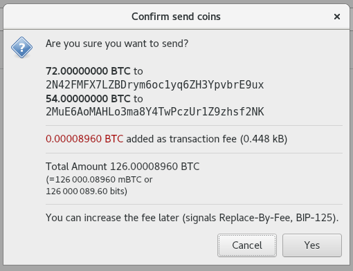 To this:  As a side note, while doing this, I thought about a better way to show fees and found there's already a PR on this (#12189) and thought it is Tree-SHA512: e94b740fab6c1babd853a97be65c3b6f86ec174c975a926fde66b147f7a47e0cf0fa10f7255ba92aaba68c76a80dde8c688008179a34705a9799bf24d3c5cd46
|
Post merge tested ACK f08a385 |
Summary: f08a385 [qt]: changes sendcoinsdialog's box layout for improved readability. (marcoagner) Pull request description: I'm addressing two (probably duplicate) issues: bitcoin/bitcoin#11606 and bitcoin/bitcoin#10613. Some points worth noting: - I've tried to balance the proposed changes on both issues without going too far and remaining a bit conservative. It will be easier to improve based on suggestions where necessary. - I preferred to maintain a layout that doesn't ask for an address truncation because, in my view, this wallet should be conservative on this. - I didn't follow the idea of aligning the amounts to the right for finding it more natural (and minimalist) to read the information without having to map alignments. Additionally, that approach seems to need more `<hr />`'s (or similar) in order to help the user to map information, which ended up cluttering the box too much (specially with multiple recipients). Thus, I preferred to just give some more space between recipients. Let me know if there are better ideas on this. Visually, I went from this (current):  To this:  As a side note, while doing this, I thought about a better way to show fees and found there's already a PR on this (bitcoin/bitcoin#12189) and thought it is Tree-SHA512: e94b740fab6c1babd853a97be65c3b6f86ec174c975a926fde66b147f7a47e0cf0fa10f7255ba92aaba68c76a80dde8c688008179a34705a9799bf24d3c5cd46 Backport of Core PR13158 bitcoin/bitcoin#13158 Test Plan: make check bitcoin-qt -> Send -> View confirmation window Before: {F4069070} After: {F4069069} Reviewers: deadalnix, Fabien, jasonbcox, O1 Bitcoin ABC, #bitcoin_abc Reviewed By: deadalnix, Fabien, O1 Bitcoin ABC, #bitcoin_abc Differential Revision: https://reviews.bitcoinabc.org/D4154
f08a385 [qt]: changes sendcoinsdialog's box layout for improved readability. (marcoagner) Pull request description: I'm addressing two (probably duplicate) issues: bitcoin#11606 and bitcoin#10613. Some points worth noting: - I've tried to balance the proposed changes on both issues without going too far and remaining a bit conservative. It will be easier to improve based on suggestions where necessary. - I preferred to maintain a layout that doesn't ask for an address truncation because, in my view, this wallet should be conservative on this. - I didn't follow the idea of aligning the amounts to the right for finding it more natural (and minimalist) to read the information without having to map alignments. Additionally, that approach seems to need more `<hr />`'s (or similar) in order to help the user to map information, which ended up cluttering the box too much (specially with multiple recipients). Thus, I preferred to just give some more space between recipients. Let me know if there are better ideas on this. Visually, I went from this (current):  To this:  As a side note, while doing this, I thought about a better way to show fees and found there's already a PR on this (bitcoin#12189) and thought it is Tree-SHA512: e94b740fab6c1babd853a97be65c3b6f86ec174c975a926fde66b147f7a47e0cf0fa10f7255ba92aaba68c76a80dde8c688008179a34705a9799bf24d3c5cd46
f08a385 [qt]: changes sendcoinsdialog's box layout for improved readability. (marcoagner) Pull request description: I'm addressing two (probably duplicate) issues: bitcoin#11606 and bitcoin#10613. Some points worth noting: - I've tried to balance the proposed changes on both issues without going too far and remaining a bit conservative. It will be easier to improve based on suggestions where necessary. - I preferred to maintain a layout that doesn't ask for an address truncation because, in my view, this wallet should be conservative on this. - I didn't follow the idea of aligning the amounts to the right for finding it more natural (and minimalist) to read the information without having to map alignments. Additionally, that approach seems to need more `<hr />`'s (or similar) in order to help the user to map information, which ended up cluttering the box too much (specially with multiple recipients). Thus, I preferred to just give some more space between recipients. Let me know if there are better ideas on this. Visually, I went from this (current):  To this:  As a side note, while doing this, I thought about a better way to show fees and found there's already a PR on this (bitcoin#12189) and thought it is Tree-SHA512: e94b740fab6c1babd853a97be65c3b6f86ec174c975a926fde66b147f7a47e0cf0fa10f7255ba92aaba68c76a80dde8c688008179a34705a9799bf24d3c5cd46
f08a385 [qt]: changes sendcoinsdialog's box layout for improved readability. (marcoagner) Pull request description: I'm addressing two (probably duplicate) issues: bitcoin#11606 and bitcoin#10613. Some points worth noting: - I've tried to balance the proposed changes on both issues without going too far and remaining a bit conservative. It will be easier to improve based on suggestions where necessary. - I preferred to maintain a layout that doesn't ask for an address truncation because, in my view, this wallet should be conservative on this. - I didn't follow the idea of aligning the amounts to the right for finding it more natural (and minimalist) to read the information without having to map alignments. Additionally, that approach seems to need more `<hr />`'s (or similar) in order to help the user to map information, which ended up cluttering the box too much (specially with multiple recipients). Thus, I preferred to just give some more space between recipients. Let me know if there are better ideas on this. Visually, I went from this (current):  To this:  As a side note, while doing this, I thought about a better way to show fees and found there's already a PR on this (bitcoin#12189) and thought it is Tree-SHA512: e94b740fab6c1babd853a97be65c3b6f86ec174c975a926fde66b147f7a47e0cf0fa10f7255ba92aaba68c76a80dde8c688008179a34705a9799bf24d3c5cd46
f08a385 [qt]: changes sendcoinsdialog's box layout for improved readability. (marcoagner) Pull request description: I'm addressing two (probably duplicate) issues: bitcoin#11606 and bitcoin#10613. Some points worth noting: - I've tried to balance the proposed changes on both issues without going too far and remaining a bit conservative. It will be easier to improve based on suggestions where necessary. - I preferred to maintain a layout that doesn't ask for an address truncation because, in my view, this wallet should be conservative on this. - I didn't follow the idea of aligning the amounts to the right for finding it more natural (and minimalist) to read the information without having to map alignments. Additionally, that approach seems to need more `<hr />`'s (or similar) in order to help the user to map information, which ended up cluttering the box too much (specially with multiple recipients). Thus, I preferred to just give some more space between recipients. Let me know if there are better ideas on this. Visually, I went from this (current):  To this:  As a side note, while doing this, I thought about a better way to show fees and found there's already a PR on this (bitcoin#12189) and thought it is Tree-SHA512: e94b740fab6c1babd853a97be65c3b6f86ec174c975a926fde66b147f7a47e0cf0fa10f7255ba92aaba68c76a80dde8c688008179a34705a9799bf24d3c5cd46
f08a385 [qt]: changes sendcoinsdialog's box layout for improved readability. (marcoagner) Pull request description: I'm addressing two (probably duplicate) issues: bitcoin#11606 and bitcoin#10613. Some points worth noting: - I've tried to balance the proposed changes on both issues without going too far and remaining a bit conservative. It will be easier to improve based on suggestions where necessary. - I preferred to maintain a layout that doesn't ask for an address truncation because, in my view, this wallet should be conservative on this. - I didn't follow the idea of aligning the amounts to the right for finding it more natural (and minimalist) to read the information without having to map alignments. Additionally, that approach seems to need more `<hr />`'s (or similar) in order to help the user to map information, which ended up cluttering the box too much (specially with multiple recipients). Thus, I preferred to just give some more space between recipients. Let me know if there are better ideas on this. Visually, I went from this (current):  To this:  As a side note, while doing this, I thought about a better way to show fees and found there's already a PR on this (bitcoin#12189) and thought it is Tree-SHA512: e94b740fab6c1babd853a97be65c3b6f86ec174c975a926fde66b147f7a47e0cf0fa10f7255ba92aaba68c76a80dde8c688008179a34705a9799bf24d3c5cd46
f08a385 [qt]: changes sendcoinsdialog's box layout for improved readability. (marcoagner) Pull request description: I'm addressing two (probably duplicate) issues: bitcoin#11606 and bitcoin#10613. Some points worth noting: - I've tried to balance the proposed changes on both issues without going too far and remaining a bit conservative. It will be easier to improve based on suggestions where necessary. - I preferred to maintain a layout that doesn't ask for an address truncation because, in my view, this wallet should be conservative on this. - I didn't follow the idea of aligning the amounts to the right for finding it more natural (and minimalist) to read the information without having to map alignments. Additionally, that approach seems to need more `<hr />`'s (or similar) in order to help the user to map information, which ended up cluttering the box too much (specially with multiple recipients). Thus, I preferred to just give some more space between recipients. Let me know if there are better ideas on this. Visually, I went from this (current):  To this:  As a side note, while doing this, I thought about a better way to show fees and found there's already a PR on this (bitcoin#12189) and thought it is Tree-SHA512: e94b740fab6c1babd853a97be65c3b6f86ec174c975a926fde66b147f7a47e0cf0fa10f7255ba92aaba68c76a80dde8c688008179a34705a9799bf24d3c5cd46
f08a385 [qt]: changes sendcoinsdialog's box layout for improved readability. (marcoagner) Pull request description: I'm addressing two (probably duplicate) issues: bitcoin#11606 and bitcoin#10613. Some points worth noting: - I've tried to balance the proposed changes on both issues without going too far and remaining a bit conservative. It will be easier to improve based on suggestions where necessary. - I preferred to maintain a layout that doesn't ask for an address truncation because, in my view, this wallet should be conservative on this. - I didn't follow the idea of aligning the amounts to the right for finding it more natural (and minimalist) to read the information without having to map alignments. Additionally, that approach seems to need more `<hr />`'s (or similar) in order to help the user to map information, which ended up cluttering the box too much (specially with multiple recipients). Thus, I preferred to just give some more space between recipients. Let me know if there are better ideas on this. Visually, I went from this (current):  To this:  As a side note, while doing this, I thought about a better way to show fees and found there's already a PR on this (bitcoin#12189) and thought it is Tree-SHA512: e94b740fab6c1babd853a97be65c3b6f86ec174c975a926fde66b147f7a47e0cf0fa10f7255ba92aaba68c76a80dde8c688008179a34705a9799bf24d3c5cd46
f08a385 [qt]: changes sendcoinsdialog's box layout for improved readability. (marcoagner) Pull request description: I'm addressing two (probably duplicate) issues: bitcoin#11606 and bitcoin#10613. Some points worth noting: - I've tried to balance the proposed changes on both issues without going too far and remaining a bit conservative. It will be easier to improve based on suggestions where necessary. - I preferred to maintain a layout that doesn't ask for an address truncation because, in my view, this wallet should be conservative on this. - I didn't follow the idea of aligning the amounts to the right for finding it more natural (and minimalist) to read the information without having to map alignments. Additionally, that approach seems to need more `<hr />`'s (or similar) in order to help the user to map information, which ended up cluttering the box too much (specially with multiple recipients). Thus, I preferred to just give some more space between recipients. Let me know if there are better ideas on this. Visually, I went from this (current):  To this:  As a side note, while doing this, I thought about a better way to show fees and found there's already a PR on this (bitcoin#12189) and thought it is Tree-SHA512: e94b740fab6c1babd853a97be65c3b6f86ec174c975a926fde66b147f7a47e0cf0fa10f7255ba92aaba68c76a80dde8c688008179a34705a9799bf24d3c5cd46
I'm addressing two (probably duplicate) issues: #11606 and #10613.
Some points worth noting:
I've tried to balance the proposed changes on both issues without going too far and remaining a bit conservative. It will be easier to improve based on suggestions where necessary.
I preferred to maintain a layout that doesn't ask for an address truncation because, in my view, this wallet should be conservative on this.
I didn't follow the idea of aligning the amounts to the right for finding it more natural (and minimalist) to read the information without having to map alignments. Additionally, that approach seems to need more
<hr />'s (or similar) in order to help the user to map information, which ended up cluttering the box too much (specially with multiple recipients). Thus, I preferred to just give some more space between recipients. Let me know if there are better ideas on this.Visually, I went from this (current):

To this:

As a side note, while doing this, I thought about a better way to show fees and found there's already a PR on this (#12189) and thought it is