
- About
- Data Acquirement
- Data Cleaning
- Dashboard
- Sunburst Chart
- Histogram
- Horizontal Bar Chart
- Line Graph
- Stacked Bar Chart
- The Wheel
- What's Next
- Meat the Team
The rise of streaming technology changed a lot. There is no need to pay up to 100$ in costs for TV cable, the content has become more diverse, and there has even been a change in consumption habits of an audience. However, growing demand spawned so many options that choosing the platforms that suit your needs and desires the best AND staying within a budget can become a challenging task. Let’s break down four major movie streaming services and explore what they have to offer!

Kaggle provided us with 4 datasets, one for each platform (Netflix, Hulu, Disney+, Prime Video). Each dataset contained the following information: movie title, genre, release date, added date, rating. Additionally, we cross-checked our merged dataset with the dataset that contained movies’ rotten tomato scores. Finally, we used ChatGPT API to re-assign genres and subgenres to each movie.
Datasets used:
https://www.kaggle.com/shivamb/amazon-prime-movies-and-tv-shows
https://www.kaggle.com/shivamb/disney-movies-and-tv-shows
https://www.kaggle.com/shivamb/netflix-shows
https://www.kaggle.com/shivamb/hulu-movies-and-tv-shows
https://www.kaggle.com/datasets/ruchi798/movies-on-netflix-prime-video-hulu-and-disney
Our data was cleaned in Jupyter Notebook using Pandas. The first step in cleaning the data was to combine the four CSV files representing each streaming service into one. Once this unified dataset was cleaned and complete, it was merged by movie title with a dataset of movies that had Rotten Tomatoes scores. Only movies with a Rotten Tomatoes score were kept for the purposes of our analysis. These preliminary CSV files are located in the 'original_data' folder. Once cleaned and condensed, they were exported in both their individual and merged formats into the 'cleaned_data' folder.
In order to get the full benefits of genre analysis across all four streaming platforms, certain genres of similar nature had to be combined, while others renamed, due to differences in nomenclature across platforms. Once genre labels were satisfactorily made uniform, the data needed to be organized in a way where analysis could be done by the specific genres that each individual movie was 'listed in'. To do this, two versions of complete data that were eventually stored in our Database were created, both found in the 'complete_data' folder.
The first version, or the vertical version, had each movie split up into multiple renditions of itself based on genre. This version would be ideal for analyses specific to genres. The second version, or the horizontal version, added genre columns to each movie title. If a movie was listed in a specific genre, it was denoted by a '1' in that column. Otherwise, the value of the column would be '0'. This version did not have movie duplicates, which would make it suitable in situations where overall trends were being analyzed.
To give you a breakdown of the platforms by genre and sub-genre (including the number of movies each has as well) we present you with a sunburst chart. Click through and explore different options of each platform! See if maybe a specific niche genre that you are interested in is represented and by which service. But be careful, those sunburst charts can be quite addictive!

The histogram shows film content by release year for all platforms! You can select only platfrom you are interested in, as well as compare one platform to another right on the chart.

On our horizontal bar chart you can compare average scores for selected genres for all platforms. So if you are a fan of thrillers, for instance, and want to see what platform offers better received thriller content - check it out!

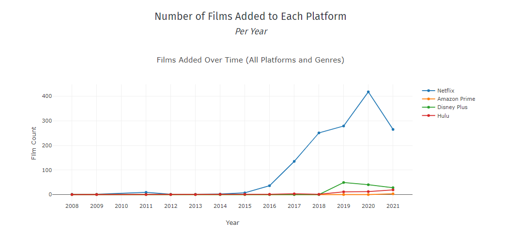
Line graph represents the number of movies added to each platform through the years!
We know, we know… those boring bar charts. But they are boring for a reason. They are used a lot since they are easy to read and understand. Hence, the bar chart! We explored the top-five most popular genres across all the platforms and dove into information of how well represented they are and how much content has been added for each of these genres since 2016. Now, two things to consider here. Amazon Prime didn’t release the information on added content through the years, and Disney Plus launched in 2019! Also, to keep our visuals informative and easy to read we didn’t normalize y-axis.

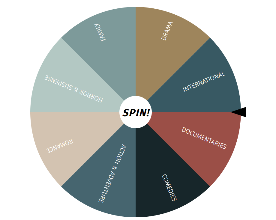
Exploring data and playing with charts is a lot of fun! But don’t think that it is everything we have in store for you! Do you know the feeling of sitting down to watch a movie to then just proceed scrolling through countless options, spending time reading every description, maybe even watching mini-tailers? Your food gets cold and your partner is getting more frustrated saying “Just pick something!”. But it doesn’t have to be this way anymore! Let us introduce you to the Wheel! We represented the top 8 most favored genres across all four platforms, all you have to do is just spin it to see what each platform has to offer.
We see many ways we can improve and expand our dashboard:
- Adding TV-shows content
- Introduce other popular platforms to our analysis
- Get more data on removed content from each platform, as well as selection for different countries.
Chad Barlow:
Reid Walker:
Miodrag Radovic:
Olga Dolzhko: